Box and Whisker Plot Maker with VizGPT: Create Box Plots Conveniently
Ready to start creating your own box and whisker plot with VizGPT? Try this Prompt:
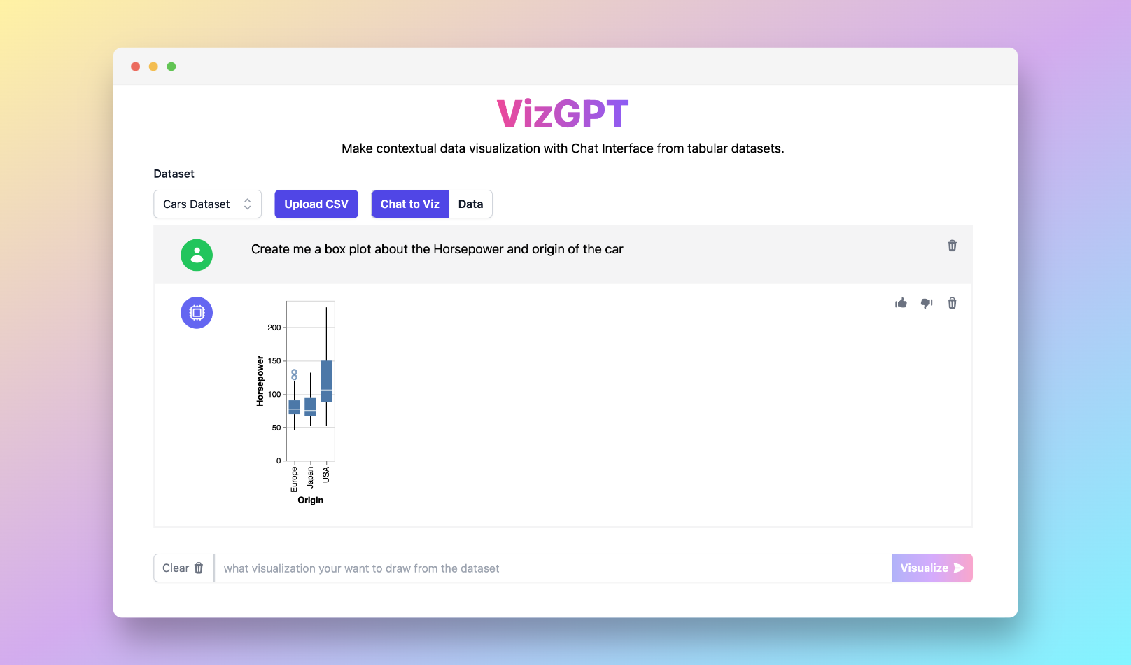
Create a box and whisker plot from the data set
Want to Upload a Customized CSV File? Upgrade to Kanaries Plus Plan, you can get the full package of apps (opens in a new tab) for handling much more complicated data analysis!

What is a Box and Whisker Plot Maker in Statistics?
A Box and Whisker Plot Maker is a software tool or online service that assists in creating box plots, a type of graph used in statistics. These plots, also known as box and whisker diagrams, display the distribution of data and are particularly useful when comparing distributions across groups.
Using a Box and Whisker Plot Maker
Using an online box plot generator, such as VizGPT or a box and whisker plot maker in Excel, you can create a box and whisker plot from a 5-number summary of your data. This summary includes the minimum, first quartile (Q1), median (Q2), third quartile (Q3), and maximum.
To generate a box plot, input these five values into the generator. In an advanced box plot maker, you have the option to customize your plot by altering colors, labeling data points, adding titles, and more.
Components of a Box and Whisker Plot
A box plot consists of a rectangular box, the whiskers, and individual points representing outliers. The box itself represents the interquartile range (IQR), the range between Q1 and Q3. The line inside the box marks the median of the dataset. The whiskers extend from the box to the smallest and largest data values within 1.5 times the IQR. Any data points beyond this range are considered outliers and are usually marked with individual points.
The Importance of Box Plots in Data Analysis
Box plots provide a visual summary of data distribution, allowing for quick comparisons between datasets or categories. They show the median, quartiles, and potential outliers, offering insights into data spread and skewness. Whether you're using a simple box and whisker plot maker or an advanced tool, box plots can be a valuable addition to your data analysis toolkit.
Top Online Box and Whisker Plot Makers
Several online services allow you to create box plots. Google Sheets, for instance, has a box and whisker plot maker function integrated into its chart options. Desmos, an advanced mathematics software, offers a box plot maker. And, of course, VizGPT is another excellent tool for this purpose.
All these platforms offer unique features. Some allow you to create horizontal box plots, while others enable you to include outliers or generate plots from a 5-number summary. Regardless of your requirements, there's likely a tool that can accommodate your needs.
Conclusion
A box and whisker plot maker can simplify the process of creating box plots, helping you visualize and analyze your data efficiently. Whether you need a box plot maker for two sets of data or a stacked box plot maker, online tools like VizGPT offer easy, customizable, and effective solutions. So, get started on your data visualization journey today!
Frequently Asked Questions
-
How do I create a box and whisker plot? To create a box plot, you need a 5-number summary of your data: minimum, first quartile (Q1), median (Q2), third quartile (Q3), and maximum. Input these values into a box and whisker plot maker to generate your plot.
-
What is the best online box and whisker plot maker? There are several good online box plot generators available. The best one depends on your specific needs. VizGPT, Google Sheets, and Desmos all offer reliable box plot creation tools.
-
What information does a box plot provide? A box plot provides a visual summary of the distribution of data. It shows the median, quartiles, range, and potential outliers in a dataset, offering insights into data spread and skewness.