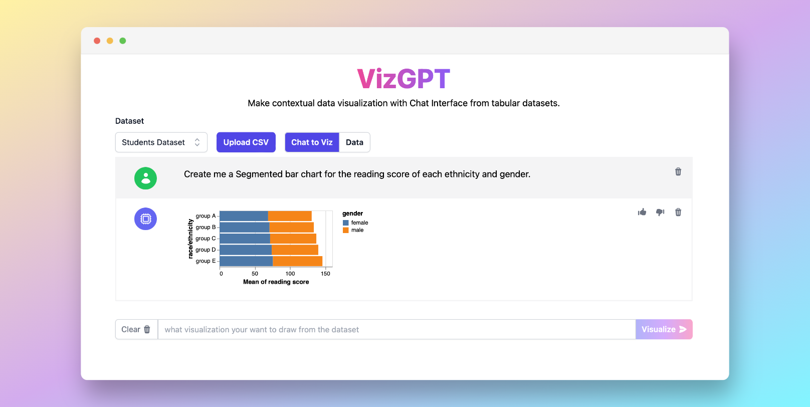
Easily Create Segmented Bar Graph with VizGPT
Ready to start creating your own Segmented Bar Graph with VizGPT? Try this Prompt:
Create a Stacked Bar Chart from the data set
Simply download the generated chart and import it to Excel, you are good to go!
Want to Upload a Customized CSV File? Upgrade to Kanaries Plus Plan, you can get the full package of apps (opens in a new tab) for handling much more complicated data analysis!
Introduction to Segmented Bar Graph Maker
Data visualization is a critical component in interpreting categorical data and statistics. One such effective tool is the segmented bar graph, a type of bar chart that provides a visual representation of data sets. This article will walk you through the concept of segmented bar graphs, how they compare with other types of charts, and how to create them in Excel or Google Sheets. Additionally, we will introduce you to some of the best online bar graph makers available today.
What is a Segmented Bar Graph?
A segmented bar graph, also referred to as a stacked bar chart, is a graphical representation of categorical data. It displays information by dividing a bar into segments, each representing a particular category. The length or height of each segment corresponds to the quantity of that category within the total data set.
Segmented Bar Graph vs. Other Charts
Segmented Bar Graph vs. Mosaic Plot
While both are used for visualizing categorical data, there's a difference between a segmented bar graph and a mosaic plot. A segmented bar graph portrays multiple data categories in individual bars, with the size of segments representing values. On the other hand, a mosaic plot uses area to represent proportions, effectively combining a segmented bar graph and a two-way frequency table.
Segmented Bar Graph vs. Stacked Bar Chart
The terms segmented bar graph and stacked bar chart are often used interchangeably. Both display data in segments within a bar, representing different categories. However, the difference lies in their presentation. In a stacked bar chart, segments are placed on top of each other, forming a single bar. In a segmented bar graph, segments can be horizontally aligned side by side, although they're often vertically stacked, leading to the confusion.
How to Create a Segmented Bar Graph?
Creating a segmented bar graph can be accomplished in various software tools, with Excel and Google Sheets being two of the most common.
Creating a Segmented Bar Graph in Excel
To create a segmented bar graph in Excel, input your data in rows or columns on the worksheet. From there, select the data and choose the "Stacked Bar" or "
Stacked Column" chart from the "Insert" tab. This will generate a segmented bar graph, which can be further customized.
Creating a Segmented Bar Graph in Google Sheets
Similarly, to create a segmented bar graph in Google Sheets, enter your data in rows or columns. Once your data is selected, go to "Insert," then "Chart," and finally select the "Stacked Bar Chart" or "Segmented Bar Graph" option. You can adjust the colors and labels as needed.
Why Use a Segmented Bar Graph?
Segmented bar graphs are valuable tools in data visualization. They allow for quick comparison of different data categories, showing their individual contributions to the total data set. They're excellent for comparing parts to a whole and tracking changes over time. Furthermore, they can help determine if there's an association between categorical variables in a data set.
Creating a Segmented Bar Graph in Excel and Other Tools
Creating a segmented bar graph can be accomplished in various software tools, with Excel being one of the most common. In Excel, you simply select the data you want to plot, go to the Insert tab, and click the bar chart type you want to insert. This process generates a segmented bar graph, which can be further customized.
But Excel is not the only tool you can use to create bar graphs. There are many online bar graph makers available, including:
- Visme: This tool allows you to create animated charts, color code, and import your brand colors.
- Bar Graph Maker: A straightforward tool that generates a bar chart based on user input.
- RapidTables: Here, you can enter the title, axis labels, data label names, and more.
- Canva: Canva offers bar graph templates where you can add your own data.
- Microsoft Word: You can insert a chart from the illustrations group and select the bar tab.
- PowerPoint: To create a bar graph, insert a blank slide, click Insert, Chart, and choose Bar.
- Fotor: This tool allows you to import your data from your local folder and create bar graphs.
- Graph maker: Input the bar categorical data parameter and category name, and the tool will calculate the bar height and length proportion.
- Adobe Express: With Adobe Express, you can create your own eye-catching graph in minutes.
Conclusion
In conclusion, segmented bar graphs are essential tools for data visualization. They help communicate complex data in an easily digestible format. By understanding and mastering the use of these charts, you can effectively present your data and derive valuable insights.
Segmented Bar Graph FAQs
Here are a few frequently asked questions (FAQs) about segmented bar graphs:
What is the best bar graph generator?
VizGPT in general. The best bar graph generator depends on your specific needs. If you need advanced features and customization, tools like Visme and Adobe Express are excellent choices. For simpler tasks, Bar Graph Maker or RapidTables might be sufficient.
Can you make a bar graph in Excel?
Yes, you can make a bar graph in Excel, but you can also use VizGPT for being quicker and easier. Simply select the data you want to plot, go to the Insert tab, and click the bar chart type you want to insert.
How do I make a bar graph in Canva?
You can use VizGPT to create bar graph instead of using Canva. To make a bar graph in Canva, you can use their bar graph templates and add your own data.

