Matplotlib fill_between: 조건 영역 채우기, 신뢰 구간, isin() 오류 해결


fill_between은 두 y-곡선 사이(또는 곡선과 baseline 사이) 영역을 채웁니다. 신뢰 구간(confidence band), “위/아래” 강조, 선 차트 위 구간 표시의 표준 도구입니다.
빠른 문법
import matplotlib.pyplot as plt
import numpy as np

x = np.linspace(0, 10, 200)
y1 = np.sin(x)
y2 = np.cos(x)

fig, ax = plt.subplots()
ax.plot(x, y1, label="sin")
ax.plot(x, y2, label="cos")
ax.fill_between(x, y1, y2, color="0.7", alpha=0.4)
ax.legend()
plt.show()| 목표 | 패턴 |
|---|---|
| 두 시리즈 사이 채우기 | ax.fill_between(x, y1, y2, alpha=0.3) |
| 한 선 아래 채우기 | ax.fill_between(x, 0, y, alpha=0.3) |
| 조건이 참일 때만 | where=(y1 > y2) (x와 같은 길이) |
| 인덱스/카테고리 필터 | where=df.index.isin([...]) — Python in 아님 |
| 조건 경계 부드럽게 | interpolate=True |
- Claude Code AGENTS.md 지원: 설정 방법, 4가지 로딩 모드, Codex·OpenCode·Cursor와 한 파일 공유하기
- GPT Image 2.5 사용법: Flare·Sunburst 비교와 API 가격
- DeepSeek Harness 사용법: 설치, 설정, 첫 에이전트 실행까지
- Runcell Science: Claude Science를 대체할 오픈소스 AI 연구 워크스페이스
- 맥 잠자기 방지: 맥북 닫아도 Codex와 Claude Code 계속 실행하기
- OpenClaw vs ZeroClaw vs Pi Agent vs Nanobot: 2026년에 어떤 AI 에이전트 스택을 선택해야 할까?
- Claude Code로 Jupyter 노트북을 분석하는 방법 | Data Science 실무 가이드와 한계
- Claude Code 루틴 사용법: AI 에이전트 cron 작업과 자동 트리거
- Claude Code Desktop에서 Bypass permissions 켜는 법
- Google의 A2A 프로토콜을 사용한 두 개의 Python 에이전트 빌드하기 - 단계별 튜토리얼
- 2025년 파이썬에서 가장 성장하는 상위 10개 데이터 시각화 라이브러리
fill_between이 하는 일
Matplotlib은 (x, y1)에서 (x, y2)로 폴리곤을 그리고 채웁니다. x, y1, y2는 같은 길이여야 합니다(y1/y2는 스칼라도 가능).
이 한 가지 아이디어로 “이 구간을 강조해 줘” 작업 대부분을 커스텀 patch 없이 처리할 수 있습니다.
두 곡선 사이 기본 채우기
사인·코사인 사이를 전부 채우는 예제입니다.
import matplotlib.pyplot as plt
import numpy as np

x = np.linspace(0, 10, 300)
y1 = np.sin(x)
y2 = np.cos(x)

fig, ax = plt.subplots(figsize=(7.2, 4.2))
ax.plot(x, y1, label="sin(x)", color="#2563eb", lw=2)
ax.plot(x, y2, label="cos(x)", color="#dc2626", lw=2)
ax.fill_between(x, y1, y2, color="#94a3b8", alpha=0.45)
ax.set_xlabel("x")
ax.set_ylabel("y")
ax.legend(loc="upper right")
plt.show()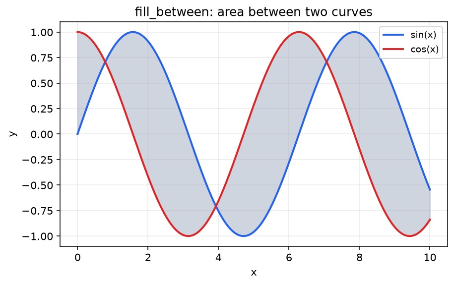
유용한 조절 값:
alpha— 반투명으로 두어 선이 읽히게 유지color/facecolor— 채우기 색linewidth=0— 선 스타일과 싸우는 폴리곤 테두리 숨기기label=— 채우기가 실제 범주를 나타낼 때 범례에 포함
where=로 조건 영역 채우기
x와 같은 길이의 boolean 배열을 넘기면 밴드의 일부만 칠합니다. 색을 둘로 나누려면 호출을 두 번:
fig, ax = plt.subplots(figsize=(7.2, 4.2))
ax.plot(x, y1, label="sin(x)", color="#2563eb", lw=2)
ax.plot(x, y2, label="cos(x)", color="#dc2626", lw=2)

ax.fill_between(
    x, y1, y2,
    where=(y1 > y2),
    interpolate=True,
    color="#22c55e",
    alpha=0.35,
    label="sin > cos",
)
ax.fill_between(
    x, y1, y2,
    where=(y1 <= y2),
    interpolate=True,
    color="#f97316",
    alpha=0.30,
    label="sin ≤ cos",
)

ax.legend(loc="upper right", ncol=2)
plt.show()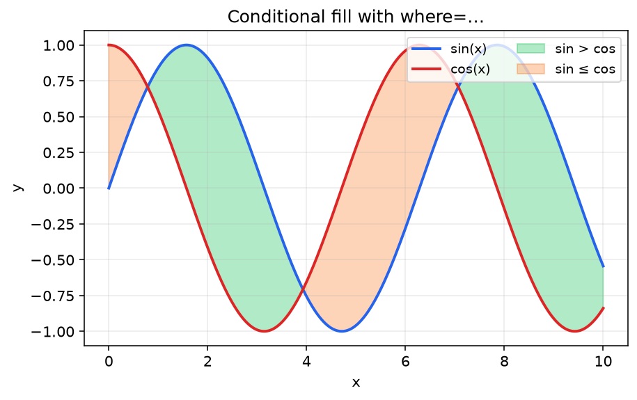
interpolate=True가 중요한 이유
보간 없이 두면, 조건이 샘플 점 사이에서 바뀔 때 채우기가 블록처럼 수직으로 잘릴 수 있습니다. interpolate=True는 교차점을 추정해 강조가 곡선을 더 자연스럽게 따릅니다. 밀집된 연속 시리즈에 권장하고, 희소한 범주형 x축에서는 덜 중요합니다.
신뢰 구간 / 오차 밴드 패턴
실무에서 매우 흔한 패턴이 “평균 ± 불확실성”입니다.
t = np.linspace(0, 12, 200)
mean = np.sin(t / 1.5) + 0.15 * t
std = 0.35 + 0.08 * np.abs(np.cos(t))

fig, ax = plt.subplots(figsize=(7.2, 4.2))
ax.plot(t, mean, color="#0f766e", lw=2.2, label="estimate")
ax.fill_between(t, mean - std, mean + std, color="#14b8a6", alpha=0.28, label="±1σ band")
ax.set_xlabel("time")
ax.set_ylabel("value")
ax.legend(loc="upper left")
plt.show()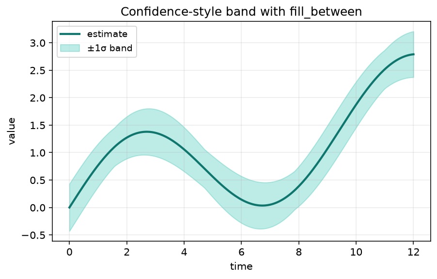
분위수(p10/p90), 예측 구간, min/max 포락선에도 같은 아이디어가 통합니다. 채우기가 너무 강하면 중심선을 이후에 그리거나 z-order를 높이세요.
트러블슈팅: 일부 카테고리/월만 채우기
검색 트래픽이 이 페이지에 오는 흔한 실패 시도:
# Broken ideas
where = plotMonths.index in ["January", "February", "March"]   # ValueError / nonsense
where = [m in ["January", "February", "March"] for m in plotMonths.index]  # may work, but isin is cleaner
무엇이 잘못되나
array in list는 요소별 연산이 아닙니다. NumPy/pandas 객체는 **ValueError**를 내거나 애매한 단일 boolean을 반환합니다.- 배열 전체에 대한 True/False 하나가 아니라,
x에 정렬된 boolean 벡터가 필요합니다.
해결: isin() (또는 np.isin)
범주형 월 라벨로 완결·실행 가능한 예제:
import matplotlib.pyplot as plt
import numpy as np
import pandas as pd

months = ["Jan", "Feb", "Mar", "Apr", "May", "Jun", "Jul", "Aug"]
df = pd.DataFrame(
    {
        "A": [12, 14, 13, 15, 18, 17, 16, 19],
        "B": [10, 11, 12, 14, 13, 15, 14, 16],
    },
    index=months,
)

fig, ax = plt.subplots(figsize=(7.2, 4.2))
ax.plot(df.index, df["A"], marker="o", label="series A")
ax.plot(df.index, df["B"], marker="o", label="series B")

ax.fill_between(
    np.arange(len(df)),
    df["A"],
    df["B"],
    where=df.index.isin(["Jan", "Feb", "Mar"]),
    color="#38bdf8",
    alpha=0.35,
    label="Q1 highlight",
)

ax.set_xticks(range(len(df)), df.index)
ax.legend(loc="upper left")
plt.show()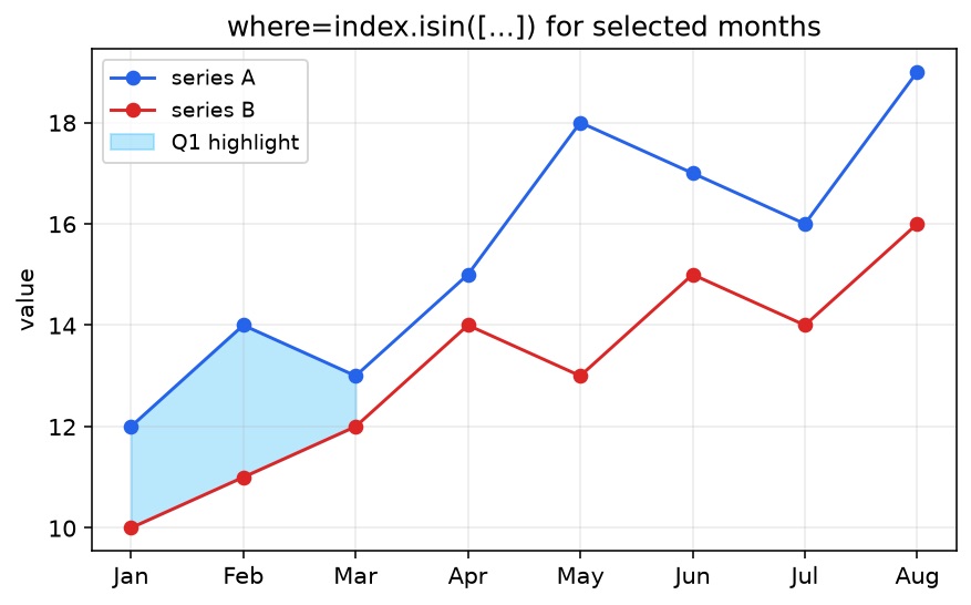
참고:
- DatetimeIndex면
(df.index.month <= 3)같은 boolean mask, 또는 정규화한 라벨에.isin을 선호하세요. - 축에 범주 라벨을 쓰는 경우, 위처럼
fill_between에 정수 위치를 넘기는 편이 문자열 카테고리보다 안정적인 경우가 많습니다. where길이는 넘긴 x 배열과 같게 유지하세요.
흔한 함정
| 함정 | 증상 | 해결 |
|---|---|---|
| 길이 불일치 | ValueError: ... not the same size | x, y1, y2, where 정렬 |
Index/array에 Python in | ValueError 또는 빈 채우기 | index.isin([...]) / np.isin |
alpha 생략 | 채우기가 선을 가림 | alpha=0.2–0.4 |
| PNG에서 바깥 범례 잘림 | 범례 잘림 | 플롯 밖 범례 + bbox_inches="tight" |
| 조건 경계가 거칠음 | 블록형 영역 | interpolate=True |
다중 시리즈 차트에서는 여러 선 플롯의 명확한 선 스타일과 채우기를 짝지으세요. 주석·밴드 후 그림이 답답하면 범례 위치와 싸우기 전에 figure size를 먼저 조절하세요.
fill_between vs fill_betweenx
fill_between(x, y1, y2)— x를 따라 두 y 값 사이 세로 채우기 (가장 흔함).fill_betweenx(y, x1, x2)— y를 따라 두 x 값 사이 가로 채우기 (수직 프로파일, density strip, tornado 스타일 구간에 유용).
같은 where= 아이디어가 둘 다에 적용됩니다.
FAQ
마무리
ax.fill_between(x, y1, y2)는 작은 API로 시각적 효과가 큽니다. 시리즈 비교, 불확실성 표시, 구간 스포트라이트에 쓰세요. 조건부 이야기면 where=를, 라벨 필터에는 Python in 대신 isin/boolean mask를, 데이터 선이 앞서 보이도록 alpha는 낮게 유지하세요.
관련 가이드
- Matplotlib legend outside plot — 채운 영역 옆 시리즈 라벨을 읽기 쉽게
- Matplotlib multiple line plots — 채우기와 잘 맞는 다중 시리즈 차트
- Matplotlib figure size — 밴드·라벨·범례 공간
- Matplotlib savefig cuts off labels — 잘림 없이보내기
- Matplotlib subplots — 여러 채운 시리즈를 위한 패널 레이아웃
- Matplotlib annotations and text — 방금 채운 영역에 라벨 달기