Matplotlib fill_between:条件塗りつぶし・信頼区間バンド・isin() 対処


fill_between は 2 本の y 曲線(または曲線とベースライン)のあいだを塗りつぶします。信頼区間バンド、「上側 / 下側」のハイライト、折れ線上の区間コールアウトの定番です。
クイック構文
import matplotlib.pyplot as plt
import numpy as np

x = np.linspace(0, 10, 200)
y1 = np.sin(x)
y2 = np.cos(x)

fig, ax = plt.subplots()
ax.plot(x, y1, label="sin")
ax.plot(x, y2, label="cos")
ax.fill_between(x, y1, y2, color="0.7", alpha=0.4)
ax.legend()
plt.show()| 目的 | パターン |
|---|---|
| 2 系列のあいだを塗る | ax.fill_between(x, y1, y2, alpha=0.3) |
| 1 本の下を塗る | ax.fill_between(x, 0, y, alpha=0.3) |
| 条件が真のところだけ | where=(y1 > y2)(x と同じ長さ) |
| インデックス / カテゴリで絞る | where=df.index.isin([...]) — Python の in ではない |
| 条件の境をなめらかに | interpolate=True |
- Laya の使い方:pandas でテキスト分類(Jev のオープンソース代替を4言語で実測)
- Claude Code が AGENTS.md を読むように:設定方法、4つの読み込みモード、Codex・OpenCode・Cursor との共用
- GPT Image 2.5の使い方:FlareとSunburstの違い・API料金
- DeepSeek Harness の使い方:インストール、初期設定、最初のエージェント実行まで
- Runcell Science:Claude Scienceのオープンソース代替となるAI研究ワークスペース
- Macをスリープさせない方法:Codex・Claude Codeを止めずに動かす
- OpenClaw vs ZeroClaw vs Pi Agent vs Nanobot: 2026年に選ぶべきAIエージェントスタックは?
- Claude CodeでJupyterノートブックを分析する方法|Data Science向けの実践ポイントと限界
- Claude Code Routinesとは?AIエージェントの定期実行と自動化を理解する
- Claude Code DesktopでBypass permissionsを有効にする方法
- GoogleのA2Aプロトコルで2つのPythonエージェントを構築する方法 - ステップバイステップチュートリアル
- 2025年のPythonで人気のあるトップ10のデータ可視化ライブラリ
fill_between がやっていること
Matplotlib は (x, y1) から (x, y2) までの多角形を描いて塗りつぶします。x、y1、y2 は同じ長さ(または y1 / y2 をスカラー)にします。
この一点で、「この区間を目立たせたい」系の仕事の大半が、自作パッチなしで足ります。
2 曲線のあいだを基本的に塗る
sine と cosine のあいだをすべて塗る例です。
import matplotlib.pyplot as plt
import numpy as np

x = np.linspace(0, 10, 300)
y1 = np.sin(x)
y2 = np.cos(x)

fig, ax = plt.subplots(figsize=(7.2, 4.2))
ax.plot(x, y1, label="sin(x)", color="#2563eb", lw=2)
ax.plot(x, y2, label="cos(x)", color="#dc2626", lw=2)
ax.fill_between(x, y1, y2, color="#94a3b8", alpha=0.45)
ax.set_xlabel("x")
ax.set_ylabel("y")
ax.legend(loc="upper right")
plt.show()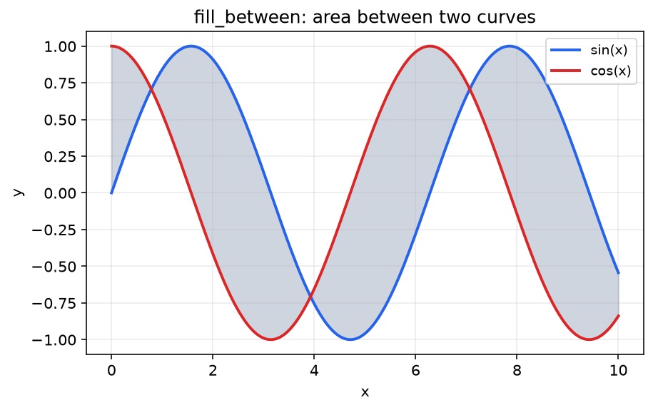
よく使うつまみ:
alpha— 半透明にして線を読めるままにするcolor/facecolor— 塗り色linewidth=0— 多角形の縁が線スタイルと喧嘩するなら消すlabel=— 塗りが意味のあるカテゴリなら 凡例 に載せる
where= による条件付き塗りつぶし
x と同じ長さの真偽配列を渡し、帯の一部だけ塗ります。色を 2 つに分けたいなら呼び出しを 2 回にします。
fig, ax = plt.subplots(figsize=(7.2, 4.2))
ax.plot(x, y1, label="sin(x)", color="#2563eb", lw=2)
ax.plot(x, y2, label="cos(x)", color="#dc2626", lw=2)

ax.fill_between(
    x, y1, y2,
    where=(y1 > y2),
    interpolate=True,
    color="#22c55e",
    alpha=0.35,
    label="sin > cos",
)
ax.fill_between(
    x, y1, y2,
    where=(y1 <= y2),
    interpolate=True,
    color="#f97316",
    alpha=0.30,
    label="sin ≤ cos",
)

ax.legend(loc="upper right", ncol=2)
plt.show()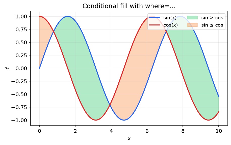
なぜ interpolate=True が効くか
補間なしだと、サンプル点のあいだで条件が切り替わるところで塗りがブロック状の縦辺になりがちです。interpolate=True は交点を推定し、ハイライトが曲線に沿いやすくなります。密な連続系列では優先して使い、疎なカテゴリ x 軸では重要度は下がります。
信頼区間 / 誤差バンドのパターン
実務でいちばん多いのは「平均 ± 不確かさ」です。
t = np.linspace(0, 12, 200)
mean = np.sin(t / 1.5) + 0.15 * t
std = 0.35 + 0.08 * np.abs(np.cos(t))

fig, ax = plt.subplots(figsize=(7.2, 4.2))
ax.plot(t, mean, color="#0f766e", lw=2.2, label="estimate")
ax.fill_between(t, mean - std, mean + std, color="#14b8a6", alpha=0.28, label="±1σ band")
ax.set_xlabel("time")
ax.set_ylabel("value")
ax.legend(loc="upper left")
plt.show()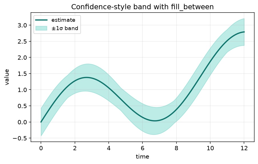
分位点(p10 / p90)、予測レンジ、min/max エンベロープも同じ考え方です。塗りが強すぎるときは、中心線を あとから 描くか、z-order を上げます。
トラブルシュート: 一部のカテゴリ / 月だけ塗る
検索からこのページに来る人は、次のような失敗を一度していることが多いです。
# Broken ideas
where = plotMonths.index in ["January", "February", "March"]   # ValueError / nonsense
where = [m in ["January", "February", "March"] for m in plotMonths.index]  # may work, but isin is cleaner
何が起きているか
array in listは要素ごとの比較ではありません。NumPy / pandas オブジェクトはValueErrorを出したり、曖昧な単一の真偽値を返したりします。- 必要なのは
xに揃った真偽ベクトル であり、配列全体に対する 1 つの True/False ではありません。
修正: isin()(または np.isin)
カテゴリ月ラベル付きの、そのまま動く例です。
import matplotlib.pyplot as plt
import numpy as np
import pandas as pd

months = ["Jan", "Feb", "Mar", "Apr", "May", "Jun", "Jul", "Aug"]
df = pd.DataFrame(
    {
        "A": [12, 14, 13, 15, 18, 17, 16, 19],
        "B": [10, 11, 12, 14, 13, 15, 14, 16],
    },
    index=months,
)

fig, ax = plt.subplots(figsize=(7.2, 4.2))
ax.plot(df.index, df["A"], marker="o", label="series A")
ax.plot(df.index, df["B"], marker="o", label="series B")

ax.fill_between(
    np.arange(len(df)),
    df["A"],
    df["B"],
    where=df.index.isin(["Jan", "Feb", "Mar"]),
    color="#38bdf8",
    alpha=0.35,
    label="Q1 highlight",
)

ax.set_xticks(range(len(df)), df.index)
ax.legend(loc="upper left")
plt.show()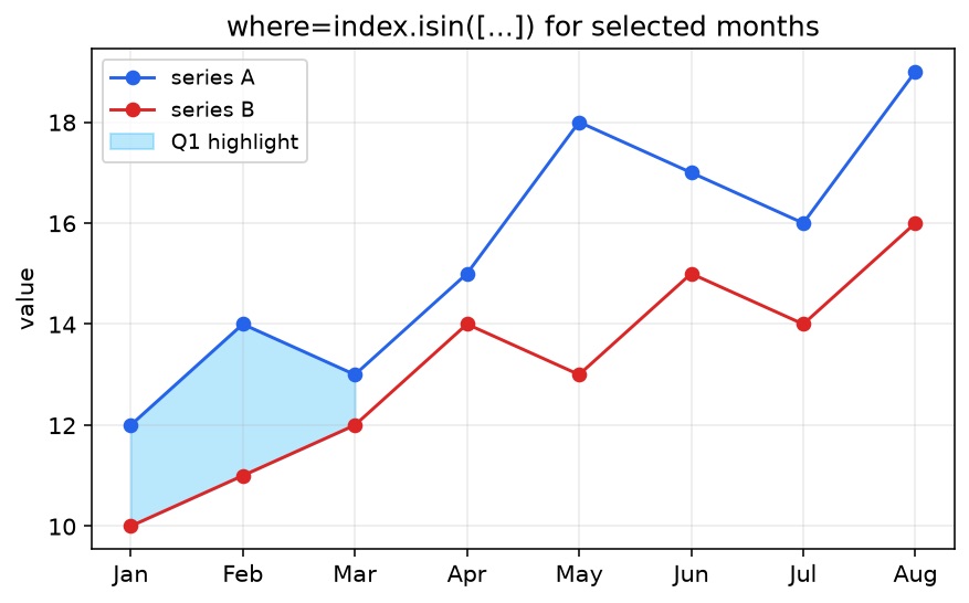
補足:
- DatetimeIndex なら
(df.index.month <= 3)のような真偽マスクや、正規化したラベルへの.isinが扱いやすいです。 - 軸上のカテゴリラベルがあるとき、
fill_betweenには文字列カテゴリより 整数位置(上例)の方が安定しやすいです。 whereの長さは渡した x 配列と揃えます。
よくある罠
| 罠 | 症状 | 直し方 |
|---|---|---|
| 長さ不一致 | ValueError: ... not the same size | x / y1 / y2 / where を揃える |
Index/配列に Python の in | ValueError または塗りが空 | index.isin([...]) / np.isin |
alpha を忘れる | 塗りが線を隠す | alpha=0.2–0.4 |
| 外側凡例が PNG で切れる | 凡例が欠ける | 凡例を外側に置く + bbox_inches="tight" |
| 条件境界がギザつく | ブロック状の領域 | interpolate=True |
複数系列では、塗りとあわせて 複数折れ線 の線スタイルをはっきりさせます。注釈やバンドで窮屈なら、凡例位置をいじる前に 図のサイズ を先に直します。
fill_between と fill_betweenx
fill_between(x, y1, y2)— x 方向に沿って 2 つの y のあいだを縦方向に塗る(いちばん多い)fill_betweenx(y, x1, x2)— y 方向に沿って 2 つの x のあいだを横方向に塗る(鉛直プロファイル、密度帯、tornado 型レンジなど)
where= の考え方はどちらも同じです。
FAQ
まとめ
ax.fill_between(x, y1, y2) は小さな API ですが見た目の効果が大きいです。系列比較、不確かさの表示、区間のスポットライトに使えます。条件付きなら where=、ラベル絞り込みは Python の in ではなく isin / 真偽マスク、データが主役のままになるよう alpha は低めに保ちます。
関連ガイド
- Matplotlib 凡例を外側に置く — 塗り領域の横でも系列ラベルを読めるようにする
- Matplotlib 複数折れ線 — 塗りと相性の良い複数系列
- Matplotlib の図サイズ — バンド・ラベル・凡例の余白
- savefig でラベルが切れる — クリップなしエクスポート
- Matplotlib subplots — 塗り付き複数系列のパネル配置
- Matplotlib アノテーションとテキスト — 塗った領域へのラベル