Scatter Plot Calculator with VizGPT
Ready to start creating your own Scatter Plots with VizGPT? Try this Prompt:
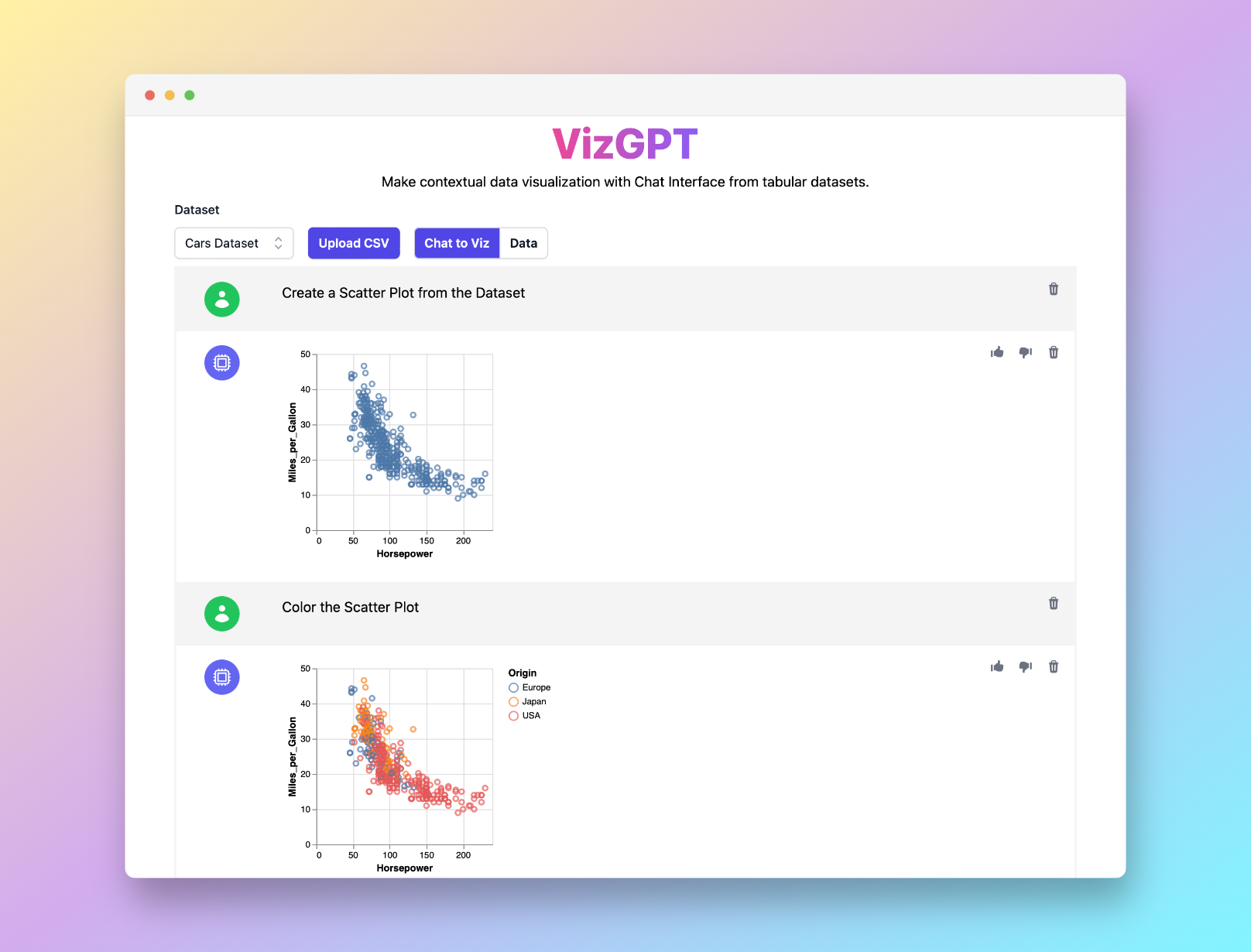
Create a Scatter Plot from the data
Want to Upload a Customized CSV File? Upgrade to Kanaries Plus Plan, you can get the full package of apps (opens in a new tab) for handling much more complicated data analysis!

Introduction to Scatter Plot Calculator
Scatter plots are essential tools in statistical analysis, providing a visual representation of two variables and their correlation. With advancements in technology, an array of tools, including the TI-84 calculator, Desmos, Excel, and various online scatter plot generators, have been developed to simplify this process. This guide explores how to leverage these tools effectively.
Visualizing data can sometimes be a daunting task, especially if you're dealing with large data sets. That's where our VizGPT tool comes in, transforming your data into elegant charts.
Understanding Scatter Plots and their Calculators
Scatter plots, also known as scatter diagrams, are graphs that depict the relationship between two variables. Each point on the graph represents a single observation of the variables. The trend line, or line of best fit, provides an overall impression of the data pattern.
The Role of Scatter Plot Calculators
A scatter plot calculator serves as a tool to generate scatter plots from provided datasets. It can calculate the line of best fit, correlation coefficient, and even the slope intercept form. Several online platforms offer scatter plot calculators, such as Desmos, Alcula, MathCracker, and Omni Calculator.
Using the TI-84 Plus to Create a Scatter Plot
The TI-84 calculator, a popular graphing calculator, can easily create scatter plots. The 'STAT PLOT' feature allows users to generate scatter diagrams, providing visual representation of their data.
How to Make an XY Scatter Plot in Excel
Excel is another commonly used tool for creating scatter plots. By using Excel’s 'Chart' function, you can create an XY scatter plot, customize it, and even add a trend line to it.
Online Scatter Plot Generators
Online scatter plot generators are also available, offering free and easy-to-use platforms. They can create scatter plots with two sets of data and even calculate the line of best fit. Notable examples include Desmos and LibreTexts.
Conclusion
Scatter plots and scatter plot calculators are indispensable tools in statistical analysis, providing the power to visualize and analyze data effectively. With the knowledge provided in this guide and the right tool like VizGPT, you can unlock the full potential of your data.
Scatter Plot FAQs
-
How do you calculate a scatter plot? To calculate a scatter plot, you need a set of bivariate data. Using a scatter plot calculator, plot the data points on a graph. Each point represents a single data pair.
-
Where is the stat plot on TI 84? To locate the stat plot on TI-84, press the "STAT" button, then "PLOT". This will bring up the statistical plot definitions screen.
-
How do you make an XY scatter plot in Excel? To make an XY scatter plot in Excel, first input your data pairs in two separate columns. Select the data, go to the "Insert" tab, choose "Chart", and then select "Scatter".