Box and Whisker Plot Calculator with RunCell
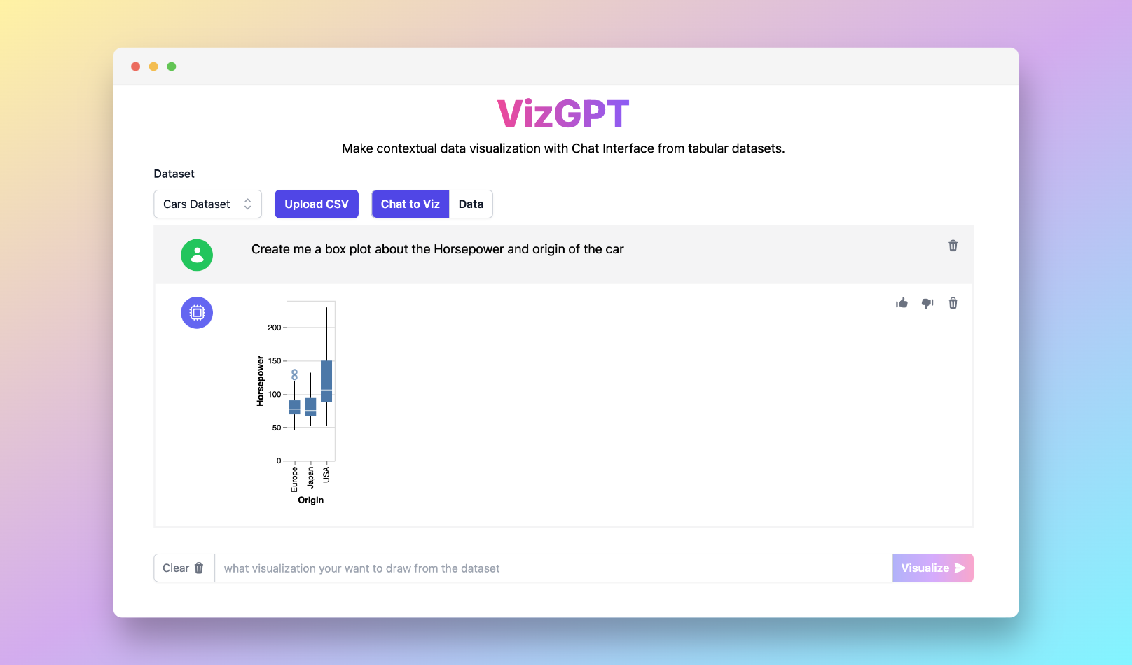
If you want a quick first draft in RunCell, start with a prompt like this:
Create a box and whisker plot from the data set
If you want to start from your own CSV instead of the sample data, use RunCell first and export the chart once it looks right.
Introduction to Box and Whisker Plot Calculator
A box and whisker plot, also known as a box plot, is a tool used in statistics for visualizing the distribution of a data set. It's a great way to showcase outliers, quartiles, and the interquartile range of your data. This guide will dive into the specifics of what a box and whisker plot is, how to create one, and how tools such as the box and whisker plot calculator can help.
What is a Box and Whisker Plot?
A box and whisker plot is a method of displaying the distribution of numerical data through quartiles. This plot includes a 'box', which contains the interquartile range (the first quartile to the third quartile), and 'whiskers' that represent the variability outside the upper and lower quartiles. The box plot is a useful tool to visually display the data's skewness, kurtosis, and dispersion.
Using a Box and Whisker Plot Calculator
Creating a box and whisker plot can be done either by hand or using various software tools. While creating a box plot manually is excellent for learning, online box plot generators, like a box and whisker plot calculator, provide a quicker and more accurate method, especially when dealing with large datasets.
To create a box and whisker plot by hand, you'll need to understand and calculate the five number summary of your data. This includes the minimum, first quartile (Q1), median (Q2), third quartile (Q3), and maximum. The interquartile range (IQR) is the range between Q1 and Q3.
Online Box and Whisker Plot Calculator Tools
Online tools like box and whisker plot calculators or box and whisker plot makers provide a quick and easy method to create box plots. These tools allow you to input your data, either manually or through uploading a CSV file, and automatically calculate the five-number summary and draw the plot.
Software like Excel, TI-84, and RunCell not only allow creating box plots but also enable the interpretation and analysis of complex datasets through visualization. For instance, with RunCell, you can upload your data and instruct it to create a box plot, enabling an easy and interactive method of creating and interpreting box plots.
Understanding and Interpreting a Box and Whisker Plot
Interpreting a box and whisker plot involves understanding what its different parts represent. The box in the plot represents the interquartile range, the range between the first quartile (Q1) and the third quartile (Q3). The line inside the box represents the median of the data. The whiskers represent the variability outside the upper and lower quartiles, showing data spread and potential outliers.
A box and whisker plot can also provide insights into the data's skewness and standard deviation. A skewed box plot indicates that the data are not symmetric, while the length of the box and whiskers can give an idea of the data's standard deviation.
Conclusion
Box and whisker plots provide a comprehensive view of data distribution and variability, making them essential tools in statistics and data visualization. Whether you're creating a plot manually or using a box and whisker plot calculator, understanding the plot's components and what they represent is crucial to interpreting your data effectively.
Now, practice what you've learned with box and whisker plot worksheets, or explore how to make a double box and whisker plot calculator to compare two sets of data. Remember, tools like RunCell can make your journey in data visualization and interpretation much more manageable and enjoyable.
Frequently Asked Questions
-
What is a Box and Whisker Plot Calculator? A Box and Whisker Plot Calculator is an online tool that aids in creating a box and whisker plot by automatically calculating the five number summary (minimum, Q1, median, Q3, maximum) from your dataset and drawing the corresponding box plot.
-
How to calculate the Interquartile Range in a Box and Whisker Plot? The interquartile range (IQR) is calculated by subtracting the first quartile (Q1) from the third quartile (Q3). It represents the middle 50% of data points.
-
What's the purpose of a Box and Whisker Plot in statistics? A box and whisker plot is used in statistics to visually display a data set's distribution. It represents the range, interquartile range, median, and potential outliers of the data, helping in understanding data dispersion, skewness, and kurtosis.
