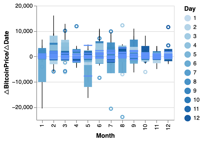
How to Create a Box Plot
Box plots are a powerful tool in data visualization, ideal for showing statistical information about a dataset. This guide will walk you through the process of creating a box plot using RATH.
What is a Box Plot?
A box plot (or box-and-whisker plot) is a type of data visualization that provides a summary of a set of data values, including the minimum, first quartile, median, third quartile, and maximum. In a box plot, a box is created from the first quartile to the third quartile, a vertical line is also drawn through the box at the median, and whiskers go from each quartile to the minimum or maximum.

Creating a Box Plot in RATH
In RATH (opens in a new tab), you can create a box plot by following these steps:
-
Import your Data: Log into your account and upload your CSV or Excel file to RATH, or connect your online database to RATH.
-
Select the Chart Type: In the Exploration tab, choose the Mark Type button on the Tools bar and select 'Box Plot'.
-
Create the Box Plot: Drag and drop your variables onto the shelves, defining the x-axis and y-axis for your box plot.
Creating an Effective Box Plot: Key Considerations
When designing box plots, there are a few key considerations to keep in mind:
-
Comparison of Groups: Box plots excel at comparing distributions among different groups. Make sure to compare multiple groups to fully leverage their potential.
-
Group Ordering: Arrange your groups strategically to highlight patterns and insights.
-
Orientation: The orientation of your box plot, be it vertical or horizontal, should be determined based on the number of groups and the length of group labels.
Practical Applications of Box Plots
Box plots are versatile tools for data visualization in various scenarios. Some practical applications include:
-
Academic Performance: Comparing exam scores across different classes or schools.
-
Sales Analysis: Evaluating monthly sales across different regions or stores.
-
Healthcare Assessment: Assessing variations in patient recovery times across different treatment methods.
Letter Value Plots
Letter value plots offer an enhanced version of standard box plots. These use a series of boxes to cover larger portions of your dataset. When working with a substantial amount of data, letter value plots provide a more detailed group comparison.
Conclusion
Box plots, based on the specifics of your data distribution and the level of detail you require, can be supplemented with other visualization types like histograms or violin plots. Despite the varying customization capabilities of different visualization tools, even the most basic box plots can deliver quick and insightful data understanding.