Unlocking Insights: Python Data Visualization Libraries You Need to Know
- Name
- Rajiv Chandra
Updated on
Data visualization is a highly coveted skill in today's data-driven world. It can help us understand complex data sets, uncover trends, patterns, and relationships in the data, and communicate insights in an easily digestible form. Among the tools available for data visualization, Python holds a special place, thanks to its versatility, accessibility, and the rich ecosystem of libraries it offers. This article introduces the top five Python data visualization libraries, detailing their key features and use cases to guide your selection process.
- Runcell Science: An Open Source Alternative to Claude Science for Research Workflows
- How to Make Mac Not Sleep: Keep Codex, Claude Code, and AI Agents Running
- OpenClaw vs ZeroClaw vs Pi Agent vs Nanobot: Which AI Agent Stack Should You Choose in 2026?
- Can Claude Code Analyze Jupyter Notebooks for Data Science? What It Actually Does
- Claude Code Routines: Why AI Agent Cron Jobs Matter
- Claude Code Desktop Bypass Permissions: How to Enable It
- How to Build Two Python Agents with Google’s A2A Protocol - Step by Step Tutorial
- Top 10 growing data visualization libraries in Python in 2025
The Power of Python for Data Visualization
Python's ascendance as a leading language in data science can be attributed to its simplicity and robust capabilities. It is not only easy to learn and understand but also has powerful libraries that can handle virtually any data science task you throw at it. In terms of data visualization, Python provides a host of libraries that exceed the capabilities of many traditional tools.
A crucial aspect of data visualization is making complex, data-driven decisions more manageable. Python, being a versatile and highly adaptable language, enables the creation of a wide range of compelling visualizations, from simple line plots to complex heat maps. However, the variety of libraries available can be overwhelming for newcomers. That's why we're here to help.
The Best Python Data Visualization Libraries
Before diving into the top five libraries, let's clarify the criteria we'll use to evaluate them. We'll consider whether the library supports interactive features, the level of control it provides over the visualization process, and its main strengths and typical use cases.
Matplotlib
Matplotlib (opens in a new tab) is a go-to library for many when it comes to plotting in Python. This library provides a low-level, highly customizable interface for creating a wide variety of 2D and 3D plots. It may have a slightly steeper learning curve due to its granular control, but its flexibility and the large supportive community around it make Matplotlib an excellent choice for those seeking precise control over their visualizations.
Example of Matplotlib Visualization:
import matplotlib.pyplot as plt
import numpy as np

x = np.linspace(0, 10, 100)
y = np.sin(x)

plt.plot(x, y)
plt.show()
PyGWalker
To test out PyGWalker right now, you can run PyGWalker in Google Colab (opens in a new tab), Binder (opens in a new tab) or Kaggle (opens in a new tab).
PyGWalker is Open Source. You can check out PyGWalker GitHub page (opens in a new tab) and read the Towards Data Science Article (opens in a new tab) of it.
Get started with PyGWalker in Jupyter Notebook
PyGWalker can simplify your Jupyter Notebook data analysis and data visualization workflow. By bringing a lightweight, easy-to-use interface instead of analyzing data using Python. The steps are easy:
Import pygwalker and pandas to your Jupyter Notebook to get started.
import pandas as pd
import pygwalker as pyg
You can use pygwalker without changing your existing workflow. For example, you can call up Graphic Walker with the dataframe loaded in this way:
df = pd.read_csv('./bike_sharing_dc.csv', parse_dates=['date'])
gwalker = pyg.walk(df)
Resize a chart with PyGWalker
You can easily resize a chart with your mouse cursor.
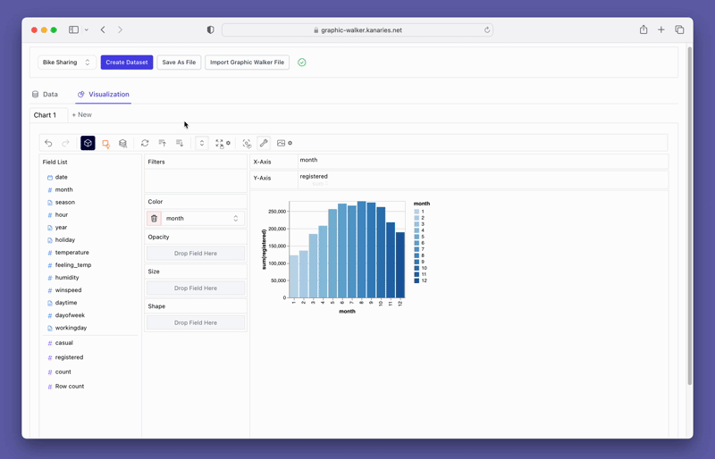
Change the chart type
A line chart might demonstrate the trends of the registered user numbers better than a bar chart. To switch the existing chart to a line chart, click on the Mark Types option on the Tools bar and choose Line.
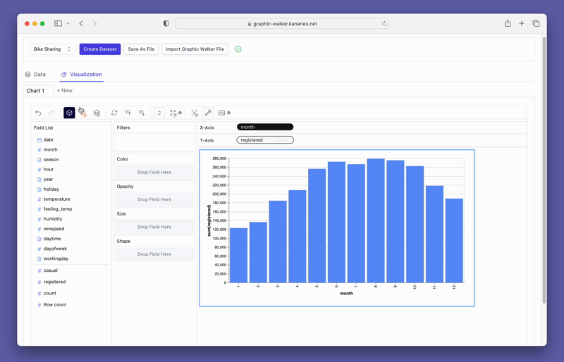
Create a Concat View
You may want to compare the differences between registered and casual users. Simply add more measures to the rows/columns and compare them.
Seaborn
Built on top of Matplotlib, Seaborn (opens in a new tab) is another popular Python data visualization library that offers a high-level interface for creating beautiful, statistical graphics. It provides more aesthetically pleasing default themes and is more straightforward to use than Matplotlib. However, as Seaborn is built on Matplotlib, you can use Matplotlib's functions to tweak Seaborn plots if necessary.
Example of Seaborn Visualization:
import seaborn as sns

tips = sns.load_dataset("tips")
sns.boxplot(x="day", y="total_bill", data=tips)
Bokeh
Bokeh (opens in a new tab) is a Python interactive visualization library that enables high-performance visual presentations of large datasets in modern web browsers. It provides both high-level and low-level interfaces that are influenced by the Grammar of Graphics, allowing the creation of complex statistical plots quickly and efficiently.
Example of Bokeh Visualization:
from bokeh.plotting import figure, show

p = figure(plot_width

=400, plot_height=400)
p.circle([1, 2, 3, 4, 5], [6, 7, 2, 4, 5], size=20, color="navy", alpha=0.5)
show(p)
Altair
Altair (opens in a new tab) is a declarative statistical visualization library in Python. Altair offers a powerful and concise visualization grammar that enables you to build a wide range of statistical visualizations quickly.
Example of Altair Visualization:
import altair as alt
from vega_datasets import data

source = data.cars()

alt.Chart(source).mark_circle(size=60).encode(
    x='Horsepower',
    y='Miles_per_Gallon',
    color='Origin',
).interactive()
Plotly
Plotly (opens in a new tab) is a feature-rich library that provides both high-level and low-level interfaces for creating interactive plots. It's great for creating complex, publication-quality graphs like line graphs, 3D charts, and heat maps. It's also heavily used in Dash, a popular framework for building analytical web applications with Python.
Example of Plotly Visualization:
import plotly.express as px

df = px.data.iris()
fig = px.scatter(df, x="sepal_width", y="sepal_length", color="species", size='petal_length', hover_data=['petal_width'])
fig.show()
Choosing the Right Python Data Visualization Library
Choosing the right Python data visualization library often depends on the complexity of the task at hand, the need for customization, and the preference for a specific coding style. Matplotlib and Seaborn offer substantial power for static plots, while Bokeh, Altair, and Plotly excel in creating interactive visualizations. Use the library that best suits your needs and preferences, keeping in mind that it's not uncommon to use multiple libraries to leverage their individual strengths.
Python's rich ecosystem of data visualization libraries empowers you to present data in insightful and meaningful ways. With Python, creating impressive, insightful, and interactive visualizations is at your fingertips.