How to Make a Pie Chart in Google Docs: An Easy Guide
If you want a quick first draft in RunCell, start with a prompt like this:
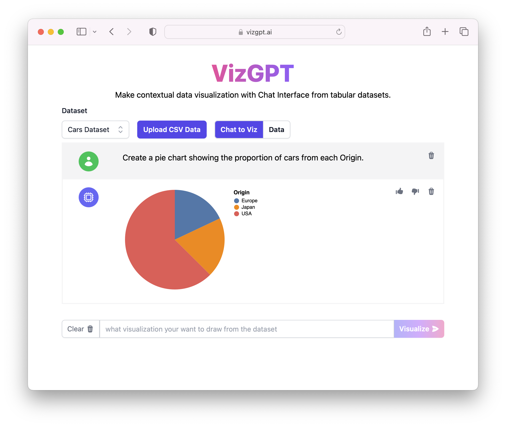
Create a Pie Chart from the data
You can draft the pie chart in RunCell first, then download it and place it in Google Docs.
If you want to start from your own CSV instead of the sample data, use RunCell first and export the chart once it looks right.
Introduction
Creating visuals like pie charts in Google Docs can be a practical way to explain data clearly. This guide covers the Google Docs workflow, and also shows where RunCell can help you draft the chart before you move it into the document.
How to Make a Pie Chart in Google Docs with RunCell
RunCell is an ingenious tool built for Jupyter that simplifies the creation of charts and visualizations. Instead of going through complex steps or writing code, you just need to provide a prompt, and voila! Here are the simple steps to use RunCell:
- Upload your CSV data to RunCell.
- Provide a prompt to create a pie chart.
Prompt: Create a Pie Chart with (Variables of your selection)
- Press the Visualize button.
- Download the Chart and import to Google Docs.
With these steps, anyone can create stunning and informative charts without needing advanced technical skills.
If you want to keep refining the chart before exporting it, continue working in RunCell (opens in a new tab).
How to Make a Pie Chart in Google Docs
Creating a pie chart, a valuable data visualization tool, in Google Docs involves a simple yet effective process that leverages the Google Sheets functionality within a Doc. To facilitate a better understanding, let's dive deeper into each step, from starting a new Google Doc to successfully creating and embedding a dynamic pie chart.
Step 1: Starting with Google Docs
To begin, open your Google Docs by navigating to the Google Docs website. Google Docs, a free web-based application, allows you to create, edit, and store documents online. If you have a Google account, you can access Google Docs directly with your login credentials. Once you're in, create a new document or open an existing one where you intend to insert the pie chart.
Step 2: Insert a Google Sheets in your Google Docs
Once your Google Doc is open, the next step is to insert a Google Sheets spreadsheet. You might wonder why you need Google Sheets. The answer lies in the integrated design of Google Workspace (formerly known as G Suite). Google Docs does not natively support chart creation, but it's seamlessly integrated with Google Sheets, which does.
To insert a Google Sheets document, click on the 'Insert' tab present on the menu bar at the top of your Google Docs interface. From the drop-down menu that appears, move your cursor to hover over 'Chart.' A side menu will pop up; from this menu, click on 'From Sheets.' This action will open a dialog box that will let you select a Google Sheets document from your drive.
Step 3: Select the Right Data in Google Sheets
Now that you've opened a Google Sheets document, it's time to select the data you want to represent in your pie chart. If your data isn't ready, take a moment to prepare it. Ensure your data is organized correctly, preferably in columns, with one column representing the categories of your pie chart and another column representing the corresponding values.
Once your data is ready, use your mouse to click and drag over the cells containing the data you want to include in your chart. Be sure to highlight the correct data set. The effectiveness of your pie chart in conveying information hinges on the accuracy and relevance of the selected data.
Step 4: Create the Pie Chart
With your data now highlighted, navigate to the 'Insert' tab on the Google Sheets menu bar. From the drop-down menu, click on 'Chart.' This action will open the chart editor on the right side of your screen. Here, Google Sheets offers an array of chart types from which you can choose.
In this case, we want a pie chart, so find and select the 'Pie' option. Google Sheets will immediately generate a pie chart based on the data you highlighted. This chart is dynamic and will automatically update if the data in the selected cells changes.
Step 5: Customize Your Pie Chart (Optional)
Google Sheets also provides options for customizing your pie chart. In the chart editor pane, you can change the chart's title, colors, and other aspects to suit your preferences. This feature allows you to make the chart more visually appealing and align it with the aesthetic of your Google Doc.
Step 6: Import the Pie Chart into your Google Docs
The final step is to bring your pie chart into your Google Doc. To do this, go back to your Google Docs tab. If the Google Sheets document is correctly linked, your Google Doc should automatically refresh to display your new pie chart.
However, if it doesn't, you can manually refresh the link. To do this, click on the 'Update' button that appears when you click on the chart in your Google Doc. Voila! You've now successfully created and inserted a dynamic,
FAQs
Q1: Can I update the pie chart in Google Docs directly?
No, you cannot update the pie chart directly in Google Docs. You must update the chart in Google Sheets, and the changes will reflect in Google Docs.
Q2: Is RunCell free to use?
RunCell is a premium tool with a free tier available. You may need to check their pricing for more extensive usage.
Q3: Can I create other types of charts in Google Docs?
Yes, you can create different types of charts in Google Docs by using Google Sheets, including bar charts, line charts, and more.
Conclusion
In conclusion, creating pie charts in Google Docs is quite straightforward. With the right knowledge and tools like RunCell, data visualization becomes an effortless task. The power to represent data effectively is now at your fingertips!