How to Make a Bar Chart in Google Sheets with Ease
If you want a quick first draft in RunCell, start with a prompt like this:
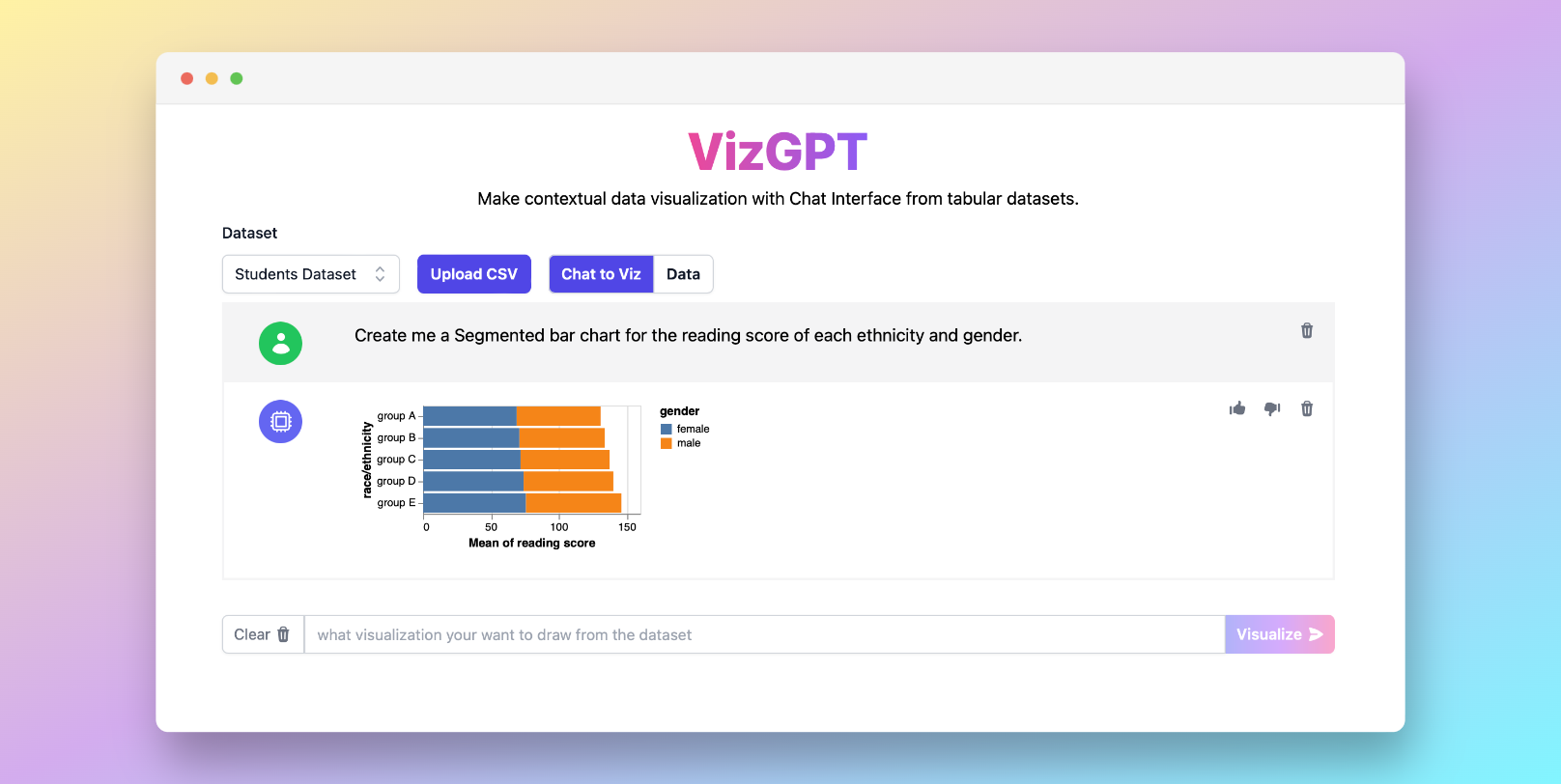
Create a Bar Chart from the data set
You can draft the chart in RunCell first, then download it and move it into Google Sheets.
If you want to start from your own CSV instead of the sample data, use RunCell first and export the chart once it looks right.

Introduction
Creating visual data representation is a quintessential skill in today's data-centric world. One of the most popular tools for data manipulation and visualization is Google Sheets, a robust spreadsheet program, providing several powerful features, including the ability to create bar charts. This essay explores multiple methods for creating a bar chart in Google Sheets and other handy tools like RunCell to help visualize your data efficiently and effortlessly.
How to Make a Bar Chart in Google Sheets with RunCell
Before we get into Google Sheets itself, it is worth noting that RunCell can help you draft the chart in Jupyter first, then export it once the result looks right.
To use RunCell, follow these simple steps:
- Upload your CSV file to RunCell.
- Provide a prompt for the chart you want to create.
Sample Prompt: Make a Bar Chart with (Variables of your Selection)
- Press the Visualize button and watch RunCell do the magic.
The beauty of RunCell lies in its simplicity. It's a great tool to use alongside Google Sheets to enhance your data visualization process.
If you want to keep refining the chart before exporting it, continue working in RunCell (opens in a new tab).
How to Make a Bar Chart in Google Sheets: Step-by-Step
Crafting a bar chart in Google Sheets does not have to be a complicated process. Follow these detailed steps to transform your data into a meaningful visualization.
Step 1: Data Preparation
Before we start building a bar chart, the first and most crucial step is preparing your data. Start by entering the data into the cells, ensuring each column has a distinct and descriptive heading. Your data should be organized in a way that the categories (e.g., products, months, etc.) are in one column, and the corresponding values are in the next column(s).
The data organization directly impacts the clarity and readability of your chart. An adequately arranged data set leads to a more precise and insightful visualization, helping you interpret your data efficiently.
Step 2: Chart Selection
Once your data is ready, it's time to create your chart. Start by highlighting or selecting all the cells that contain the data you want to visualize, including the column headers.
Go to the 'Insert' menu at the top of your Google Sheets page and select 'Chart' from the dropdown menu. Google Sheets will automatically create a chart type based on your data, but you have full control over the final chart type.
Step 3: Chart Type Selection
After the initial chart appears, you may notice that Google Sheets might not choose a bar chart by default. To change the chart type, locate the chart editor panel on the right side of your screen.
In the chart editor, under the 'Setup' tab, click on the 'Chart type' dropdown menu. A variety of chart types will appear; navigate through and select 'Bar chart'. You will immediately notice that your chart has transformed into a bar chart.
Step 4: Chart Customization
Now that you have your bar chart, it's time to customize it to match your needs and preferences. Google Sheets offers a wide range of customization options that allow you to alter colors, adjust the axes, add data labels, titles, and much more.
To access these customization options, go back to the chart editor and click on the 'Customize' tab. Here, you can explore different sections such as 'Chart style', 'Chart & axis titles', 'Series', 'Legend', 'Horizontal axis', 'Vertical axis', and 'Gridlines' to modify your bar chart.
In 'Chart & axis titles', you can add a title to your chart, and name your horizontal and vertical axes. The 'Series' section lets you change the color of the bars, adjust the bar thickness, and even add data labels. If you want to reposition or change the font of your legend, you can do that in the 'Legend' section.
Furthermore, you can modify the range of your axes and change the gridline count in the 'Horizontal axis' and 'Vertical axis' sections, respectively. These granular customizations not only improve the aesthetics of your bar chart but also enhance its readability.
Wrapping Up: Importance of a Well-crafted Bar Chart
A well-crafted bar chart has the power to make even the most complex data easy to understand. With its visual nature, a bar chart can quickly highlight trends, comparisons, and distributions that might not be readily evident in raw, tabular data.
Bar charts are a key player in data-driven decision making. By following the steps outlined above, you can effortlessly create a bar chart in Google Sheets, transforming your data into a compelling narrative. Always remember, the goal of data visualization is to simplify the complexity – a well-designed bar chart in Google Sheets can help you achieve just that.
Remember, a well-crafted bar chart can make complex data easy to understand, enhancing your ability to make informed decisions.
FAQ
Q1: Can I make a bar chart with multiple data sets in Google Sheets?
Yes, Google Sheets allows you to make a bar chart with multiple data sets. Simply select all the relevant data when creating the chart.
Q2: Can I use RunCell with other types of charts apart from bar charts?
Absolutely, RunCell supports a variety of chart types, including pie charts, line graphs, scatter plots, and many more.
Q3: How can I share my Google Sheets bar chart with others?
You can share your Google Sheets bar chart by sharing the entire document. Simply click the 'Share' button at the top right corner of the sheet and enter the email addresses of the people you want to share it with.
Conclusion
Creating a bar chart in Google Sheets and visualizing data with RunCell are skills that will enhance your data representation prowess. So, get started and make your data storytelling journey more engaging and insightful.