Data Visualization with Pandas Plot: How to Effortlessly Create Beautiful and Insightful Plots

In the world of data science, Data Visualization plays a crucial role in providing insights into complex data sets. One of the most powerful tools for data visualization is Python's Pandas Plot library, which allows users to create stunning and interactive visualizations with just a few lines of code.
In this article, we will explore how to use Pandas Plot to create various types of visualizations, including bar charts, scatter plots, and pie charts. We will also discuss how to install Matplotlib, the underlying library that powers Pandas Plot. Finally, we will take a quick look at an Open Source Data Visualization tool that integrates with Python Pandas: PyGWalker.
- Runcell Science: An Open Source Alternative to Claude Science for Research Workflows
- How to Make Mac Not Sleep: Keep Codex, Claude Code, and AI Agents Running
- OpenClaw vs ZeroClaw vs Pi Agent vs Nanobot: Which AI Agent Stack Should You Choose in 2026?
- Can Claude Code Analyze Jupyter Notebooks for Data Science? What It Actually Does
- Claude Code Routines: Why AI Agent Cron Jobs Matter
- Claude Code Desktop Bypass Permissions: How to Enable It
- How to Build Two Python Agents with Google’s A2A Protocol - Step by Step Tutorial
- Top 10 growing data visualization libraries in Python in 2025
Visualize Data with Pandas Plot
Installing Matplotlib
Before we dive into creating visualizations with Pandas Plot, we need to ensure that Matplotlib is installed in our Python environment. Matplotlib is a data visualization library that is used by Pandas Plot to create its visualizations.
To install Matplotlib, we can use the pip package manager:
pip install matplotlibNext, import matplotlib:
import matplotlib.pyplot as pltCreating a Bar Chart with Pandas Plot
Let's start by creating a simple bar chart using Pandas Plot. We will use a sample dataset of monthly sales figures for a fictional company.
sales = {'Month': ['Jan', 'Feb', 'Mar', 'Apr', 'May', 'Jun'],
         'Sales': [10000, 20000, 30000, 25000, 15000, 18000]}
df = pd.DataFrame(sales)
df.plot(kind='bar', x='Month', y='Sales')
plt.show()
In the code above, we first create a dictionary of monthly sales figures and convert it into a Pandas DataFrame. We then use the plot method of the DataFrame to create a bar chart, specifying the x and y axes.
The resulting bar chart will show the monthly sales figures as bars, with the x-axis labeled with the months and the y-axis labeled with the sales figures.
Creating a Scatter Plot with Pandas Plot
Next, let's create a scatter plot using Pandas Plot. We will use a sample dataset of student exam scores.
students = {'Name': ['Alice', 'Bob', 'Charlie', 'David', 'Emma', 'Frank'],
            'Math': [70, 80, 90, 60, 75, 85],
            'Science': [80, 70, 85, 65, 90, 75]}
df = pd.DataFrame(students)
df.plot(kind='scatter', x='Math', y='Science')
plt.show()
In the code above, we first create a dictionary of student exam scores and convert it into a Pandas DataFrame. We then use the plot method of the DataFrame to create a scatter plot, specifying the x and y axes.
The resulting scatter plot will show the relationship between the student's math and science scores.
Creating a Bar Chart with Pandas Plot
Bar charts are useful for visualizing data in a rectangular graph format. In this section, we will use the same sample dataset of website traffic sources to create a bar chart using Pandas Plot.
# Create bar chart
df['source'].value_counts().plot(kind='bar')

# Add title and axis labels
plt.title('Website Traffic Sources')
plt.xlabel('Traffic Source')
plt.ylabel('Number of Visits')
In the above code, we use the value_counts() function to count the number of occurrences of each website traffic source. We then pass the kind='bar' parameter to the plot() function to create a bar chart.
We customize the plot by adding a title using plt.title(), x-axis label using plt.xlabel(), and y-axis label using plt.ylabel().
Creating a Pie Chart with Pandas Plot
Finally, let's create a pie chart using Pandas Plot. We will use a sample dataset of website traffic sources.
traffic = {'Source': ['Search Engines', 'Direct Traffic', 'Referral Traffic', 'Social Media'],
           'Traffic': [40, 20, 30, 10]}
df = pd.DataFrame(traffic)
df.set_index('Source', inplace=True)
df.plot(kind='pie', y='Traffic', autopct='%1.1f%%')
plt.show()
How to Customize Plots Using Parameters such as Color, Size, and Labels
Pandas Plot offers a variety of parameters to customize the appearance of our plots. Let's explore some of these parameters:
color: changes the color of the plot fontsize: changes the font size of the plot title: adds a title to the plot xlabel and ylabel: adds labels to the x-axis and y-axis legend: adds a legend to the plot grid: adds grid lines to the plot For example, to change the color of the bar chart we created earlier to red, we can add the color='red' parameter to the plot() function:
df['source'].value_counts().plot(kind='bar', color='red')To add a legend to the plot, we can add the legend=True parameter to the plot() function:
df['source'].value_counts().plot(kind='bar', legend=True)Alternative to Pandas Plot: Use PyGWalker in Jupyter Notebook
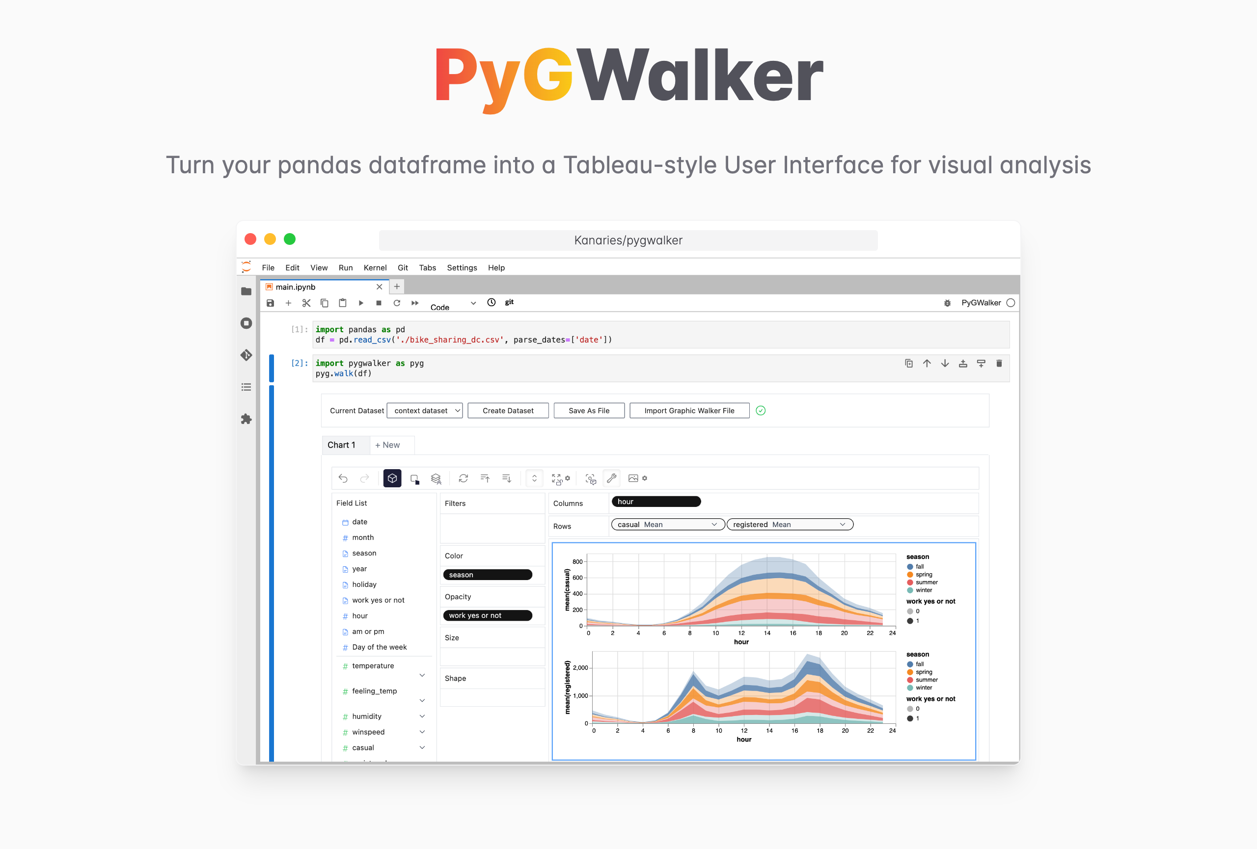
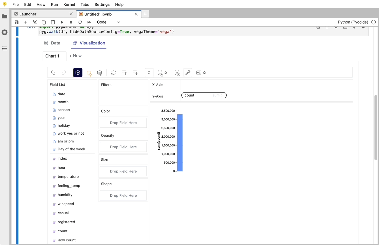
PyGWalker (opens in a new tab) can simplify your data analysis and data visualization workflow, by turning your pandas dataframe (and polars dataframe) into a tableau-alternative User Interface for visual exploration. It integrates Jupyter Notebook (or other jupyter-based notebooks) with Graphic Walker, a different type of open-source alternative to Tableau. It allows data scientists to analyze data and visualize patterns with simple drag-and-drop operations.
| Run in Kaggle (opens in a new tab) | Run in Colab (opens in a new tab) |
|---|---|
 (opens in a new tab) (opens in a new tab) | 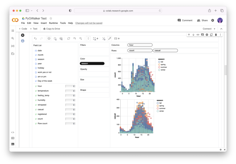 (opens in a new tab) (opens in a new tab) |
PyGWalker is Open Source. Don't forget to check out PyGWalker GitHub (opens in a new tab) and leave a ⭐️!
Use PyGWalker in Jupyter Notebook
Import PyGWalker and pandas to your Jupyter Notebook to get started.
import pandas as pd
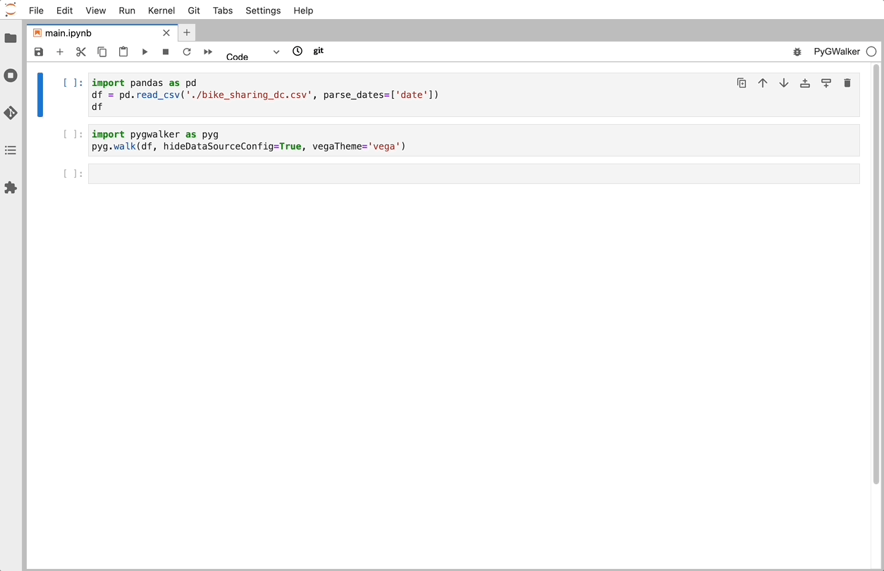
import PyGWalker as pygYou can use PyGWalker without breaking your existing workflow. For example, you can load the Pandas Dataframe into a visual UI.
df = pd.read_csv('./bike_sharing_dc.csv', parse_dates=['date'])
gwalker = pyg.walk(df)
And you can use PyGWalker with polars (since PyGWalker>=0.1.4.7a0):
import polars as pl
df = pl.read_csv('./bike_sharing_dc.csv',try_parse_dates = True)
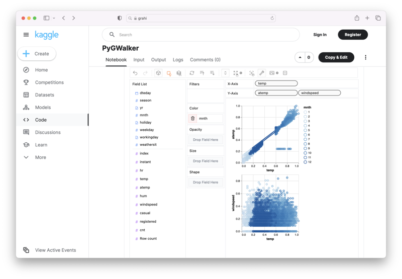
gwalker = pyg.walk(df)You can even try it online, simply visiting Binder (opens in a new tab), Google Colab (opens in a new tab) or Kaggle Code (opens in a new tab).
That's it. Now you have a tableau-alternative user interface to analyze and visualize data by dragging and dropping variables.
Create Data Visualizations with PyGWalker
You can create these charts with Graphic Walker with a UI that supports dragging and dropping variables:
Bar Chart 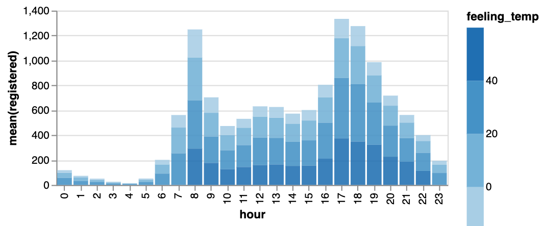 | Line Chart 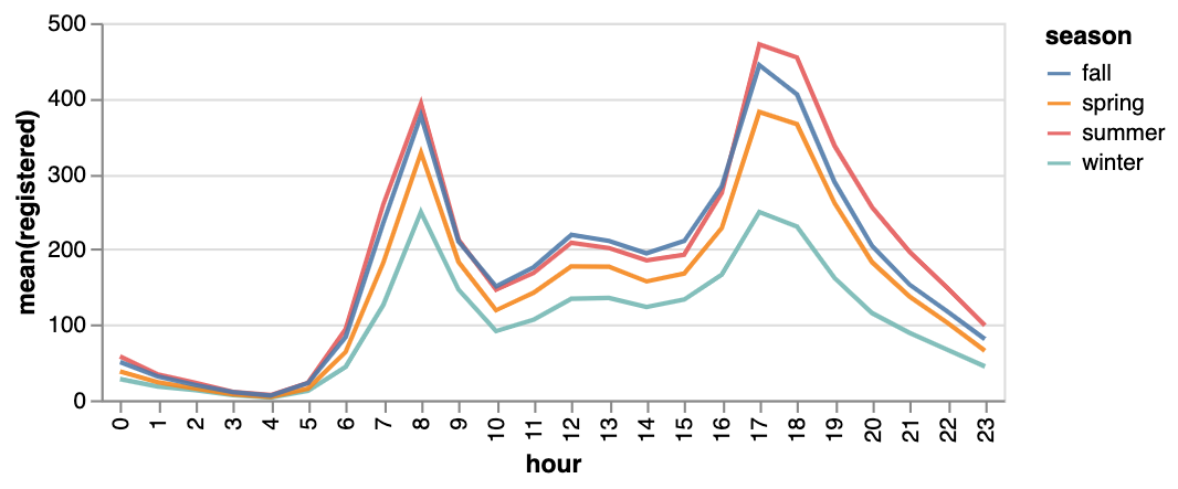 | Area Chart 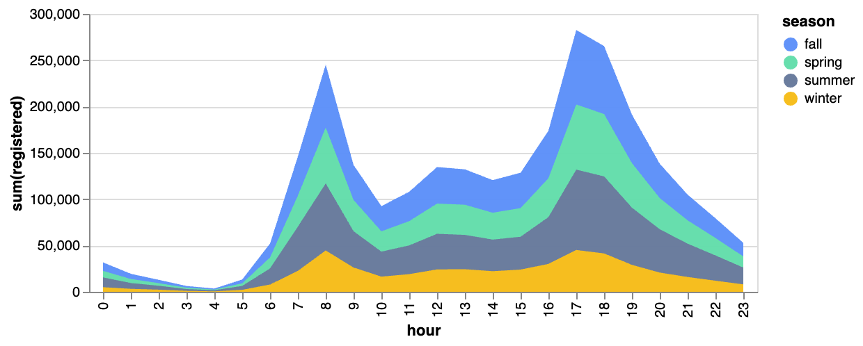 |
|---|---|---|
Trail 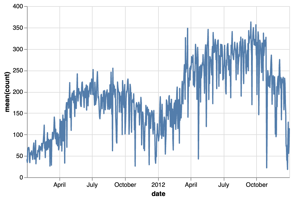 | Scatter Plot  | Cirlce  |
Tick Plot  | Rectangle 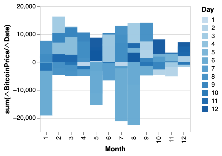 | Arc Diagram  |
Box Plot 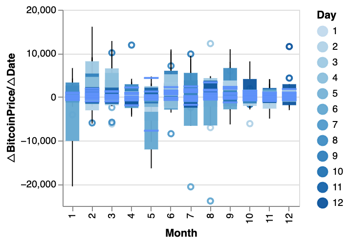 | Heatmap 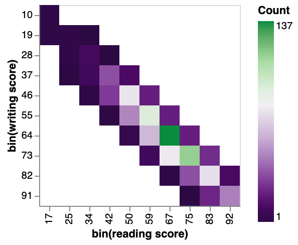 |
You can explore our Data Visualization Gallery for more Examples.
Advanced Plotting with Pandas Plot
Pandas Plot offers more advanced plotting capabilities such as subplots, grouped bar charts, and stacked bar charts. Let's explore some of these capabilities.
Subplots
Subplots are a powerful way to display multiple plots within a single figure. To create subplots with Pandas Plot, we can use the subplots function. This function creates a figure and returns a set of subplots that can be used to create the desired plots. For example, let's say we have two data sets that we want to plot side by side. We can use the following code to create a figure with two subplots:
import pandas as pd
import matplotlib.pyplot as plt

data1 = pd.read_csv('data1.csv')
data2 = pd.read_csv('data2.csv')

fig, axs = plt.subplots(1, 2, figsize=(10, 5))

data1.plot(ax=axs[0])
data2.plot(ax=axs[1])
In this code, we first read in two data sets (data1 and data2). We then create a figure with two subplots using the subplots function. The 1 and 2 arguments specify that we want one row of subplots and two columns of subplots. The figsize argument specifies the size of the figure.
We then plot data1 on the first subplot (axs[0]) and data2 on the second subplot (axs[1]).
Grouped Bar Charts
Grouped bar charts are a useful way to compare multiple data sets. To create a grouped bar chart with Pandas Plot, we can use the bar function with the width argument set to a value less than 1. For example, let's say we have two data sets that we want to compare using a grouped bar chart. We can use the following code to create the chart:
import pandas as pd
import matplotlib.pyplot as plt

data = pd.read_csv('data.csv')

fig, ax = plt.subplots()

data.plot(kind='bar', x='Group', y=['Data1', 'Data2'], width=0.4, ax=ax)
In this code, we first read in the data set (data). We then create a figure with a single subplot using the subplots function. We plot the data on this subplot using the bar function. The kind argument specifies that we want a bar chart. The x argument specifies the column to use for the x-axis (in this case, the "Group" column). The y argument specifies the columns to use for the y-axis (in this case, the "Data1" and "Data2" columns). The width argument specifies the width of each bar (in this case, 0.4).
Stacked Bar Charts
Stacked bar charts are another useful way to compare multiple data sets. To create a stacked bar chart with Pandas Plot, we can use the bar function with the bottom argument set to the values of the previous data set. For example, let's say we have three data sets that we want to compare using a stacked bar chart. We can use the following code to create the chart:
import pandas as pd
import matplotlib.pyplot as plt

data = pd.read_csv('data.csv')

fig, ax = plt.subplots()

data.plot(kind='bar', x='Group', y=['Data1', 'Data2', 'Data3'], stacked=True, ax=ax)
In this code, we first read the data set using Pandas and then use the groupby function to group the data by year and continent. We then plot a stacked bar chart using the plot.bar method with the stacked parameter set to True. This creates a bar chart where the bars for each year are stacked on top of each other, with each bar representing the proportion of the population by continent for that year.
Tips and Tricks for Effective Data Visualization
Data visualization is an essential tool for data scientists and analysts to communicate insights effectively. In this section, we will discuss some tips and tricks to create effective data visualizations using Pandas Plot.
-
Choose the appropriate type of visualization for the data being analyzed: The choice of visualization type depends on the type of data and the message that you want to convey. For instance, if you want to show the distribution of a continuous variable, a histogram or a density plot would be appropriate. On the other hand, if you want to compare two or more variables, a scatter plot or a line plot may be more appropriate.
-
Use appropriate colors, labels, and titles: The use of appropriate colors, labels, and titles is crucial to ensure that the message is conveyed effectively. Choose colors that are easy on the eyes and do not distract from the data. Use clear and concise labels to describe the variables and units of measurement. Finally, use an informative title that summarizes the message of the visualization.
-
Avoid common mistakes: There are some common mistakes that people make when creating visualizations. These include using too many colors or too many elements in the visualization, using a 3D plot for a two-dimensional dataset, and using a pie chart to compare more than two variables.
Conclusion
In this blog post, we have explored the power of data visualization with Pandas Plot. We started by explaining the basics of Pandas Plot and how to create simple visualizations such as bar charts and line plots. We encourage readers to explore the power of data visualization with Pandas Plot and PyGWalker and to experiment with different types of visualizations to communicate insights effectively.