Create Data Visualizations with Graphic Walker
In this technical documentation, we will guide you through the process of building customized data visualizations using Graphic Walker. You can easily create the following types of charts:
Bar Chart 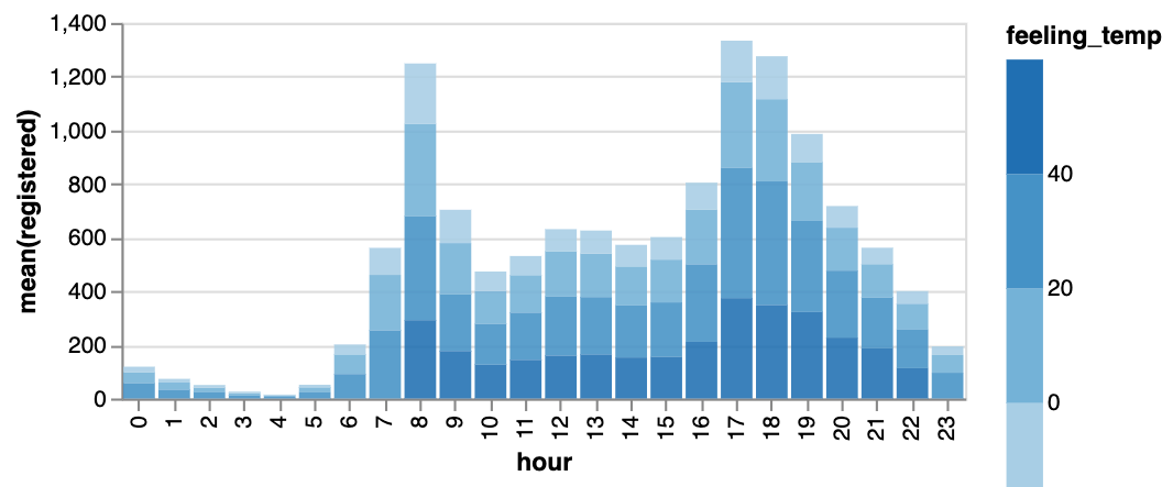 | Line Chart 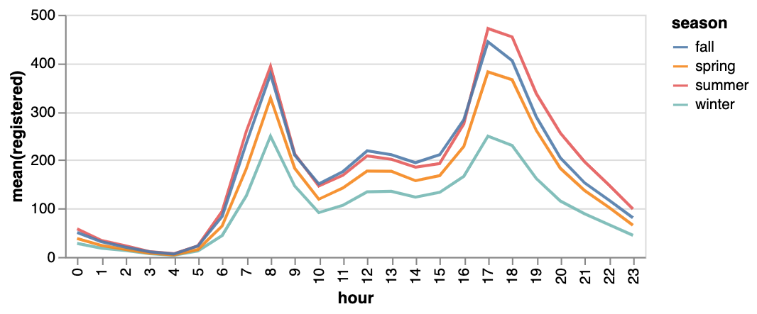 | Area Chart  |
|---|---|---|
Trail  | Scatter Plot 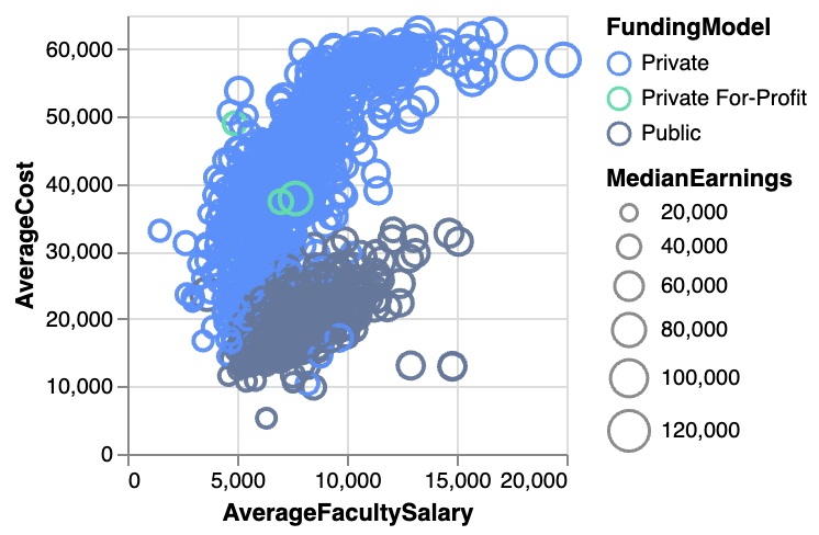 | Cirlce 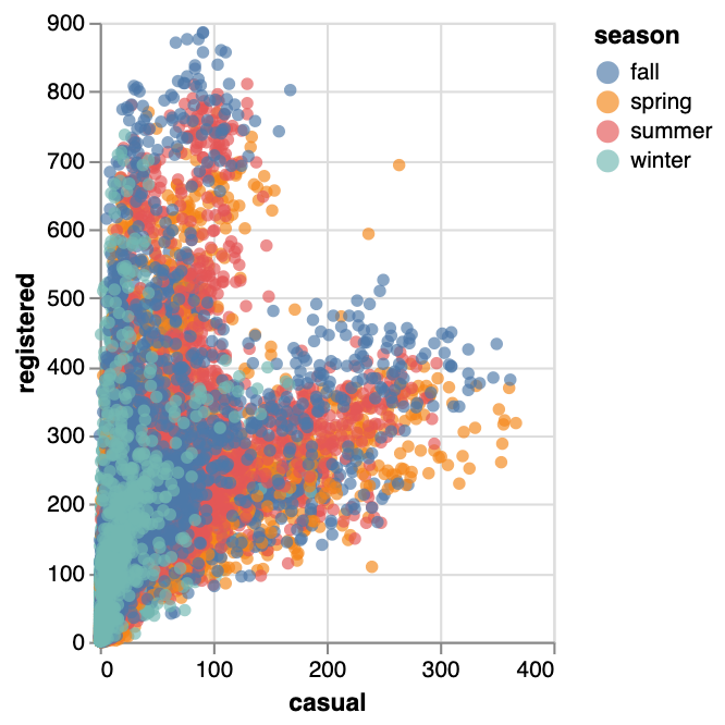 |
Tick Plot 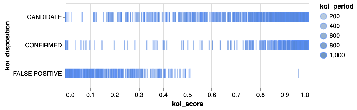 | Rectangle 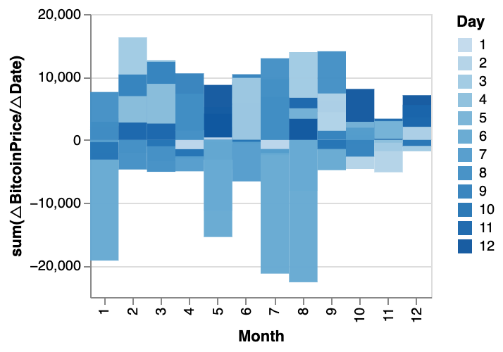 | Arc Diagram 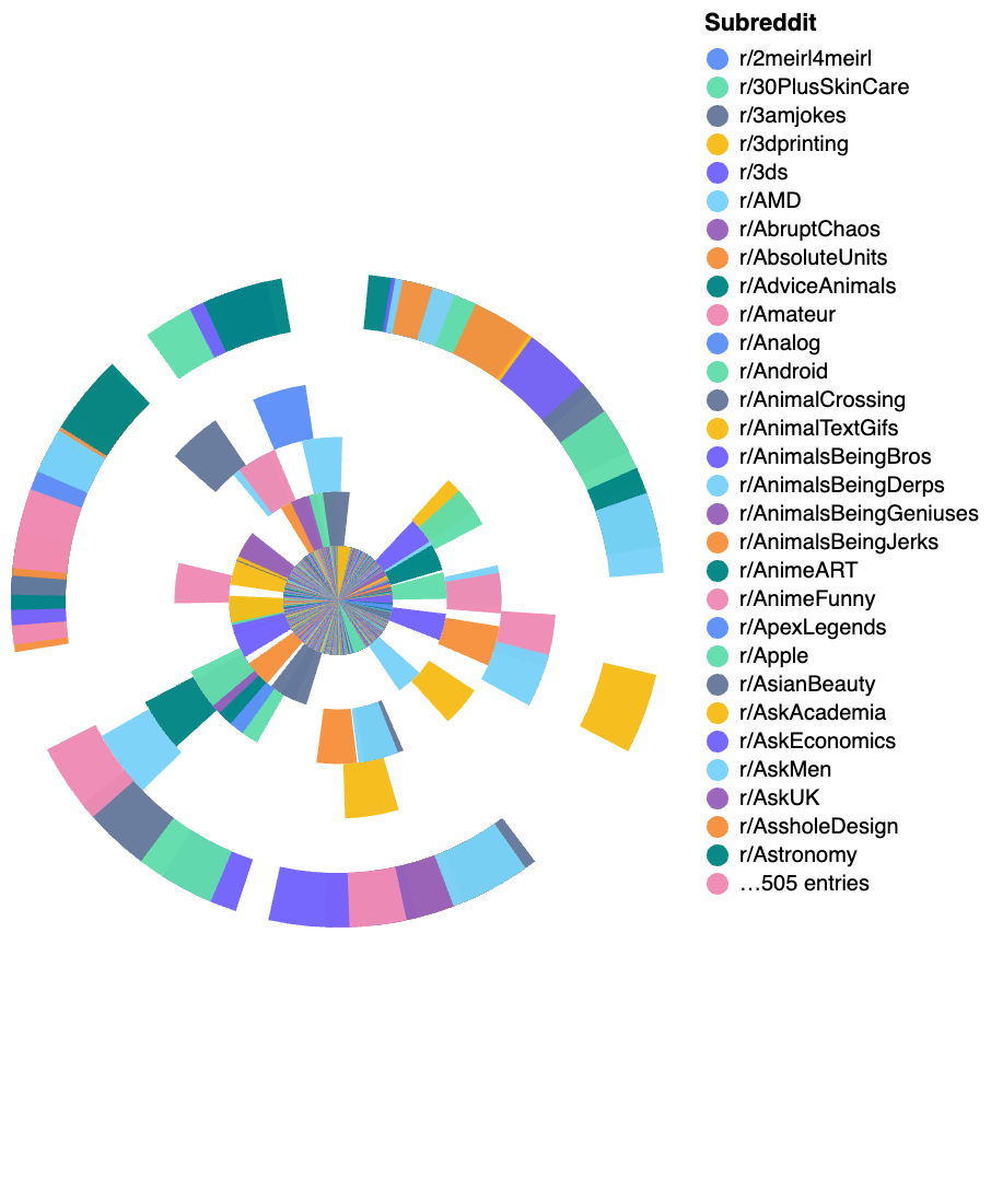 |
Box Plot 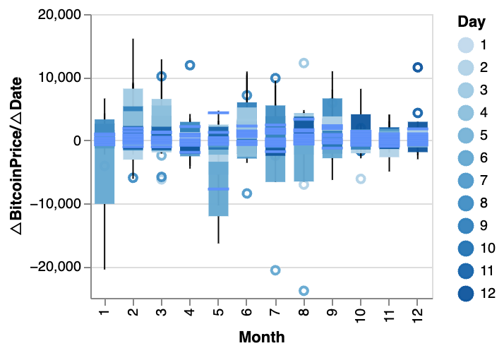 | Heatmap 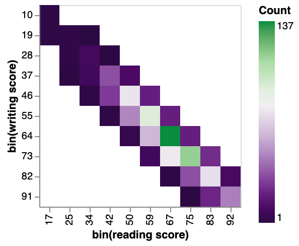 |
You can explore our Data Visualization Gallery for more Examples.
Tabs
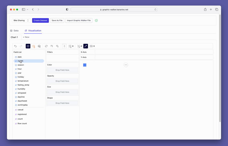
Graphic Walker workspace is the laboratory for you to create, edit charts and explore data patterns, uncover insights.
Each chart is managed by a Tab on the top of the screen. Create a new chart by clicking on the New button.
Tools bar
The Tools bar is located at the top of the webpage.

The functionality of each button is explained as follows:
| Undo/Redo | Aggregation | Mark Type | Stack Mode | Transpose | Sort Order | Axis Resizing | Layout Mode | Exploration Mode | Export |
|---|---|---|---|---|---|---|---|---|---|
| Undo or redo an operation. | Aggregate your data using methods like sum, mean, and count. | Switch between different chart types. | Create a Stack chart or Normalize a chart. | Switch the x-axis and y-axis of the chart. | Sort in Ascending or Descending Order | Resize the axes. | Resize the chart or use the auto-sized chart. | Explore data. You can choose either point mode or brush mode. | Export the chart to either PNG or SVG file. |
Basic Operations
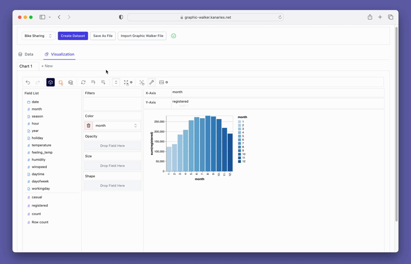
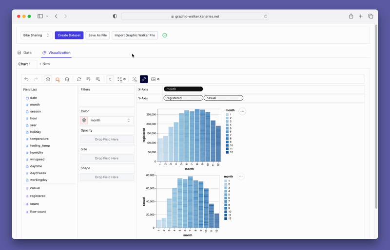
To learn the basic operations of Graphic Walker, we are about to create a simple bar chart showing the registered users by month. To get started, click on the Create Dataset button. Import the "Bike Sharing" dataset from the Public Datasets.
Create a basic chart
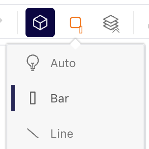
We can try to create a basic bar chart. Select Bar Chart from the Mark Types button on the tools bar.
Drag and drop measures
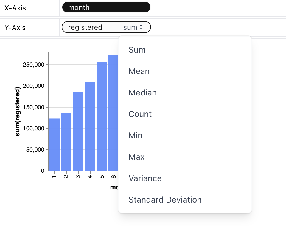
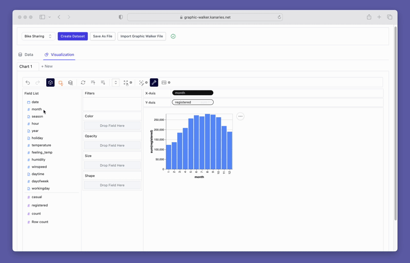
From the Field List shelf on the left, drag and drop registered to the "Rows" shelf. Drag and drop month to the "Columns" shelf.
Note that the registered has been changed to SUM(registered). This is because the Aggregation button is on, and the default aggregation for this measure is SUM. You can click on the downward arrow on the right side of registered to view to change the aggregation.
To mark the month measure with different colors, drag and drop month to the Color shelf.
Resize a chart
Click on the Resize button on the tools bar to change the chart size.
Remove a measure
Remove a measure by dragging and dropping it off the shelf.
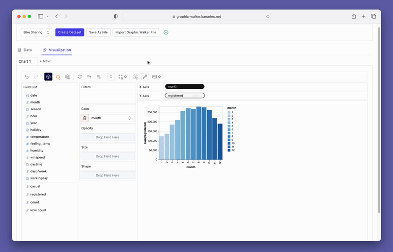
Change the chart type
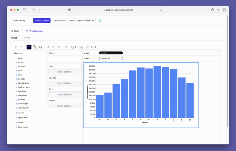
A line chart might demonstrate the trends of the registered user numbers better than a bar chart. To switch the existing chart to a line chart, click on the Mark Types option on the Tools bar and choose Line.
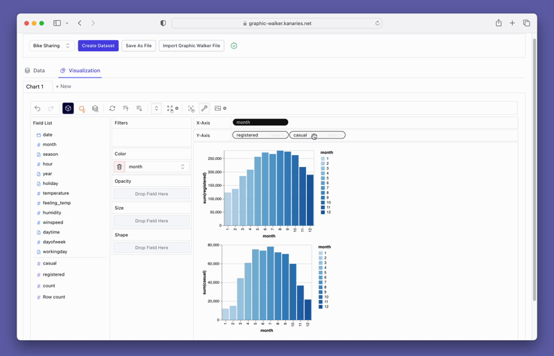
Create a Concat View
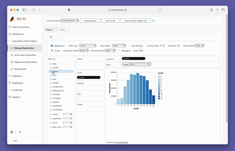
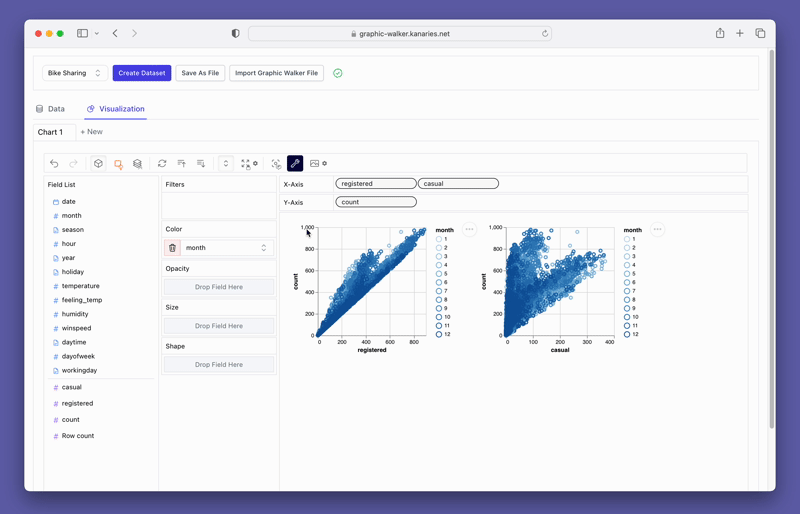
You may want to compare the differences between registered and casual users. Simply add more measures to the rows/columns and compare them.
Explore Data
Graphic Walker not only has the capacity to build highly-customizable charts. It is also a powerful tool for data exploration to uncover the underlying patterns, trends, and insights.
On the tools bar, select the Exploration Mode option and choose one of the Data Exploration options:
Point Mode
With the point mode, you can explore data by pointing their mouse cursor at a specific segment of the data. Simply clicking on the selected segment allows for the retrieval of insights.
Brush Mode
With the brush mode, you can explore data with the following steps:
- Select a segment of the data by dragging and dropping.
- Drag the data segment, Graphic Walker will give you insights.
Get Insights
You can also use the Explainer feature to get insights from data.
In the given example, we aim to investigate the reason behind the lower number of registered users in January than what was expected. To do so, make sure Exploration mode is off, and simply double-click on January, and the explainer will attempt to identify potential explanations.
According to the Data Explainer, a possible cause could be that the percentage of working days in January is lower than the average. This suggests that the reduced number of working days may have impacted user registrations.