The Best Python Visualization Libraries for Converting Data into Insight
- Name
- Amber de Ligt
Updated on
Data visualization is a critical component in the world of data science, and Python, with its rich ecosystem of libraries, stands as a premier tool for this task. But with so many libraries to choose from, how do you decide which one is the best Python visualization library for your needs? This article aims to answer that question by providing a comprehensive comparison of some of the most popular Python visualization libraries: Matplotlib, Seaborn, Plotly, Bokeh, and the rising star, PyGWalker.
In the realm of Python data visualization, these libraries have established themselves as the go-to tools for beginners and experts alike. Whether you're looking to create simple statistical graphics or complex, interactive web-based visualizations, there's a Python library that's perfect for you. Let's dive in and explore these libraries in detail.
- Runcell Science: An Open Source Alternative to Claude Science for Research Workflows
- How to Make Mac Not Sleep: Keep Codex, Claude Code, and AI Agents Running
- OpenClaw vs ZeroClaw vs Pi Agent vs Nanobot: Which AI Agent Stack Should You Choose in 2026?
- Can Claude Code Analyze Jupyter Notebooks for Data Science? What It Actually Does
- Claude Code Routines: Why AI Agent Cron Jobs Matter
- Claude Code Desktop Bypass Permissions: How to Enable It
- How to Build Two Python Agents with Google’s A2A Protocol - Step by Step Tutorial
- Top 10 growing data visualization libraries in Python in 2025
Matplotlib: The Comprehensive Choice
Matplotlib is one of the most widely used Python libraries for data visualization. It's comprehensive, powerful, and flexible, making it a great choice for creating both simple and complex visualizations. With Matplotlib, you can generate line plots, scatter plots, bar charts, error charts, histograms, and much more.
import matplotlib.pyplot as plt
import numpy as np

x = np.linspace(0, 10, 100)
y = np.sin(x)

plt.plot(x, y)
plt.show()
This simple example demonstrates how to create a basic line plot using Matplotlib. But don't let the simplicity fool you. Matplotlib's true power lies in its flexibility. You can customize every aspect of your plot, from the labels and legends to the color schemes and layout.
Seaborn: The User-Friendly Choice
Seaborn is another popular Python visualization library. Built on top of Matplotlib, Seaborn provides a high-level interface for creating beautiful, statistically-informed visualizations. It's user-friendly and intuitive, making it a great choice for beginners.
import seaborn as sns
import pandas as pd

# Load the example tips dataset
tips = sns.load_dataset("tips")

# Draw a boxplot to show distributions with respect to days
sns.boxplot(x="day", y="total_bill", data=tips)
In this example, we're using Seaborn's built-in dataset "tips" to create a boxplot. Seaborn excels at creating complex statistical plots with just a few lines of code. Plus, it integrates well with the Pandas library, making it easy to visualize data directly from DataFrames.
Plotly: The Web-Based Choice
If you're looking to create interactive, web-based visualizations, Plotly is the library for you. Plotly allows you to create a wide range of interactive plots, including 3D charts, geographic maps, and even animated visualizations.
import plotly.express as px

# Create a simple interactive scatter plot
df = px.data.iris()
fig = px.scatter(df, x="sepal_width", y="sepal_length", color="species", size='petal_length', hover_data=['petal_width'])
fig.show()
In this example, we're using Plotly Express, a high-level interface to Plotly, to create an interactive scatter plot. With Plotly, your visualizations are
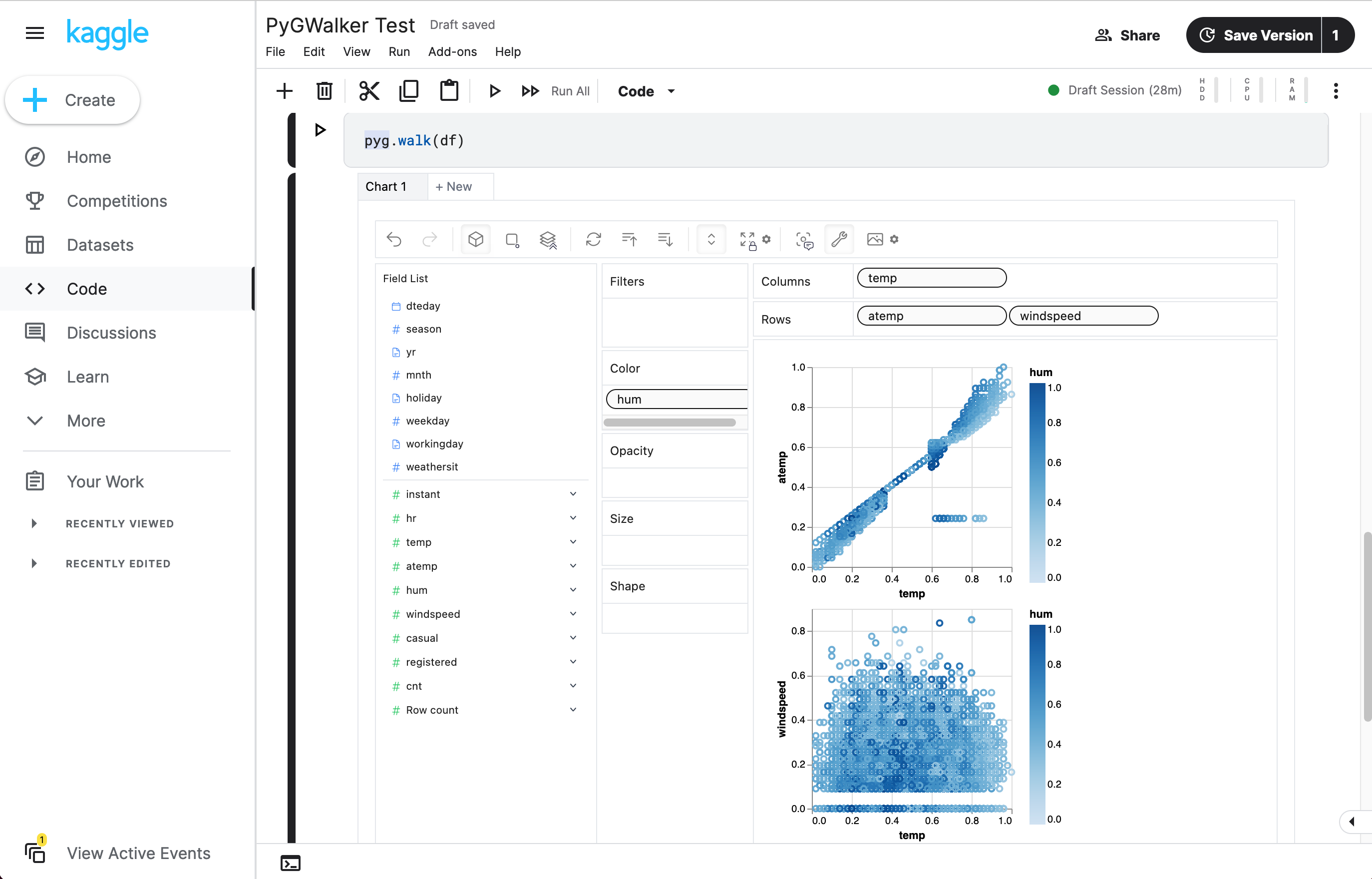
PyGWalker: Create Visualization by Dragging and Dropping
PyGWalker is another popular choice in the Python visualization library landscape. It's a Python library designed for exploratory data analysis with visualization. PyGWalker simplifies your Jupyter Notebook data analysis and data visualization workflow by turning your pandas DataFrame and polars DataFrame into a tableau-alternative user interface for visual exploration.

import pandas as pd
import pygwalker as pyg

# Load your data into a DataFrame
df = pd.read_csv('bikesharingdc.csv', parse_dates=['date'])

# Call up Graphic Walker with the DataFrame
gwalker = pyg.walk(df)
In this example, we're using PyGWalker to load a DataFrame and then create a Tableau-alternative user interface for visual exploration. PyGWalker integrates well with Jupyter Notebook and other Jupyter-based notebooks, allowing data scientists to analyze data and visualize patterns with simple drag-and-drop operations.
You can try PyGWalker in one of the online notebooks here:
| Run in Kaggle (opens in a new tab) | Run in Colab (opens in a new tab) |
|---|---|
 (opens in a new tab) (opens in a new tab) | 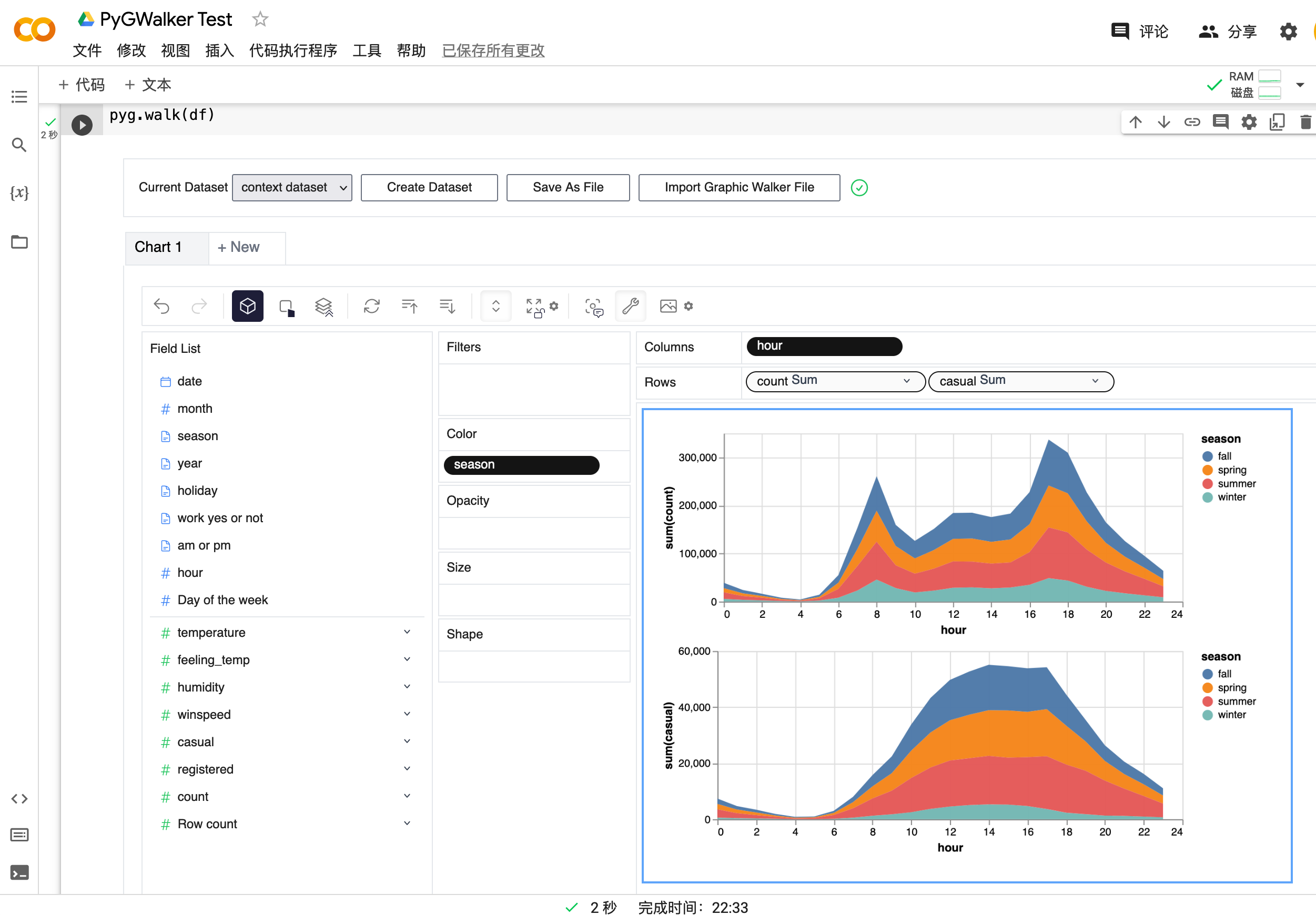 (opens in a new tab) (opens in a new tab) |
PyGWalker is named as an abbreviation of Python binding of Graphic Walker. It's a different type of open-source alternative to Tableau, and it's gaining popularity for its user-friendly interface and powerful visualization capabilities. You can check out more about PyGWalker on its GitHub page (opens in a new tab).
Bokeh: The Interactive Choice
Bokeh is a Python library for creating interactive visualizations for modern web browsers. It's designed to help you create interactive plots, dashboards, and data applications. Bokeh's strength lies in its ability to make complex and elegant visualizations in a straightforward manner.
from bokeh.plotting import figure, show
from bokeh.sampledata.iris import flowers

# Create a new plot with a title and axis labels
p = figure(title="Iris Morphology", x_axis_label='Petal Length', y_axis_label='Petal Width')

# Add a scatter renderer with legend and fill color
p.circle(flowers["petal_length"], flowers["petal_width"], legend_label="Petal", fill_color="red")

# Show the results
show(p)
In this example, we're using Bokeh to create an interactive scatter plot. With Bokeh, you can create a wide range of interactive plots that are perfect for web-based presentations and dashboards.
Each of these libraries has its strengths and is suited to different types of tasks. Whether you're a beginner looking for a user-friendly library or a seasoned data scientist in need of powerful tools, Python's visualization libraries have something to offer. And with the rising star PyGWalker joining the ranks, the Python visualization landscape continues to evolve and expand.
Choosing the Right Python Visualization Library
Choosing the right Python visualization library depends largely on your specific needs and the nature of your project. If you're looking for a comprehensive library that can handle a wide range of visualization tasks, Matplotlib is a solid choice. For those who prefer a more user-friendly and intuitive interface, Seaborn is an excellent option. If you need to create interactive, web-based visualizations, Plotly and Bokeh are both strong contenders.
However, if you're looking for a library that offers a tableau-alternative user interface for visual exploration, the rising star PyGWalker is worth considering. It integrates well with Jupyter Notebook and other Jupyter-based notebooks, allowing data scientists to analyze data and visualize patterns with simple drag-and-drop operations.
In the end, the best Python visualization library is the one that best fits your needs. By understanding the strengths and capabilities of each library, you can make an informed decision and choose the library that will best help you achieve your data visualization goals.
Frequently Asked Questions
To help you further understand Python visualization libraries, here are some frequently asked questions:
-
What is the best Python visualization library for beginners?
Seaborn is often recommended for beginners due to its user-friendly and intuitive interface. It's built on top of Matplotlib and provides a high-level interface for creating beautiful, statistically-informed visualizations. However, the best library for a beginner will depend on their specific needs and the nature of their project.
-
Can Python visualization libraries create interactive web-based visualizations?
Yes, libraries like Plotly and Bokeh are specifically designed for creating interactive, web-based visualizations. They allow you to create a wide range of interactive plots that are perfect for web-based presentations and dashboards.
-
How do I choose the right Python visualization library for my needs?
Choosing the right Python visualization library depends largely on your specific needs and the nature of your project. Consider factors like the complexity of the visualizations you need to create, whether you need to create web-based interactive visualizations, and your level of experience with Python and data visualization.