How to make line chart with PyGWalker
Line charts show a set of data points connected by straight lines. When you want to draw attention to changes in one variable's values for continuous values of another variable, you utilize them. You require a variable on the horizontal axis that shows continuous values with a consistent measurement period. It is typically a temporal one. For each point that falls inside the intervals set by the horizontal-axis variable, you will report the value of a numerical variable on the vertical axis.
Updated on

How to Create a Line Chart
Creating a line chart with PyGWalker is a simple process that can be completed in a few easy steps.
Step 1 Import Your Data
In a new Jupyter Notebook file, type the following command:
import pandas as pd
import pygwalker as pyg
Next, import your data into PyGWalker by typing:
df = pd.read_csv("your_data_file.csv")
df.head()
Then, type pyg.walk(df) to display the visualization page:
Congratulations! You’ve successfully imported your data and accessed the PyGWalker user interface. Here, you can visualize your data by drag-and-drop operations.
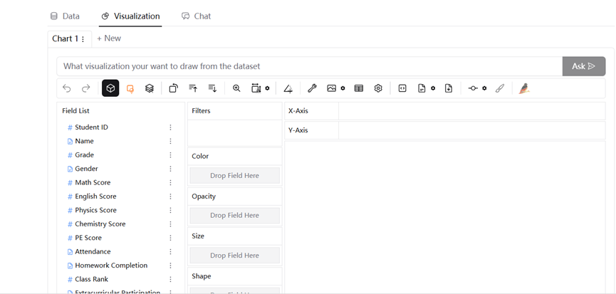
Step 2 Visualize Your Data Through Drag-and-Drop Operations
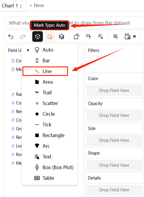
To get line charts, first in "Mark Type", you need to select "Line" .
- Single Line Chart
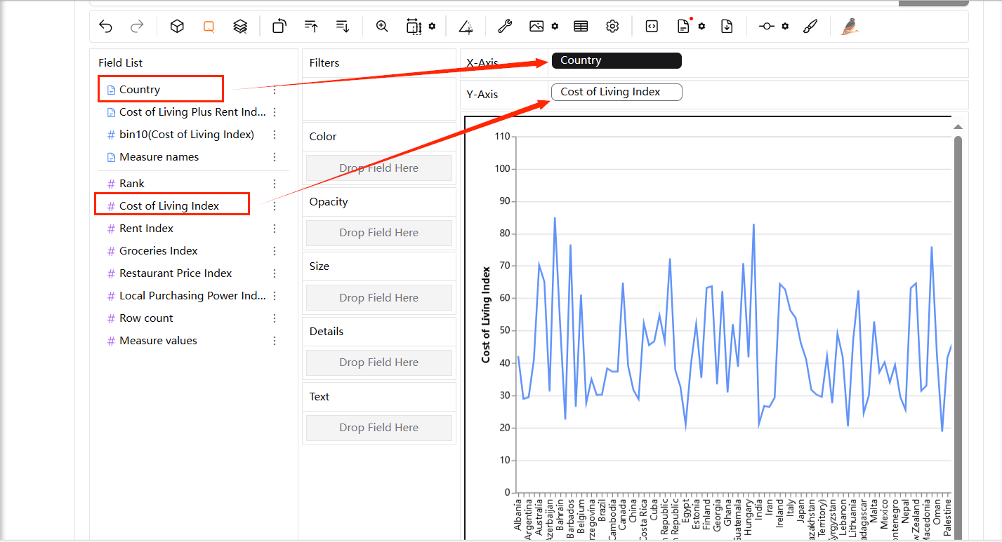
The line chart in below makes it easy to identify trends, such as which countries have higher or lower living costs relative to others.
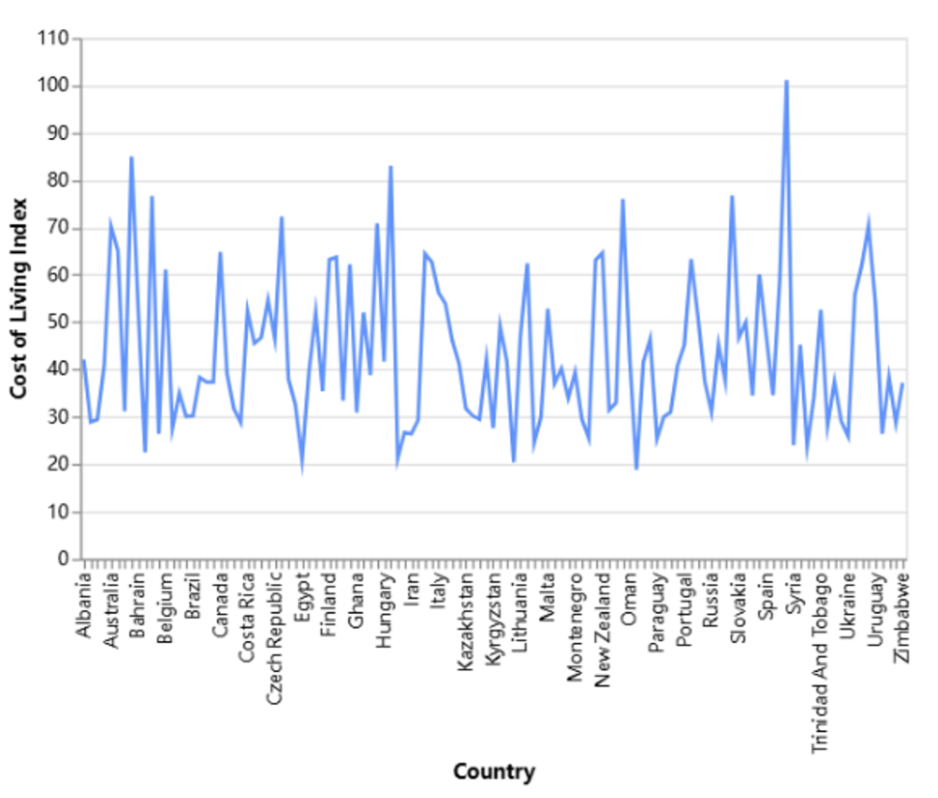
To get a simple line chart like above, you can drag two different variables into X-axis and Y-axis respectively as shown below.
- Multiple Line Chart
The lines in below representing each product, you can quickly see which regions are performing better or worse for specific products.
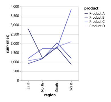
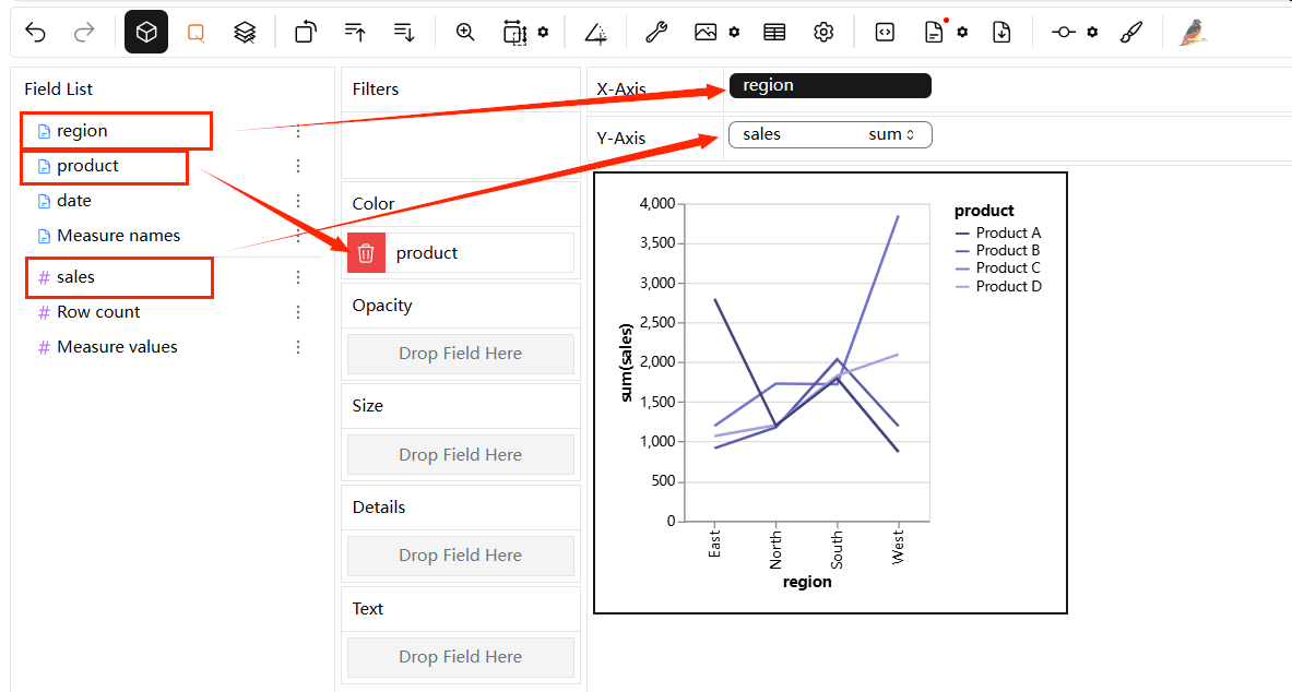
To create it, you can drag "region" into X-Axis, "product" into "Color" channel, and "sales" into Y-Axis.
- Multiple Line Charts by Categories
The line charts in below allow users to see trends and patterns for each product separately, making it easier to identify which products are performing well in certain regions and which are not.
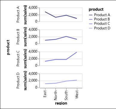
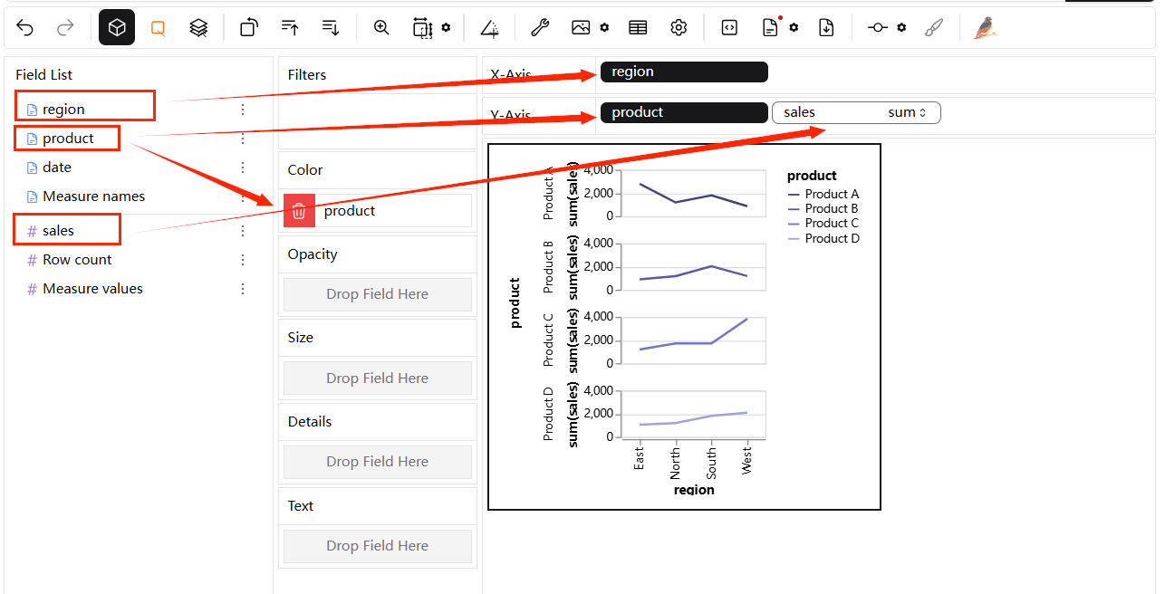
To create it, you can drag "region" into X-Axis, "product" into "Color" channel and Y-Axis, and "sales" into Y-Axis. In another word, drag "product" into Y-Axis.
Step 3 Save and Export the Result
Once you're satisfied with your chart, save and export it in the format of your choice.
Best Practices for Using a Line Chart
Choose an Appropriate Measurement Interval
An important aspect of creating a line chart is selecting the right interval. You can choose a good bin size by experimenting with different intervals or by using your domain expertise about the data being collected. Alternatively, you may use two lines: one for the general trend, averaged across a rolling window, and another for a finer-grained interval.
Don’t Plot Too Many Lines
Although it is technically possible to fit numerous lines onto a single line chart, it is advisable to use caution when choosing how much data to plot because tremendous power comes with great responsibility. Try to keep your plot to five lines or less as a general rule of thumb to avoid making it appear unintelligible. You can still plot all of the values you want to track, though, if the lines are evenly spaced.
Conclusion
You may efficiently show your data in the most appropriate and visually appealing way by employing these drag-and-pull operations. Any user, regardless of expertise level, can easily create and share intelligent line charts with PyGWaler for its numerous customization options and user-friendly interface.