How to Effortlessly Create GPT-Powered Visualization with VizGPT
- Name
- Kana Mikami
Updated on
Data Visualization with GPT models has long been a dream for users and data analysts. Among the recent developments in AI and data analytics, Generative Pretrained Transformers (GPT) have transformed the way to create data visualization. Imagine you have the ability to turn complex information into understandable insights and instant visualizations with Chat GPT!
That's where VizGPT (opens in a new tab) comes into play. This innovative tool enables users to ask questions in natural language and get answers in the form of visualizations, making the process of data analysis more intuitive and straightforward.
What is Data Visualization and What is GPT?
-
Data visualization is the graphical representation of data and information. It uses visual elements like charts, graphs, and maps to provide an accessible way to see and understand trends, outliers, and patterns in data. Effective data visualization helps users analyze and interpret the data, leading to better decision-making and forecasting.
-
GPT, or Generative Pretrained Transformer, is a type of artificial intelligence model used for understanding and generating human-like text. It's trained on a diverse range of internet text and can generate coherent and contextually relevant sentences by predicting the next word in a given piece of text.
To combine Data visualization and GPT models, you can utilize tools such as: VizGPT (opens in a new tab). VizGPT makes the process of creating visualizations more intuitive and accessible, as users can simply ask questions in natural language to generate visualizations.
What is VizGPT?
VizGPT is a powerful tool that leverages the capabilities of GPT models to create data visualizations. It interprets natural language queries and generates corresponding visualizations, making it easier for users to understand and analyze data.
Here is a quick video demo about how to use VizGPT:
Interested? Visit VizGPT Playground and test it out:
If you like this prompt-driven workflow but want it inside a live Jupyter notebook, RunCell (opens in a new tab) is the more natural next step for code, analysis, and chart iteration.
How to Easily Visualize Data with VizGPT
Visualizing data with VizGPT is as simple as typing a sentence. This tool takes your natural language query and turns it into a detailed visualization. Here's how you can do it:
-
Access VizGPT: Visit VizGPT website (opens in a new tab) to get started using VizGPT.
-
Choose your dataset: You can choose from the default dataset. Alternatively, you can Upload your own CSV file by creating an account.
-
Input Prompt: Just like using ChatGPT, you can simply type in your request. This should be a natural language sentence describing the visualization you want to create. Let's try entering these prompts, and pressing the "Visualize" button".
12 Prompts to Create Visualizations in VizGPT
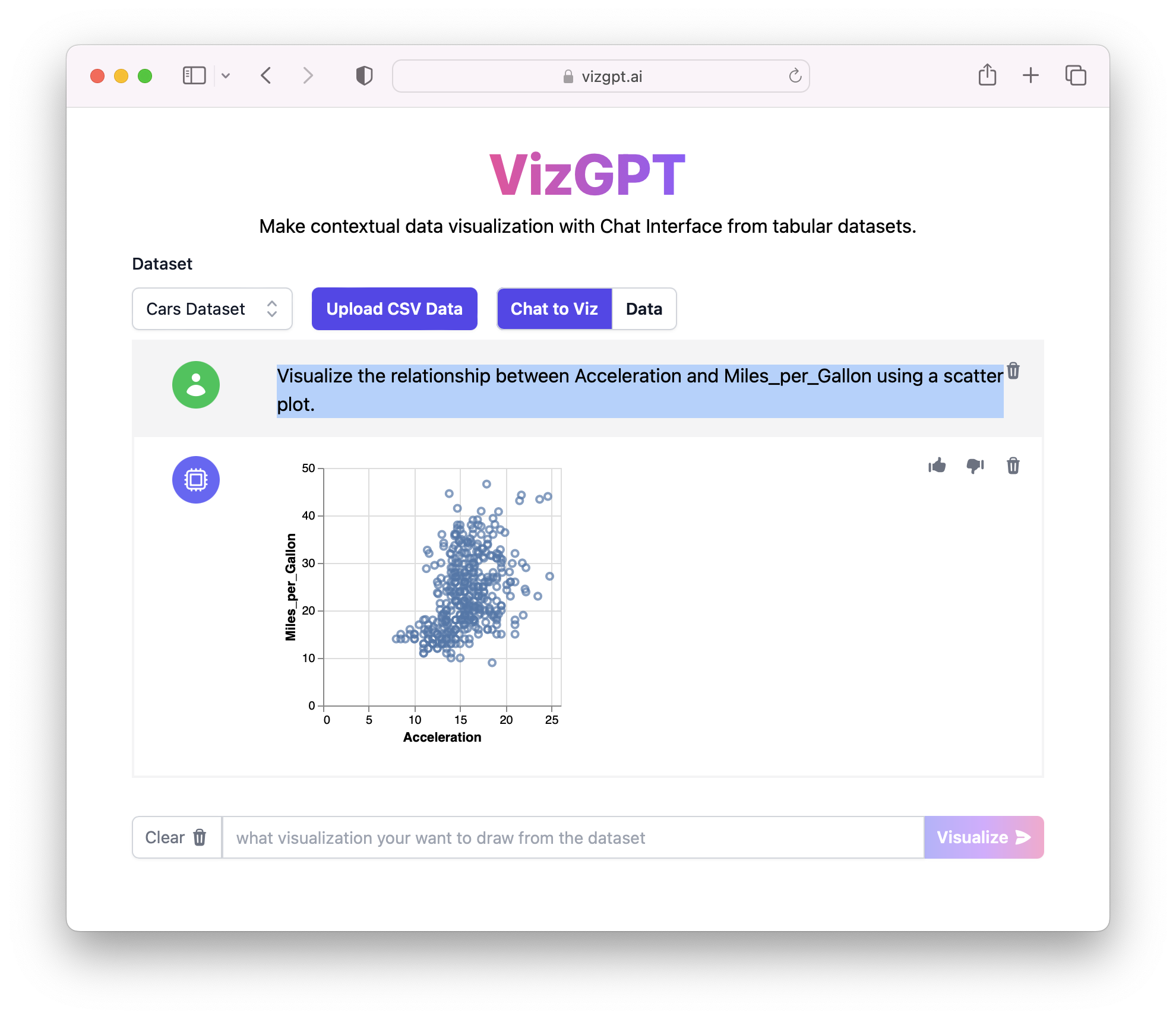
Create Scatterplots in VizGPT
Prompt: Visualize the relationship between Acceleration and Miles_per_Gallon using a scatter plot.
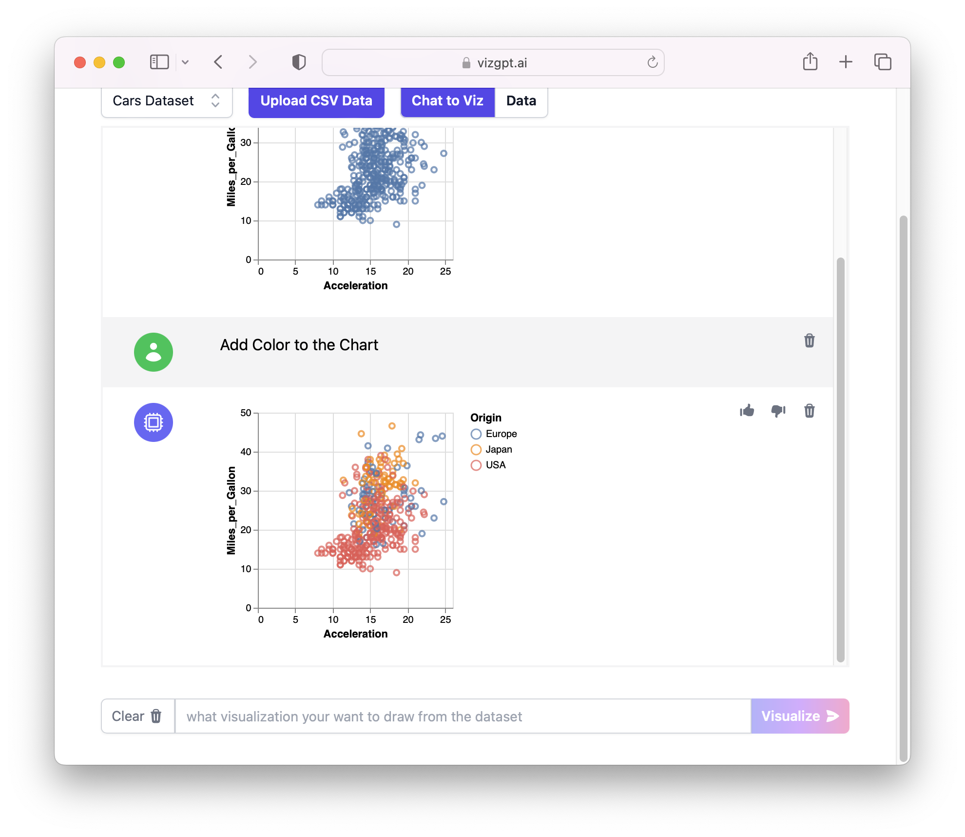
You can continue to ask further contextual questions:
Tip: If you want to remove one part of the conversation, simply click on the Delete button on the top right corner.
Prompt: Add Color to the Chart
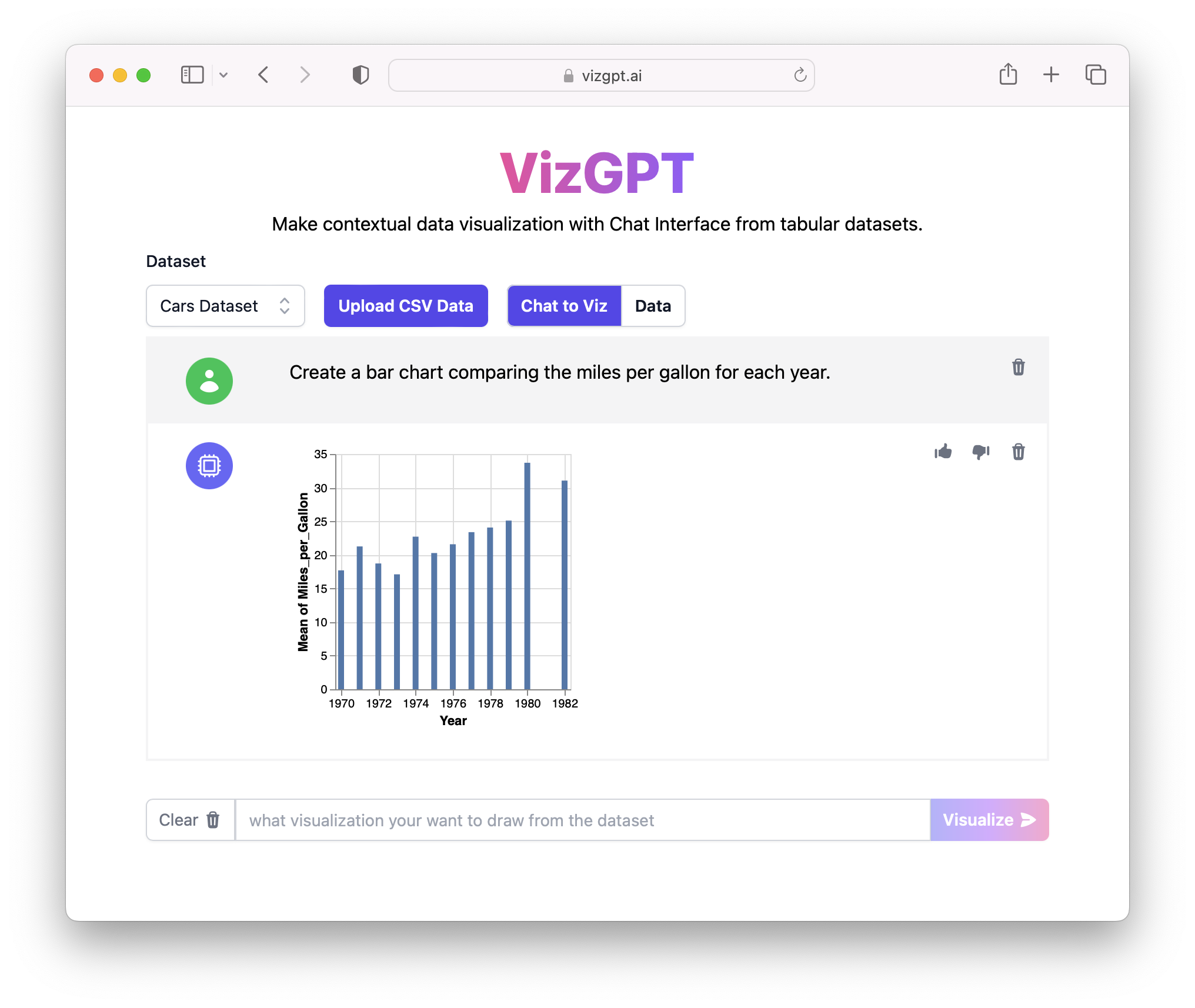
Create Bar Charts in VizGPT
Prompt: Create a bar chart comparing the miles per gallon for each year.
Create Line Charts in VizGPT
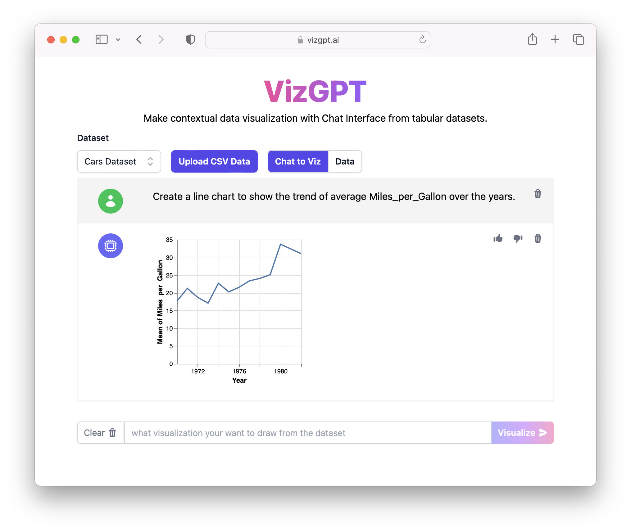
Prompt: Create a line chart to show the trend of average Miles_per_Gallon over the years.
Create Box Plots in VizGPT
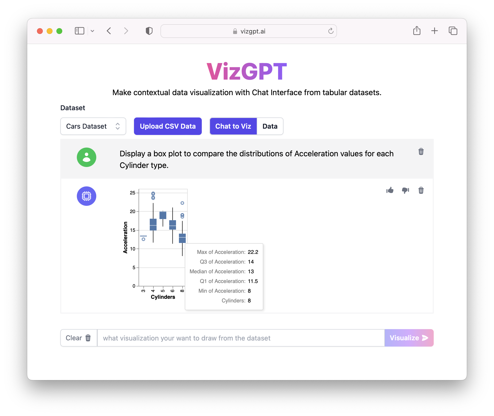
Prompt: Display a box plot to compare the distributions of Acceleration values for each Cylinder type.
Create Pie Charts in VizGPT
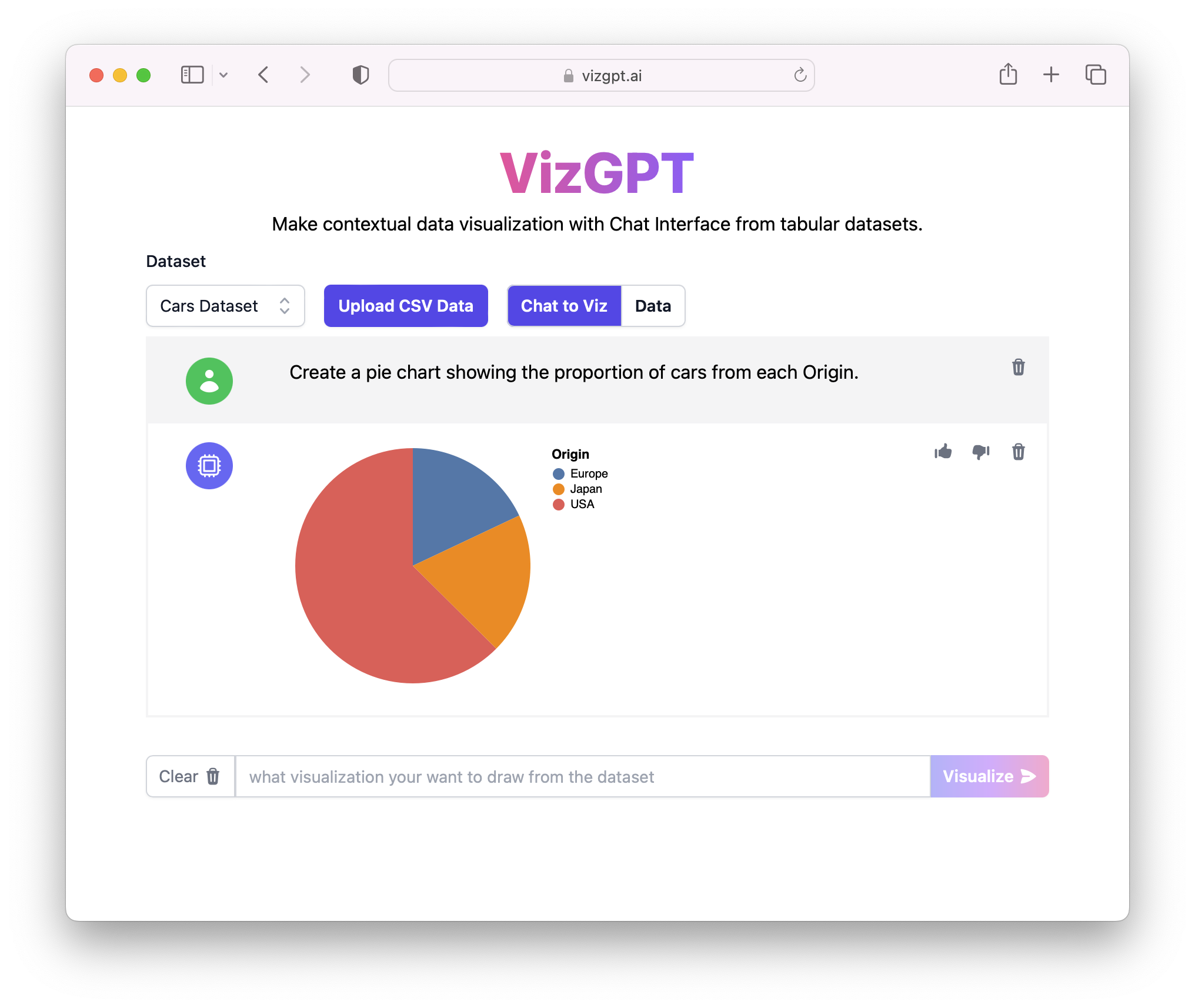
Prompt: Create a pie chart showing the proportion of cars from each Origin.
Create Histograms in VizGPT
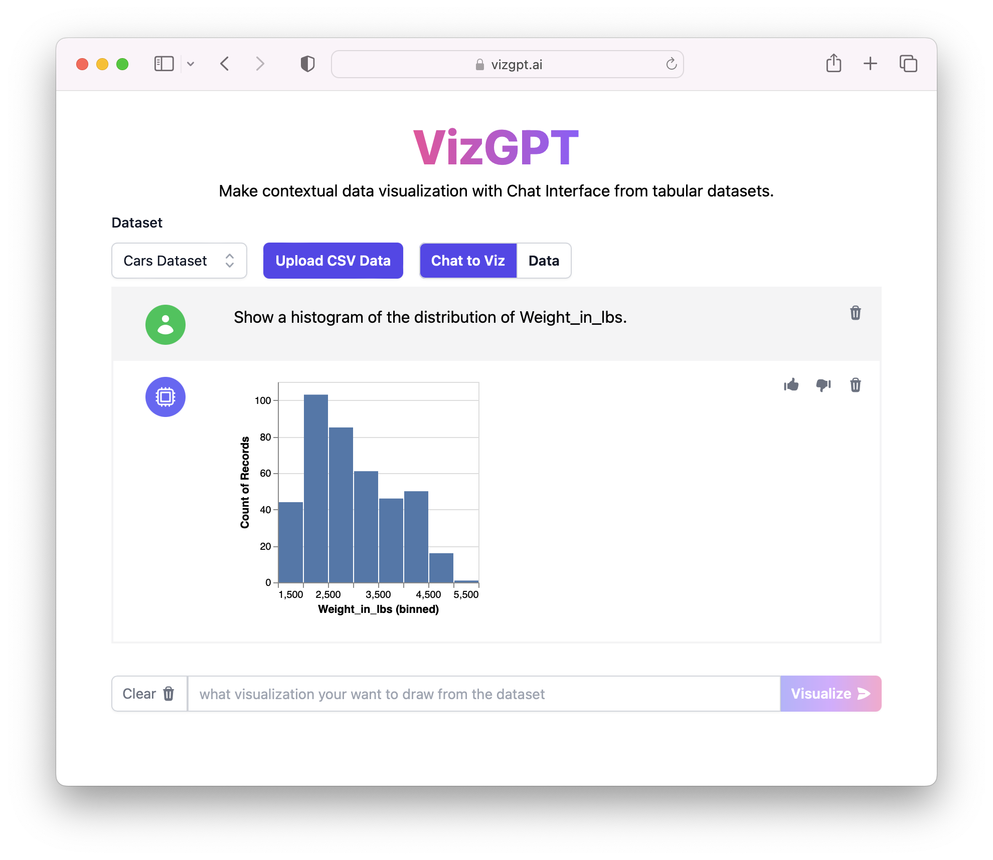
Prompt: Show a histogram of the distribution of Weight_in_lbs.
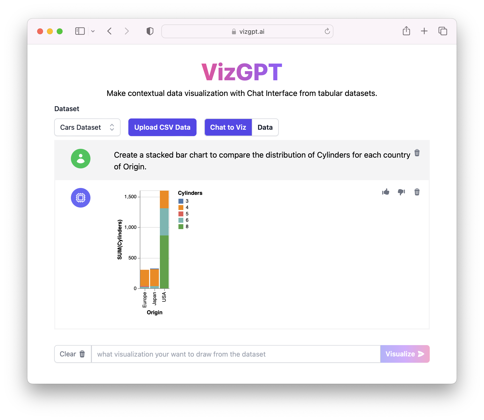
Create a Stacked Bar Chart(Grouped Bar Chart) in VizGPT
Prompt: Create a stacked bar chart to compare the distribution of Cylinders for each country of Origin.
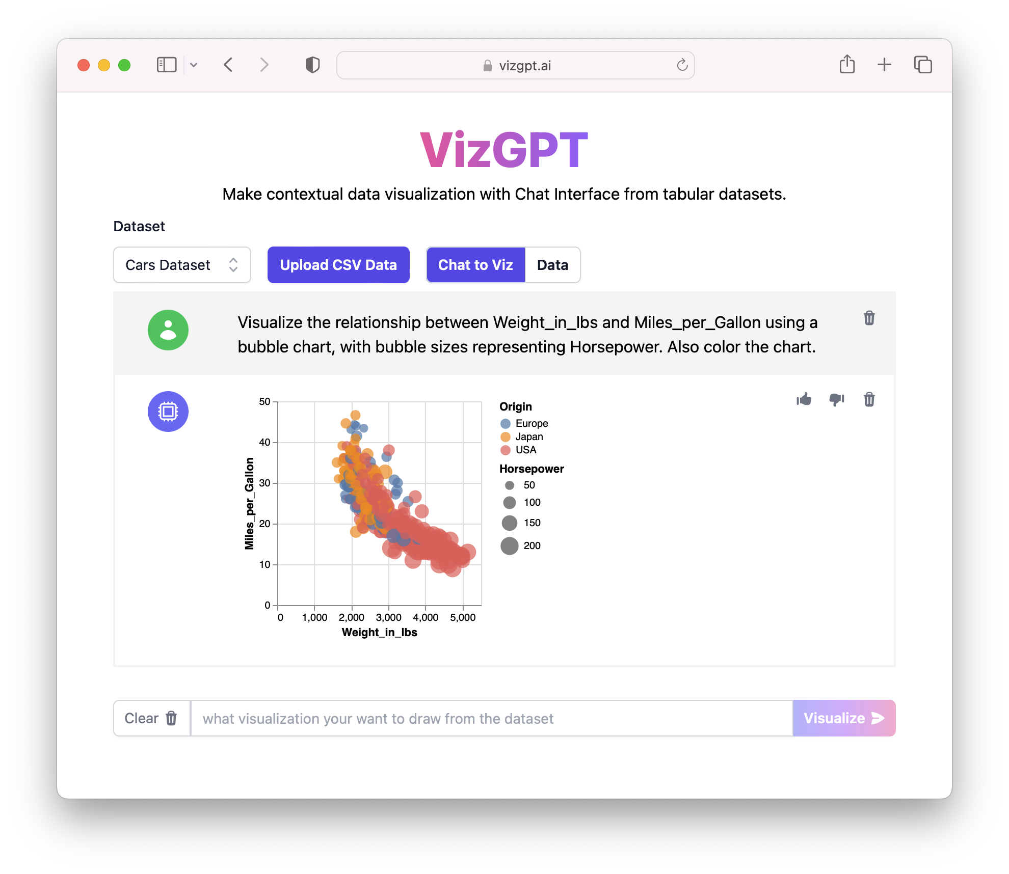
Create a Bubble Chart in VizGPT
Prompt: Visualize the relationship between Weight_in_lbs and Miles_per_Gallon using a bubble chart, with bubble sizes representing Horsepower. Also color the chart.
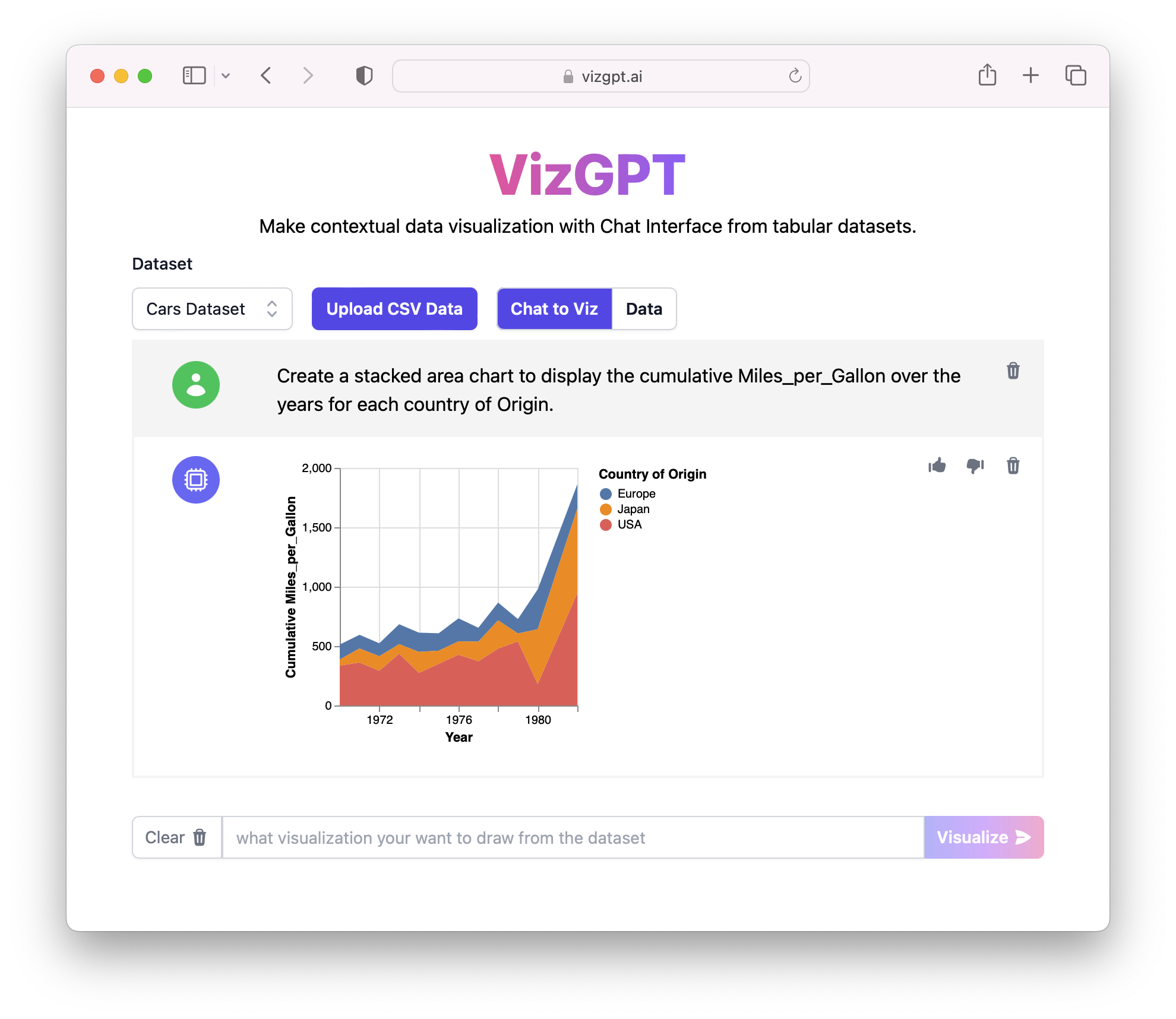
Create a Stacked Area Chart in VizGPT
Prompt: Create a stacked area chart to display the cumulative Miles_per_Gallon over the years for each country of Origin.
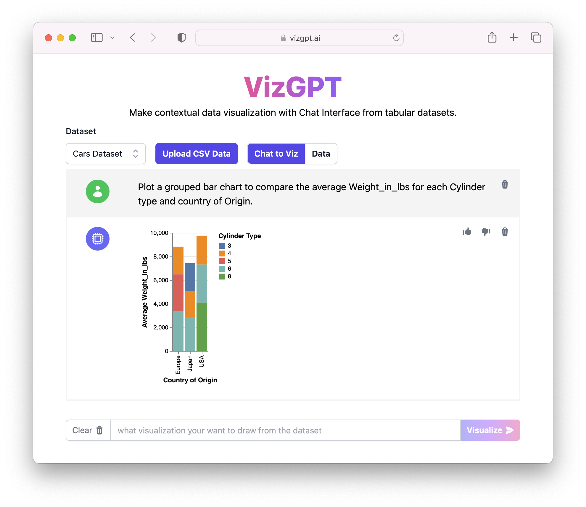
Create a Grouped Bar Chart in VizGPT
Prompt: Plot a grouped bar chart to compare the average Weight_in_lbs for each Cylinder type and country of Origin.
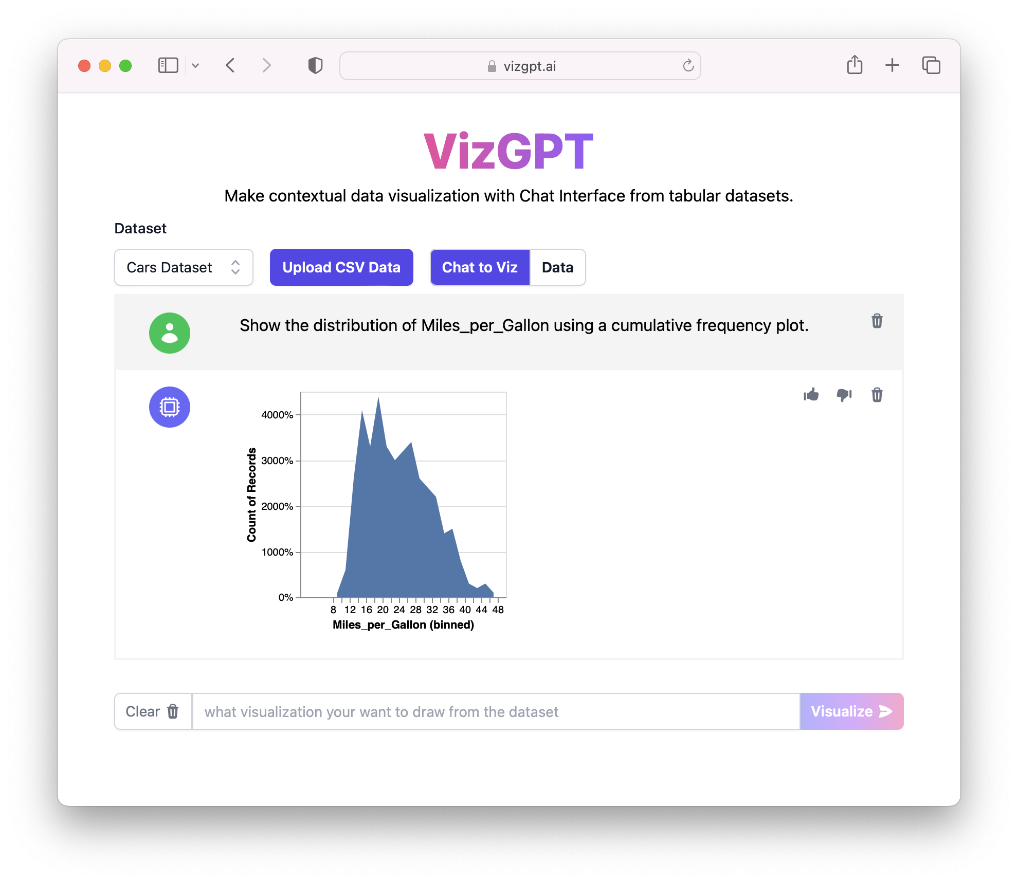
Create a Cumulative Frequency Plot in VizGPT
Prompt: Show the distribution of Miles_per_Gallon using a cumulative frequency plot.
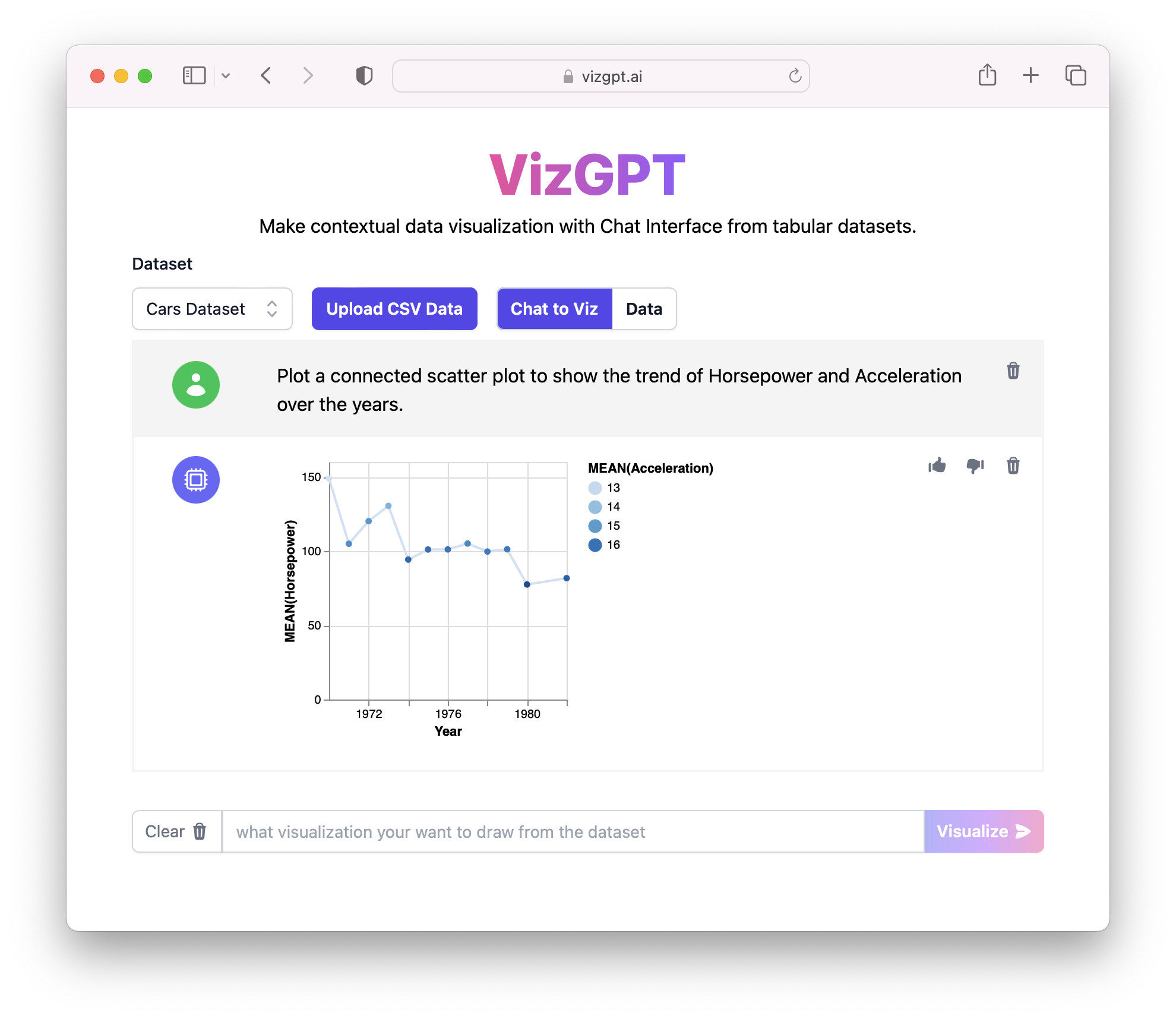
Create a Connected Scatterplot in VizGPT
Prompt: Plot a connected scatter plot to show the trend of Horsepower and Acceleration over the years.
Want to test out these awesome prompts? Visit VizGPT Website (opens in a new tab) right now:
How to Visualize Data with Chat GPT?
Visualizing data with Chat GPT involves a few simple steps:
-
Find a dataset: First, you need to find a dataset that you want to visualize. This could be any dataset that you have access to.
-
Process the data: Next, you need to process the data to make it suitable for visualization. This could involve cleaning the data, normalizing it, or performing other preprocessing steps.
-
Create a visualization: Finally, you input your natural language query into Chat GPT, and it generates the corresponding visualization.
Process Data with Chat GPT
To process your data and prepare it for visualization, you can utilize Chat GPT's ability to generate Python code snippets. Here's an example prompt to demonstrate how Chat GPT can assist you in processing data:
Prompt: Generate Python code to load and explore the dataset named "data.csv" with columns "x", "y", and "z".
Code Output:
import pandas as pd

# Load the dataset
df = pd.read_csv("data.csv")

# Explore the dataset
print(df.head())
print(df.describe())
With this prompt, Chat GPT generates Python code that loads the dataset named "data.csv" and uses the Pandas library to read and explore the data. The generated code output includes the loading code and the head() and describe() functions to provide an initial understanding of the dataset's structure and summary statistics.
Create Data Visualizations with Chat GPT
Chat GPT can also generate Python code for creating a variety of data visualizations. Here are some sample prompts that showcase the creation of different types of visualizations:
-
Prompt: Generate Python code to create a bar chart to visualize the distribution of the "category" variable using Seaborn.
Code Output:
import seaborn as sns # Create a bar chart sns.countplot(data=df, x="category") plt.xlabel("Category") plt.ylabel("Count") plt.title("Distribution of Categories") plt.show() -
Prompt: Create a line chart to display the trend of the "sales" variable over time using Plotly.
Code Output:
import plotly.express as px # Create a line chart fig = px.line(df, x="time", y="sales") fig.update_layout(title="Sales Trend Over Time", xaxis_title="Time", yaxis_title="Sales") fig.show() -
Prompt: Generate Python code to create a scatter plot to visualize the relationship between "age" and "income" variables using Plotnine.
Code Output:
from plotnine import ggplot, aes, geom_point

# Create a scatter plot
scatter_plot = (ggplot(df, aes(x="age", y="income")) + geom_point())
scatter_plot.draw()
These sample prompts demonstrate how Chat GPT can generate Python code for different types of visualizations, including bar charts, line charts, and scatter plots. The code output includes the necessary code to plot the visualization, set labels for the axes, and add a title to the chart.
By comparison, VizGPT is by far the easiest way to create Data Visualizations leveraging the power of Chat GPT. You can easily use VizGPT to create data visualizations tailored to your dataset and analysis goals, allowing you to gain insights and effectively communicate your findings.
You can test VizGPT out at VizGPT Playground (opens in a new tab) at:
Conclusion
VizGPT and Chat GPT have made data visualization more accessible and intuitive. By leveraging the power of GPT models, these tools allow users to generate visualizations using natural language queries, making data analysis a more straightforward process.
FAQ for Visualization and GPT
Q: Can Chat GPT visualize data? A: Yes, Chat GPT can visualize data. By interpreting natural language queries, it can generate the corresponding visualizations. This makes it a powerful tool for data analysis and visualization.
Q: What is visualization in data mining? A: Visualization in data mining is the presentation of data in a pictorial or graphical format. It enables decision-makers to see and understand trends, outliers, and patterns in data.
Q: What are the four types of data visualization techniques? A: The four main types of data visualization techniques are charts, tables, infographics, and maps. Charts include bar charts, line charts, pie charts, and more. Tables display raw data sets for comparison. Infographics combine charts, tables, and text. Maps display geographical data.
Q: What are the common types of visualization? A: Common types of visualization include bar charts, line graphs, pie charts, scatter plots, heat maps, area charts, and histograms. These visualizations are used to represent data in various formats for better understanding and analysis.