In-depth Analysis: Plotly vs Matplotlib in Python
- Name
- Matt Popovic
Updated on
Data visualization is a crucial element in data science and analytics, enhancing the comprehension and communication of complex data. Here, we are delving into an in-depth analysis of two of the most widely used data visualization libraries in Python, namely Plotly and Matplotlib. We will explore the strengths and weaknesses of each, while also demonstrating their capabilities with detailed examples and code snippets.
Set the Stage: Python Environment Setup
Before we commence with the comparisons, it's essential to have a suitable Python environment set up. To follow along with the examples in this article, ensure you have Python installed along with the required packages. If your Python version is outdated, consider either:
- Downloading and installing the pre-built “Data Plotting” runtime environment for Windows 10 or Mac OSX.
- Creating a custom Python runtime with just the packages you'll need for this project by creating a free ActiveState Platform account.
The ActiveState Platform also offers ActivePython, a pre-built Python version containing hundreds of packages aimed at solving common tasks. For more assistance of Python, you can read our Python tutorials here.
Comparing Plotly and Matplotlib: Visualizing Data
Plotly and Matplotlib, two Python libraries, have made a significant impact in the world of data visualization. However, each comes with its unique traits that could make one more suited to your needs than the other.
Plotting Data with Matplotlib
Matplotlib, reminiscent of MATLAB's plotting functionality, provides users full control over aesthetics such as fonts, line styles, colors, and axes properties. This flexibility allows for intricate customization, but can lead to verbosity in the code. To extend Matplotlib's functionality, third-party packages such as Basemap and Cartopy are widely used. Matplotlib is also well-integrated into pandas, a robust data handling and manipulation library in Python, expediting exploratory data analysis.
Here's an example of data plotting using Matplotlib:
import pandas as pd
import matplotlib.pyplot as plt
from mpl_toolkits.basemap import Basemap

# Assuming wine_df is your DataFrame and the columns 'Alcohol' and 'OD280/OD315' exist
fig, ax = plt.subplots(figsize=(12,8))
ax.scatter(x = wine_df['Alcohol'], y = wine_df['OD280/OD315'], c = wine_df['Class'])
ax.set_xlabel('Alcohol', fontsize=15)
ax.set_ylabel('OD280/OD315', fontsize=15)
ax.set_title('Wine Dataset')
ax.grid(True)
fig.tight_layout()
plt.show()
Plotting Data with Plotly
Plotly, on the other hand, is capable of generating interactive web-based visualizations, making it a powerful tool for geographical, scientific, statistical, and financial data. Its seamless integration with pandas and interactivity offers significant advantages over static matplotlib plots.
Here's how to create an interactive scatter plot with Plotly:
import plotly.express as px

# Assuming wine_df is your DataFrame and the columns 'Alcohol' and 'OD280/OD315' exist
fig = px.scatter(wine_df, x="Alcohol", y='OD280/OD315', color="Class", marginal_y="box", marginal_x="box")
fig.show()
Interactivity in Plotly allows users to zoom, pan, hover, and get detailed information about each data point on the graph without having to modify the source code. This adds a whole new dimension to data visualization that makes it a more immersive experience.
Consider the case when you have hundreds or thousands of data points on your scatter plot. With static images, you can't get specific information about individual data points unless you add annotations, which can clutter the graph. On the contrary, with Plotly, you just need to hover your mouse over the point you're interested in and you get the details for that point.
Moreover, you can include more data dimensions by using color, size and even animation. In the above example, the color of each point corresponds to the "Class" attribute, adding another layer of information to our plot.
Here's how you can add more dimensions using size and animation:
# Assume the column "Size" represents the size of each point and "Year" represents the time attribute.
fig = px.scatter(wine_df, x="Alcohol", y='OD280/OD315', color="Class", size="Size", animation_frame="Year", marginal_y="box", marginal_x="box")
fig.show()
The Plotly graph will not only display the scatter plot for each year when you play the animation, but also show how the scatter plot changes over time.
Compare Ploty and Matplotlib to Other Data Visualization Python Libraries
Understanding the nuances of various data visualization libraries can empower you to choose the most suitable one for your specific use-case. Let's compare some popular libraries to Matplotlib - MATLAB, ggplot2, pandas, Plotly, Seaborn, and PyGWalker.
Alternative to Matplotlib: Visualize Data with PyGWalker
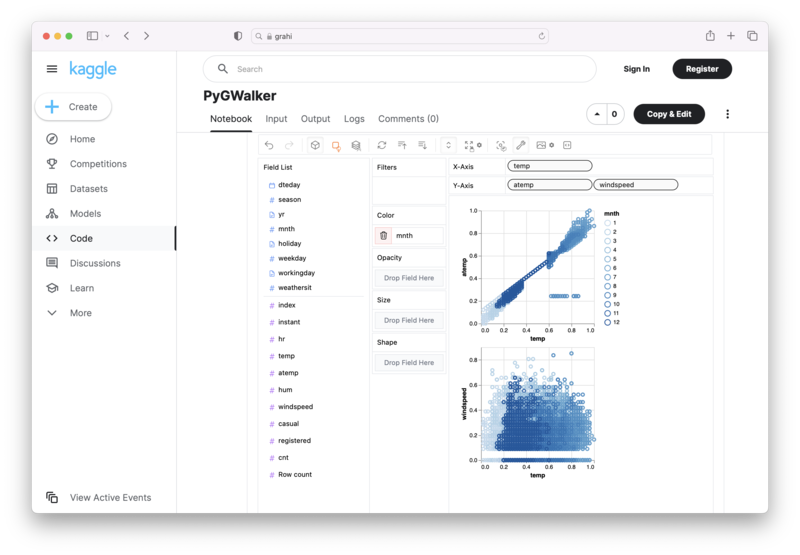
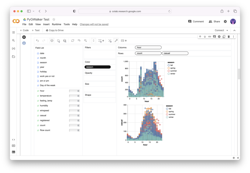
Besides using Matplotlib to visualize your pandas dataframe, here is an alternative, Open Source python library that can help you create data visualization with ease: PyGWalker (opens in a new tab).

No need to complete complicated processing with Python coding anymore, simply import your data, and drag and drop variables to create all kinds of data visualizations! Here's a quick demo video on the operation:
Here's how to use PyGWalker in your Jupyter Notebook:
pip install pygwalker
import pygwalker as pyg
gwalker = pyg.walk(df)
Alternatively, you can try it out in Kaggle Notebook/Google Colab:
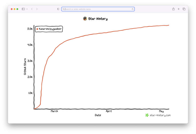
PyGWalker is built on the support of our Open Source community. Don't forget to check out PyGWalker GitHub (opens in a new tab) and give us a star!
MATLAB vs. Matplotlib
MATLAB, a dedicated technical computing language, boasts a closed-source integrated development environment (IDE). It can merge with code written in several other languages like C, C++, Java, .NET, and Python.
Matplotlib, on the other hand, is an open-source plotting library offering a MATLAB-like interface through its Pyplot module. Nonetheless, when crafting complex plots, Matplotlib may encounter performance issues.
# Matplotlib PyPlot example
import matplotlib.pyplot as plt
plt.plot([1,2,3,4])
plt.ylabel('Sample Numbers')
plt.show()
If you're a scientist or engineer with budget for a MATLAB license, you might find MATLAB preferable. However, Matplotlib can be an excellent choice if you seek an open-source plotting library that offers versatility and the added benefit of Python's algorithmic capabilities.
ggplot2 vs. Matplotlib
ggplot2, a visualization library designed for the R programming language, enables users to intuitively create graphs by declaring the desired output. Conversely, Matplotlib, designed for Python, involves users specifying the steps to construct a graph.
# Matplotlib graph construction example
plt.figure()
plt.plot([1,2,3,4])
plt.xlabel('x-axis')
plt.ylabel('y-axis')
plt.title('Sample Plot')
plt.show()
If you are an R user preferring a declarative approach to create plots, consider ggplot2. On the other hand, Matplotlib is beneficial if you are new to data visualization with Python or are more familiar with Python than R.
Matplotlib vs. pandas
Matplotlib, a visualization library, synergizes with libraries like NumPy and pandas to visually represent data. pandas primarily focuses on data manipulation and analysis in tabular form, with built-in plotting functions relying on Matplotlib.
# pandas built-in plotting example
import pandas as pd
df = pd.DataFrame({"A": [1, 2, 3], "B": [4, 5, 6]})
df.plot(kind='bar')
For full control over your visualizations, consider using Matplotlib atop pandas. However, if your focus is on proof-of-concept visualizations and data organization without explicitly using other libraries, you might opt for pandas alone.
Plotly vs. seaborn
Plotly, a partially open-source tool, offers extensive features including web-based, 3D, and animated plots. It supports multiple languages and allows a high degree of customization and interactivity.
seaborn, fully open-source and built on Matplotlib, helps in creating visually appealing plots swiftly. However, it does not support built-in 3D and animation capabilities without Matplotlib.
# seaborn plot example
import seaborn as sns
iris = sns.load_dataset('iris')
sns.pairplot(iris, hue='species')
Consider Plotly if you work with Python, R, MATLAB, Perl, Julia, or want interactive or animated web-based plots. If your goal is to quickly create visually appealing graphs leveraging Matplotlib functionality, seaborn could be your pick.
ggplot2 vs. seaborn
ggplot2, a declarative plotting library for R, enables users to concisely describe graph components and build visualizations. seaborn, a Python library, facilitates creating Matplotlib-based visualizations using less code but comes with some limitations.
# seaborn plot with customization
sns.set_style('whitegrid')
sns.box

plot(x='species', y='petal_length', data=iris)
Consider ggplot2 if you use R and prefer defining your visualization's look instead of describing the steps to create it. For Python users desiring to create Matplotlib visualizations without much interaction with Matplotlib, seaborn could be the choice.
pandas vs. seaborn
pandas, a Python library, offers concise data manipulation, particularly in tabular format. Its built-in plotting methods (with limited customization) use Matplotlib. seaborn, another Python plotting library, integrates heavily with pandas to create visually appealing Matplotlib graphs.
# seaborn plot using pandas DataFrame
sns.histplot(data=df, x="A", bins=10)
Consider using pandas alone if your aim is to manipulate data and quickly build visualizations without deep control over the visualization. For more control and customization in your visualizations, consider seaborn with pandas.
- Runcell Science: An Open Source Alternative to Claude Science for Research Workflows
- How to Make Mac Not Sleep: Keep Codex, Claude Code, and AI Agents Running
- OpenClaw vs ZeroClaw vs Pi Agent vs Nanobot: Which AI Agent Stack Should You Choose in 2026?
- Can Claude Code Analyze Jupyter Notebooks for Data Science? What It Actually Does
- Claude Code Routines: Why AI Agent Cron Jobs Matter
- Claude Code Desktop Bypass Permissions: How to Enable It
- How to Build Two Python Agents with Google’s A2A Protocol - Step by Step Tutorial
- Top 10 growing data visualization libraries in Python in 2025
Conclusion
Data visualization is a vital part of data analysis and exploration. The choice of the right tool depends on your specific use case, programming language preference, need for interactivity, and the level of customization required. While Matplotlib provides a simple and versatile way to create static plots, libraries like Plotly, Seaborn, ggplot2, and pandas offer unique strengths in interactivity, aesthetic appeal, syntax simplicity, and data manipulation respectively.
Whether you prefer the MATLAB-like interface of Matplotlib, the interactive and web-based graphs of Plotly, the aesthetics of Seaborn, or the simplicity of pandas, each of these tools brings something unique to the table. Your choice should align with your goals, the nature of your data, and your programming environment.
FAQ
What is the difference between Matplotlib and Plotly?
A: Matplotlib and Plotly are Python libraries used for data visualization. Matplotlib is a popular library that is great for creating static visualizations, while Plotly is a more sophisticated tool that is better suited for creating elaborate plots more efficiently. Matplotlib is more explicit in declaring each plot element, making it an ideal place for new Python users to start, while Plotly is well-suited for creating interactive plots to be displayed in a web browser.
What are the pros and cons of using Plotly in Python?
A: Plotly is a more sophisticated tool than Matplotlib, and its key advantages are its ability to create interactive plots and its speed when creating intricate visualizations. The main disadvantage of Plotly is that some of its customization options require complex and technical solutions. However, it is still a powerful tool for data visualization.
What is Plotly good for?
A: Plotly is a great tool for creating interactive visualizations that can be displayed in a web browser. It is efficient at creating intricate data visualizations with its well-designed tooling and APIs. It is also a useful tool for creating static visualizations.
Which plot library is best for Python?
A: The choice between different plot libraries depends on the requirements of the project, the skill level of the user, and the type of visualization needed. Matplotlib is a great library for beginners, while Seaborn is ideal for creating complex plots with minimal code. Plotly is a more sophisticated tool that is well-suited for creating interactive visualizations, particularly for web-based applications. Other popular libraries include ggplot2, Bokeh, and pandas.
How does Plotly compare to Seaborn and Bokeh?
A: Seaborn is ideal for creating complex visualizations with minimal code, while Bokeh is best for creating interactive web-based visualizations. Plotly is a more sophisticated tool than Seaborn and Bokeh, and it is well-suited for creating interactive visualizations with its well-designed tooling and APIs. However, some of its customization options require complex and technical solutions.