How to Create a Line Graph in Google Sheets: A Comprehensive Guide
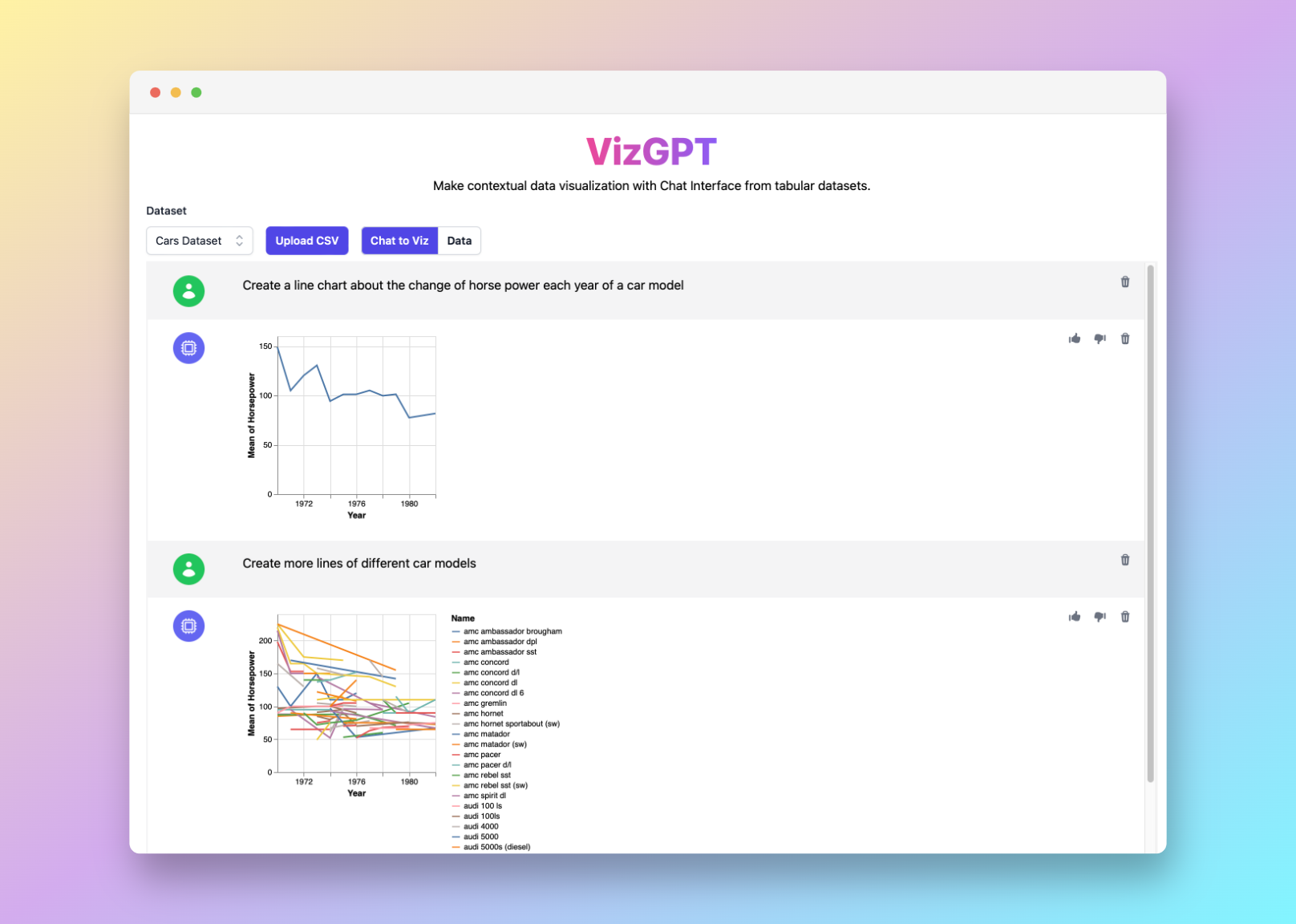
If you want a quick first draft in RunCell, start with a prompt like this:
Create a Line Graph from the data
You can draft the line graph in RunCell first, then download it and move it into Google Sheets.
If you want to start from your own CSV instead of the sample data, use RunCell first and export the chart once it looks right.
Introduction
Creating line graphs in Google Sheets can help you visualize and communicate data effectively. This guide will walk you through the process step by step, as well as introduce you to some advanced tools like RunCell for a richer charting experience.
How to Create a Line Graph in Google Sheets with RunCell
RunCell is a tool built for Jupyter, designed to generate charts and visualizations. It's a user-friendly, no-code solution that simplifies the chart creation process. Follow these steps to harness the power of RunCell:
- Upload your CSV data file to RunCell.
- Input a prompt that describes the type of chart you want to create.
- Press the Visualize button to generate your chart.
If you want to keep refining the chart before exporting it, continue working in RunCell (opens in a new tab).
Detailed Steps to Create a Line Graph in Google Sheets
Creating a line graph in Google Sheets is a straightforward process that involves preparing your data, selecting the data, creating the graph, and customizing the graph.
Step 1: Prepare Your Data
The foundation of any good graph or chart is well-organized, consistent data. The data you want to plot should be arranged in a clear, understandable format. This usually means arranging your data in columns or rows.
The x-axis (horizontal axis) typically represents time or categories, depending on the type of data you're dealing with. For instance, you might have a list of dates or periods (like quarters or years), or categories like product types or countries.
On the other hand, the y-axis (vertical axis) usually represents the values that correspond to the time or categories on the x-axis. These could be sales figures, temperatures, population numbers, and more. It's important to ensure that these values are consistent and accurate.
Step 2: Select the Data
Once your data is prepared, the next step is to select it. Click and drag over the cells containing the data you wish to graph. It's crucial to include the column and row headers in your selection, as Google Sheets uses these headers to interpret your data correctly and label the graph.
Step 3: Create the Graph
Now, it's time to create the graph. Navigate to the toolbar at the top of the Google Sheets interface, click on the "Insert" menu, and then select "Chart."
Upon doing this, Google Sheets will automatically generate a chart based on the data you've selected. It uses algorithms to choose the type of chart it thinks best represents your data.
Step 4: Customize Your Graph
Although Google Sheets tries to select the most suitable chart type for your data, it might not always choose a line graph by default. To change this, go to the "Chart type" dropdown menu in the right-side Chart Editor panel and select "Line Chart."
But the customization doesn't stop there. You can personalize your line graph further by adjusting various elements like colors, labels, and axes.
To do this, stay in the Chart Editor panel and navigate to the "Customize" tab. Here, you'll find a range of options that allow you to alter the look and feel of your graph. For instance, you can change the line color, adjust the thickness of the line, add data labels, change the axis title, and much more.
In the end, it's all about making the graph as clear and informative as possible while also appealing to the visual preferences of your audience.
FAQs
1. Can I create a line graph with multiple lines in Google Sheets?
Yes, you can. Simply include multiple data series in your selection before creating the chart.
2. How can I share my line graph from Google Sheets?
You can share your graph by sharing the entire sheet, publishing the graph to the web, or downloading it as an image or PDF.
3. Can I use RunCell with Google Sheets data?
Absolutely. Just export your Google Sheets data as a CSV file and upload it to RunCell.
Conclusion
In conclusion, whether you're using Google Sheets or an advanced tool like RunCell, creating line graphs is a crucial skill for anyone who works with data. With the techniques you've learned in this guide, you're well-equipped to make the most out of your data visualization tasks.
