How to Create a Scatter Plot
Scatter plots are a versatile tool in data visualization, perfect for showing the relationship between two variables. This guide will walk you through the process of creating a scatter plot using RATH.
Key Features of Scatter Plots
The main purpose of scatter plots is to identify correlational relationships. If we have a specific horizontal value, a scatter plot helps predict a corresponding vertical value. Often, the variable on the horizontal axis is considered the independent variable, while the vertical axis represents the dependent variable. The relationships between variables can be positive or negative, strong or weak, linear or non-linear.
Scatter plots also help identify other patterns in data. For instance, data points can be grouped based on how closely they cluster together. Scatter plots can reveal unexpected gaps in the data and highlight outlier points. This feature is useful when you want to segment data into different parts, like in user persona creation.
Preparing Data for a Scatter Plot
To create a scatter plot, you need to select two columns from your data table, one for each axis of the plot. Each row in the table becomes a single dot in the plot, positioned according to its column values. For more details about How to prepare a scatter plot, refer to the Prepare Data chapter.
Creating a Scatter Plot in RATH
In RATH (opens in a new tab), you can create a scatter plot by following these steps:
-
Import your Data: Log into your account and upload your CSV or Excel file to RATH, or connect your online database to RATH.
-
Select the Chart Type: In the Exploration tab, choose the Mark Type button on the Tools bar and select 'Scatter'.
-
Create the Chart: Drag and drop your variables onto the shelves, defining the x-axis and y-axis for your scatter plot.
Use Cases for Scatter Plots
Scatter plots are versatile tools for visualizing data in various scenarios, such as:
-
Market Research: Understanding the correlation between product price and sales.
-
Healthcare: Studying the relationship between patient age and recovery time.
-
Environmental Science: Analyzing the correlation between temperature and ice melt rates.
Tips for Better Scatter Plots
Adding a Trend Line: If you're using a scatter plot to look at a predictive or correlational relationship, you can add a trend line showing the best mathematical fit to the data.
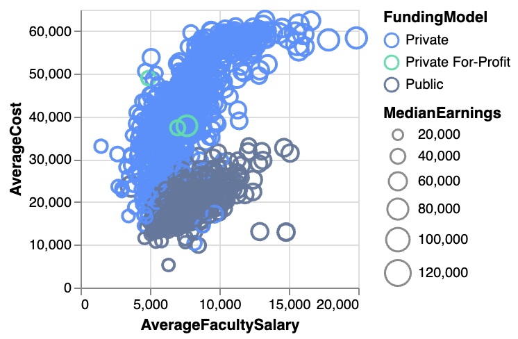
Categorical Third Variable: A third variable can be added to the scatter plot. If this third variable is categorical (like geographical region or gender), you can encode it by changing the color of the points.
Numeric Third Variable: If the third variable is numeric, you can change the size of the points, creating a bubble chart. Alternatively, hue can also be used to depict numeric values.
Highlighting Points of Interest: To present insights, you can highlight specific points of interest through annotations and color.
Alternatives to Scatter Plots
Scatter Map: If the two variables are geographical coordinates, you can overlay the points on a map to create a scatter map.
Heatmap: A heatmap can be used when there are many data points, and their density causes overplotting issues.
Connected Scatter Plot: If the third variable indicates timestamps, a connected scatter plot can show how the relationship between the two main variables changes over time.
Conclusion
In summary, scatter plots are powerful tools for visualizing and understanding the relationships between two numerical variables, identifying patterns and outliers, and segmenting data. The strategic use of scatter plots can provide valuable insights and aid in data-driven decision-making.