Explore Netflix Data with PyGWalker
Netflix stands out as a premier platform for movies and TV shows. With an ever-growing library, understanding the trends and patterns of its content becomes crucial for analysts, filmmakers, and even viewers. In this notebook, we'll dive deep into the Netflix dataset using the PyGWalker library, a powerful tool for data visualization and exploration.
What is PyGWalker?
PyGWalker (opens in a new tab) is a Python library designed to simplify the process of data visualization. It allows users to create interactive charts with minimal code, making it easier to uncover insights and patterns in datasets.

Using PyGWalker, we can generate insightful visualizations that provide a clearer understanding of the Netflix content landscape.
Steps to Explore Netflix Data with PyGWalker
Setting Up the Environment
To kick things off, we need to ensure our environment is primed for the analysis. This involves installing the PyGWalker library and importing the necessary Python packages.
!pip install pygwalker -q --preimport pandas as pd
import pygwalker as pyg
df = pd.read_csv("/kaggle/input/netflix-shows/netflix_titles.csv")Load Netflix Dataset and Preprocessing
Our first task is to load the Netflix dataset. Once loaded, we'll preprocess it to make our subsequent analysis smoother. This preprocessing involves:
- Converting the date_added column to a datetime format.
- Extracting the year and month from the date_added column.
- Cleaning up the duration column to represent either the total minutes for movies or the number of seasons for TV shows.
- Filtering out data post-2019.
df["date_added"] = pd.to_datetime(df["date_added"])
df["date_added_year"] = df["date_added"].dt.year.fillna(0).astype(int)
df["date_added_month"] = df["date_added"].dt.month.fillna(0).astype(int)
df["duration"] = df["duration"].fillna("0").str.split(" ").str[0].astype(int)
df = df[df["date_added_year"] <= 2019]

df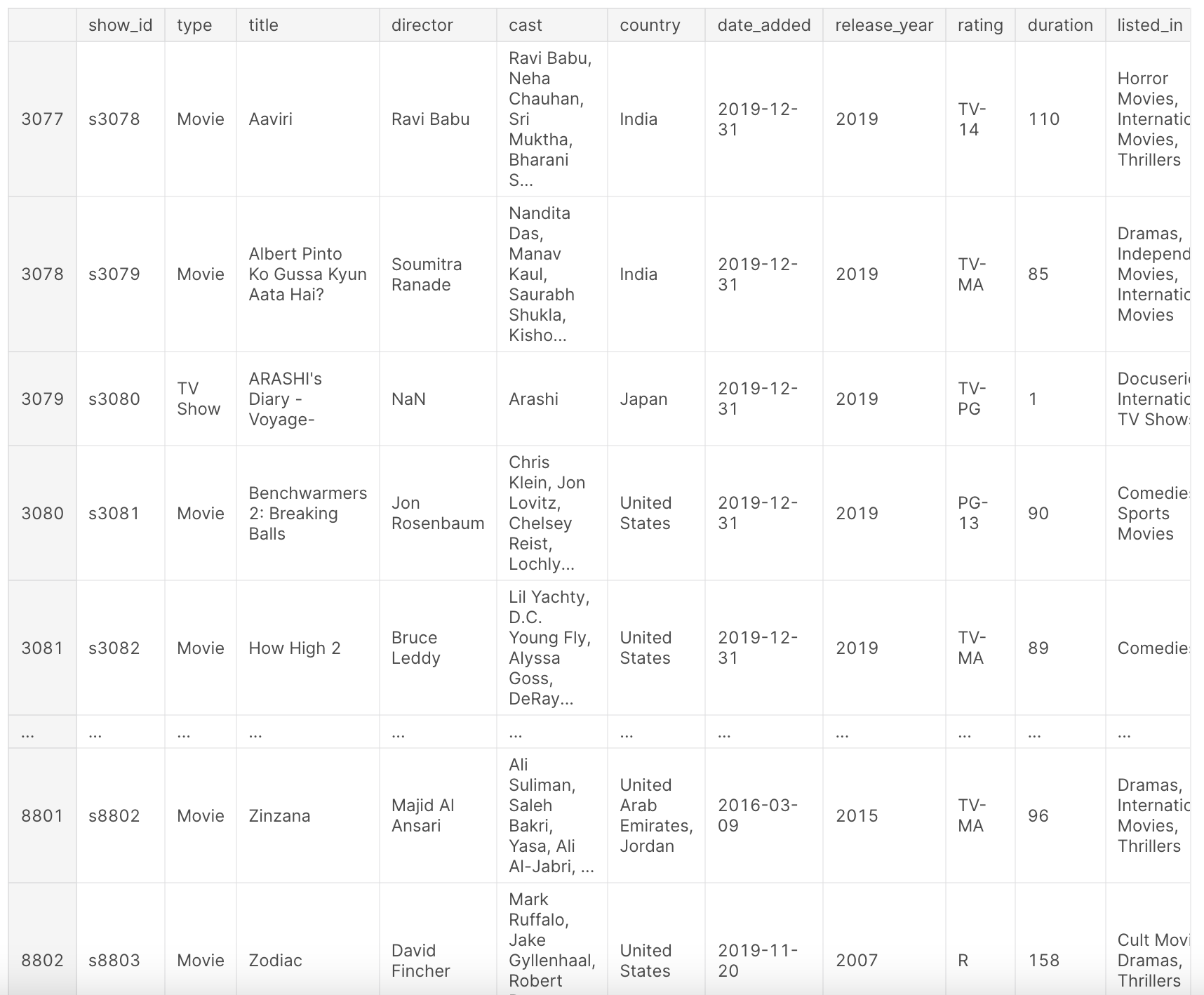
Overview Netflix Dataset
After the above preprocessing, our dataset df provides a comprehensive view of the Netflix titles. It contains information such as the type of content (movie or TV show), title, director, cast, country of production, date added to Netflix, release year, rating, duration, genre, and a brief description.
This dataset offers a snapshot of Netflix's content landscape up to the year 2019, allowing us to analyze trends, preferences, and growth patterns over the years. Take a look at the following columns:
show_id: Unique ID for every Movie/TV Showtype: Identifier for Movie or TV Showtitle: Title of the Movie/TV Showdirector: Director of the Moviecast: Actors involved in the movie/showcountry: Country where the movie/show was produceddate_added: Date it was added on Netflixrelease_year: Actual release year of the movie/showrating: TV Rating of the movie/showduration: Total Duration - in minutes or number of seasonslisted_in: Genredescription: A brief description of the movie/show
Visualize Netflix Data with PyGWalker
Now, for the exciting part: visualizations. With PyGWalker, we'll generate interactive visualizations to unearth insights from our dataset.
1. General Overview of Netflix Data
Here, we're initializing a walker for our main dataset. This will allow us to generate a series of charts based on the specifications saved in "0.json".
walker0 = pyg.walk(df, spec="0.json", use_preview=True)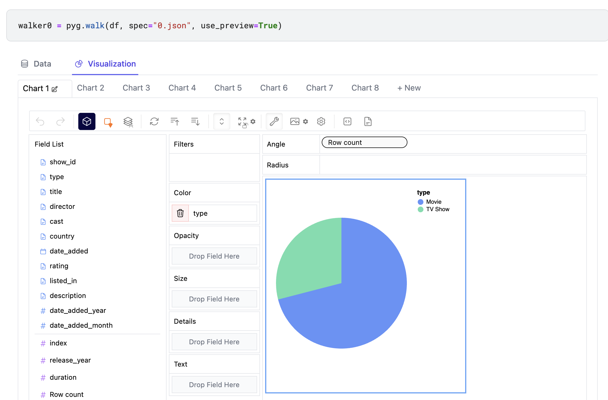
You can Explore this dataset interactively with an online version of PyGWalker here (opens in a new tab).
walker0.display_chart("Chart 1", title="Content Type On Netflix")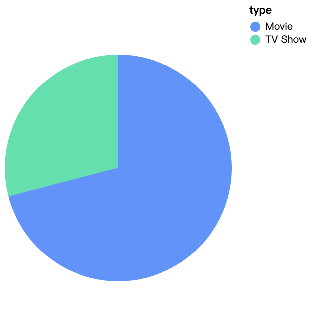
walker0.display_chart("Chart 2", title="Content Added Over Year", desc="The number of movies on Netflix is growing much faster than TV shows, movie content has grown substantially after 2016.")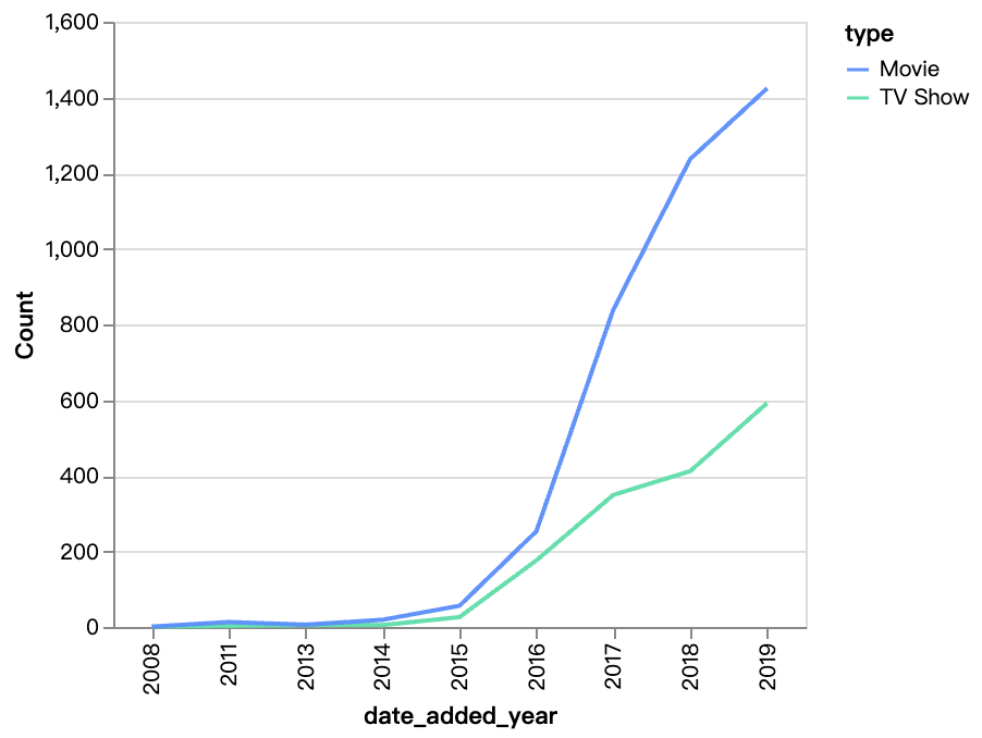
walker0.display_chart("Chart 3", title="Content Release Over Year")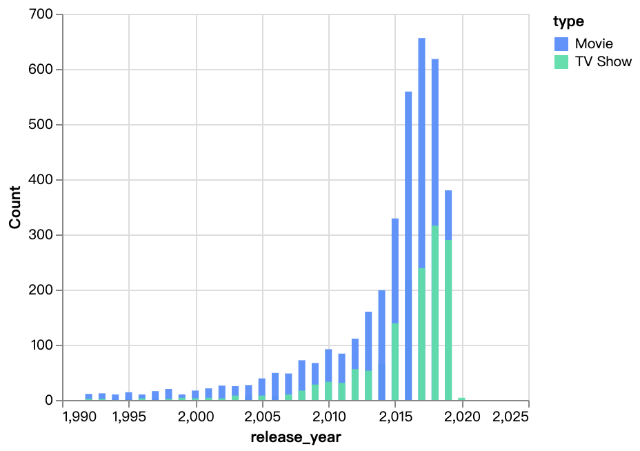
walker0.display_chart("Chart 4", title="Content Added Over Month", desc="")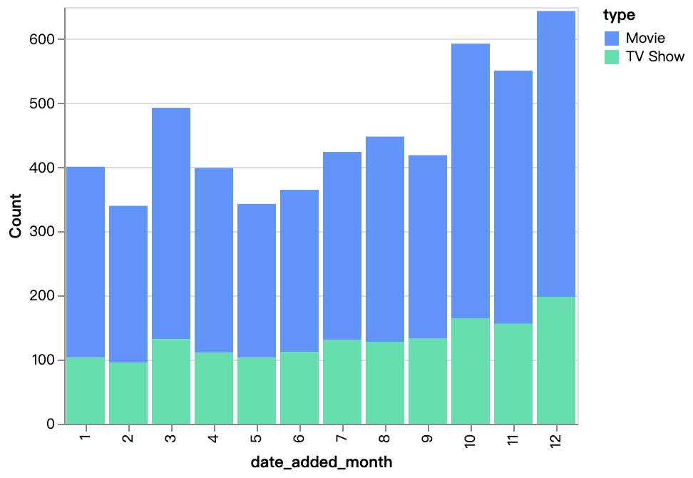
walker0.display_chart("Chart 5", title="Content Added Over Year Diff By Rating", desc="TV-MA, TV-14 are the ratings for most of Netflix's content, and R content is also increasing year by year")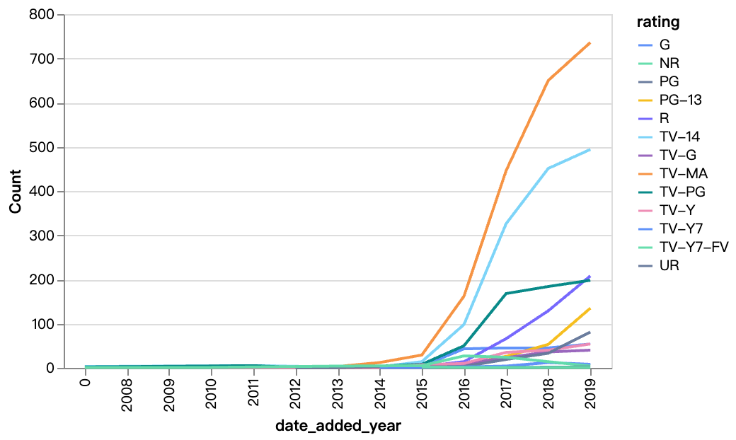
walker0.display_chart("Chart 6", title="movie time distribution", desc="Mainly concentrated between 90 and 110 minutes")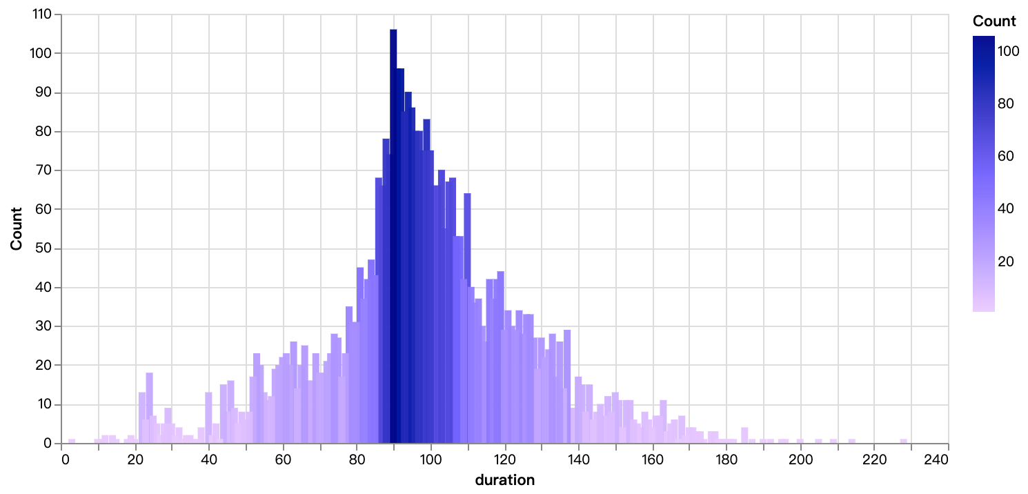
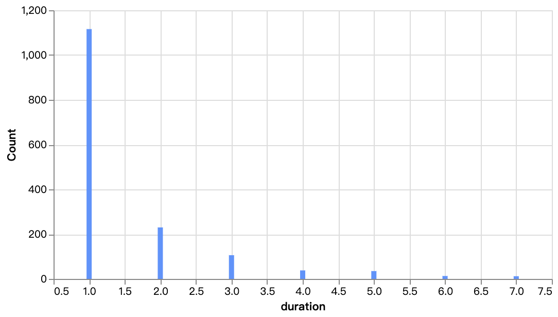
walker0.display_chart("Chart 7", title="tv-show season distribution")
2. Country-specific Analysis on the Netflix Data
In this segment, we're breaking down the content by country. By splitting and restructuring the country column, we can analyze the distribution of content across different countries.
country_df = df["country"].str.split(",", expand=True).stack().reset_index(level=1, drop=True).to_frame('country')
country_df["country"] = country_df["country"].str.strip()
walker1 = pyg.walk(country_df, spec="1.json", use_preview=True)
You can get an on-hand try with PyGWalker User Interface here (opens in a new tab)
walker1.display_chart("Chart 1", title="Countries Of Most Content")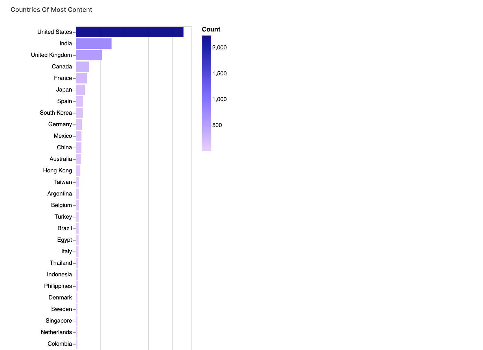
3. Category and Rating Analysis
Lastly, we're focusing on categories and ratings. This section will allow us to understand the distribution of content across genres and how ratings vary within those genres.
category_df = df.loc[:, ("listed_in", "rating", "type")]
category_df["category"] = category_df["listed_in"].str.split(",")
category_df = category_df[["category", "rating", "type"]]
category_df = category_df.explode("category").reset_index(drop=True)
walker2 = pyg.walk(category_df, spec="2.json", use_preview=True)
You can get an on-hand try with PyGWalker User Interface here (opens in a new tab)
walker2.display_chart("TV category", title="tv-show category distribution")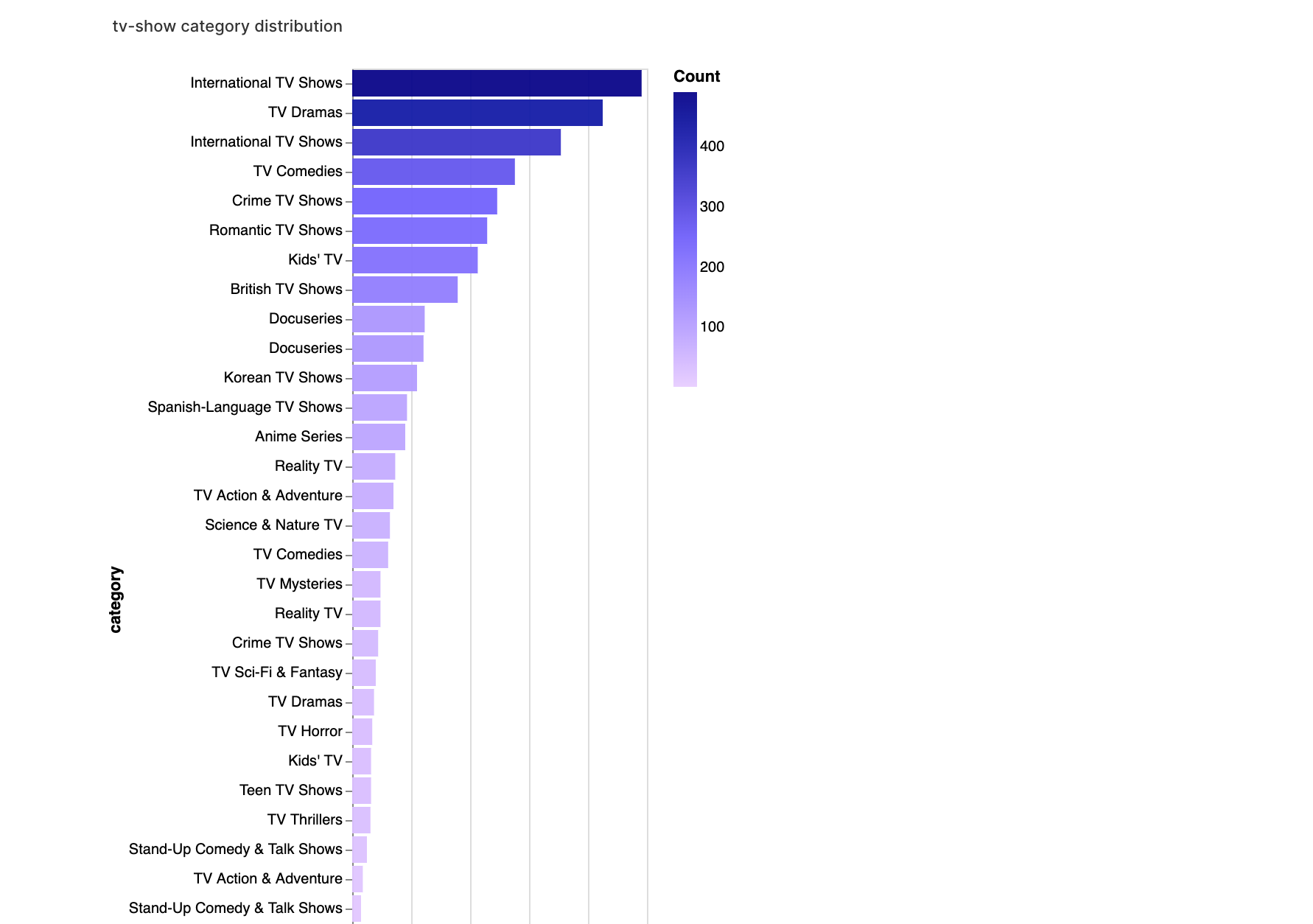
walker2.display_chart("Movie category", title="movie category distribution")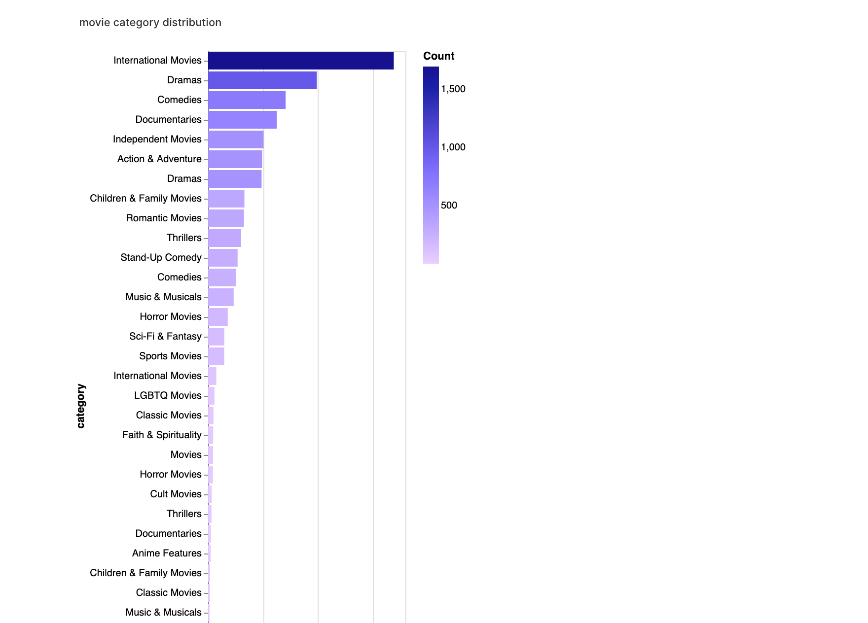
walker2.display_chart("rating category(tv)", title="rating category heatamp(TV-Show)")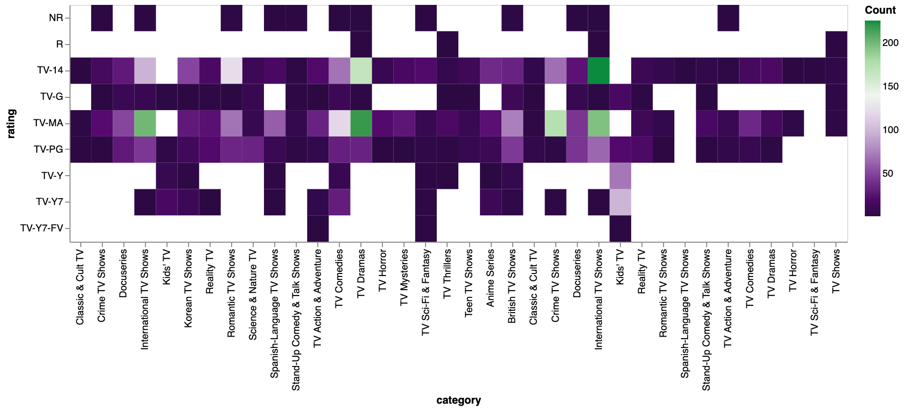
walker2.display_chart("rating category(movie)", title="rating category heatamp(movie)")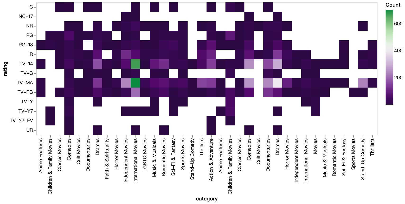
Conclusion
In this comprehensive exploration of the Netflix dataset using the PyGWalker library, we delved deep into the myriad facets of the Netflix content landscape. PyGWalker proved to be a potent tool, simplifying the visualization process to reveal essential trends. The analysis provided clarity on the growth patterns, preferences, and trends of Netflix content up to 2019, drilling down into categories and ratings revealed the variety and distribution of genres across movies and TV shows and how ratings vary within those genres.
This Documentation is also available on Kaggle Notebook (opens in a new tab).
FAQs
1. What are Netflix datasets?
- Netflix datasets are collections of data that provide detailed information about the content available on the Netflix platform. This data typically includes aspects like the type of content (movie or TV show), title, director, cast, country of production, date added to Netflix, release year, rating, duration, genre, and a brief description. These datasets allow researchers and analysts to gain a better understanding of the content landscape of the platform.
2. How can Netflix datasets be used?
- Netflix datasets can be used in a variety of ways:
- Trend Analysis: Understand the growth patterns, preferences, and trends over the years.
- Country Analysis: Determine which countries produce the most content and what type of content is popular in different regions.
- Genre Distribution: Explore the most popular genres and how they vary between movies and TV shows.
- Rating Insights: Analyze the distribution of ratings across various content types and determine audience preferences.
- Data Visualization: Use tools like PyGWalker to create interactive visualizations for deeper insights.
3. What is PyGWalker and why is it beneficial for data exploration?
- PyGWalker is a Python library specifically designed to streamline the process of data visualization. It allows users to generate interactive charts with minimal code, facilitating the uncovering of patterns and insights in datasets. For platforms like Netflix, which have vast datasets, PyGWalker can be invaluable in simplifying data exploration and generating easily understandable visualizations.