Exploratory Data Analysis with Python Pandas: A Complete Guide
- Name
- Omar C. Williams
Updated on
Exploratory Data Analysis (EDA) is a critical step in any data science project. It involves understanding the data, identifying patterns, and making initial observations. This article will guide you through the process of EDA using Python's Pandas library, a powerful tool for data manipulation and analysis. We'll cover everything from handling missing values to creating insightful visualizations.
Use Pandas for Exploratory Data Analysis
Handling Missing Values
When working with real-world data, it's common to encounter missing values. These can occur due to various reasons, such as data entry errors or data not being collected for certain observations. Handling missing values is crucial as they can lead to inaccurate analysis if not treated properly.
In Pandas, you can check for missing values using the isnull() function. This function returns a DataFrame where each cell is either True (if the original cell contained a missing value) or False (if the cell was not missing a value). To get the total number of missing values in each column, you can chain the sum() function:
missing_values = df.isnull().sum()This will return a series with the column names as the index and the total number of missing values in each column as the values. Depending on the nature of your data and the analysis you plan to perform, you might decide to fill in the missing values with a certain value (like the median or mean of the column), or you might decide to drop the rows or columns containing missing values altogether.
Exploring Unique Values
Another important step in EDA is exploring the unique values in your data. This can help you understand the diversity of your data. For example, if you have a column that represents categories of a certain feature, checking the unique values can give you an idea of how many categories there are.
In Pandas, you can use the nunique() function to check the number of unique values in each column:
unique_values = df.nunique()This will return a series with the column names as the index and the number of unique values in each column as the values.
Sorting Values
Sorting your data according to a certain column can also be useful in EDA. For example, you might want to sort your data by a 'population' column to see which countries have the highest populations. In Pandas, you can use the sort_values() function to sort your DataFrame:
sorted_df = df.sort_values(by='population', ascending=False)This will return a new DataFrame sorted by the 'population' column in descending order. The ascending=False argument sorts the column in descending order. If you want to sort in ascending order, you can omit this argument as True is the default value.
Visualizing Correlations with Heatmaps
Visualizations can provide valuable insights into your data that might not be apparent from looking at the raw data alone. One useful visualization is a heatmap of correlations between different features in your data.
In Pandas, you can calculate a correlation matrix using the corr() function:
correlation_matrix = df.corr()This will return a DataFrame where the cell at the intersection of row i and column j contains the correlation
coefficient between the i-th and j-th feature. The correlation coefficient is a value between -1 and 1 that indicates the strength and direction of the relationship between the two features. A value close to 1 indicates a strong positive relationship, a value close to -1 indicates a strong negative relationship, and a value close to 0 indicates no relationship.
To visualize this correlation matrix, you can use the heatmap() function from the seaborn library:
import seaborn as sns
import matplotlib.pyplot as plt

plt.figure(figsize=(10, 7))
sns.heatmap(correlation_matrix, annot=True)
plt.show()
This will create a heatmap where the color of each cell represents the correlation coefficient between the corresponding features. The annot=True argument adds the correlation coefficients to the cells in the heatmap.
Grouping Data
Grouping your data based on certain criteria can provide valuable insights. For example, you might want to group your data by 'continent' to analyze the data at the continent level. In Pandas, you can use the groupby() function to group your data:
grouped_df = df.groupby('continent').mean()This will return a new DataFrame where the data is grouped by the 'continent' column, and the values in each group are the mean values of the original data in that group.
Visualizing Data Over Time
Visualizing your data over time can help you identify trends and patterns. For example, you might want to visualize the population of each continent over time. In Pandas, you can create a line plot for this purpose:
df.groupby('continent').mean().transpose().plot(figsize=(20, 10))
plt.show()
This will create a line plot where the x-axis represents time and the y-axis represents the average population. Each line in the plot represents a different continent.
Identifying Outliers with Box Plots
Box plots are a great way to identify outliers in your data. An outlier is a value that is significantly different from the other values. Outliers can be caused by various factors, such as measurement errors or genuine variability in your data.
In Pandas, you can create a box plot using the boxplot() function:
df.boxplot(figsize=(20, 10))
plt.show()
This will create a box plot for each column in your DataFrame. The box in each box plot represents the interquartile range (the range between the 25th and 75th percentiles), the line inside the box represents the median, and the dots outside the box represent outliers.
Understanding Data Types
Understanding the data types in your DataFrame is another crucial aspect of EDA. Different data types require different handling techniques and can support different types of operations. For instance, numerical operations can't be performed on string data, and vice versa.
In Pandas, you can check the data types of all columns in your DataFrame using the dtypes attribute:
df.dtypesThis will return a Series with the column names as the index and the data types of the columns as the values.
Filtering Data Based on Data Types
Sometimes, you might want to perform operations only on columns of a certain data type. For example, you might want to calculate statistical measures like mean, median, etc., only on numerical columns. In such cases, you can filter the columns based on their data types.
In Pandas, you can use the select_dtypes() function to select columns of a specific data type:
numeric_df = df.select_dtypes(include='number')This will return a new DataFrame containing only the columns with numerical data. Similarly, you can select columns with object (string) data type as follows:
object_df = df.select_dtypes(include='object')Visualizing Data Distributions with Histograms
Histograms are a great way to visualize the distribution of your data. They can provide insights into the central tendency, variability, and skewness of your data.
In Pandas, you can create a histogram using the hist() function:
df['population'].hist(bins=30)
plt.show()
This will create a histogram for the 'population' column. The bins parameter determines the number of intervals to divide the data into.
Combine PyGWalker and Pandas for Exploratory Data Analysis
In the realm of data science and analytics, we often find ourselves delving deep into data exploration and analysis using tools like pandas, matplotlib, and seaborn. While these tools are incredibly powerful, they can sometimes fall short when it comes to interactive data exploration and visualization. This is where PyGWalker steps in.

PyGWalker, pronounced like "Pig Walker", is a Python library that integrates seamlessly with Jupyter Notebook (or other jupyter-based notebooks) and Graphic Walker, an open-source alternative to Tableau. PyGWalker transforms your pandas dataframe into a tableau-alternative user interface for visual exploration, making your data analysis workflow more interactive and intuitive.
PyGWalker is built by a passionate collective of open source contributors. Don't forget to check out PyGWalker GitHub (opens in a new tab) and give a star!
Getting Started with PyGWalker
Installing PyGWalker is a breeze. Simply open your Jupyter notebook and type:
!pip install pygwalkerInteractive Data Exploration with PyGWalker
Once you have PyGWalker installed, you can start exploring your data interactively. To do this, you simply need to call the walk() function on your dataframe:
import pygwalker as pyg

pyg.walk(data)
This will launch an interactive data visualization tool that closely resembles Tableau. The left-hand side of the interface displays the variables in your dataframe. The central area is reserved for your visualizations, where you can drag and drop variables to the X and Y-axis boxes. PyGWalker also offers various customization options, such as filters, color, opacity, size, and shape, allowing you to tailor your visualizations to your specific needs.
Creating Visualizations with PyGWalker
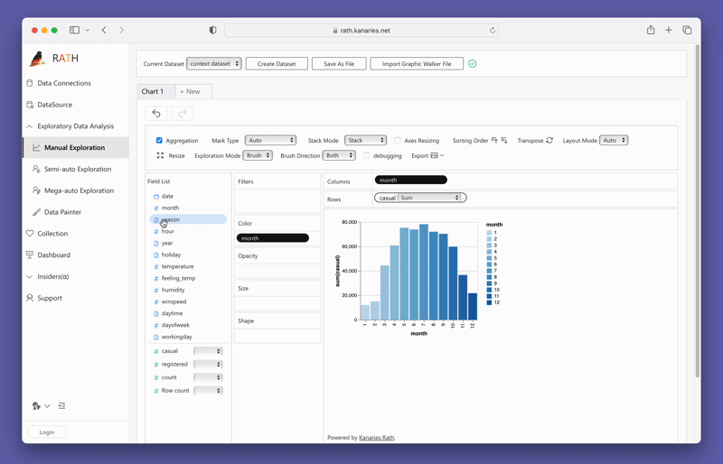
Creating visualizations with PyGWalker is as simple as dragging and dropping your variables. For instance, to create a bar plot of sales by region, you would drag the "Sales" column to the x-axis and the "Region" column to the y-axis. PyGWalker also allows you to select the desired mark type or leave it in auto mode so the tool can select the most appropriate plot type for you.
For more details about creating all types of data visulziations, check out the Documentation.
Explore Data with PyGWalker
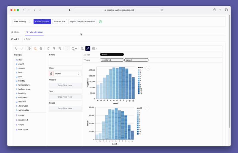
PyGWalker also provides easy-to-use filtering and aggregation options. You can filter your data based on any column by dragging the column to the filter box. Similarly, you can aggregate your numeric columns by selecting the aggregation function from the available options.
Check out the Documentation for more examples and tools for Exploratory Data Analysis in PyGWalker.
Once you're satisfied with your visualizations, you can export them and save them as PNG or SVG files for further use. In the 0.1.6 PyGWalker update, you can also export visuzliations to code string.
Conclusion
Exploratory Data Analysis (EDA) is a fundamental step in any data science project. It allows you to understand your data, uncover patterns, and make informed decisions about the modeling process. Python's Pandas library offers a wide array of functions for conducting EDA efficiently and effectively.
In this article, we've covered how to handle missing values, explore unique values, sort values, visualize correlations, group data, visualize data over time, identify outliers, understand data types, filter data based on data types, and visualize data distributions. With these techniques in your data science toolkit, you're well-equipped to dive into your own data and extract valuable insights.
Remember, EDA is more of an art than a science. It requires curiosity, intuition, and a keen eye for detail. So, don't be afraid to dive deep into your data and explore it from different angles. Happy analyzing!
- Runcell Science: An Open Source Alternative to Claude Science for Research Workflows
- How to Make Mac Not Sleep: Keep Codex, Claude Code, and AI Agents Running
- OpenClaw vs ZeroClaw vs Pi Agent vs Nanobot: Which AI Agent Stack Should You Choose in 2026?
- Can Claude Code Analyze Jupyter Notebooks for Data Science? What It Actually Does
- Claude Code Routines: Why AI Agent Cron Jobs Matter
- Claude Code Desktop Bypass Permissions: How to Enable It
- How to Build Two Python Agents with Google’s A2A Protocol - Step by Step Tutorial
- Top 10 growing data visualization libraries in Python in 2025
Frequently Asked Questions
-
What is exploratory data analysis?
Exploratory data analysis is the process of analyzing and visualizing data to uncover patterns, relationships, and insights. It involves techniques such as data cleaning, data transformation, and data visualization.
-
Why is exploratory data analysis important?
Exploratory data analysis is important because it helps in understanding the data, identifying trends and patterns, and making informed decisions about further analysis. It allows data scientists to gain insights and discover hidden patterns that can drive business decisions.
-
What are some common techniques used in exploratory data analysis?
Some common techniques used in exploratory data analysis include summary statistics, data visualization, data cleaning, handling missing values, outlier detection, and correlation analysis.
-
What tools are commonly used for exploratory data analysis?
There are several tools commonly used for exploratory data analysis, including Python libraries such as Pandas, NumPy, and Matplotlib, as well as software like Tableau and Excel.
-
What are the key steps in exploratory data analysis?
The key steps in exploratory data analysis include data cleaning, data exploration, data visualization, statistical analysis, and drawing conclusions from the data. These steps are iterative and involve continuous refinement and exploration of the data.