Create Box Plots with Labels with RunCell
If you want a quick first draft in RunCell, start with a prompt like this:
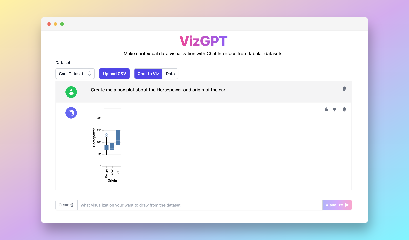
Create a box plot from the data set
If you want to start from your own CSV instead of the sample data, use RunCell first and export the chart once it looks right.
Introduction to Box Plots
Box plots, also known as whisker plots, are graphical displays that measure the central tendency and variability of a dataset. They are especially beneficial when you want to understand the data distribution and identify outliers. In this guide, we delve into the world of box plots with labels, comparing them to other chart types and exploring different methods of creation.
Our guide features hands-on tutorials with tools like Python, R, Matplotlib, ggplot2, and Seaborn, not to mention tips on how to create labeled box plots in Excel. Prepare for a deep dive into the box plot definition, skewness, shapes, quartiles, and whiskers.
Additionally, we'll introduce a powerful tool for creating all sorts of charts, including box plots, RunCell, to make your data visualization tasks more straightforward and enjoyable.
Why Create Box Plots with Labels?
A box plot (or box and whisker plot) is a chart type that offers a graphical view of the summary statistics of a dataset. These statistics include median, quartiles, and potential outliers, providing insights about your data's spread and skewness. Box plots are often used in explanatory data analysis to visually show the distribution of numerical data and skewness through displaying the data quartiles (or percentiles) and averages.
Create Box Plots with Labels: What You Need to Know
One of the crucial aspects of any plot or chart is its labels. Labels help users understand the data better by providing specific insights into each data point or data set's significant aspects. For a box plot, labels commonly represent the different sections of the plot: minimum, first quartile (Q1), median, third quartile (Q3), and maximum.
Creating Box Plots with Labels in Python
Python, with its robust libraries like Matplotlib and Seaborn, provides comprehensive functionality to create box plots with labels. You can add axis labels to your box plot for better data understanding.
Create Box Plots with Labels in R
Just as Python, R is another powerful language that data analysts and scientists use for creating
box plots. The ggplot2 package in R is particularly useful for creating ggplot2 box plots with labels.
Create Box Plots with Labels and Histograms
While both box plots and histograms provide graphical representations of data distributions, they differ in certain ways. Understanding the box plot vs. histogram distinction is essential to choose the right tool for your data.
The Significance of Box Plot Whiskers and Quartiles
Box plot whiskers extend from the box's upper and lower parts, representing the variability outside the upper and lower quartiles. On the other hand, the box plot quartiles divide the data into four equal parts, providing a deeper understanding of data distribution.
FAQs
-
How do you add labels to a box plot? Adding labels to a box plot involves specifying the labels argument inside the plot function.
-
What are the labels on a box plot graph? The labels on a box plot typically represent different sections of the plot, including the minimum, first quartile, median, third quartile, and maximum.
-
Do box plots have axis labels? Yes, box plots can have axis labels. They can be added for better understanding of the data distribution.