How to Explore Data with Data Autopilot in RATH
After connecting to your data source, you can easily visualize data and get automated data insights on the Data Autopilot tab.
You can use Data Autopilot for:
- One-click insights for unexplored datasets that you are unfamiliar with.
- Accelerate your data analytics process with auto-generated results as a foundation, from here, you can conduct further in-depth analysis.
Here's a basic walkthrough for using RATH Data Autopilot feature:
In this tutorial, we'll walk through the Data Autoplilot feature, and conduct Automated Data Exploration with a demo dataset (opens in a new tab).
Getting Started
- Import Data to RATH: For importing data to RATH, click on the Data Connections tab -> Create Data Source -> Demo -> Cars.
Note 1. Refer to the Choose a Database documentation and explore all the data sources that RATH supports.
Note 2. or large files and databases, it is suggested to subset the data. On the Data Source page. RATH gives you a general overview of the dataset. You might omit a certain subset of your dataset from analysis by unchecking the use field option.
Use Data Autopilot
-
On the Data Source page, Click on the Start Analysis button on the upper-left side of the screen to launch Data Autopilot.
-
RATH redirects you to the Data Autopilot page, and generates automated Visual Insights.
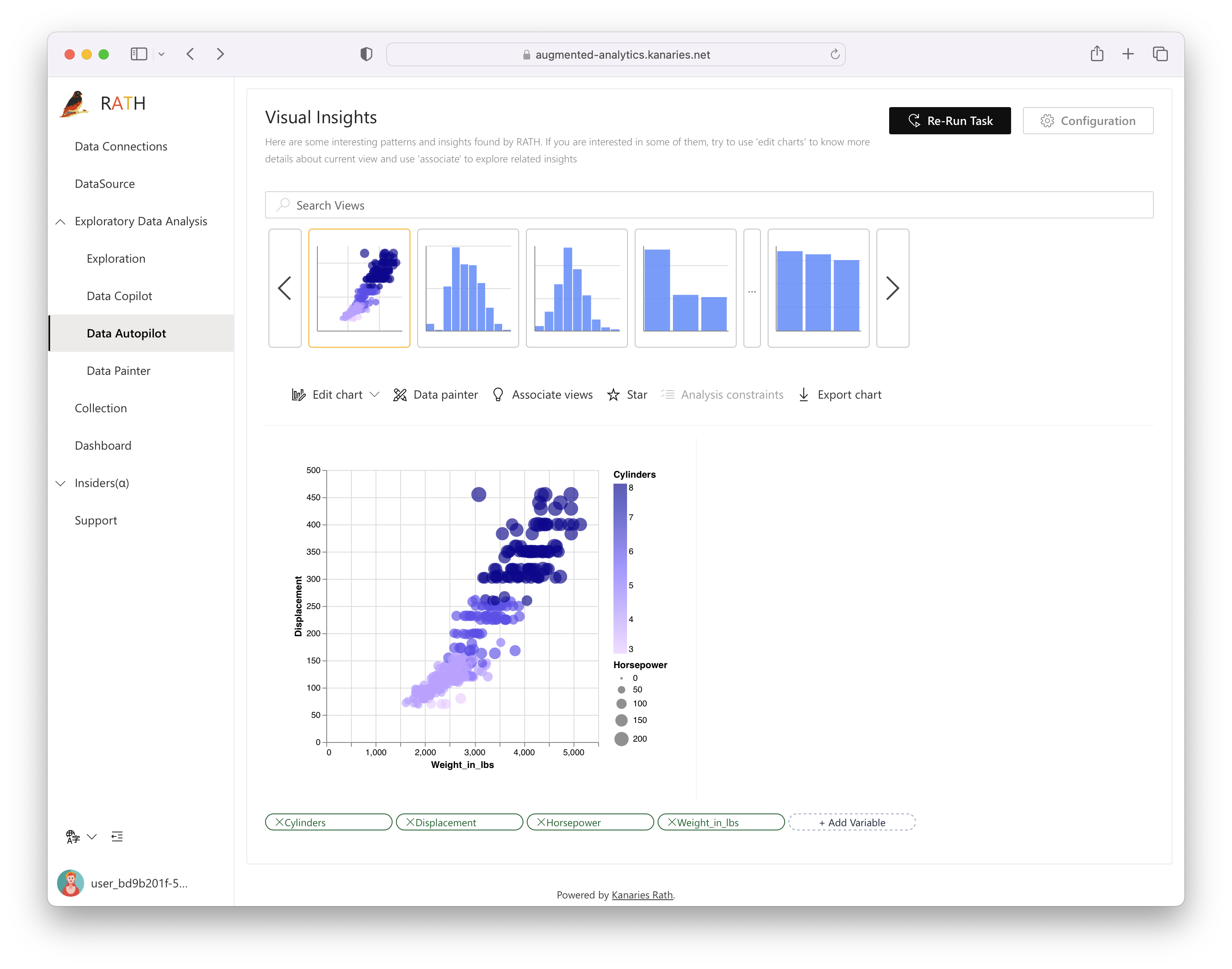
Explore Visual Insights
You can further explore Visual Insights with the following options:
- Click on the Search Views bar to search generated Visual Insights.
After RATH has finished processing, you may:
-
Pick a chart that from a row automatically generates visual insights.
-
Search a particular chart by inputting your keywords in the Search Views bar.
-
Add or remove a variable on the lower side of the screen.

-
Save a chart to your collections by clicking on the Star button:

Your starred charts are accessible on the Collection tab on the left side of the screen.
-
Export the chart to a PNG or SVG format image file by clicking on the export chart button.

-
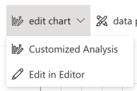
Explore your data with a tableau-alternative interface where you can drag and drop variables to construct charts manually. Click on the edit chart -> Customized Analysis option to edit the chart with Graphic Walker (Manual Exploration).
-
Explore your data visually with a painter-like interface where you can directly select, remove and study your data with drawing tools. Click on the data painter option to edit the chart with Data Painter.

-
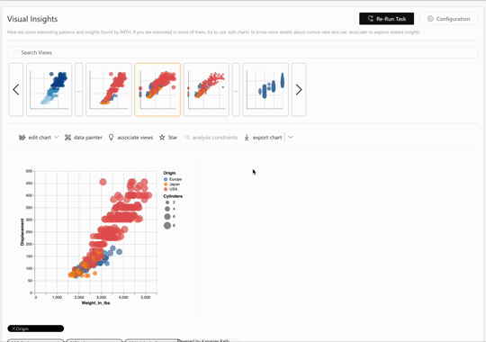
Explore the automated data exploration results by checking out the associated charts. Click on the associate views button:

On the right side of the screen, RATH automatically generates relevant charts. These associated charts are categorized by Associated Measures or Associated Dimensions.
If you find a chart that fits your interest, click on the Analysis button to study the chart.
Edit charts with Vega Editor
Vega/Vega-Lite is a high-level grammar for interactive graphics, in which you can edit data visualization with declarative JSON syntax.
For more details about how to use Vega Editor, refer to the Edit Charts with Vega Editor chapter.
Best practices
-
For new databases or unexplored datasets, it is the best practice to conduct Mega-auto Exploration to get a general idea about your materials on hand.
-
If you already have some concrete ideas about your datasets, it is the best practice to move on to Semi-auto Exploration, which functions as the Copilot in assisting your data exploration journey.