Databricks Visualization: Gaining Insights with Unified Data Analytics
Databricks is a unified data analytics platform that combines big data processing, machine learning, and collaboration tools. In this article, we'll explore how to use Databricks visualization features to create compelling visualizations and uncover valuable insights from your data.
- Runcell Science: An Open Source Alternative to Claude Science for Research Workflows
- How to Make Mac Not Sleep: Keep Codex, Claude Code, and AI Agents Running
- OpenClaw vs ZeroClaw vs Pi Agent vs Nanobot: Which AI Agent Stack Should You Choose in 2026?
- Can Claude Code Analyze Jupyter Notebooks for Data Science? What It Actually Does
- Claude Code Routines: Why AI Agent Cron Jobs Matter
- Claude Code Desktop Bypass Permissions: How to Enable It
- How to Build Two Python Agents with Google’s A2A Protocol - Step by Step Tutorial
- Top 10 growing data visualization libraries in Python in 2025
Understanding Databricks Visualization
Databricks Visualization is an integrated feature within the platform that allows users to create and customize visualizations directly from their notebooks or dashboards. With a wide range of visualization types, including bar charts, line charts, scatter plots, and more, Databricks visualization makes it easy to explore and analyze your data in a visually engaging way.
Getting Started with Databricks Visualization
-
Set up your Databricks workspace: Before you can start using Databricks visualization, you need to set up your workspace. This involves signing up for a Databricks account and creating a new workspace. If you're new to Databricks, check out the official documentation to learn how to set up your environment and access the platform.
-
Create a new notebook: Once your workspace is set up, create a new notebook to start your analysis. You can choose the programming language (Python, Scala, or SQL) that you'd like to use for your analysis. For a comprehensive guide on how to create and use Databricks notebooks, refer to the Databricks notebooks documentation.
-
Load and explore your data: Import your data into the Databricks notebook using the built-in connectors for various data sources, such as Apache Spark, Delta Lake, or external databases. You can also upload local files, such as CSV or Parquet files, for analysis. Once your data is loaded, perform exploratory data analysis to understand the structure and characteristics of the dataset.
-
Transform and clean your data: Prepare your data for visualization by performing necessary data cleaning, transformation, and aggregation tasks. Use the available libraries and functions in your chosen programming language to manipulate the data as needed. This step is crucial for ensuring that your visualizations accurately represent the underlying data and insights.
-
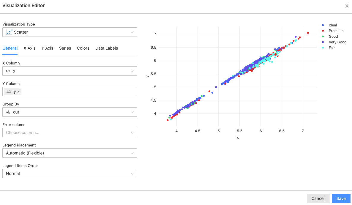
Create visualizations: With your data prepared, you can now create visualizations using Databricks visualization tools. In a notebook cell, run a command that generates a table or dataframe containing the data you want to visualize. Then, click the Plot Options button that appears below the output to configure and customize your visualization. Choose from various chart types, such as bar, line, pie, scatter, and more, and customize the chart's appearance, layout, and interactivity as needed.
-
Analyze and interpret your visualizations: Examine your visualizations to identify patterns, trends, and anomalies in your data. Use these insights to inform your decision-making, guide further analysis, or share with stakeholders. Remember that visualizations are only as valuable as the insights they reveal, so take the time to thoroughly analyze and interpret your visualizations.
-
Collaborate and share your insights: Databricks makes it easy to collaborate with teammates and share your findings with stakeholders. Use the built-in commenting and sharing features to discuss your visualizations and insights with your team, or export your visualizations as images or interactive HTML files for sharing with others. You can also create dashboards that combine multiple visualizations and insights into a single, interactive view.
To complete your Data Visualization workflow effortlessly, consider integrating Databricks with Kanaries RATH (opens in a new tab), a personal Copilot for Automated Data Analysis, to further enhance your data analysis and visualization workflows.
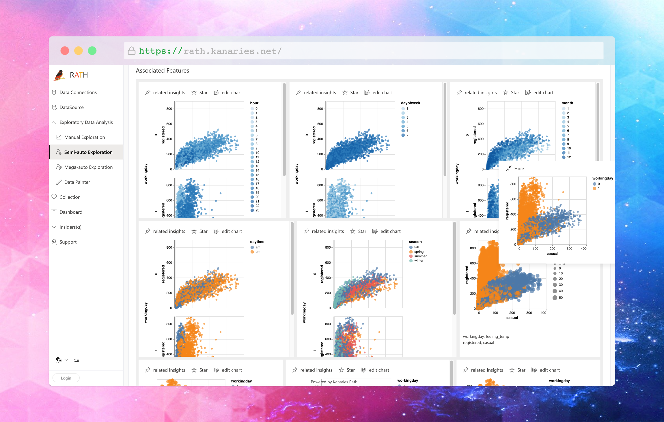
You can easily import data into RATH, and create beautiful data visualization automatically. There is no need for complicated Python coding, you can easily archive this by using a user-friendly UI.

Databricks Visualization Best Practices
To create effective and insightful visualizations in Databricks, it's important to follow some best practices. These practices can help ensure that your visualizations are clear, easy to understand, and accurately communicate the insights in your data. Here are some best practices to keep in mind:
-
Choose the right chart type: One of the most important decisions when creating a visualization is selecting the right chart type. Choose a chart that is best suited to the data and insights you want to convey. For example, use bar charts for comparing discrete categories, line charts for showing trends over time, and scatter plots for exploring relationships between variables.
-
Keep it simple: Avoid cluttering your visualizations with too many data points, colors, or labels. Focus on the most important information and use clear, concise labels and legends to make your visualizations easy to understand. Simplicity helps ensure that the viewer can quickly identify the key takeaways.
-
Use color wisely: Colors can be an effective way to highlight specific data points or trends in your visualization, but they should be used sparingly and with intention. Choose colors that are visually appealing and easy to differentiate. Use a consistent color scheme across multiple visualizations to help viewers quickly understand the relationships between different data elements.
-
Optimize for readability: Ensure that your visualizations are easy to read and interpret by using appropriate font sizes, line widths, and spacing. Avoid using overly complex or decorative fonts that may be difficult to read.
-
Iterate and refine: As you analyze your data and create visualizations, be prepared to iterate and refine your visualizations based on the insights you uncover. Continuously improving your visualizations will help you communicate your findings more effectively.
By following these best practices, you can create Databricks visualizations that are effective and insightful, allowing you to better understand your data and make data-driven decisions with confidence.
FAQ
Is Databricks a visualization tool? No, Databricks is not a visualization tool. However, it does offer built-in data visualization capabilities that allow users to create and customize various types of charts and graphs.
How do you visualize data in Databricks? To visualize data in Databricks, you can use the built-in visualization tools such as Matplotlib, Seaborn, ggplot, and Bokeh. You can also use third-party visualization tools such as Tableau, PowerBI, and QlikView by connecting them to Databricks.
How do you Visualise data in PySpark? You can visualize data in PySpark by using various plotting libraries like Matplotlib, Seaborn, and Plotly. PySpark also provides built-in visualization capabilities through the pyspark.sql.functions module, which allows you to create basic charts like histograms, scatter plots, and line charts.
How do you Visualise a DataFrame? You can visualize a DataFrame in PyGWalker. PyGWalker is an Open Source Python library that turns Pandas Dataframes into tableau-alternative UI for visualize analysis.
Conclusion
In conclusion, Databricks visualization offers a powerful solution for creating compelling visualizations and uncovering valuable insights from your data. By following the steps outlined in this article and adhering to best practices, you can effectively leverage Databricks visualization to drive better decision-making and business outcomes. Combining Databricks with additional tools like Kanaries RATH can further enhance your data analysis and visualization capabilities, empowering you to make data-driven decisions with confidence.