Explore Data in Copilot Mode
In this tutorial, you can learn how to discover insightful data visualizations and explore the underlying patterns and trends by using RATH as the Copilot for your Exploratory Data Analysis workflow.
On the Data Copilot tab, you can use RATH as a Copilot for exploratory data analysis, automatically analyzes your data, generates visualizations, learns from your preferences and makes recommendations to help you explore trends and patterns in the data.
Moreover, you can customize any given chart with a tableau-alternative interface.
In the following example, we will be working on the demo dataset named "Bike Sharing". This dataset contains the hourly and daily count of rental bikes between years 2011 and 2012 in Capital bikeshare system in Washington, DC with the corresponding weather and seasonal information. You can download this public dataset from Kaggle (opens in a new tab).
Prerequisites
-
Import data: On the Data Source tab, click on the Import Data button, choose Demo, and select the "Bike Sharing" dataset.
-
To process other data sources, refer to the Data Profiling chapter.
Case 1. Explore registered vs casual users
Find a chart to study
In this case, we want to figure out: Among the users of the bike-sharing service, how many of them are registered users (registered), and how many of them are only using the service casually (casual)?
To achieve this, switch to the Data Copilot tab. Scroll down to the Associated Patterns section. In this section, RATH automatically generates visualizations based on your dataset.
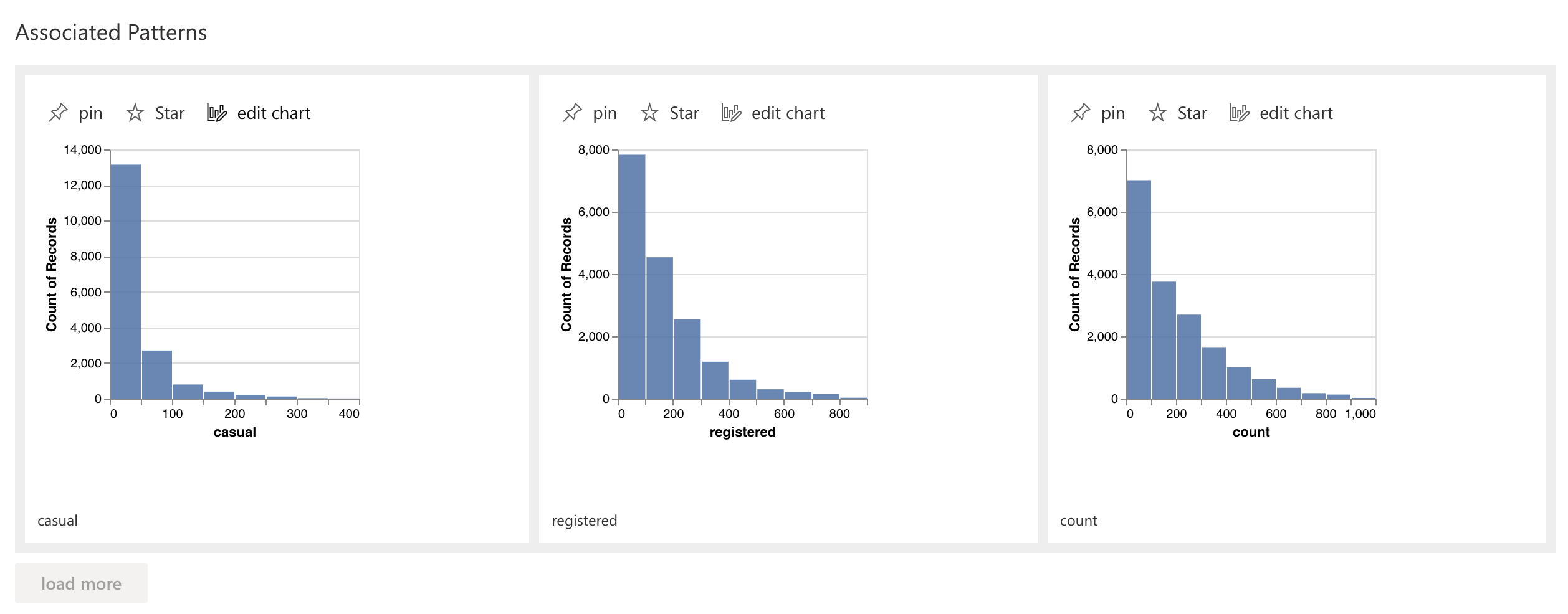
Since we want to study the registered users, locate the registered chart, and click on the pin button.

On the next screen, scroll down to the Associated Patterns section. RATH automatically generates a chart named: "registered, casual". This chart demonstrates the relationship between registered users and casual users.
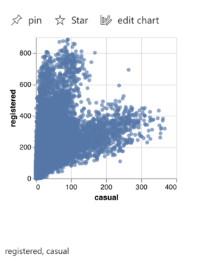
Click on the Pin button again to study the chart.
Explore patterns, features and underlying trends
The "registered, casual" chart immediately raises questions for us: why the data is aggregated into two clusters?
Scroll down to the Associated Patterns section, RATH automatically understands our intent and generates a "workingday registered, casual" chart that answers our question.
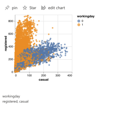
As this chart demonstrates, customers prefer to use bike-sharing services on weekdays, while casual users tend to ride shared bikes on weekends for fun.
Explore subset data
You can also explore a subset of your data instead of the whole dataset. Navigate to the Associated Subsets section, where RATH automatically generates subsets based on analyzing your data.
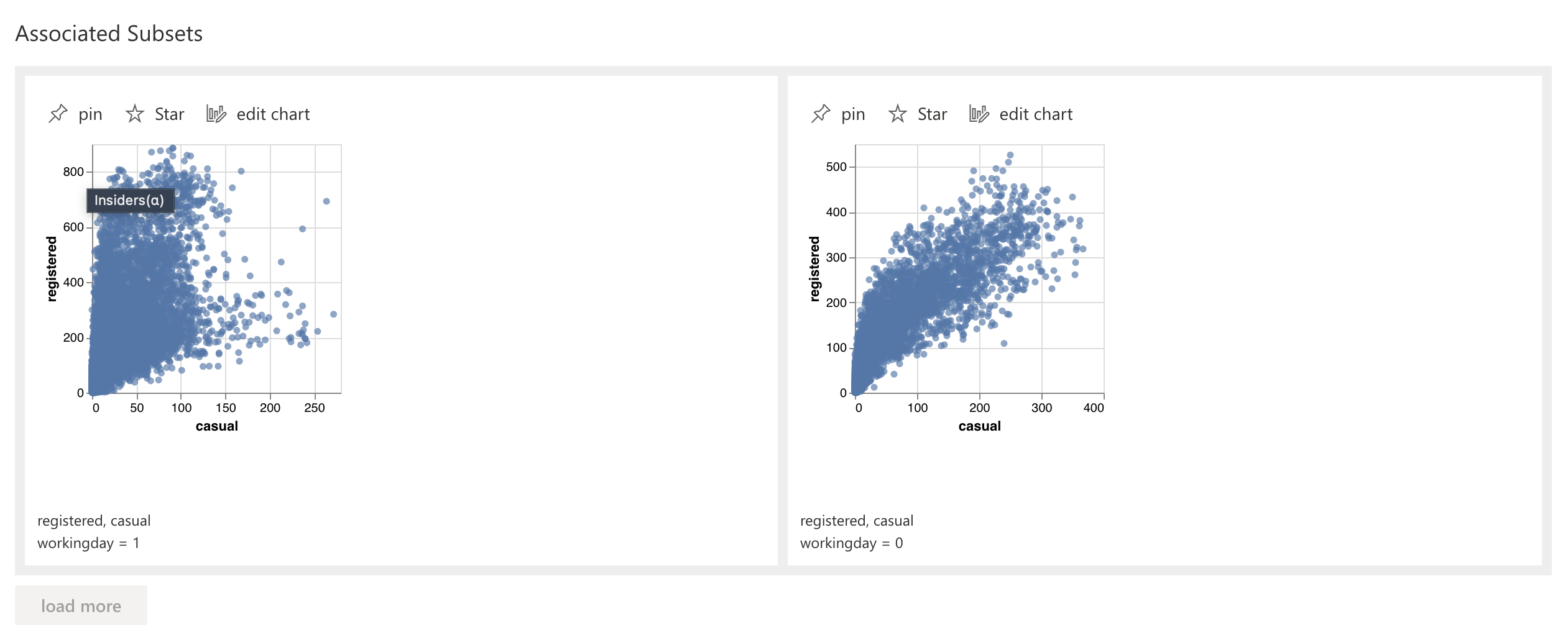
Select a subset and click on the pin button. RATH generates new charts about the selected subsets categorized by associated patterns and features.
This feature particularly helps when the dimensions of the dataset are overwhelming. For example, you are trying to study data from an e-commerce shop with hundreds of goods categories.
Case 2. Explore preferred hours for registered users
Explore patterns, features and underlying trends
In this case, we would like to know at what time of day, the registered users prefer to use the bike-sharing service.
We begin the data exploration by pinning the registered chart. Scroll down to the Associated Features section and locate the "hour, registered" chart, which suggests the rush hours of bike-sharing services on a working day.
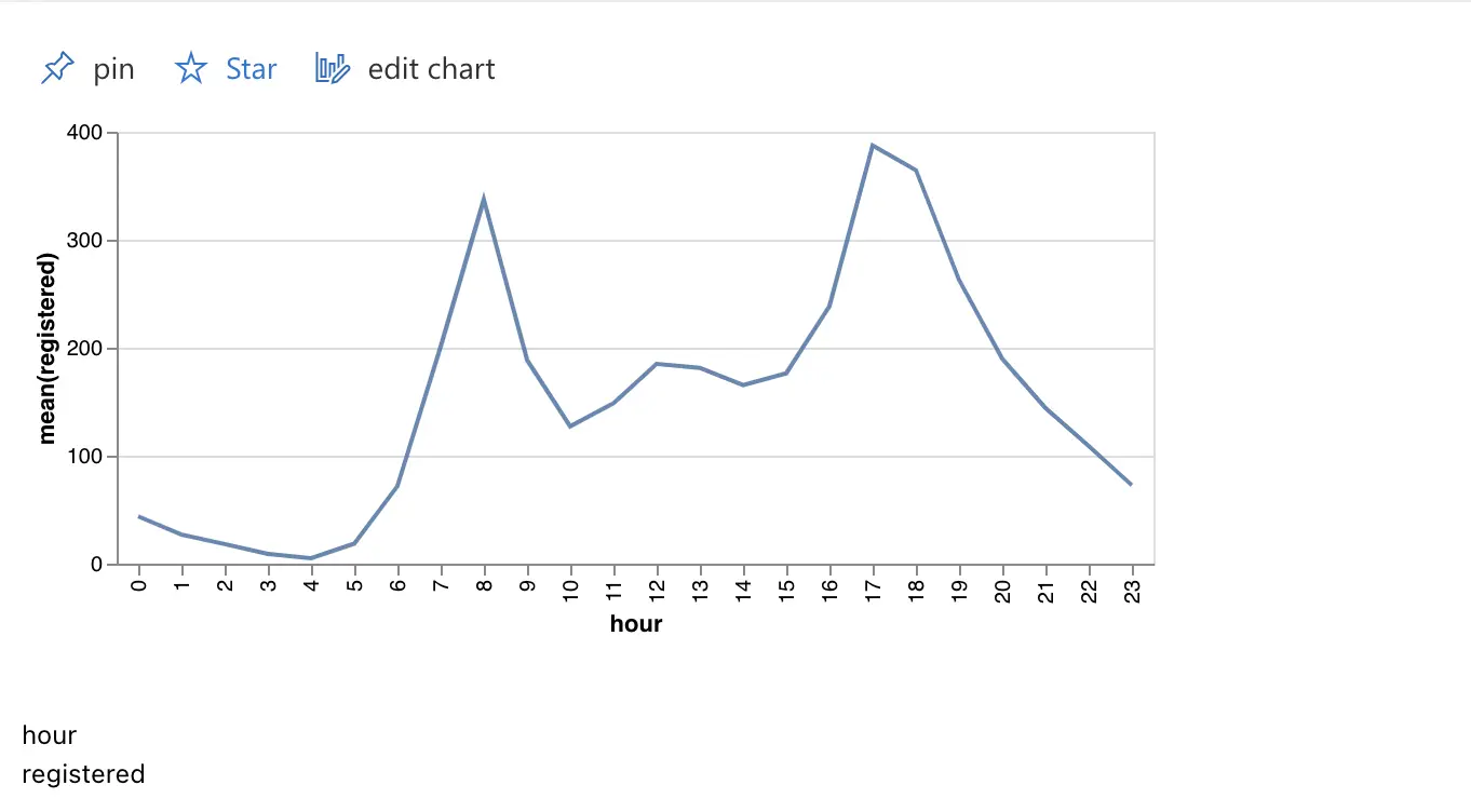
Click on the Pin button to study this chart. We want to explore further, is there any potential variable that affects the hourly change of registered users?
Scroll down to the Associated Features section, and locate the "hour, season registered" chart.
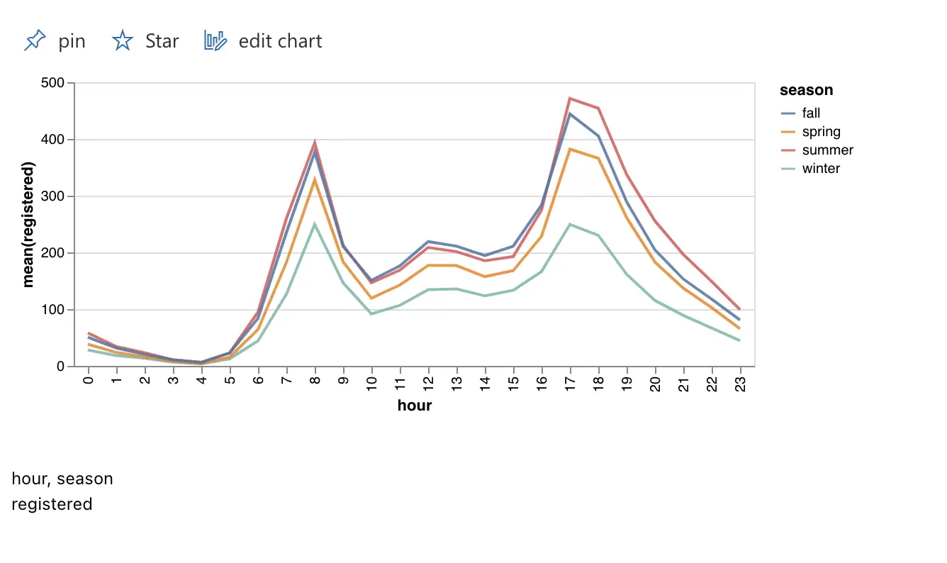
Tip: You can click on the Load More button to generate more Associated Patterns/Features.

This chart demonstrates the seasonal changes of the registered users. You can figure out the peak usage hour for registered users are holiday nights in summer.
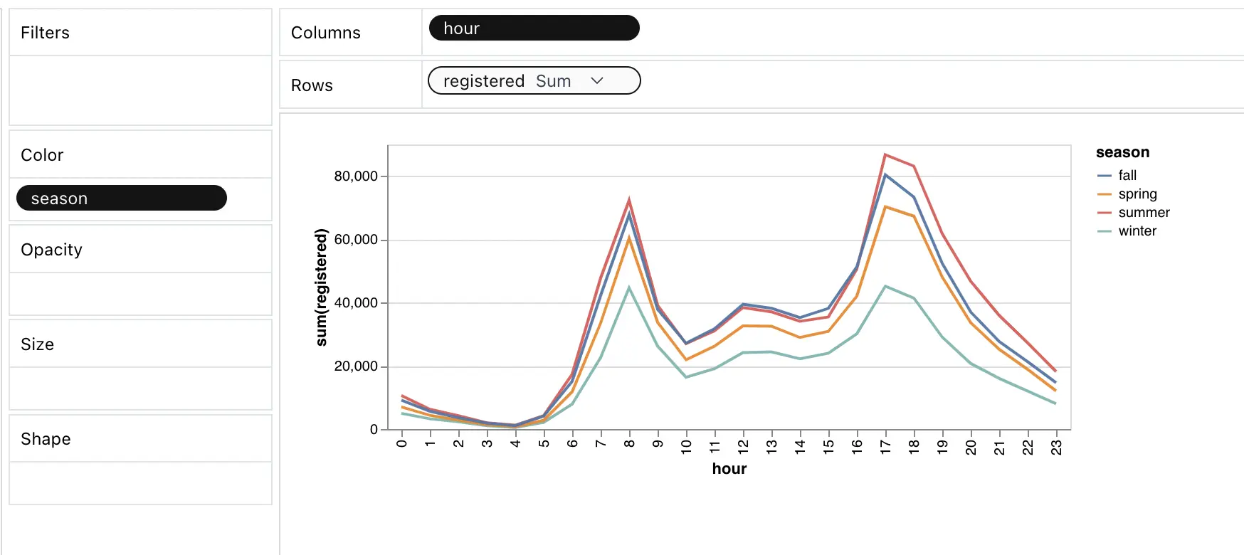
Customize your charts
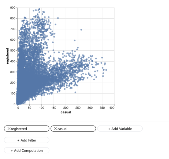
If you find out a chart and prefer to edit it with a tableau-alternative interface, Click on the Edit Chart option to customize the chart on the Manual Exploration tab. For more details, refer to the Build Customized Charts chapter.
Best practices
-
Data Copilot fits best for data analysts and data scientists as an automated AI assistant, without disturbing your existing workflow. You can use RATH to generate some visualization and insights, conduct automated data exploration, and move back to your existing data analysis workflow.
-
For users who want to explore datasets with a painter-like interface and tools, Data Painter offers a painter-like interface for direct and creative data exploration without the need for complicated BI software or programming languages.