How to Make a Pie Chart in Google Sheets with RunCell
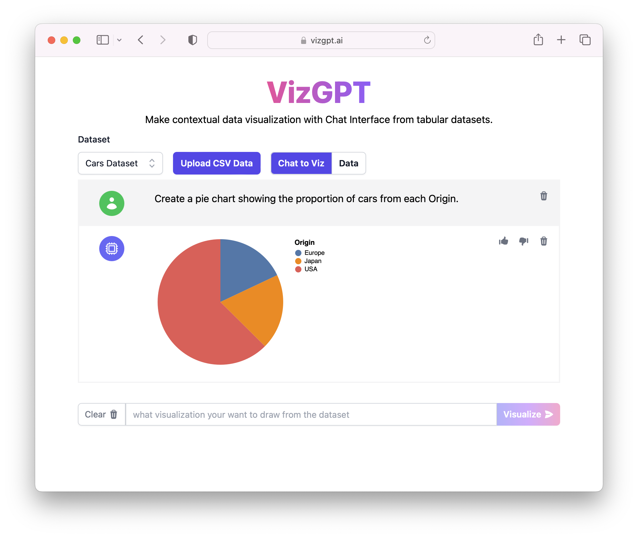
If you want a quick first draft in RunCell, start with a prompt like this:
Create a Pie Chart from the data
You can draft the pie chart in RunCell first, then download it and move it into Google Sheets.
If you want to start from your own CSV instead of the sample data, use RunCell first and export the chart once it looks right.
Introduction
In data visualization, pie charts are an essential tool for representing percentages and proportions. Google Sheets, a widely-used spreadsheet software, provides easy and dynamic pie chart creation functionality. In this guide, we'll cover how to make a pie chart, create a pie chart with percentages, and make a pie chart with data in Google Sheets. Whether you're using Google Sheets for Mac, iPad, iPhone, or any other platform, this guide has got you covered.
How to Make a Pie Chart in Google Sheets
Google Sheets is an excellent tool for creating pie charts. Here's how you can make a simple pie chart:
- Open Google Sheets and create a new spreadsheet.
- In the first column, list your categories. In the second column, input your data.
- Highlight the cells containing the data.
- Click on the "Insert Chart" icon in the toolbar.
- In the "Chart type" dropdown, select "Pie Chart".
Adding Percentages to Your Pie Chart
Including percentages in your pie chart in Google Sheets can give a clear overview of your data's distribution. Here are the steps:
- Follow the previous steps to create a pie chart.
- Click on your chart to select it.
- In the chart editor on the right, select "Pie chart" under the "Setup" tab.
- Under the "Customize" tab, click on "Pie chart".
- Select "Slice label" and choose "Percentage" from the dropdown menu.
Working with Multiple Data Sets
Creating a pie chart with multiple data sets in Google Sheets is a little more complex but still achievable. You'll need to use a 3D pie chart for this purpose.
- Follow the previous steps to create a pie chart.
- In the chart editor, under the "Setup" tab, change the chart type to "3D Pie Chart".
- Under the "Data range" option, select the range that includes all the data sets.
Conclusion
Creating pie charts in Google Sheets is a straightforward process that allows for robust data visualization. With these tips, you can effortlessly present your data in an understandable format.
FAQs
Here are some common questions about making pie charts in Google Sheets:
-
Q: How to make a pie chart in Google Sheets with multiple data sets? A: To create a pie chart with multiple data sets, you need to change the chart type to "3D Pie Chart" and select the data range that includes all data sets.
-
Q: How to create a pie chart in Google Sheets on iPhone? A: The process to create a pie chart on iPhone is similar to the one on the desktop. Just open Google Sheets, enter your data, highlight it, and choose "Insert chart" from the "+" menu.
-
Q: How to make a pie chart with percentages in Google Sheets? A: After creating a pie chart, click on it, go to the "Customize" tab in the chart editor, click on "Pie chart", select "Slice label", and choose "Percentage".
