How to Make an Area Chart
Area charts are a powerful tool in data visualization. In this comprehensive guide, we will explore the basics of area charts, their benefits, common mistakes to avoid, and how to create them using the right visualization tools. We will also delve into overlapping and stacked area charts, providing you with the knowledge and skills needed to effectively use this versatile chart type.
What is an Area Chart?
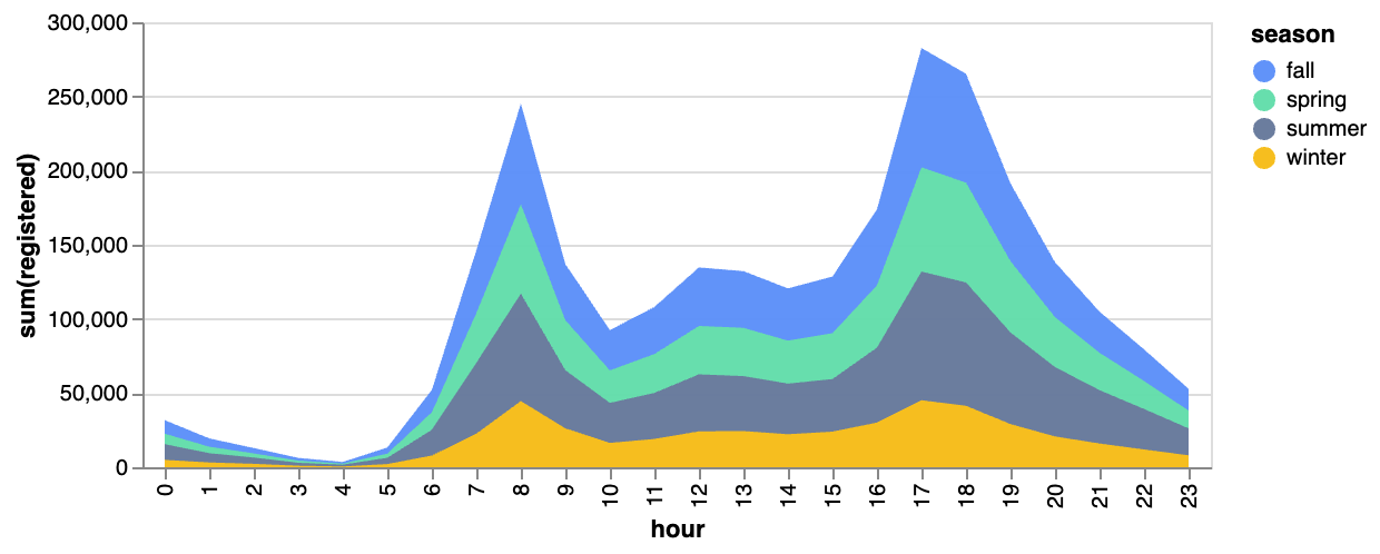
An area chart is a type of data visualization that represents quantitative data across a continuous interval or time frame. It emphasizes the magnitude of change over time and can be used to highlight trends and patterns in the data. Area charts are similar to line and bar charts, but with a filled area beneath the plotted line, providing a visual representation of the data's volume.
How to Create an Overlapping or Stacked Area Chart
In RATH (opens in a new tab), you can easily create an overlapping or stacked area chart with the following steps:
-
Import your Data: Log into your RATH (opens in a new tab) account, and upload your CSV or Excel file to RATH, or connect your online database to RATH
-
Select the Chart Type: On the Exploration tab, choose the Mark Type button on the Tools bar.
-
Create the Chart: Now, create a customized chart by dragging and dropping variables to shelves.
-
Review and Refine: Review your area chart for accuracy and clarity, making any necessary adjustments to ensure the chart effectively communicates your data insights.
Benefits of Using an Area Chart
Area charts offer several benefits, including:
-
Visualizing Volume: The filled area beneath the plotted line highlights the magnitude of change in the data, making it easy to observe trends and patterns.
-
Comparing Data Series: Area charts can be used to compare multiple data series, enabling the viewer to identify relationships and differences between them.
-
Highlighting Trends: By emphasizing the change over time, area charts can effectively display trends, patterns, and seasonality in the data.
-
Customizability: Area charts offer a variety of customization options, such as colors, shading, and chart types, allowing you to create visually appealing and informative charts.
When to Use an Area Chart in Data Visualization
Area charts are ideal for visualizing data that changes over time, particularly when you want to emphasize the volume or magnitude of change. They are also useful for comparing multiple data series, analyzing the cumulative effect of data points, and identifying trends and patterns. Some scenarios in which area charts can help maximize your data insights include financial analysis, marketing performance tracking, resource management, environmental data monitoring, and demographic trend analysis.
Common Area Chart Design Tips
-
Use Consistent Colors: Choose a color scheme that is consistent across all data series to make it easy for the viewer to identify each series.
-
Label Your Axes: Clearly label your x and y axes to provide context and improve the chart's readability.
-
Use Shading Strategically: In overlapping area charts, use different shades or opacities for each data series to make it easier to differentiate between them.
-
Keep It Simple: Avoid cluttering your chart with too many data series or unnecessary elements, which can make it difficult to read and understand.
-
Emphasize Key Data Points: Use annotations, highlights, or other visual cues to draw attention to important data points or trends.
Conclusion
By understanding the basics, best practices, and various chart types, and by utilizing the top tools and design tips, you can create compelling area charts that effectively communicate your data insights.