How to Create a Heatmap
Heatmaps are an excellent tool in data visualization, effectively communicating complex data in an easy-to-understand format. This guide will walk you through the process of creating a heatmap using RATH.
What is a Heatmap?
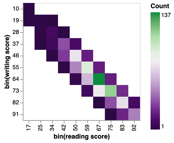
Heatmaps are a type of data visualization tool that uses color to represent different values. They are used to show relationships between two variables, one plotted on each axis. By observing how cell colors change across each axis, you can observe if there are any patterns in value for one or both variables. The colorings of the cells can correspond to various metrics, such as a frequency count of points in each bin, or summary statistics like mean or median for a third variable.
Creating a Heatmap in RATH
In RATH (opens in a new tab), you can create a heatmap following these steps:
-
Import your Data: Log into your RATH (opens in a new tab) account and upload your CSV or Excel file to RATH, or connect your online database to RATH.
-
Select the Chart Type: In the Exploration tab, choose the Mark Type button on the Tools bar and select 'Rectangle'.
-
Convert the Variable: Left-click on your variable, and a menu will pop up. Choose the
BINoption. -
Create the Chart: Drag and drop your variables onto the shelves, defining the x-axis, y-axis, and color variable for your heatmap.
Use Cases for Heatmaps
Heatmaps are excellent tools for revealing patterns or trends in your data. They are particularly useful when you don't need exact data values, but rather, wish to portray overarching trends and relationships between data points. They can also bring attention to significant outliers, or points that deviate from the general data direction. Here are a few scenarios where a heatmap is a good choice:
-
Comparing average room rental prices based on location and property type.
-
Visualizing geographic data, such as election results across different districts or population density.
-
Analyzing the number of customer orders across various store locations by month of the year.
-
In the context of website analytics, heatmaps can provide insights into how users interact with your website.
Advantages of Heatmaps
Heatmaps are beneficial in several ways:
-
Simplifying Complex Data: Heatmaps help visualize complex data sets in an easy-to-understand format.
-
Spotting Patterns: They allow easy identification of patterns, correlations, and unusual data points.
-
Comparing Categories: Heatmaps enable comparison across different variables.
-
Customization Options: With color schemes and labeling, heatmaps can be customized for better visualization.
Heatmap Design Tips
-
Pick a Good Color Scheme: The color scheme should accurately represent your data and be easy for users to understand.
-
Label Clearly: All axes and categories should be clearly labeled to provide context.
-
Scale Your Data: Scaling can help highlight patterns and correlations in the heatmap.
-
Keep It Simple: Avoid too much information on your heatmap. Keep it clean and focused.
-
Know Your Audience: Design your heatmap keeping your audience in mind. Make sure it's easy for them to understand.
Conclusion
By understanding the basics of heatmaps and using these design tips, you can create effective and intuitive heatmaps with RATH. Enjoy your data visualization journey.