How to Create a Graph in Google Docs
If you want a quick first draft in RunCell, start with a prompt like this:
Create a Graph from the data
You can draft the chart in RunCell first, then download it and place it in Google Docs.
If you want to start from your own CSV instead of the sample data, use RunCell first and export the chart once it looks right.
Introduction
Creating a graph in Google Docs is an effective way to present data, making it more understandable and engaging for your audience. This guide provides step-by-step instructions on how to create graphs, including using alternative tools like RunCell for advanced visualizations.
How to Create a Graph in Google Docs by Using RunCell
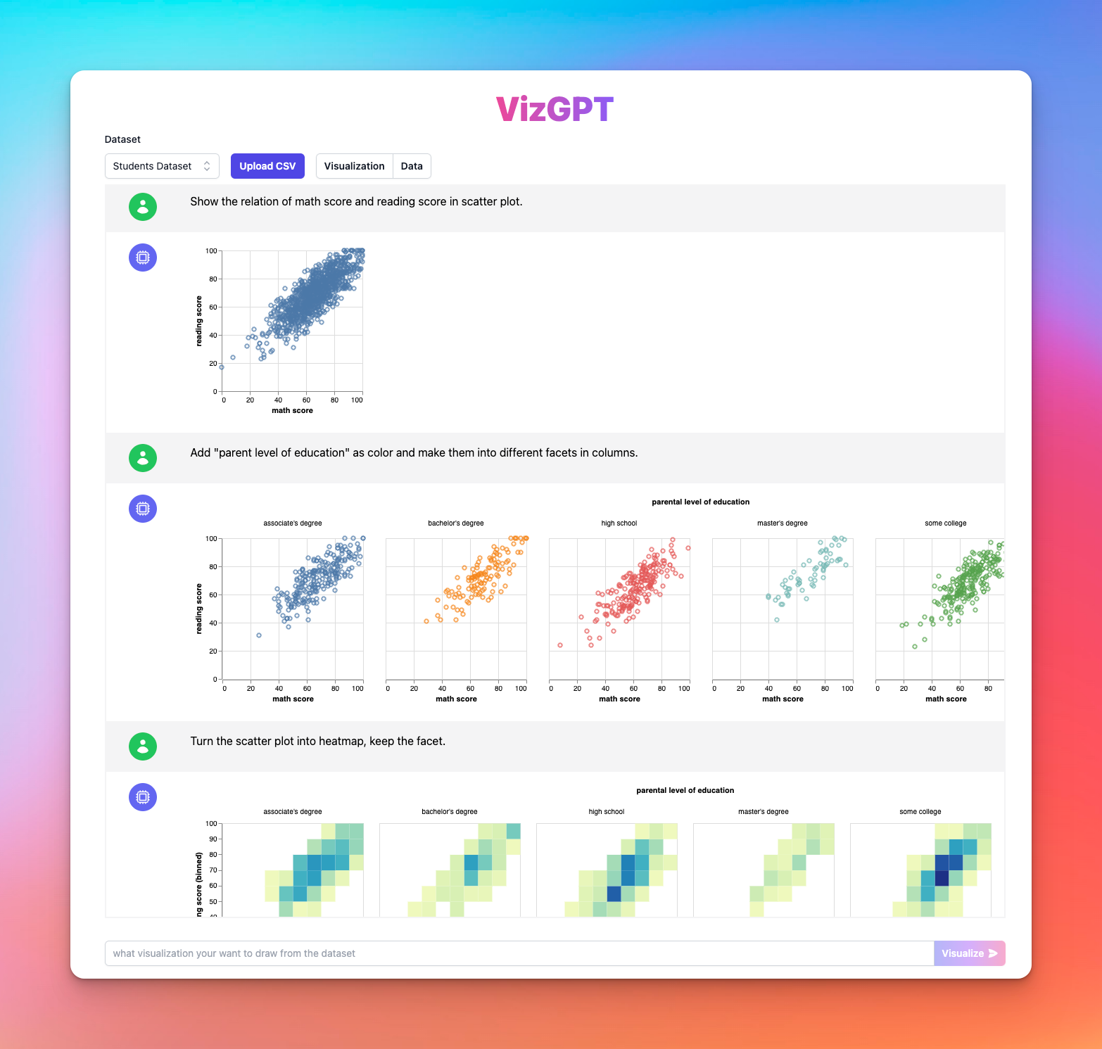
RunCell is a revolutionary tool built for Jupyter that makes the creation of charts and visualizations effortless. You can use it to create complex graphs without writing a line of code. Here's how you can leverage the power of RunCell:
- Upload your data in CSV format to RunCell.
- Provide a prompt to guide the tool on the type of chart you want to create.
Prompt: Create a heatmap from the dataset.
- Click on the Visualize button.
- Download the graph and import to Google Docs.
After a few moments, your chart will be ready. This tool is a fantastic alternative for those who find graph creation in Google Docs challenging.
If you want to keep refining the chart before exporting it, continue working in RunCell (opens in a new tab).
How to Create a Graph in Google Docs: A Detailed Guide
Creating a graph in Google Docs involves multiple steps. This comprehensive guide takes you through each step, ensuring that you can create visually stunning and informative graphs with ease.
Step 1: Open a Google Docs Document
Before you start creating a graph, you need to open a Google Docs document. If you don't have one, creating it is quite simple. Go to your Google Drive, click on 'New' and then choose 'Google Docs.' If you already have a document where you want to insert the graph, open it instead.
Remember, Google Docs is a powerful word processing tool that allows you to create, edit, and store documents online. You can access your files from any computer, tablet, or smartphone that is connected to the Internet.
Step 2: Click on Insert > Drawing > New
Now that your document is open, click on 'Insert' from the menu bar at the top of the screen. A drop-down menu will appear. From this menu, select 'Drawing,' then 'New.' This will open up a new window where you can draw your graph.
The 'Drawing' tool in Google Docs is versatile. It allows you to create drawings, diagrams, and graphs by providing several shapes, lines, and text boxes that you can manipulate as needed.
Step 3: Draw Your Graph
Now comes the fun part – creating your graph. In the drawing window, click on the shape icon and select the type of graph you want to create. You can choose between a pie chart, bar graph, line graph, among others.
Next, input your data into the graph. To do this, right-click on the graph and choose 'Edit chart.' This opens a new window where you can enter your data or import it from a Google Sheets document. Remember to label your graph accurately to make it easy for readers to understand.
Step 4: Customize Your Graph
After you've input your data, you can customize your graph to match your document's overall style and color scheme. You can change the colors of the bars, lines, or slices, add a title, adjust the axis labels, and much more. The customization options in Google Docs are quite extensive, allowing you to create visually appealing graphs that engage your audience.
Furthermore, you can experiment with different layouts and chart styles to best represent your data. The possibilities are practically endless. It's all about choosing the one that best fits your data and the message you want to convey.
Step 5: Save and Insert Your Graph
Once you're satisfied with your graph, it's time to insert it into your Google Docs document. To do this, click on the 'Save and Close' button at the top right corner of the drawing window. The graph will then appear in your document.
You can adjust the graph's size and position within the document by clicking and dragging. If you need to make any changes, simply click on the graph, and then click 'Edit' from the options that appear.
Conclusion
To recap, creating a graph in Google Docs involves opening a document, navigating to the 'Drawing' tool, creating your graph, customizing it to suit your needs, and finally inserting it into your document. By following these steps, you can add a professional touch to your documents, making them more engaging and easier to understand.
FAQs
Q1: Can I use RunCell to create a graph in Google Docs?
Yes, RunCell can be used to create graphs that can then be inserted into a Google Docs document.
Q2: Is RunCell free to use?
RunCell's pricing can be found on their official website. Some features may be free, while others may require payment.
Q3: What types of graphs can I create in Google Docs?
Google Docs allows you to create basic types of graphs such as bar, line, and pie charts.