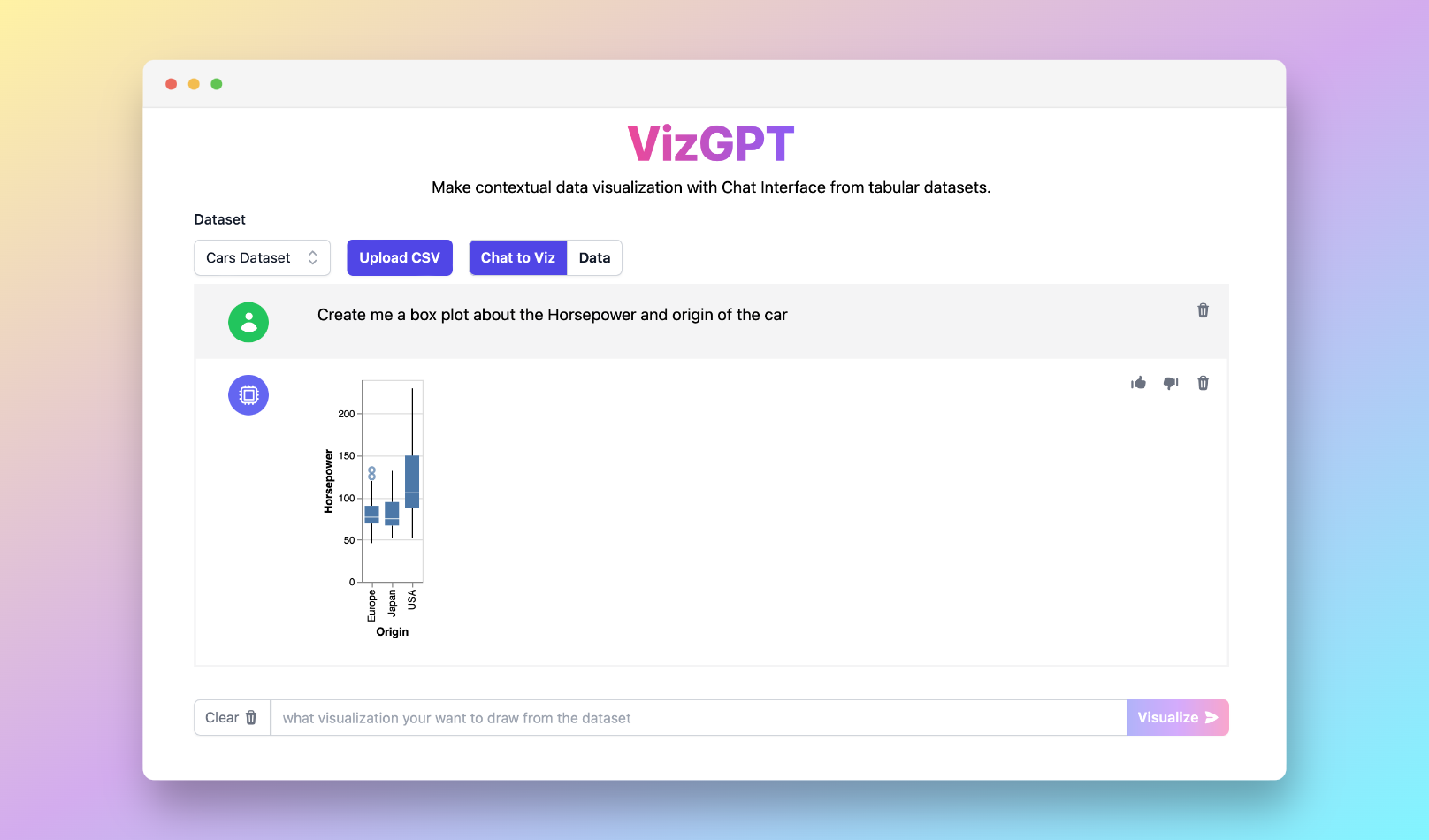
Best Online Box Plot Calculator with RunCell
If you want a quick first draft in RunCell, start with a prompt like this:
Create a box plot from the data set
If you want to start from your own CSV instead of the sample data, use RunCell first and export the chart once it looks right.
Introduction
Box plots, also known as box and whisker plots, are graphical representations of data that deliver insights into data distribution and variability. They are extensively used in statistical analysis and data visualization. This guide aims to unravel the fundamentals of box plots, their purpose in statistical analysis, and the process of creating them using a box plot calculator.
Online Box Plot Calculator: What it is?
A box plot presents the "5 number summary" of data: the minimum, first quartile (Q1), median, third quartile (Q3), and maximum. The box itself displays the interquartile range (IQR), which is the range between Q1 and Q3, representing the middle 50% of the data. The line inside the box signifies the median. The 'whiskers' on either side of the box extend to the maximum and minimum data points that are not considered outliers. Outliers, typically symbolized as dots or stars, represent data points significantly distant from others.
Box plots are effective for comparing data sets, identifying outliers, and understanding data spread and skewness. However, they do not display the distribution's exact shape or the underlying frequency distribution, unlike histograms or kernel density plots.
Calculating Quartiles Using Online Box Plot Calculator
Calculating quartiles is a fundamental step in creating a box plot. Quartiles divide a rank-ordered data set into four equal parts. Q1 is the middle value between the smallest number and the median of the dataset, Q2 is the median, and Q3 is the middle value between the median and the highest number.
Box plot calculators online, such as Alcula, Omni Calculator, or AtoZmath.com, provide an easy way to generate box plots from raw data. Alternatively, users can manually calculate quartiles and plot using Excel or statistical calculators like TI-84. Modern box plot makers offer features like interquartile range calculation, horizontal and vertical orientation, mean and standard deviation calculation, and even detection of outliers for more advanced descriptive statistics.
Interpreting Box Plots with Online Box Plot Calculator
Understanding box plots requires knowledge of their components. The box represents the IQR, offering insight into the data's spread. The median line within the box indicates the data's central tendency. Whiskers extending from the box represent variability outside the upper and lower quartiles, while outliers are marked as individual points.
The positioning and length of these components provide insights into the data's distribution. For instance, a longer box or wider whiskers suggest more variability in the dataset. Skewness can be determined by comparing the box's location within the whiskers or the median's position within the box.
Comparison and Significance of Online Box Plot Calculator
Box plots are useful for comparing distributions between different data sets. When viewing two or more box plots side by side, one can examine differences in median, spread, and symmetry.
The whiskers in a box plot have statistical significance, indicating the range within which most data falls, and helping to identify any potential outliers.
Modified box plots, with their specific handling of outliers, offer additional robustness against skewed interpretations. These plots use the IQR to determine what constitutes an outlier, providing a more nuanced view of the data.
Conclusion
In conclusion, box plots are a powerful tool for statistical analysis and data visualization. They provide a quick view of the data distribution, variability, and outliers. Tools like box plot calculators and box plot makers online simplify the process of creating and interpreting these plots. However, understanding the principles behind box plots, such as quartiles and interquartile ranges, remains essential for accurate data interpretation.
FAQs
What is the importance of quartiles in a box plot?
Quartiles divide data into four equal parts, allowing the visualization of the median, interquartile range, and overall data spread in a box plot.
How can box plots be used for comparison?
Box plots allow side-by-side comparison of different data sets, highlighting differences in median, spread, symmetry, and potential outliers.
What is the role of outliers in a box plot?
Outliers in a box plot are data points significantly distant from others. They are important for identifying anomalies in the data.

