How to Make a Bar Chart
Bar charts are a versatile and easy-to-understand way to present data in a visually appealing manner. They're great for comparing categories, identifying trends, or concisely displaying information. In this article, we'll explore a few common types of bar charts and discuss their specific use cases.
Easily Create a Bar Chart in RATH
Creating a bar chart in RATH is a straightforward process that can be completed in a few easy steps. RATH is a web-based platform that makes it easy to create and customize data visualizations without needing any coding skills. Here's how to create a bar chart using RATH:
-
Visit RATH (opens in a new tab) Website and create an account.
-
Import your data to RATH. You can upload CSV, Excel, import data from AirTable, or connect to a popular online database such as ClickHouse, etc.
-
Click on the "Exploration" tab. You are granted a UI that is similar to traditional BI software. You can easily create a bar chart by dragging and dropping variables. RATH provides a user-friendly interface that makes it easy to create and customize bar charts, even if you're not familiar with data visualization.
-
Once you're satisfied with your chart, save and export it in the format of your choice.
Bar Chart Examples
RATH offers you flexible options to create a multi bar chart and other complicated form of bar charts.
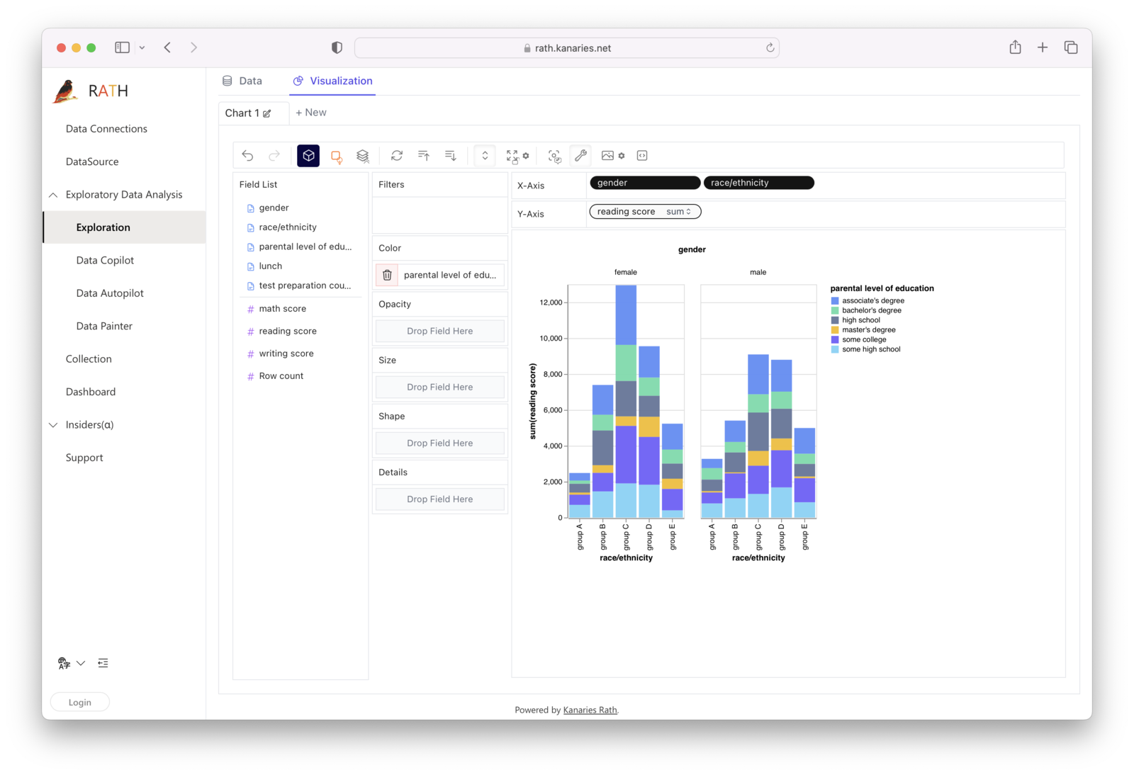
Segmented Bar Chart, or Stacked Bar Chart
A segmented bar chart, also known as a stacked bar chart, is perfect for visualizing the composition of data within different categories. Each bar represents a category, and the segments within the bar represent the various components that make up that category. A stacked diagram is particularly useful when you want to display the proportions of different elements within a single category, as well as compare those proportions across multiple categories.
You can easily create a stacked bar chart in RATH. Import your data. Complete the following steps in the Exploration tab, and create a stacked column chart with two sets of data:
Horizontal Bar Chart
A horizontal bar chart is similar to a standard vertical bar chart, with the key difference being the orientation of the bars. Instead of vertical bars, the data is presented using horizontal bars. This chart type is ideal when dealing with long category labels or when you have many categories to compare, as it provides more space for labels and can accommodate more categories without looking cluttered.
To create a horizontal stacked bar chart in RATH, you can create a bar chart, and click on the Transpose button on the Tools bar:
Double Bar Chart, or Grouped Bar Chart
A double bar chart, also known as a grouped bar chart, is used to display two sets of data side by side within the same chart. This type of chart is excellent for comparing the values of two different data series across the same categories. Double bar charts(grouped bar graphs) are particularly useful when you want to show the relationship or differences between two related data sets.
RATH could be your perfect double bar graph maker. Use the following steps to create a double bar chart:
Histogram vs Bar Chart
While histograms may look similar to bar charts, they serve different purposes. Histograms display the distribution of continuous data, whereas bar charts show categorical data. In a histogram, the bars represent intervals (or bins) of continuous data, and the height of each bar indicates the frequency of data points within that interval. Bar charts, on the other hand, have discrete bars for each category, and the height of the bar corresponds to the value of that category.
To create a Histogram in RATH, you can select a variable and choose Variance option. Watch the following demo video to create a Histogram.
Clustered Stacked Bar Chart and 100 Stacked Bar Chart
A clustered stacked bar chart combines the features of a grouped bar chart and a stacked bar chart, allowing you to display multiple data series with subcategories within the same chart. A stacked bar plot is perfect for comparing proportions across categories while maintaining a clear distinction between the data series.
Here is how to create a clustered stacked bar chart in RATH:
A 100 stacked bar chart, on the other hand, normalizes the data in each category so that the total height of each bar is 100%. A 100 stacked column chart is particularly useful for highlighting the relative proportions of different components within each category.
Diverging Bar Chart and Overlapping Bar Chart
A diverging bar chart is used to compare values across two categories or groups, with bars extending in opposite directions from a central axis. A diverging stacked bar chart is ideal for illustrating the difference or contrast between data sets, such as comparing performance or sentiment.
An overlapping bar chart, on the other hand, displays two sets of data within the same chart by overlaying one set of bars on top of the other. This chart type is useful for comparing the values of two related data series across the same categories when the data points are relatively close in value.
Conclusion
By understanding these various bar chart types and customizations, you'll be able to effectively display your data in the most appropriate and visually appealing way. RATH (opens in a new tab)'s user-friendly interface and extensive customization options make it easy to create and share insightful bar charts, regardless of your experience level.