Top 15 Open Source Data Visualization Tools for 2025
In today's data-driven world, the significance of data visualization cannot be overstated. It provides a graphical representation of information and data, making complex data more understandable, accessible, and usable. Open-source tools, in particular, have gained immense popularity in this domain, offering powerful features without the hefty price tag. This guide aims to shed light on the best open-source data visualization tools slated for prominence in 2025.
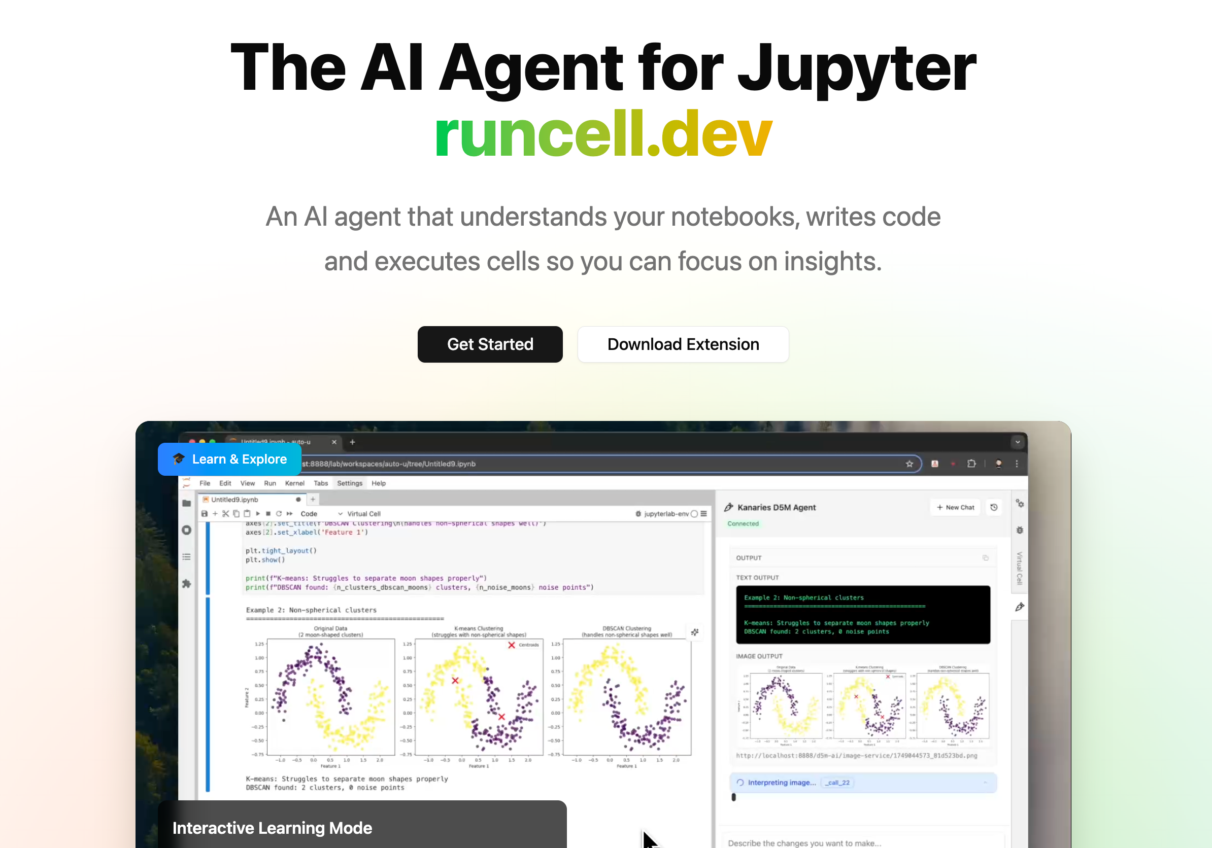
The AI Agent for Jupyter Notebooks
An AI agent that understands your notebooks, writes code and executes cells so you can focus on insights. Accelerate your data science workflow with intelligent automation that learns from your coding patterns.
What is Data Visualization?
At its core, data visualization is the practice of translating information into a visual context, such as a map or graph, to make data easier for the human brain to understand. This visual representation can expose patterns, trends, and insights in the data that might remain unnoticed in text-based data. In essence, data visualization is a bridge between the technical and non-technical, providing a clear view of complex data sets.
Why Use Open Source Tools for Data Visualization?
The software industry's trajectory towards open-source solutions is evident, and data visualization tools have not been left behind. The preference for open-source in this arena can be attributed to several compelling reasons:
-
Cost-Effectiveness: The absence of licensing costs with open-source tools makes them financially appealing. This cost advantage ensures that a diverse audience, encompassing startups, small to medium enterprises, and individual professionals, can access premium tools without straining their budgets.
-
Customizability: Open-source tools grant users access to their source code. This transparency allows for modifications, feature additions, or rectifications, ensuring the tool is tailored to meet specific needs.
-
Community Support: A defining feature of open-source tools is the robust community that backs them. These communities, consisting of experts, developers, and everyday users, promote collaboration, facilitate knowledge exchange, and offer invaluable support.
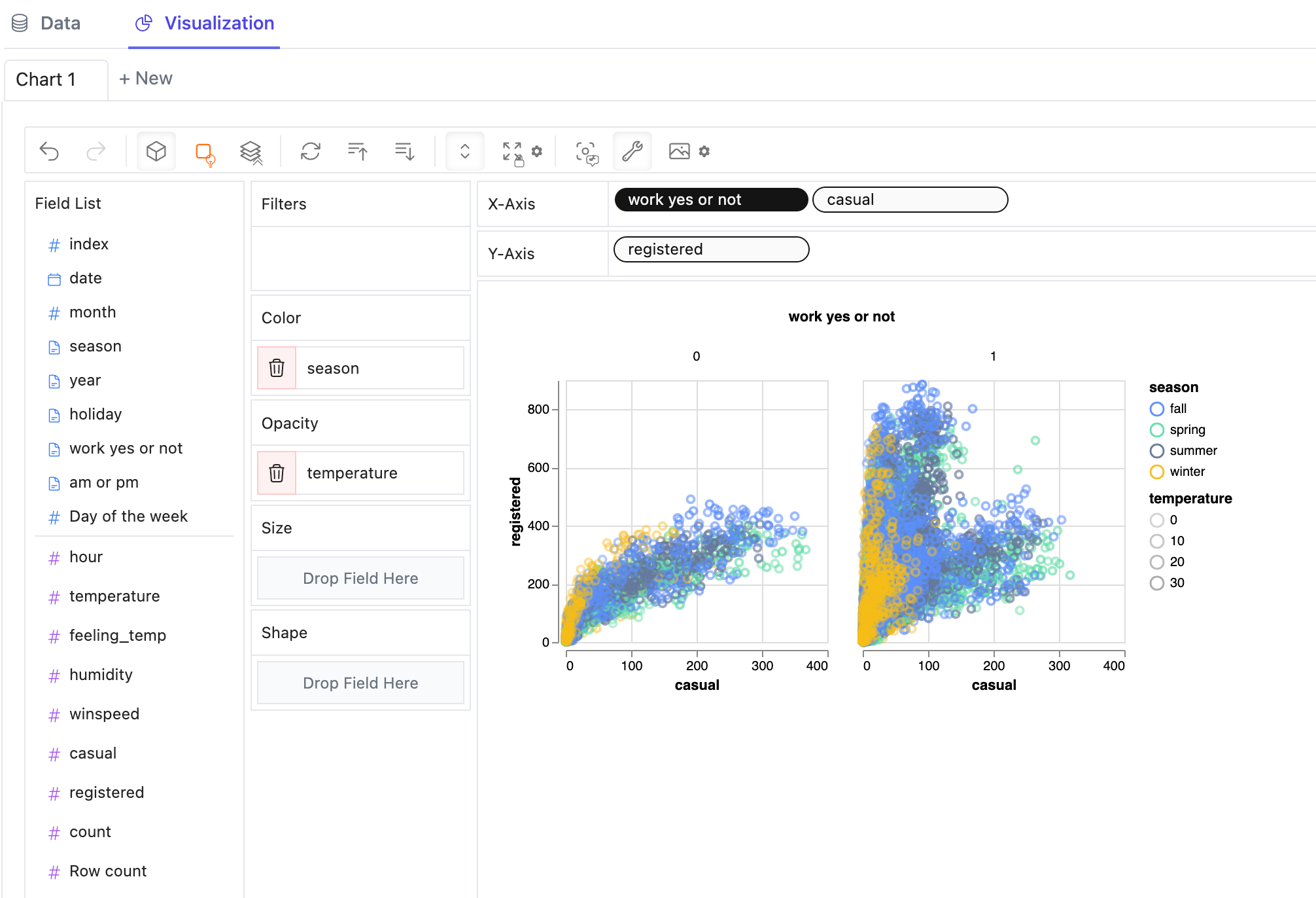
PyGWalker: Open Source Data Visualization Tool that Replaces Tableau for Free
Among the selection of Open Source Data Visualization Tools, PyGWalker (opens in a new tab) has emerged as a tool worth noting. Designed with a focus on exploratory data analysis, PyGWalker presents a fresh approach to data visualization.

Description: PyGWalker seamlessly transforms pandas dataframes into an interactive interface, mirroring the capabilities of platforms like Tableau. It adeptly combines Python's computational prowess with the interactive essence of renowned visualization platforms.
Usage: Using PyGWalke could be a straightforward process. You can easily test it out in Kaggle Notebook or Google Colab Notebook:
| Try PyGWalker in Kaggle (opens in a new tab) | Try PyGWalker in Google Colab (opens in a new tab) |
|---|---|
You can easily setup PyGWalker in your Jupyter Notebook with the following steps:
pip install pygwalker
import pandas as pd
import pygwalker as pyg
Import your dataframe
df = pd.read_csv('./bike_sharing_dc.csv', parse_dates=['date'])
walker = pyg.walk(df)
That's it. Now you have a tableau-alternative user interface to analyze and visualize data by dragging and dropping variables.
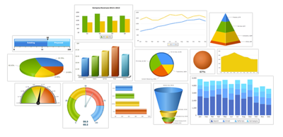
Take a look at some examples that you can create with PyGWalker:

Pros:
- Integration: Designed to work in harmony with Jupyter Notebooks, PyGWalker is a favorite among data scientists and analysts.
- User Experience: The tool prioritizes user experience, offering an intuitive drag-and-drop interface for effortless data visualization.
- Adaptability: Its compatibility with various dataframes, including but not limited to pandas and polars, underscores its versatility.
Cons:
- PyGWalker is a newly developed Python library that needs your feedback and support. Please contribute to the project by dropping issues (opens in a new tab), giving suggestions, sharing on social media or leaving a ⭐ at PyGWalker GitHub (opens in a new tab).
Review: ⭐⭐⭐⭐⭐
Deeper Look at Popular Open Source Data Visualization Tools
The realm of open-source data visualization tools is vast, with each tool offering a unique set of features. Let's delve into a comparative analysis of some popular tools in the space of open source data visualization:
D3.js: A Pioneering Force in Data Visualization

Description: D3.js, an acronym for Data-Driven Documents, has long been a stalwart in the data visualization community. Its ability to bind data to a Document Object Model (DOM) and then implement data-driven transformations to the document sets it apart.
Pros:
- Flexibility: D3.js is renowned for its flexibility, allowing for the creation of a diverse range of visualizations.
- Community Backing: With a vibrant community of developers and users, support and collaboration are always at hand.
Cons:
- Complexity: Its expansive feature set comes with a learning curve, especially for those unfamiliar with JavaScript and SVG.
Use Cases:
- Ideal for creating interactive visualizations for web applications.
- Suitable for projects requiring custom visualizations.
Review: ⭐⭐⭐⭐☆
Matplotlib: Advanced Open Source Data Visualization Tool for Complex Data

Description: Matplotlib is a powerful tool designed to visually represent complex data relations, catering especially to those dealing with intricate datasets.
Pros:
- Versatility: Can handle a wide range of data visualization tasks.
- Integration: Works well with Python and its libraries.
Cons:
- Learning Curve: Might be challenging for beginners.
Use Cases:
- Scientific research.
- Advanced data analysis projects.
Review: ⭐⭐⭐⭐☆
Plotly: Interactive Open Source Data Visualization Tool
![]()
Description: Plotly is an open-source tool that stands out for creating, editing, and sharing interactive data visualizations, catering to both technical and non-technical users.
Pros:
- Interactivity: Allows users to interact with the visualizations.
- Integration: Supports various programming languages like Python, R, and Julia.
Cons:
- Performance: Handling very large datasets might be challenging.
Use Cases:
- Scientific computing.
- Business analytics.
Review: ⭐⭐⭐⭐☆
Candela: Open Source Data Visualization Tool for JavaScript Users
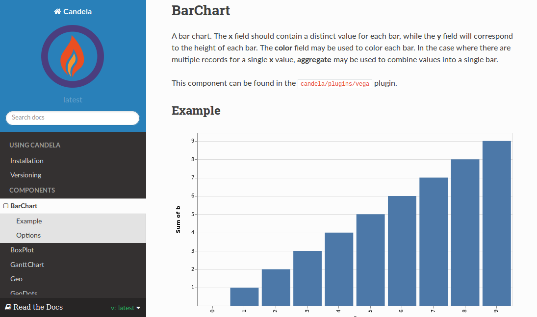
Description: Candela is a dedicated data visualization tool for JavaScript users, designed to create visually appealing representations of data.
Pros:
- JavaScript Integration: Ideal for developers familiar with JavaScript.
- Versatility: Suitable for various data visualization needs.
Cons:
- Learning Curve: Might require some time for non-JavaScript users.
Use Cases:
- Web development projects.
- Interactive data representation on websites.
Review: ⭐⭐⭐☆☆
Google Charts: Comprehensive Data Visualization Tool by Google
Description: Developed by Google, Google Charts offers a myriad of visualization options, from pie charts and bar graphs to tables and maps.
Pros:
- Diversity: Wide range of chart types.
- Integration: Seamlessly integrates with other Google services.
Cons:
- Dependency: Relies on Google's infrastructure.
Use Cases:
- Web development.
- Educational projects.
Review: ⭐⭐☆☆☆
Tableau Public: Free Data Visualization Tool from Tableau
Description: A variant of Tableau, Tableau Public specializes in transforming data into insights and making them accessible to a wider audience on the web.
Pros:
- Public Sharing: Designed for open data sharing.
- Interactivity: Allows users to interact with published data.
Cons:
- Data Privacy: All published data is public.
Use Cases:
- Open data projects.
- Community-driven data analysis.
Review: ⭐⭐⭐☆☆
wpDataTables Lite: Open Source Data Visualization Tool for WordPress
Description: wpDataTables Lite is a popular WordPress plugin that allows users to quickly create charts and tables, making data representation on WordPress sites seamless and efficient.
Pros:
- User-Friendly: Designed for those without a technical background.
- Integration: Seamlessly integrates with WordPress.
Cons:
- Platform Limitation: Specifically tailored for WordPress users.
Use Cases:
- Blogging and content creation on WordPress.
- Quick data representation on websites.
Review: ⭐⭐☆☆☆
FusionCharts: JavaScript-Based Open Source Data Visualization Tool
Description: FusionCharts offers a comprehensive JavaScript charting library, backed by technical support, making it a versatile tool for various data representation needs.
Pros:
- Diverse Chart Options: Extensive charting options available.
- Support: Offers technical support to users.
Cons:
- Price: Some features might be behind a paywall.
Use Cases:
- Business reports and dashboards.
- Web applications.
Review: ⭐⭐⭐☆☆
Bokeh: Interactive Visualizations for Modern Web Browsers
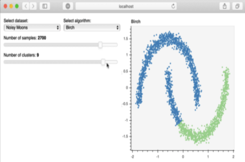
Description: Bokeh, pronounced as 'bo-kay', is a Python library that facilitates the creation of interactive and scalable visualizations. It's designed to generate browser-based visualizations, ensuring a wider reach and compatibility.
Pros:
- Interactivity: Bokeh's strength lies in creating interactive plots that can be embedded in web applications.
- Standalone HTML: The visualizations can be exported as standalone HTML files, making sharing and embedding easier.
Cons:
- Learning Curve: While it offers a lot of features, mastering Bokeh might take some time, especially for those new to Python.
Use Cases:
- Web applications that require embedded interactive plots.
- Data dashboards for business analytics.
Review: ⭐⭐⭐☆☆
Grafana: Open Source Platform for Monitoring and Observability
Description: While Grafana is primarily known for monitoring and observability, its capabilities in data visualization are noteworthy. It allows users to query, visualize, and understand metrics no matter where they are stored.
Pros:
- Data Source Integration: Grafana supports a plethora of data sources, from Prometheus to SQL databases.
- Alerting: Beyond visualization, it offers alerting features based on specific data conditions.
Cons:
- Specific Use Case: It's tailored more for monitoring and might not be the first choice for generic data visualization tasks.
Use Cases:
- IT operations and monitoring.
- Real-time analytics dashboards.
Review: ⭐⭐⭐☆☆
Altair: Declarative Visualization in Python
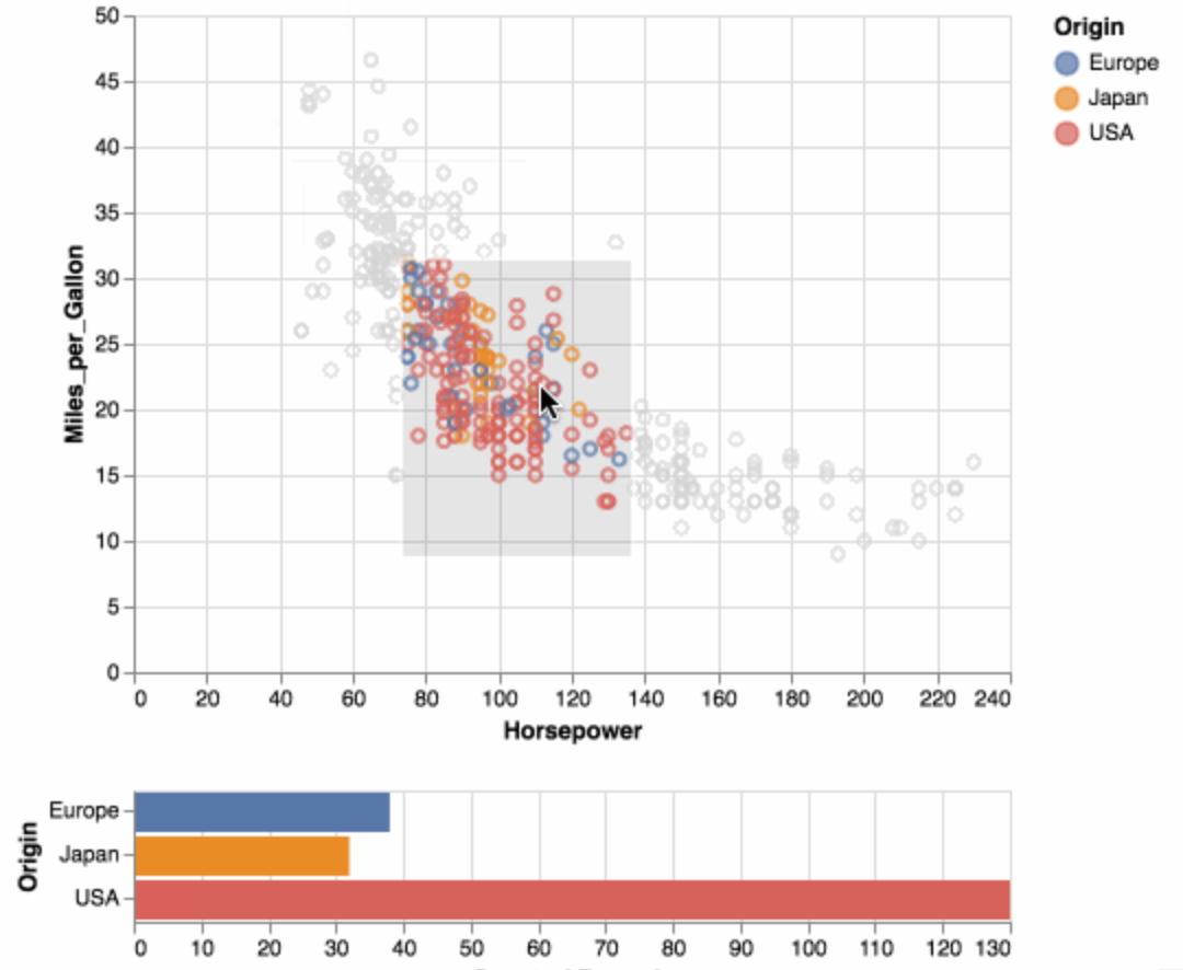
Description: Altair offers a simple API for creating a wide range of visualizations in a declarative manner. It's built on a solid foundation of the Vega and Vega-Lite visualization grammars.
Pros:
- Simplicity: The declarative nature makes it straightforward to create visualizations without verbose code.
- Integration: Works seamlessly with Jupyter notebooks, making it a favorite for data exploration.
Cons:
- Dataset Size Limitation: Given its design, it's more suited for smaller datasets.
Use Cases:
- Quick data exploration and prototyping.
- Academic projects and research.
Review: ⭐⭐⭐☆☆
Datawrapper: Simplifying the Art of Creating Charts and Maps
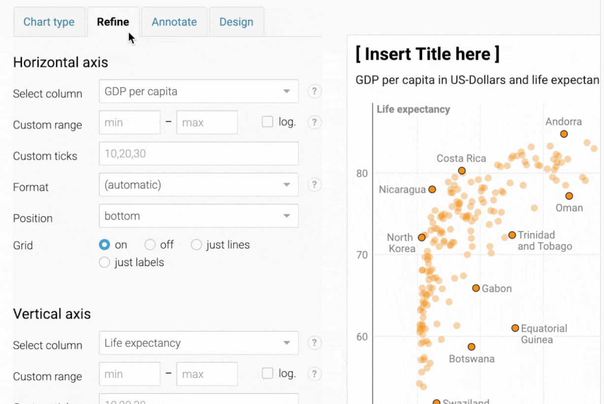
Description: Datawrapper is a tool that caters specifically to journalists, bloggers, and other content creators. It simplifies the process of creating interactive charts and maps without the need for coding.
Pros:
- User-Friendly Interface: Its drag-and-drop functionality ensures that even those without a technical background can create compelling visualizations.
- Embeddable: The visualizations can be easily embedded into websites and articles, making it a favorite among online publishers.
Cons:
- Limited Customization: While it's great for standard visualizations, it might not offer the depth of customization that some other tools provide.
Use Cases:
- Online publishing platforms that require regular data visualizations.
- Quick visualizations for social media sharing.
Review: ⭐⭐☆☆☆
Cytoscape: Network Data Visualization
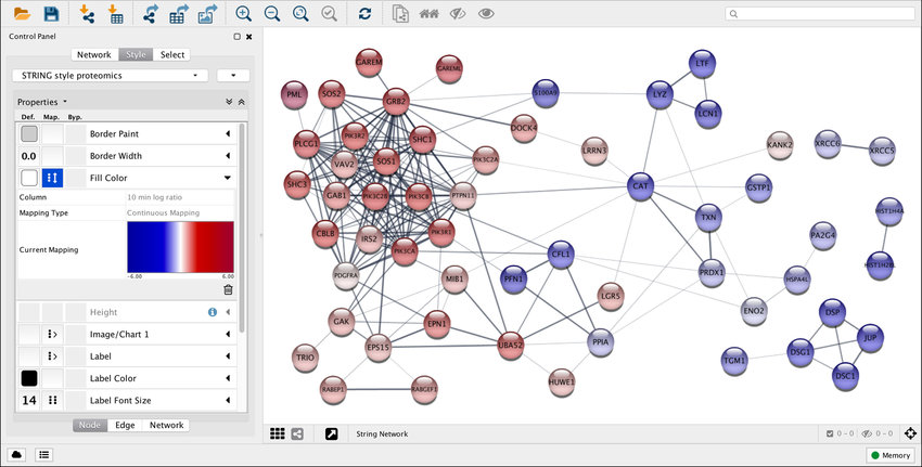
Description: Cytoscape is tailored for the visualization of molecular interaction networks and biological pathways. It's a platform that caters specifically to the needs of bioinformatics and social network analysis.
Pros:
- Specialized Tool: Its focus on network visualization ensures a feature set tailored for this specific need.
- Extensible: A range of plugins are available to extend its capabilities further.
Cons:
- Niche Audience: Given its specialized nature, it might not be suitable for generic data visualization tasks.
Use Cases:
- Bioinformatics research and molecular data analysis.
- Social network analysis for academic research.
Review: ⭐⭐☆☆☆
RAWGraphs: The Link Between Spreadsheets and Data Visualization
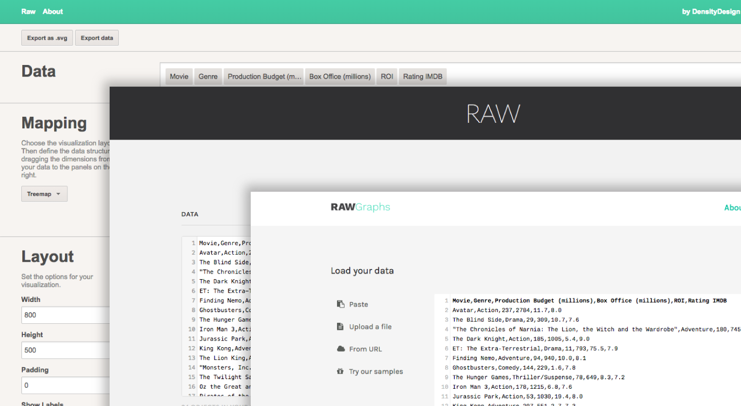
Description: RAWGraphs works as a bridge between spreadsheet applications and vector graphics editors. It allows users to create visualizations using a simple interface and then export them for further refinement.
Pros:
- No Coding Required: It's designed for those who want to create visualizations without delving into code.
- Diverse Export Options: Visualizations can be exported in a range of formats, including SVG and PNG.
Cons:
- Online Dependency: Being a web-based tool, it requires an active internet connection.
Use Cases:
- Designers who need a starting point for their data visualizations.
- Quick visualizations for presentations and reports.
Review: ⭐⭐☆☆☆
Conclusion
The realm of open-source data visualization tools is vast and varied. From tools tailored for bioinformatics to those designed for journalists, there's something for everyone. The key is to identify the specific needs of your project and choose a tool that aligns with those requirements. Whether you're looking for deep customization, ease of use, or specific integrations, the open-source community has a solution waiting for you.
With the ever-evolving landscape of data visualization, staying updated with the latest tools and trends is crucial. Whether you're a seasoned data scientist, a budding analyst, or someone with a casual interest in data, the world of open-source offers a treasure trove of tools to explore, learn, and create. Dive in and discover the power of visual data representation.
Frequently Asked Questions
Which data visualization tool is open source?
There are several open-source data visualization tools available. Some of the prominent ones include D3.js, Plotly, Vega-Lite, Matplotlib, PyGWalker, and many more. The choice depends on your specific requirements and the kind of data you're working with.
What is the easiest data visualization tool to use?
For those without a technical background or coding experience, tools like Datawrapper and RAWGraphs offer intuitive drag-and-drop interfaces, making them some of the easiest to use. Additionally, PyGWalker provides a seamless experience, especially for those familiar with Python and Jupyter notebooks.
What is the best tool to visualize a database?
For visualizing database data, Grafana stands out, especially when it comes to monitoring and observability. It supports a wide range of data sources and offers powerful visualization capabilities tailored for large-scale datasets. Apache Superset is another robust option, designed for enterprise-level data exploration and visualization.