Which Tools to Use to Make Charts? Try the Best Online Graph Maker
Use VizGPT to Make Charts Easily Online
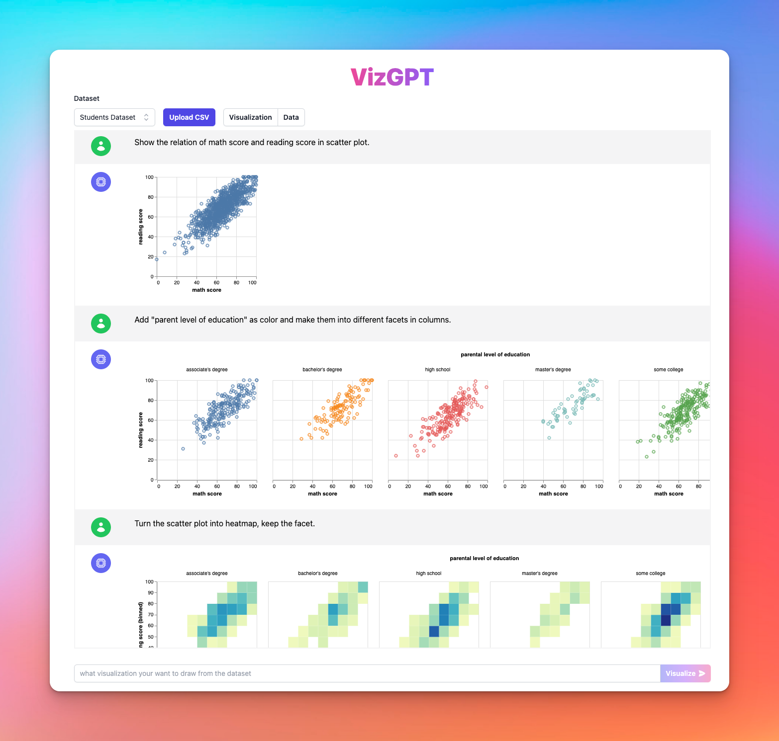
With VizGPT, creating a chart is as easy as three steps:
- Upload your CSV data to VizGPT.
- Use a prompt to indicate what kind of chart you want to create.
Sample Prompt: Show the relationship between (variables) in scatter plot.노션에서 VizGPT를 사용하여 차트 만드는 방법
- Press the Visualize button.
The tool will take care of the rest. Here's how to make the most of it:
Need more power for your charts? We got more tools that are similar to VizGPT (opens in a new tab). Check them out!

Data is crucial in today's digital era. It drives business decisions, impacts economic policies, and shapes our understanding of complex problems. Yet, understanding data can be a daunting task without the right tools—namely, data visualization tools. Data visualization is the graphic representation of data, which aids in clarifying complex data sets by arranging them in an understandable, interactive format. This article explores multiple methods and tools to effortlessly create charts.
Which Tools to Use to Effortlessly Make Charts? A Quick Guide
While VizGPT stands out for its user-friendly nature and AI-powered capabilities, there are several traditional tools for data visualization that have been widely used by professionals across various fields. They offer a broad range of functionalities that can cater to different needs and preferences.
Microsoft Excel
One of the most common tools for creating charts is Microsoft Excel, a cornerstone in data analysis and visualization. Excel's vast array of chart types, including bar charts, pie charts, line graphs, and more, allows users to represent their data in the most effective and understandable manner.
Here are the general steps to create a chart in Excel:
- Select the data range you want to chart.
- Click the 'Insert' tab, and choose the chart type that best represents your data.
- Customize your chart using the 'Chart Tools' tabs to enhance readability and aesthetic appeal.
The primary advantage of using Excel is its ubiquity in the business world, making it a safe choice for data visualization.
Google Sheets
Google Sheets is another excellent tool for creating charts, offering similar functionalities to Excel but with added benefits of real-time collaboration and cloud storage. It is a perfect choice for teams working remotely and individuals who prefer to have their data accessible from anywhere.
To create a chart in Google Sheets, follow these steps:
- Highlight the data to include in the chart.
- Click on the 'Insert chart' icon on the toolbar or choose 'Chart' from the 'Insert' menu.
- Select your preferred chart type from the Chart Editor on the right.
- Customize your chart's look and feel with different colors, labels, and chart styles.
Tableau
Tableau is a dedicated data visualization tool that excels in presenting large data sets in visually stunning ways. It allows users to create a wide range of interactive charts and dashboards, offering more advanced features than Excel or Google Sheets.
Creating a chart in Tableau involves the following steps:
- Connect Tableau to your data source.
- Drag and drop the data fields onto the 'Columns' and 'Rows' shelves.
- Select the chart type from the 'Show Me' panel.
- Customize your visualization with filters, colors, labels, and tooltips.
Remember, while VizGPT and these traditional tools can help you visualize data, the choice ultimately depends on your specific needs, data complexity, and desired output.
FAQ
Q1: How to upload CSV data to VizGPT?
Answer: To upload CSV data to VizGPT, navigate to the VizGPT interface. Look for and click on the 'Upload CSV' button. Follow the prompts to select and upload your CSV file from your device.
Q2: What type of charts can I create with VizGPT?
Answer: VizGPT offers versatility in chart creation. You can create various types of charts, including but not limited to bar charts, pie charts, line graphs, scatter plots, and histograms.
Q3: What are some alternatives to VizGPT for chart creation?
Answer: Besides VizGPT, several traditional tools are often used for chart creation, including Microsoft Excel, Google Sheets, and Tableau. Each of these tools provides unique functionalities that can cater to different data visualization needs.
Q4: How to create a chart in Microsoft Excel?
Answer: To create a chart in Excel, start by selecting your data range. Click the 'Insert' tab and choose your desired chart type. Use the 'Chart Tools' tabs to customize your chart's appearance and readability.