📊 10 Types of Histograms in Matplotlib (with Examples)

Histograms are one of the most common tools for visualizing data distributions. With Python's matplotlib, you can customize histograms in many ways to better understand your data.
In this post, we’ll explore 10 different types of histograms, what they’re used for, and how to create each one.
1. Basic Histogram
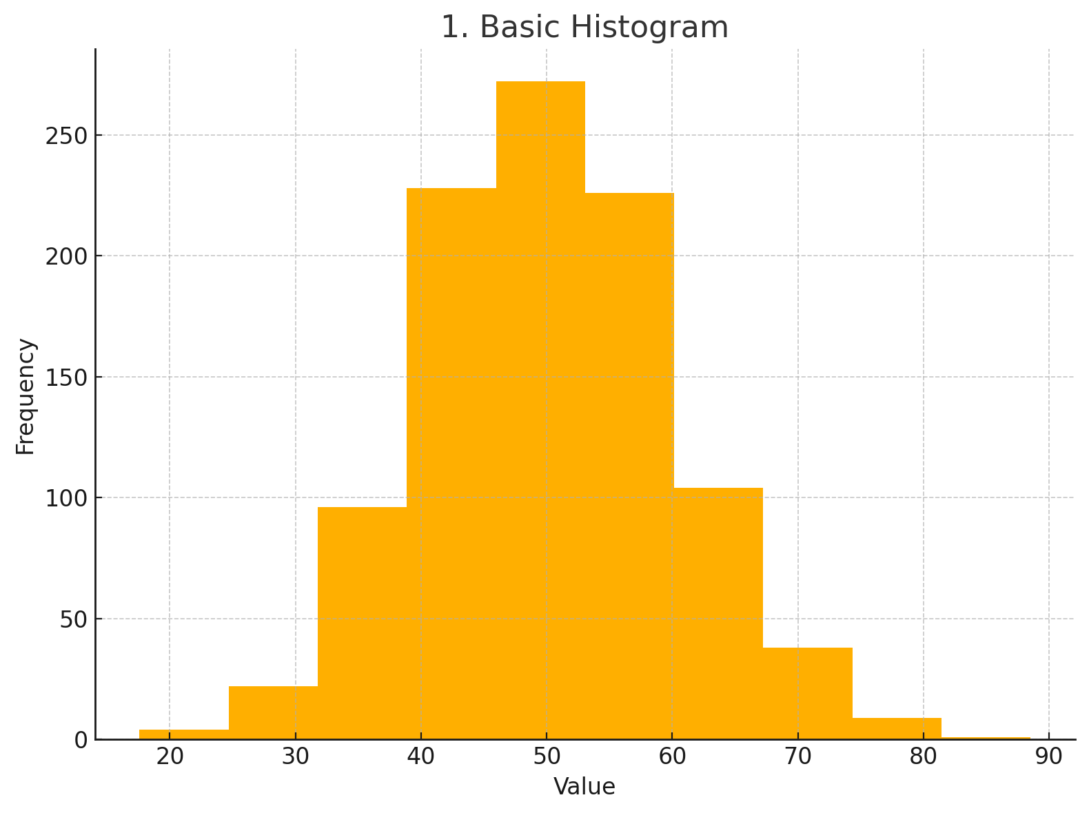
📌 Use:
Visualize the frequency distribution of a dataset.
plt.hist(data)
plt.title("Basic Histogram")
plt.xlabel("Value")
plt.ylabel("Frequency")
2. Histogram with Custom Bins
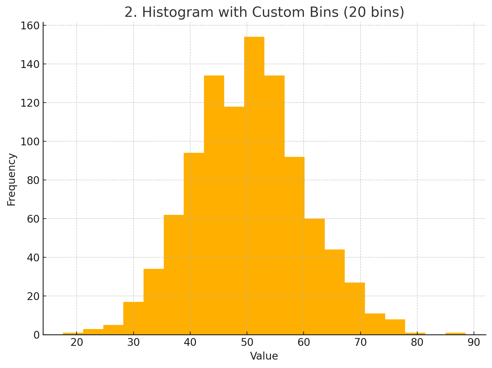
📌 Use:
Control the resolution of the histogram using more or fewer bins.
plt.hist(data, bins=20)
plt.title("Histogram with Custom Bins")
3. Colored Histogram
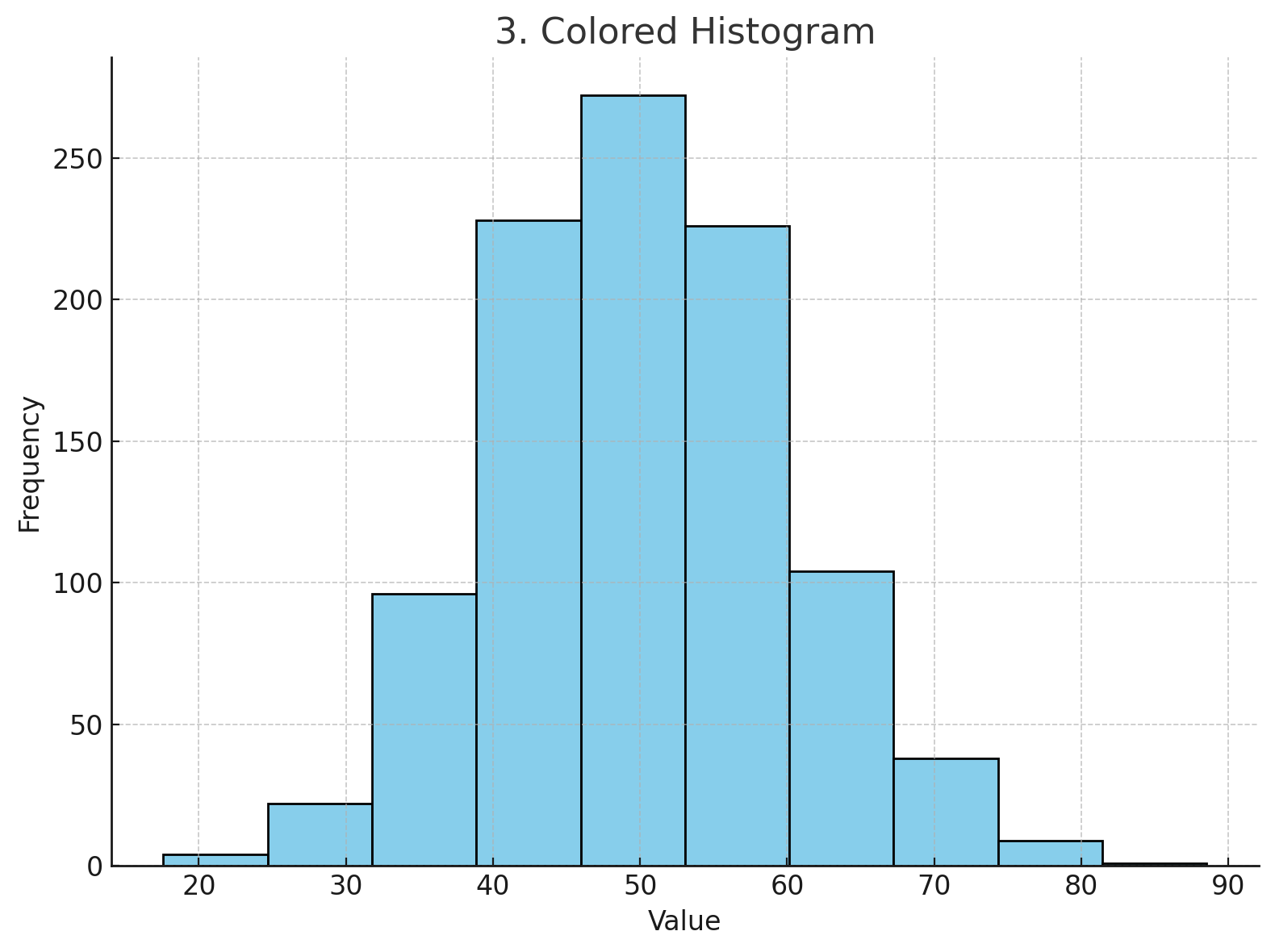
📌 Use:
Make your histogram easier to read or match your color palette.
plt.hist(data, color='skyblue', edgecolor='black')
plt.title("Colored Histogram")
4. Normalized Histogram (Density)
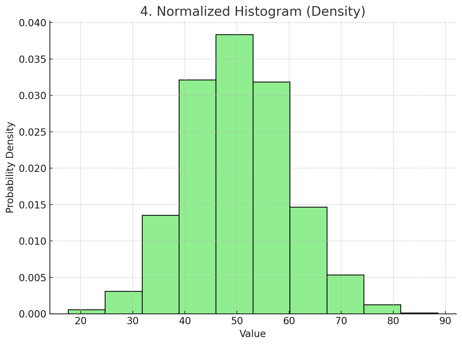
📌 Use:
Show probability density instead of raw frequency — great for comparing distributions.
plt.hist(data, density=True, color='lightgreen', edgecolor='black')
plt.title("Normalized Histogram (Density)")
5. Cumulative Histogram
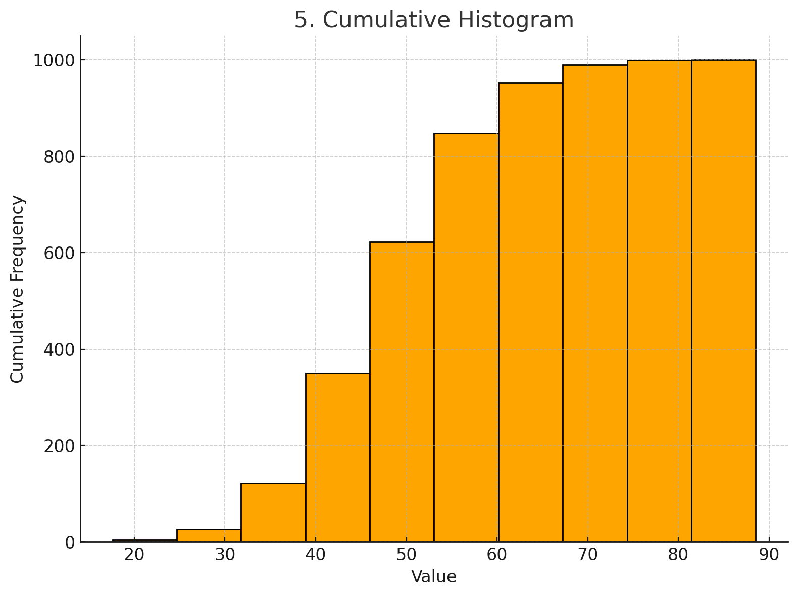
📌 Use:
Visualize the cumulative sum of data — helps understand how data accumulates over time or value.
plt.hist(data, cumulative=True, color='orange', edgecolor='black')
plt.title("Cumulative Histogram")
6. Histogram with KDE Overlay
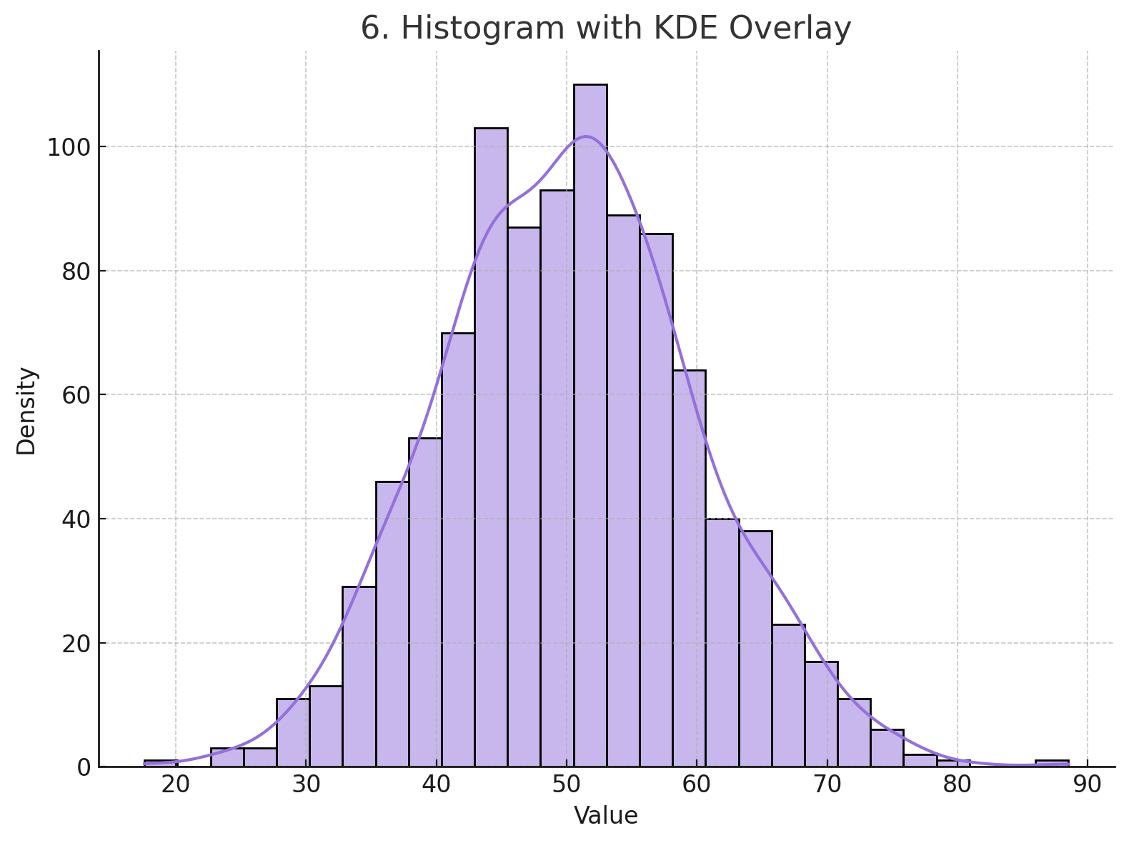
📌 Use:
Overlay a smooth density curve to estimate the distribution shape.
import seaborn as sns
sns.histplot(data, kde=True, color='mediumpurple', edgecolor='black')
plt.title("Histogram with KDE Overlay")
7. Stacked Histogram
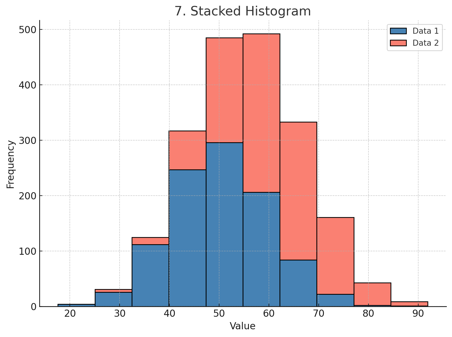
📌 Use:
Compare multiple distributions side-by-side and see how they contribute to totals.
plt.hist([data1, data2], stacked=True, color=['steelblue', 'salmon'], edgecolor='black')
plt.title("Stacked Histogram")
plt.legend(['Dataset 1', 'Dataset 2'])
8. Step Style Histogram
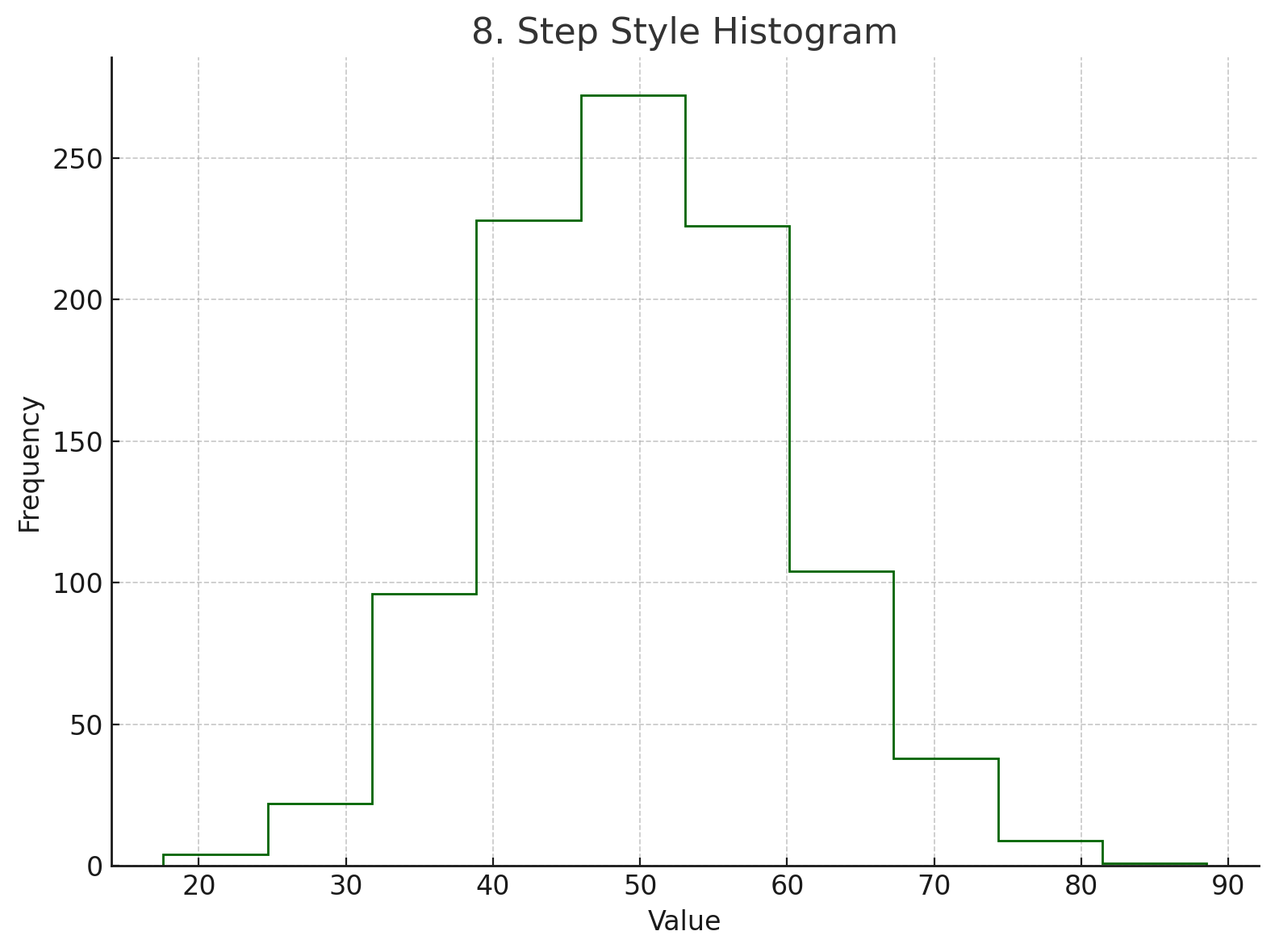
📌 Use:
Visualize histogram as an outline (good for comparing multiple datasets without clutter).
plt.hist(data, histtype='step', color='darkgreen')
plt.title("Step Style Histogram")
9. Horizontal Histogram
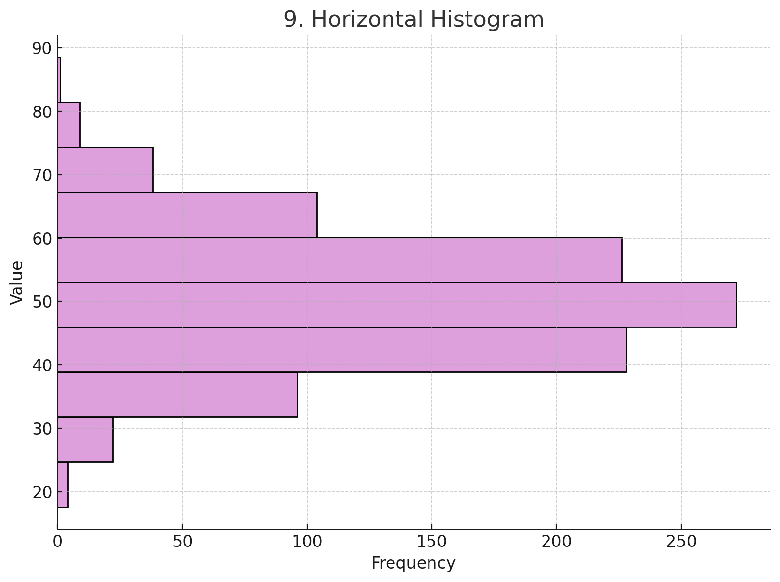
📌 Use:
Flip the axes — useful when labels on the y-axis are more meaningful or space is tight.
plt.hist(data, orientation='horizontal', color='plum', edgecolor='black')
plt.title("Horizontal Histogram")
10. Weighted Histogram
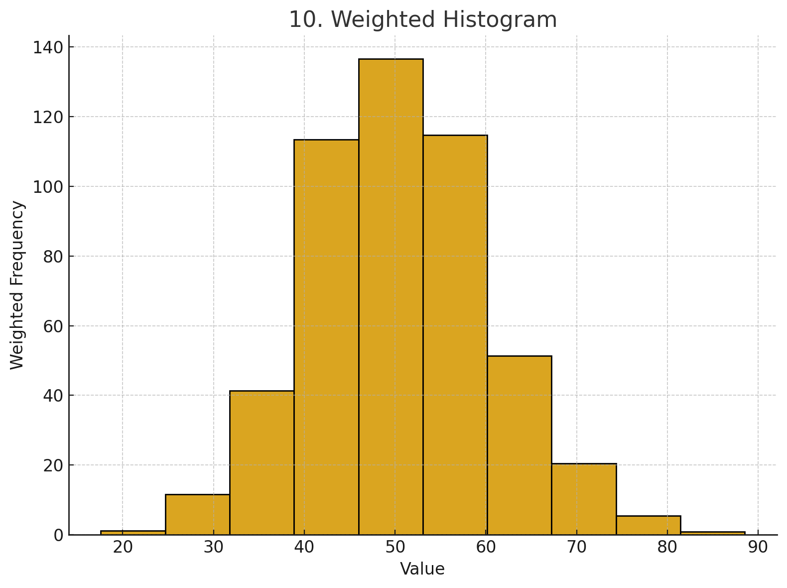
📌 Use:
Apply weights to values — useful when data points have different importance or frequency.
weights = np.random.rand(len(data))
plt.hist(data, weights=weights, color='goldenrod', edgecolor='black')
plt.title("Weighted Histogram")
🧠 Final Thoughts
Histograms are more than just simple bar plots — with the right style, you can tailor them to convey specific insights in your data. Whether you're doing EDA or preparing a final report, knowing these variations gives you a stronger data storytelling toolkit.