📊 6 Common Examples to Use plt.vlines() in Data Visualization

When working with time series, histograms, or custom plots in Python, matplotlib.pyplot.vlines() can be surprisingly handy. This simple function draws vertical lines, and when used creatively, it can make your charts more expressive, readable, and informative.
In this post, we’ll walk through six practical use cases of plt.vlines() that go beyond just “drawing a line.” Each comes with an example to help you apply it in your own data science projects.
1. 🔴 Highlight Specific X Values
You might want to emphasize a specific value on the x-axis — like a threshold, decision point, or milestone.
plt.vlines(x=5, ymin=-1, ymax=1, color='red', linestyle='--')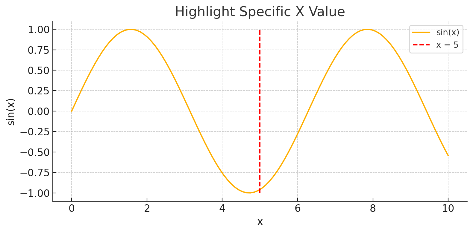
This is perfect for marking things like a model cutoff score or an event time.
2. 🟠 Annotate Events on a Time Series
Time series data often have important events (e.g., spikes, outages, or changes) that deserve special attention.
event_times = [10, 20, 35]
plt.vlines(event_times, ymin=min(data), ymax=max(data), color='orange', linestyle='--')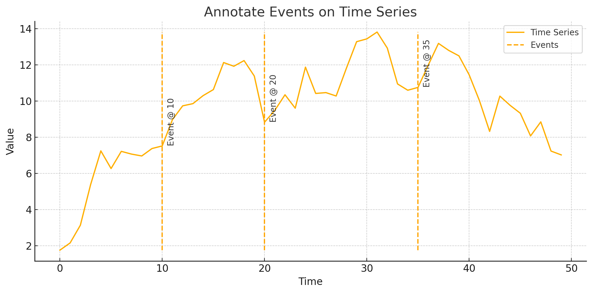
This helps viewers immediately recognize when key moments occurred.
3. 🔵 Draw Stem Plots Manually
Stem plots visualize individual values with vertical lines from a base. You can recreate this look using vlines.
plt.vlines(x, 0, y, colors='blue')
plt.plot(x, y, 'o')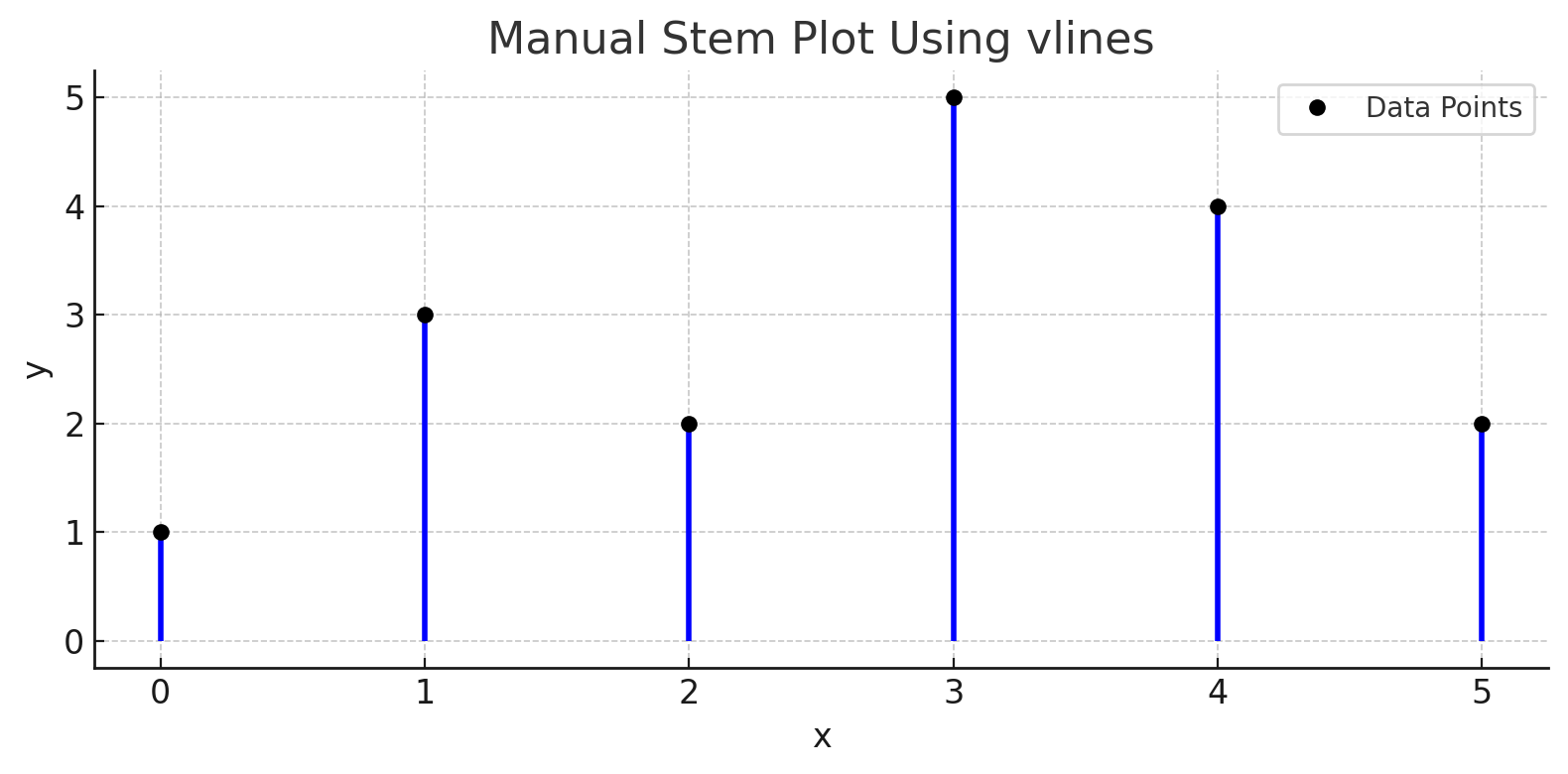
Useful for visualizing discrete signals or raw numeric data.
4. ⚪ Custom Vertical Gridlines
Need gridlines only at specific x-values? vlines gives you that precision.
grid_positions = [2, 4, 6, 8]
plt.vlines(grid_positions, ymin=-1.2, ymax=1.2, linestyle='dotted')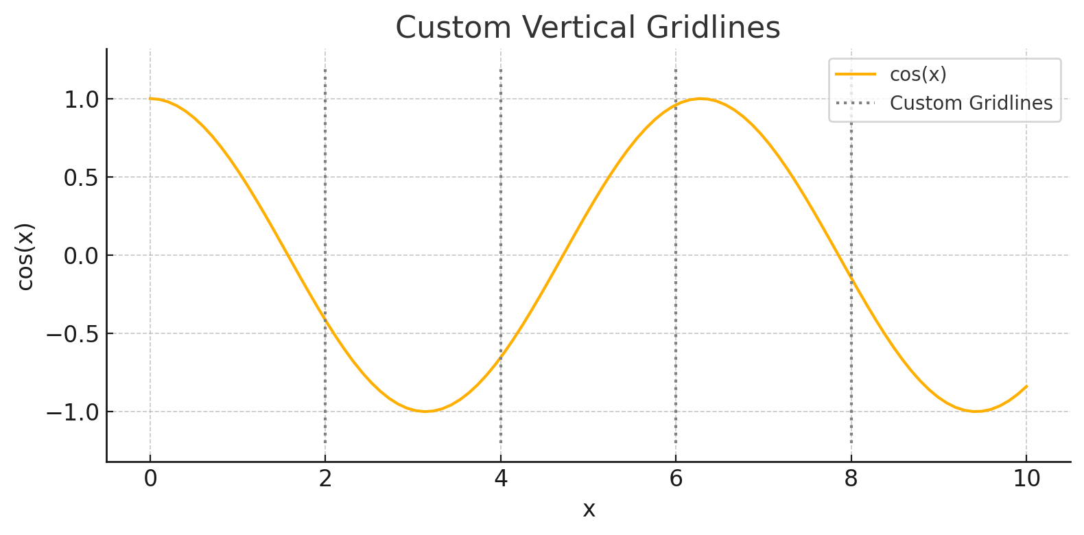
Great when your x-axis isn't evenly spaced or auto-ticks aren’t ideal.
5. 🟣 Shade Regions with Repeating Lines
Divide your chart into visual regions to represent different time windows or segments.
for x in range(0, 100, 10):
    plt.vlines(x, ymin=-1, ymax=1, color='lightgray')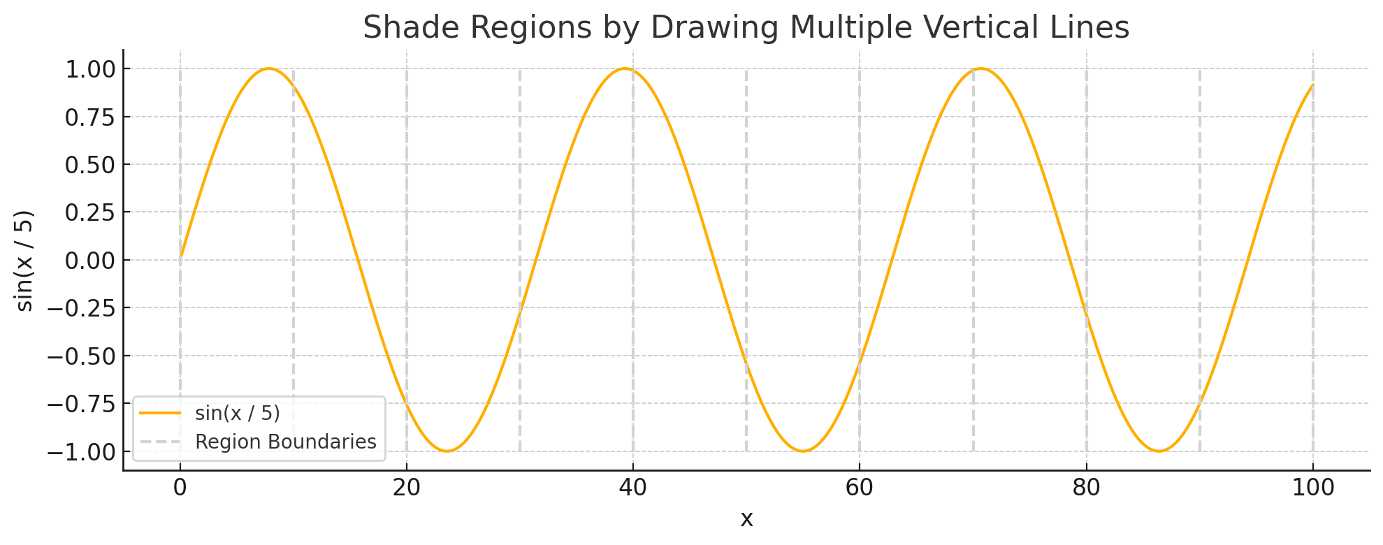
Perfect for highlighting business cycles, experimental phases, etc.
6. 🟢 Visualize Statistical Markers on a Histogram
You can add lines for the median, quartiles, or any other statistical reference point.
plt.vlines([q1, median, q3], ymin=0, ymax=30, linestyles='dashed')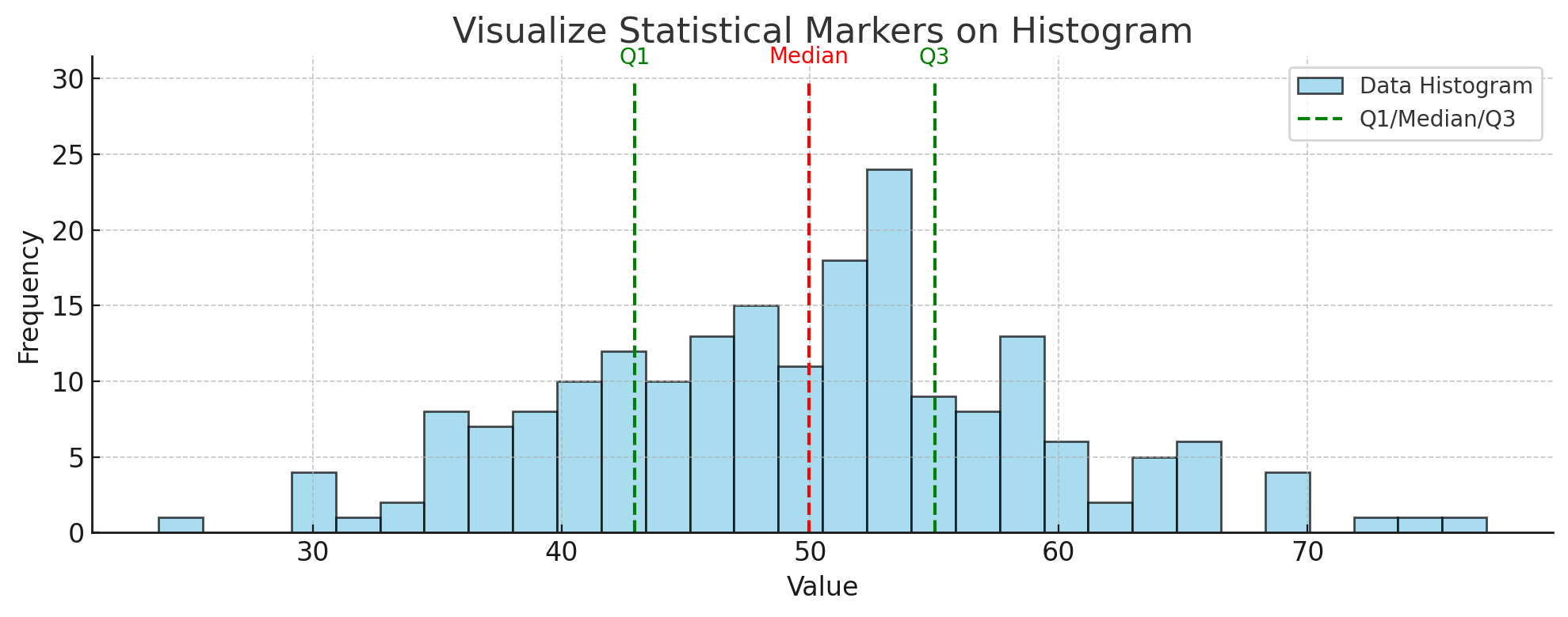
This makes histograms much more informative, especially in reports or dashboards.
🔚 Wrapping Up
plt.vlines() is more than just a way to draw a line — it’s a versatile tool that can improve clarity and storytelling in your plots. Whether you're analyzing time series, highlighting thresholds, or visualizing distributions, vertical lines give you control and flexibility.
Try adding vlines to your next chart and see how much more readable your plots become.