Matplotlib Legend Outside the Plot: bbox_to_anchor Cheatsheet


Default legends sit inside the axes and often cover data. To park a legend outside, pair loc (which corner of the legend box is the anchor) with bbox_to_anchor (where that anchor sits in axes coordinates).
Quick fix
import matplotlib.pyplot as plt
import numpy as np

x = np.linspace(0, 10, 200)
fig, ax = plt.subplots()
ax.plot(x, np.sin(x), label="sin(x)")
ax.plot(x, np.cos(x), label="cos(x)")

# Outside, upper-right of the axes
ax.legend(bbox_to_anchor=(1.02, 1), loc="upper left", borderaxespad=0)

plt.tight_layout()
plt.show()| Placement | Typical call |
|---|---|
| Right of axes | legend(bbox_to_anchor=(1.02, 1), loc="upper left") |
| Right, vertically centered | legend(loc="center left", bbox_to_anchor=(1.02, 0.5)) |
| Below, horizontal | legend(loc="upper center", bbox_to_anchor=(0.5, -0.12), ncol=n) |
| Above | legend(loc="lower center", bbox_to_anchor=(0.5, 1.02), ncol=n) |
| Export without clipping | savefig(..., bbox_inches="tight") or tight_layout() / constrained_layout=True |
Axes coordinates: (0, 0) is the lower-left of the axes, (1, 1) is the upper-right. Values slightly above 1 or below 0 sit just outside the plot frame.
- Qwen3.8 27B: Specs, Memory Requirements, and How to Run It
- Haiku pricing: Haiku 5.5 vs 4.5 vs GPT-6 Luna
- Python 3.15 Upgrade Guide: Install with uv, Use Lazy Imports, and Check Your Data Stack
- Claude Code Mods Tutorial: Build and Test Your First Mod, Plus 15 Community Examples
- How to Use Pi Coding Agent 1.0: Install, Connect a Model, and Run Your First Task
- How to Use Laya: Classify Text in a pandas DataFrame with the Open-Source Jev Alternative
- Claude Code Reads AGENTS.md Now: Setup, Loading Modes, and Sharing One File with Codex, OpenCode, and Cursor
- How to View Deleted Reddit Posts (2026 Guide): 5 Ways That Still Work
- GPT Image 2.5: How to Use It, Flare vs Sunburst, and API Pricing
- How to Use DeepSeek Harness: Install, Set Up, and Run Your First Agent
- Runcell Science: An Open Source Alternative to Claude Science for Research Workflows
- How to Make Mac Not Sleep: Keep Codex, Claude Code, and AI Agents Running
- OpenClaw vs ZeroClaw vs Pi Agent vs Nanobot: Which AI Agent Stack Should You Choose in 2026?
- Can Claude Code Analyze Jupyter Notebooks for Data Science? What It Actually Does
- Claude Code Routines: Why AI Agent Cron Jobs Matter
- Claude Code Desktop Bypass Permissions: How to Enable It
- How to Build Two Python Agents with Google’s A2A Protocol - Step by Step Tutorial
- Top 10 growing data visualization libraries in Python in 2025
The problem: legend over the data
fig, ax = plt.subplots(figsize=(7, 4))
ax.plot(x, np.sin(x), label="sin(x)", lw=2)
ax.plot(x, np.cos(x), label="cos(x)", lw=2)
ax.legend(loc="best")  # still inside the axes
ax.set_title("Default legend (often overlaps data)")
plt.show()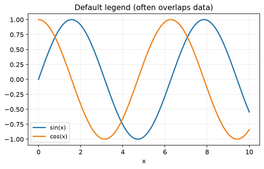
loc="best" only chooses the least-bad inside corner. It never moves the legend into the figure margin.
How bbox_to_anchor + loc work together
bbox_to_anchor=(x, y)— point in axes fraction coordinates (by default).loc="upper left"(etc.) — which point on the legend box is pinned to that anchor.borderaxespad— padding between the axes and the legend; set0when you want a tight park outside.
Mental model: anchor point on the plot + which corner of the legend sits on that point.
Place the legend to the right
fig, ax = plt.subplots(figsize=(7, 4))
ax.plot(x, np.sin(x), label="sin(x)", lw=2)
ax.plot(x, np.cos(x), label="cos(x)", lw=2)
ax.legend(bbox_to_anchor=(1.02, 1), loc="upper left", borderaxespad=0)
ax.set_title("Legend outside: upper right of axes")
fig.tight_layout()
plt.show()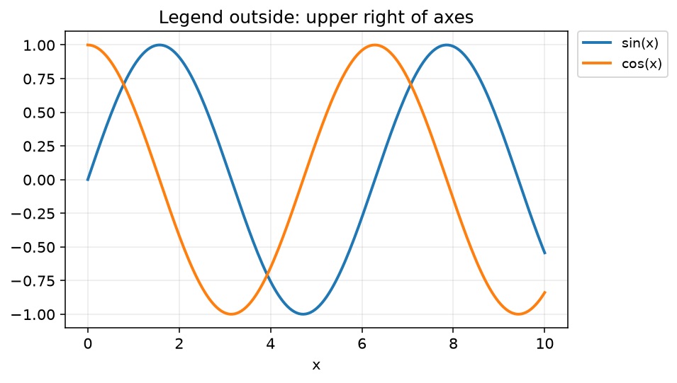
If the window still clips the legend, call tight_layout() / use constrained_layout=True in subplots, or reserve space by shrinking the axes (next section).
Shrink the axes, then dock the legend
When you have many series, give the plot a dedicated legend column:
x = np.arange(10)
fig = plt.figure(figsize=(7.2, 4.2))
ax = fig.add_subplot(111)

for i in range(5):
    ax.plot(x, i * x, label=f"y = {i}x", lw=2)

# Leave ~22% of the figure width for the legend
box = ax.get_position()
ax.set_position([box.x0, box.y0, box.width * 0.78, box.height])
ax.legend(loc="center left", bbox_to_anchor=(1.02, 0.5), borderaxespad=0)
ax.set_title("Shrink axes, legend to the right")
plt.show()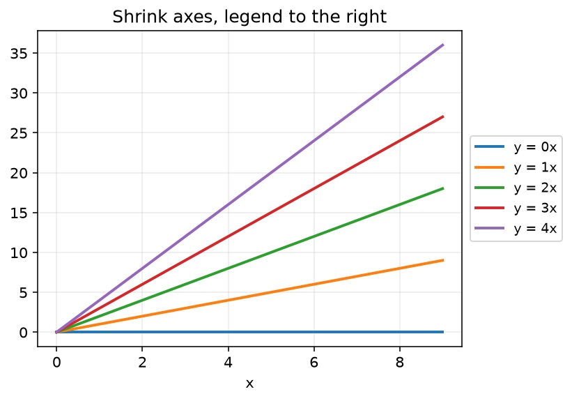
Modern alternative: create the figure with layout engines that cooperate better with outside artists:
fig, ax = plt.subplots(layout="constrained")
# ... plot ...
ax.legend(bbox_to_anchor=(1.02, 1), loc="upper left")
Legend below the plot (horizontal)
Use ncol so entries sit in one row under the chart—good for slides and wide dashboards:
x = np.arange(10)
fig = plt.figure(figsize=(7.2, 4.4))
ax = fig.add_subplot(111)

for i in range(5):
    ax.plot(x, i * x, label=f"y = {i}x", lw=2)

box = ax.get_position()
ax.set_position([box.x0, box.y0 + box.height * 0.12, box.width, box.height * 0.88])
ax.legend(loc="upper center", bbox_to_anchor=(0.5, -0.12), ncol=5)
ax.set_title("Horizontal legend below the plot")
plt.show()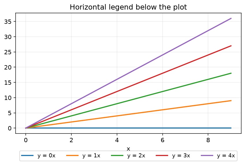
Decision guide
| Situation | Prefer |
|---|---|
| 2–4 series, simple line chart | bbox_to_anchor=(1.02, 1), loc="upper left" + tight_layout() |
| Many series, need stable layout | Shrink axes / layout="constrained" + right-side legend |
| Wide figure / presentation | Bottom legend with ncol |
| Map or image where any box hurts | Semi-transparent inside legend: framealpha=0.3 (compromise) |
| Saving PNG/PDF for papers | Always test bbox_inches="tight" (below) |
Export trap: outside legend disappears in the file
Interactive windows can show the legend while savefig crops it. The usual fix:
fig, ax = plt.subplots(figsize=(7, 4))
ax.plot(x, np.sin(x), label="sin(x)", lw=2)
ax.plot(x, np.cos(x), label="cos(x)", lw=2)
ax.legend(bbox_to_anchor=(1.02, 1), loc="upper left", borderaxespad=0)
ax.set_title("Outside legend kept with bbox_inches='tight'")

fig.savefig("legend-outside.png", dpi=150, bbox_inches="tight", facecolor="white")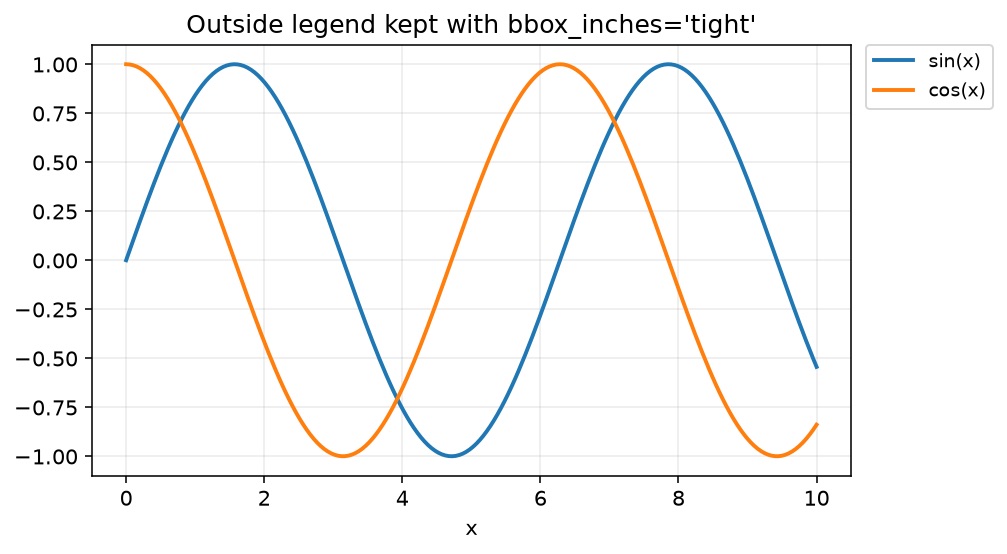
Related deep dive: savefig cuts off labels. If labels still collide, bump figure size before micro-tuning anchors.
Extra controls (without moving the box)
ax.legend(
    bbox_to_anchor=(1.02, 1),
    loc="upper left",
    borderaxespad=0,
    frameon=True,
    fancybox=False,
    framealpha=0.95,
    fontsize=9,          # or prop={"size": 9}
    title="Series",
    alignment="left",
)ncol— multi-column legendframealpha— transparency when you must keep a legend over datatitle— group label for multi-series charts
For general legend styling (not only position), see Matplotlib legend.
Common traps
| Trap | What you see | Fix |
|---|---|---|
Only set loc="right" | Legend still inside | Need bbox_to_anchor beyond 1.0 |
| Outside legend in GUI, missing in PNG | Cropped export | bbox_inches="tight" or constrained layout |
bbox_to_anchor in data coords by mistake | Legend flies away | Default is axes coords; pass a 2-tuple, not a Bbox unless intentional |
| Huge legend font | Dominates figure | fontsize=8–10, or fewer columns |
| Overlapping with colorbar | Squashed margin | Reserve space for both, or put legend below |
FAQ
Conclusion
Outside legends are a layout problem, not a mystery API: pin a legend corner with loc, place that pin with bbox_to_anchor just past the axes (> 1 or < 0), then make sure export uses tight/constrained layout so the margin survives in the file. Use a right-side stack for many series and a bottom ncol row for wide figures.
Related Guides
- Matplotlib legend — styling, titles, and multi-legend patterns
- Matplotlib savefig cuts off labels — export clipping checklist
- Matplotlib figure size — give legends room before fine-tuning anchors
- Matplotlib fill_between — shaded series that need clear legends
- Matplotlib multiple line plots — multi-series charts that trigger this problem
- Matplotlib annotations and text — labels when a legend is not enough
- Matplotlib subplots — shared legends across panels