Plotly Heatmap - Tips, Tricks, and Examples
- Name
- Oluwaseun Adeojo
Updated on
Heatmaps are a powerful tool in the realm of data visualization. They allow us to represent complex data in a visually intuitive manner, making them an essential tool for data scientists and analysts. One of the most popular libraries for creating heatmaps is Plotly, a Python library that offers a high degree of customization and interactivity. In this guide, we will delve into the world of Plotly heatmaps, exploring its features, and providing practical examples to help you create your own stunning visualizations.
Plotly is a versatile library that provides an easy-to-use interface for creating a wide range of visualizations, including heatmaps. Heatmaps in Plotly are not just visually appealing but are also interactive, allowing users to zoom, pan, and hover to gain a deeper understanding of the data. This guide will provide you with a comprehensive understanding of how to create, customize, and optimize Plotly heatmaps for your data visualization needs.
What is a Heatmap?
A heatmap is a graphical representation of data where individual values are represented as colors. It's a way of plotting data that can be especially useful when you have a lot of data points, and you're interested in patterns or correlations. The color variations in the heatmap can easily highlight patterns and offer a quick visual summary of the information.
What is a Plotly Heatmap?
Plotly heatmap is a type of heatmap that can be generated using the Plotly library in Python. It offers a range of features that make it a powerful tool for creating complex heatmap visualizations. With Plotly, you can create heatmaps that are interactive, customizable, and can be easily shared or embedded in websites or apps.
How to Create a Plotly Heatmap?
Creating a Plotly heatmap involves a few key steps. First, you need to import the necessary libraries and load your data. Plotly Express, a high-level interface for Plotly, can be used to create heatmaps with just a few lines of code. Here's a basic example:
import plotly.express as px

# Assuming df is a pandas DataFrame
fig = px.imshow(df)
fig.show()
In this example, px.imshow() is used to create a heatmap from the DataFrame df. The resulting heatmap can be displayed using fig.show().
Adding Annotations to a Plotly Heatmap
Annotations can be added to a Plotly heatmap to provide additional information about the data points. This can be done using the add_annotation() function in Plotly. Here's an example:
import plotly.graph_objects as go

fig = go.Figure(data=go.Heatmap(
                   z=[[1, 20, 30],
                      [20, 1, 60],
                      [30, 60, 1]]))
fig.add_annotation(text="Annotated Heatmap",
                  xref="paper", yref="paper",
                  x=0.5, y=-0.15, showarrow=False)

fig.show()
In this example, an annotation is added below the heatmap. The xref and yref parameters are set to "paper", which means the coordinates are
relative to the size of the figure, with (0,0) being the bottom left and (1,1) being the top right.
Creating a Correlated Heatmap in Python
A correlated heatmap is a type of heatmap that is often used to visualize the correlation matrix of a dataset. The correlation matrix is a table that shows the correlation coefficients between many variables. Each cell in the table shows the correlation between two variables. A correlation matrix is used to summarize data, as an input into a more advanced analysis, and as a diagnostic for advanced analyses.
In Python, you can use the Plotly library to create a correlated heatmap. Here's an example:
import plotly.figure_factory as ff
import numpy as np
import pandas as pd

# Assuming df is a pandas DataFrame
corr_matrix = df.corr()
heatmap = ff.create_annotated_heatmap(z=corr_matrix.values,
                                      x=list(corr_matrix.columns),
                                      y=list(corr_matrix.index),
                                      annotation_text=corr_matrix.round(2).values,
                                      showscale=True)

heatmap.show()
In this example, we first calculate the correlation matrix of the DataFrame df using the corr() function. We then create an annotated heatmap using the create_annotated_heatmap() function from plotly.figure_factory. The correlation values are rounded to two decimal places for the annotation text.
Changing the Colorscale in a Plotly Heatmap
The colorscale of a heatmap can be changed to better suit the data or the aesthetic preferences of the user. Plotly provides a variety of colorscales to choose from, including Cividis, Electric, Viridis, and more. Here's how you can change the colorscale:
import plotly.express as px

# Assuming df is a pandas DataFrame
fig = px.imshow(df, colorscale='Viridis')
fig.show()
In this example, we set the colorscale to 'Viridis' using the colorscale parameter in the imshow() function. The resulting heatmap will use the Viridis colorscale, which ranges from dark purple to yellow.
Heatmap with Plotly Express
Plotly Express is a high-level interface for Plotly that makes it easier to create complex visualizations with less code. It's particularly useful for creating heatmaps. Here's an example of how to create a heatmap with Plotly Express:
import plotly.express as px

# Assuming df is a pandas DataFrame
fig = px.imshow(df)
fig.show()
In this example, we use the imshow() function from Plotly Express to create a heatmap. This function automatically infers the x and y labels from the DataFrame, making it even easier to create a heatmap.
Interactive Dashboard with Plotly Heatmap
One of the most powerful features of Plotly is its ability to create interactive dashboards. These dashboards can include multiple visualizations, including heatmaps, and allow users to interact with the data in real-time. Here's an example of how to create an interactive dashboard with a Plotly heatmap:
import plotly.graph_objs as go
from plotly.subplots import make_subplots

# Assuming df1 and df2 are pandas DataFrames
fig = make_subplots(rows=1, cols=2)

heatmap1 = go.Heatmap(z=df1.values, colorscale='Viridis')
heatmap2 = go.Heatmap(z=df2.values, colorscale='Cividis')

fig.add_trace(heatmap1, row=1, col=1)
fig.add_trace(heatmap2, row=1, col=2)

fig.show()
In this example, we create a subplot with two columns. We then create two heatmaps using different DataFrames and add them to the subplot. The resulting dashboard will display both heatmaps side by side, allowing users to compare them interactively.
Easily Create Heatmap in PyGWalker
Another option to create a heatmap from your pandas dataframe without using ploty is by using PyGWalker, an Open Source Python library, where you can create data visualizations by dragging and dropping variables.
Here is how you can quickly get started:
Setup pygwalker
Before diving in, please make sure to install the necessary packages through the command line using either pip or conda. Using Pip: To install PygWalker, simply run
pip install pygwalkerIf you want to keep your version up-to-date with the latest release, try:
pip install pygwalker --upgradeAlternatively, you can also use
pip install pygwalker --upgrade --preto obtain the latest features and bug-fixes.
Using Conda-forge:
To install PygWalker through conda-forge, run either
conda install -c conda-forge pygwalkeror
mamba install -c conda-forge pygwalkerFor more help, check out the conda-forge feedstock.
Run PyGWalker
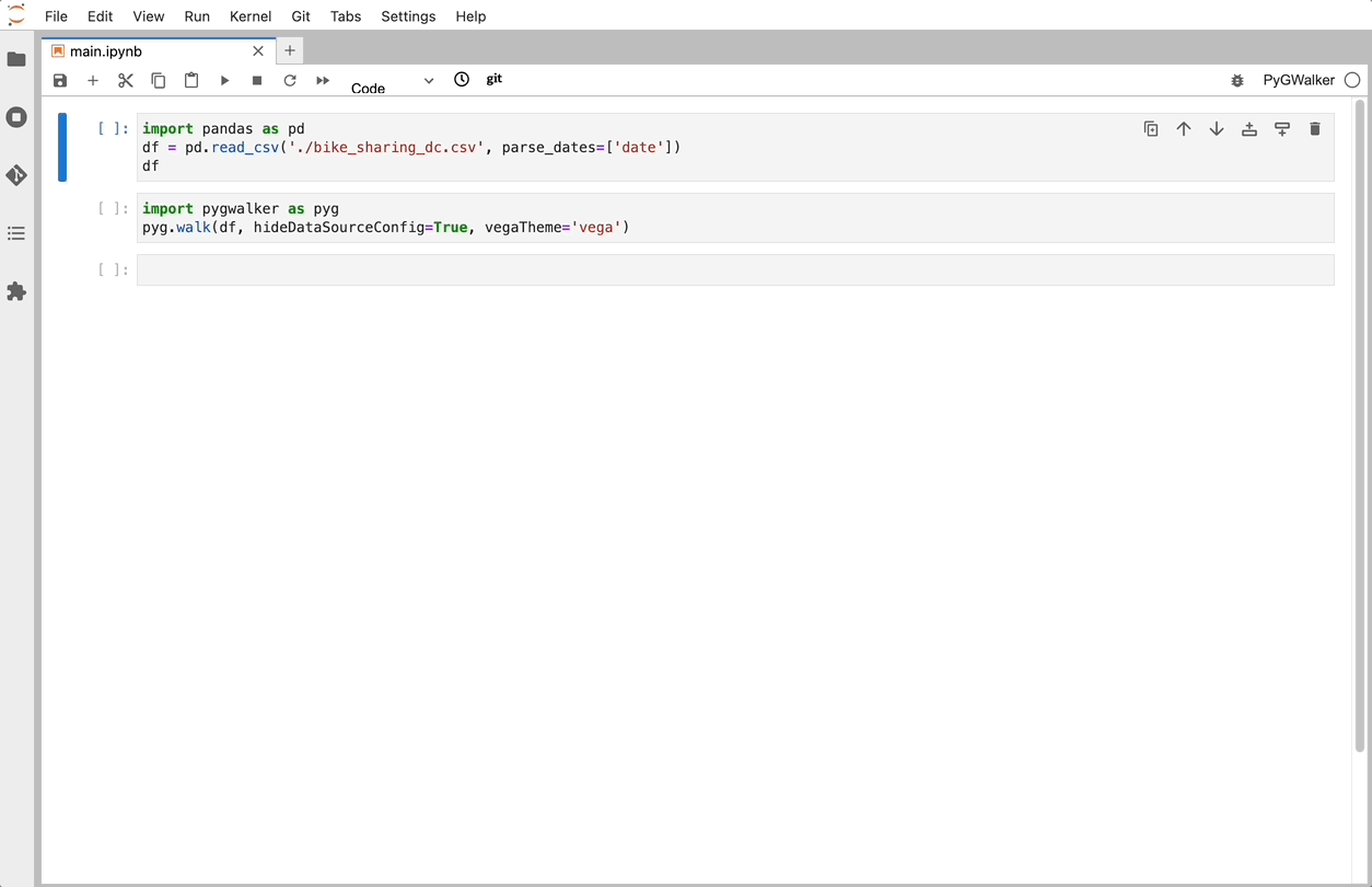
Once you have PygWalker installed, you can start using it in Jupyter Notebook by importing pandas and PygWalker.
import pandas as pd
import pygwalker as pyg
PygWalker integrates smoothly into your existing workflow. For example, to call up Graphic Walker with a dataframe, you can load your data using pandas and then run:
df = pd.read_csv('./bike_sharing_dc.csv', parse_dates=['date'])
gwalker = pyg.walk(df)
If you're using polars (version pygwalker>=0.1.4.7a0), you can also use PygWalker like this:
import polars as pl
df = pl.read_csv('./bike_sharing_dc.csv',try_parse_dates = True)
gwalker = pyg.walk(df)
For even more flexibility, you can try PygWalker online through Binder (opens in a new tab), Google Colab (opens in a new tab), or Kaggle Code (opens in a new tab).
That's it. Now you have a tableau-alternative user interface to analyze and visualize data by dragging and dropping variables.
Create a Heatmap
After importing the Pandas or Polars dataframe, you can easily create a heatmap:
- Choose the Mark Type button on the Tools bar and select 'Rectangle'.
- Left-click on your variable, and a menu will pop up. Choose the
BINoption.
PyGWalker is built with the support of a passionate community of data scientists and developers. Check out PyGWalker GitHub page (opens in a new tab) and give a star!
Frequently Asked Questions
-
What is a Plotly heatmap? A Plotly heatmap is a type of heatmap that can be generated using the Plotly library in Python. It offers a range of features that make it a powerful tool for creating complex heatmap visualizations.
-
How do I create a Plotly heatmap? You can create a Plotly heatmap by using the
imshow()function from Plotly Express or theHeatmap()function fromplotly.graph_objects. You will need to pass your data to these functions, and they will return a figure that you can display usingfig.show(). -
Can I add annotations to a Plotly heatmap? Yes, you can add annotations to a Plotly heatmap using the
add_annotation()function. This allows you to add additional text or information to your heatmap.