Positioning the Legend Outside of Plot in Matplotlib
- Name
- Sebastian Brandt
Updated on
Managing the positioning of legends in data visualizations can often prove to be a challenging task. Today, we're going to tackle this problem head-on, demonstrating how to effectively place a legend outside of a plot using the popular data visualization library, Matplotlib. Let's dive in and ensure your legends never interfere with your data again!
Understanding the Problem
The legend of a plot, while being a vital element for data interpretation, can sometimes take up valuable plot space, leading to crammed, less-readable plots. A popular solution to this problem is moving the legend outside the plot area.
The Matplotlib Solution
Matplotlib, a robust and versatile Python library for data visualization, provides a straightforward solution to position the legend outside the plot.
To illustrate the concept, we will first create a simple line plot using the pyplot API of Matplotlib:
import matplotlib.pyplot as plt
import numpy as np

x = np.linspace(0, 10, 100)

plt.plot(x, np.sin(x), label='sin(x)')
plt.plot(x, np.cos(x), label='cos(x)')
plt.legend()
plt.show()
In the above code, we have two line plots representing sin(x) and cos(x). The legend() function call adds a legend to the plot inside the plot area, often obscuring parts of the data.
Positioning the Legend Outside the Plot
To move the legend outside the plot, we can use the bbox_to_anchor parameter of the legend() function. This parameter allows us to specify the position of the bounding box of the legend in relation to the axes of the plot.
Here is an example where we place the legend to the right of the plot:
plt.plot(x, np.sin(x), label='sin(x)')
plt.plot(x, np.cos(x), label='cos(x)')
plt.legend(bbox_to_anchor=(1.05, 1), loc='upper left')
plt.show()
In this code, bbox_to_anchor=(1.05, 1) positions the bounding box of the legend just outside the axes at the upper-left corner. loc='upper left' specifies the point in the legend box that should be placed at the coordinates given in bbox_to_anchor.
Adjusting the Legend
Beyond basic positioning, we can make several adjustments to the legend to make it better fit our needs.
Reducing Font Size
To reduce the font size of the legend text:
plt.plot(x, np.sin(x), label='sin(x)')
plt.plot(x, np.cos(x), label='cos(x)')
plt.legend(bbox_to_anchor=(1.05, 1), loc='upper left', prop={'size': 6})
plt.show()
In this code, prop={'size': 6} reduces the font size of the legend text, making the overall legend box smaller.
Changing Legend Orientation
If you want a horizontal legend, use the ncol parameter to specify the number of columns:
plt.plot(x, np.sin(x), label='sin(x)')
plt.plot(x, np.cos(x), label='cos(x)')
plt.legend(bbox_to_anchor=(0.5, -0.15), loc='upper center', ncol=2)
plt.show()
Taking Control of Your Matplotlib Legend Placement
One of the recurring tasks in data visualization with Python is creating clear, concise, and appealing plots. A crucial part of achieving this involves properly arranging the legend outside of the plot in Matplotlib. This comprehensive guide will walk you through various methods for accomplishing just that.
Bbox_to_anchor: Your Ticket to Better Legend Placement
There are numerous approaches to position your legend outside the Matplotlib plot box. One of the most flexible and efficient methods involves the use of bbox_to_anchor keyword argument. Let's dive deeper into how you can utilize this powerful feature to improve your plot aesthetics.
For a basic application of bbox_to_anchor, consider the following example where the legend is shifted slightly outside the axes boundaries:
import matplotlib.pyplot as plt
import numpy as np

x = np.arange(10)

fig = plt.figure()
ax = plt.subplot(111)

for i in range(5):
    ax.plot(x, i * x, label='$y = %ix$' % i)

ax.legend(bbox_to_anchor=(1.1, 1.05))

plt.show()
In the above code snippet, the legend is strategically placed slightly to the right and above the top-right corner of the axes boundaries, thereby ensuring it doesn't obstruct the plot while remaining easily visible.
Unlocking the Power of Shrink: Another Key to Optimal Legend Positioning
In scenarios where you want to shift the legend further outside the plot, you might consider shrinking the current plot's dimensions. Let's look at a code example:
import matplotlib.pyplot as plt
import numpy as np

x = np.arange(10)

fig = plt.figure()
ax = plt.subplot(111)

for i in range(5):
    ax.plot(x, i * x, label='$y = %ix$'%i)

# Shrink current axis by 20%
box = ax.get_position()
ax.set_position([box.x0, box.y0, box.width * 0.8, box.height])

# Put a legend to the right of the current axis
ax.legend(loc='center left', bbox_to_anchor=(1, 0.5))

plt.show()
This approach enables us to dedicate a portion of the plotting space to accommodate the legend comfortably. Notice how we used ax.get_position() to fetch the current axes' position, then adjust it accordingly before repositioning the legend.
Putting Legend at the Bottom of the Plot
If placing the legend to the right of the plot isn't suitable, there's also an option to position it below the plot. Below is an example:
import matplotlib.pyplot as plt
import numpy as np

x = np.arange(10)

fig = plt.figure()
ax = plt.subplot(111)

for i in range(5):
    line, = ax.plot(x, i * x, label='$y = %ix$'%i)

# Shrink current axis's height by 10% on the bottom
box = ax.get_position()
ax.set_position([box.x0, box.y0 + box.height * 0.1,
                 box.width, box.height * 0.9])

# Put a legend below current axis
ax.legend(loc='upper center', bbox_to_anchor=(0.5, -0.05),
          fancybox=True, shadow=True, ncol=5)

plt.show()
This approach helps to utilize the available space effectively without obstructing the plot's view.
The Legend of Legends: Matplotlib Legend Guide
As an aspiring data scientist or a seasoned professional, knowing how to control the legend placement in your Matplotlib plots is an essential skill. Now that we have covered several methods to position the legend outside the plot, let's delve into some advanced customizations.
Finessing the Legend Style
Sometimes, we want to make our legend even more readable and aesthetically pleasing. The fancybox, shadow, and borderpad parameters allow for a variety of styling options:
ax.legend(loc='upper center', bbox_to_anchor=(0.5, -0.05),
          fancybox=True, shadow=True, borderpad=1.5, ncol=5)
In this example, fancybox=True gives the legend box rounded corners, shadow=True adds a shadow effect, and borderpad=1.5 increases the padding within the box.
Ordering Legend Entries
In some cases, you might want to change the order of entries in your legend. The HandlerLine2D class in Matplotlib can help you accomplish this. Here's a simple illustration:
from matplotlib.lines import Line2D

fig, ax = plt.subplots()
lines = []
labels = []

for i in range(5):
    line, = ax.plot(x, i * x, label='$y = %ix$' % i)
    lines.append(line)
    labels.append('$y = %ix$' % i)

# Reorder the labels and line handles
lines = [lines[i] for i in [4, 2, 0, 1, 3]]
labels = [labels[i] for i in [4, 2, 0, 1, 3]]

# Create a legend for the first line
first_legend = plt.legend(lines[:2], labels[:2], loc='upper left')

# Add the legend manually to the current Axes
ax.add_artist(first_legend)

# Create another legend for the rest.
plt.legend(lines[2:], labels[2:], loc='lower right')

plt.show()
In this scenario, we first plot the lines, store their handles and labels, and then reorder them according to our preference.
Alternative to Matplotlib: Visualize Data with PyGWalker
Besides using Matplotlib to visualize your pandas dataframe, here is an alternative, Open Source python library that can help you create data visualization with ease: PyGWalker (opens in a new tab).

No need to complete complicated processing with Python coding anymore, simply import your data, and drag and drop variables to create all kinds of data visualizations! Here's a quick demo video on the operation:
Here's how to use PyGWalker in your Jupyter Notebook:
pip install pygwalker
import pygwalker as pyg
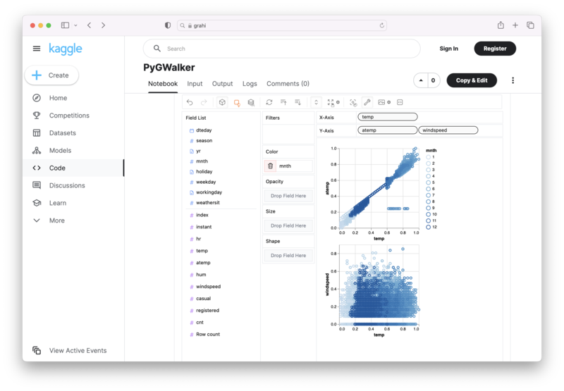
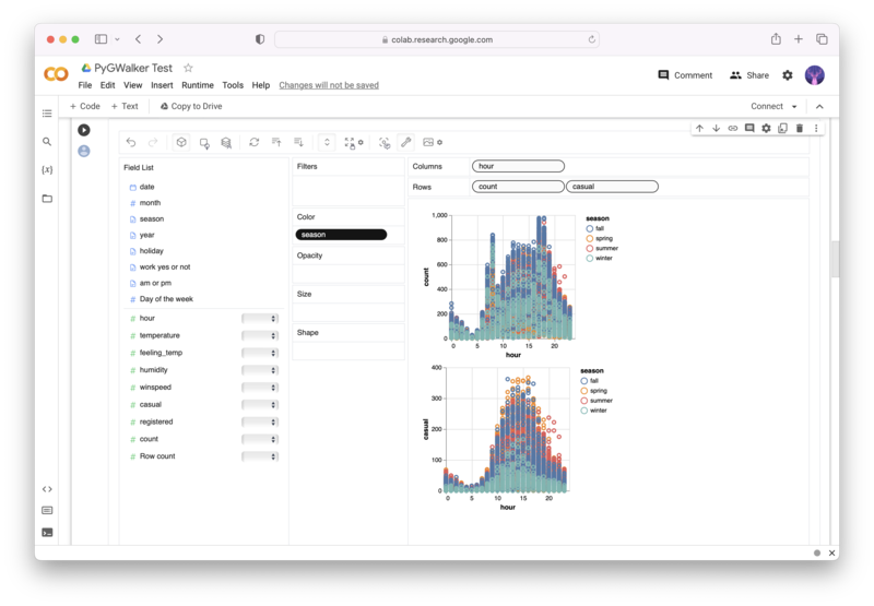
gwalker = pyg.walk(df)Alternatively, you can try it out in Kaggle Notebook/Google Colab:
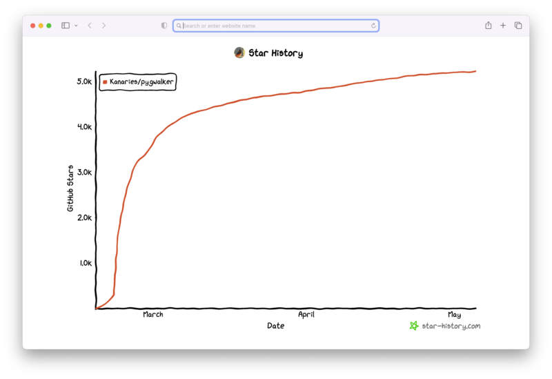
PyGWalker is built on the support of our Open Source community. Don't forget to check out PyGWalker GitHub (opens in a new tab) and give us a star!
Conclusion
Understanding the various customization options of the Matplotlib legend is key to creating professional-grade plots. So, be sure to practice these techniques and explore the Matplotlib documentation to become adept at this essential tool for data visualization.
Related guides
Frequently Asked Questions
In the following, we'll address some frequently asked questions regarding legend placement in Matplotlib.
Q1: Can I place a Matplotlib legend outside the plot area without resizing the plot itself?
Yes, you can place the legend outside the plot without resizing the plot. However, the legend might not be visible in the saved figure because the bbox_inches='tight' option in plt.savefig() may not consider the elements outside the axes boundaries.
Q2: Is there a way to automatically determine the best location for the legend?
Yes, Matplotlib provides a way to automatically determine the best location for the legend by passing loc='best' in the legend() function. This feature places the legend at the location minimizing its overlap with the plot.
Q3: How can I make the legend labels more readable if they're overlapping with the plot?
You can increase the readability of legend labels by using a semi-transparent legend background. This can be achieved by setting the framealpha parameter in legend(). For example, ax.legend(framealpha=0.5) sets the legend background to be semi-transparent.