Mastering Multiple Plots on the Same Figure in Matplotlib
- Name
- Akira Sakamoto
Updated on
Creating compelling data visualizations is an essential skill in the world of data science. One tool that is invaluable in this quest is Matplotlib, a Python library built specifically for data visualization. In this comprehensive guide, we will delve into the specifics of creating multiple plots on the same figure in Matplotlib. This ability is particularly useful when you need to compare several data trends on a unified canvas, further enhancing the clarity and readability of your data visualizations.
The Basics of Multiple Plots in Matplotlib
Before we delve into more complex visualizations, let's cover the fundamentals of plotting multiple lines on the same figure using Matplotlib.
Matplotlib's pyplot module makes the creation of graphics and plots easy. Its syntax is remarkably similar to MATLAB, which can be advantageous to those familiar with that system. To start with, here is a simple example that illustrates how to create a figure with two lines using different datasets:
import matplotlib.pyplot as plt

# Sample data
x = [1, 2, 3, 4, 5]
y1 = [1, 2, 3, 4, 5]
y2 = [5, 4, 3, 2, 1]

# Create the plots
plt.plot(x, y1, 'b-', label='Ascending')
plt.plot(x, y2, 'r-', label='Descending')

# Include legend
plt.legend(loc='best')

# Show the figure
plt.show()
In this example, plt.plot(x, y1, 'b-', label='Ascending') and plt.plot(x, y2, 'r-', label='Descending') plot the y1 and y2 datasets against x. The 'b-' and 'r-' arguments define the line color and type (blue and red, respectively), while 'Ascending' and 'Descending' serve as labels for the legend. The plt.legend(loc='best') function call places the legend at the location that overlaps the least with the plotted lines.
More Plots, More Complexity: Matplotlib's Object-Oriented API
While the aforementioned technique is straightforward and effective for simple plots, it might be limiting when dealing with more complex visualizations. This is where Matplotlib's object-oriented API comes into play. By creating Figure and Axes objects, you gain finer control over the plot's elements. Here's how you can use this API to achieve the same result as before:
# Create a new Figure and Axes object
fig, ax = plt.subplots()

# Plot the data on the Axes
ax.plot(x, y1, 'b-', label='Ascending')
ax.plot(x, y2, 'r-', label='Descending')

# Include legend
ax.legend(loc='best')

# Show the figure
plt.show()
Deciphering the Code: Understanding the Object-Oriented Approach
You might be wondering: why would anyone use the more verbose object-oriented API when the simpler pyplot module does the job? As your visualizations become more sophisticated, the answer becomes evident. Using Figure and Axes objects gives you a greater degree of control over your plots. It allows for customization that the simpler pyplot interface doesn't readily provide.
Consider the Figure and Axes objects as containers for your plot. The Figure object is the overall window or page that everything is drawn on. It can contain multiple Axes objects. Each Axes object, in turn, is a distinct plot with its own elements (lines, legends, labels, etc.).
With this understanding, you can see that the object-oriented approach lays a solid foundation for more complex multiple-plot visualizations, which we will explore in the following sections.
Multiple Subplots: More Than One Axes on a Figure
We’ve covered plotting multiple lines in a single Axes object, but what if we want to compare completely separate subplots in the same Figure? Matplotlib's subplots() function provides an efficient way to achieve this. The subplots() function creates a new Figure and several Axes objects at once, returning them for our usage. Let's see how to generate four subplots, two rows and two columns, on the same Figure:
# Create a new Figure with a 2x2 grid of Axes
fig, axs = plt.subplots(2, 2)

# Define some sample data
x = [1, 2, 3, 4, 5]
y = [[1, 2, 3, 4, 5], [5, 4, 3, 2, 1], [2, 3, 4, 5, 6], [6, 5, 4, 3, 2]]

# Plot the data on each Axes
for i, ax in enumerate(axs.flatten()):
    ax.plot(x, y[i])

# Show the figure
plt.show()
In this case, plt.subplots(2, 2) creates a 2x2 grid of Axes, and axs.flatten() is used to iterate over these Axes in a simple for loop.
Multiple Y-Axes: When One Y-Axis Isn't Enough
Sometimes, you need to plot different datasets that have different scales or units on the same graph. Using two different y-axes on the same plot is a perfect solution for such scenarios. With Matplotlib's object-oriented API, this is straightforward:
# Create a new Figure and Axes
fig, ax1 = plt.subplots()

# Create a second Axes that shares the same x-axis
ax2 = ax1.twinx()

# Plot data on each Axes
ax1.plot(x, y1, 'b-', label='Data Set 1')
ax2.plot(x, y2, 'r-', label='Data Set 2')

# Set y-axis labels
ax1.set_ylabel('Data Set 1', color='b')
ax2.set_ylabel('Data Set 2', color='r')

# Show the figure
plt.show()
In this case, ax1.twinx() creates a new Axes that shares the x-axis with ax1 but has a separate y-axis.
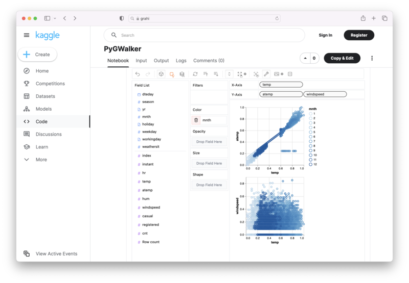
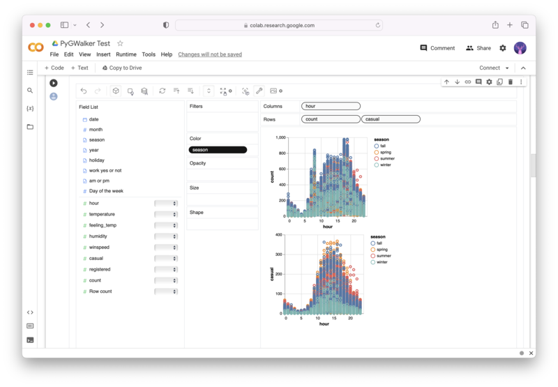
Alternative to Matplotlib: Visualize Data with PyGWalker
Besides using Matplotlib to visualize your pandas dataframe, here is an alternative, Open Source python library that can help you create data visualization with ease: PyGWalker (opens in a new tab).

No need to complete complicated processing with Python coding anymore, simply import your data, and drag and drop variables to create all kinds of data visualizations! Here's a quick demo video on the operation:
Here's how to use PyGWalker in your Jupyter Notebook:
pip install pygwalker
import pygwalker as pyg
gwalker = pyg.walk(df)
Alternatively, you can try it out in Kaggle Notebook/Google Colab:
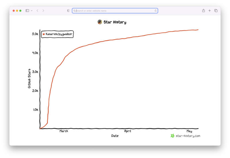
PyGWalker is built on the support of our Open Source community. Don't forget to check out PyGWalker GitHub (opens in a new tab) and give us a star!
Related guides
Conclusion
Mastering the art of creating multiple plots on the same figure in Matplotlib can take your data visualization skills to a whole new level. By understanding the basic concepts and gradually venturing into more complex territory, you can effectively use Matplotlib to bring your data to life.
FAQ
- What are the benefits of creating multiple plots on the same figure in Matplotlib?
Having multiple plots on the same figure can significantly improve your data visualization. This capability allows for more straightforward data comparisons, as you can analyze multiple data trends on a single canvas. It also enhances the clarity and readability of your data representations.
- When should I use the object-oriented API of Matplotlib?
While the pyplot module is straightforward and useful for simple plots, Matplotlib's object-oriented API is more suited to complex visualizations. By directly interacting with Figures and Axes objects, you gain finer control over the plot's elements, which can be invaluable when your visualizations require a higher degree of customization.
- What is the purpose of multiple y-axes in a single plot?
Multiple y-axes are particularly useful when you want to plot different datasets that have different scales or units on the same graph. By assigning each dataset to its y-axis, you can effectively represent these different scales or units without distorting or misrepresenting your data.