Fixing Matplotlib savefig That Cuts Off Labels: A Comprehensive Guide
- Name
- Amber de Ligt
Updated on
You've spent hours crafting the perfect plot in Matplotlib, just to find out that the labels are cut off when you try to save it using the savefig function. It can be quite frustrating, especially when your xlabel has the height equivalent of a couple of lines of text and it's just not displaying correctly. But don't worry, you've landed at the right place. In this article, we will explore several methods to fix the issue where Matplotlib's savefig function cuts off labels.
Understanding the Issue
Before we start solving the problem, let's first understand why it occurs. It is common to use complex labels in scientific or mathematical plots, which are often rendered using TeX formulas. These labels can be "tall", that is, they span multiple lines, causing the bottom of the label to be cut off in the saved figure. Here's an example of such a case:
import matplotlib.pyplot as plt

plt.figure()
plt.ylabel(r'$\ln\left(\frac{x_a-x_b}{x_a-x_c}\right)$')
plt.xlabel(r'$\ln\left(\frac{x_a-x_d}{x_a-x_e}\right)$', fontsize=50)
plt.title('Example with matplotlib 3.4.2\nMRE no longer an issue')
plt.show()
In this example, the ylabel is visible, but the xlabel is cut off at the bottom.
The subplots_adjust Method
A common solution to this issue involves adjusting the plot's margins using the subplots_adjust function. The subplots_adjust function can be applied to either the current figure obtained by plt.gcf() or directly to the plot using plt.subplots_adjust(). Here's how to use it:
plt.gcf().subplots_adjust(bottom=0.15)
# or
plt.subplots_adjust(bottom=0.15)
This method adjusts the bottom margin to make room for the xlabel.
The tight_layout Method
Matplotlib has introduced the tight_layout function which automatically adjusts the subplot parameters to give specified padding. This function is great as it provides a neat solution to the problem of cut-off labels:
fig, axes = plt.subplots(ncols=2, nrows=2, figsize=(8, 6))
axes = axes.flatten()

for ax in axes:
    ax.set_ylabel(r'$\ln\left(\frac{x_a-x_b}{x_a-x_c}\right)$')
    ax.set_xlabel(r'$\ln\left(\frac{x_a-x_d}{x_a-x_e}\right)$')

plt.tight_layout()
plt.show()
By calling plt.tight_layout(), Matplotlib automatically adjusts the axes of the subplots, ensuring that the labels do not overlap and are not cut off.
Saving the Figure with bbox_inches='tight'
Another way to ensure that labels aren't cut off when saving the figure is by specifying bbox_inches='tight' in the savefig function:
plt.savefig('myfile.png', bbox_inches="tight")This option ensures that all the elements of the plot, including labels, are fit within the bounding box when the plot is saved.
In the next section, we will dive deeper into the figure's automatic layout settings and see how they can be used to fix our issue.
Automatic Layout Adjustments
Matplotlib provides an option to automatically adjust the layout of your plots. This is particularly useful when you want your code to produce consistent plots on differently-configured machines. Here's how you can set this:
Updating rcParams During Runtime
You can update the rcParams during runtime. This allows you to ensure that the automatic layout adjustment setting is enabled when your code is executed. Here's how to do it:
from matplotlib import rcParams
rcParams.update({'figure.autolayout': True})
Configuring Matplotlibrc File
Alternatively, you can set the automatic layout adjustment directly in your matplotlibrc file:
figure.autolayout : TrueThis setting is a great way to ensure consistency in your plots across different machines and environments.
By now, you should have a good understanding of how to fix the issue where Matplotlib's savefig function cuts off labels. Remember, the best solution will depend on your specific needs and circumstances, so don't be afraid to experiment with these methods to find the one that works best for you.
Alternative to Matplotlib: Visualize Data with PyGWalker
Besides using Matplotlib to visualize your pandas dataframe, here is an alternative, Open Source python library that can help you create data visualization with ease: PyGWalker (opens in a new tab).

No need to complete complicated processing with Python coding anymore, simply import your data, and drag and drop variables to create all kinds of data visualizations! Here's a quick demo video on the operation:
Here's how to use PyGWalker in your Jupyter Notebook:
pip install pygwalker
import pygwalker as pyg
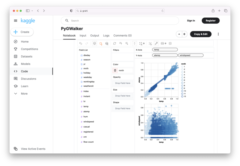
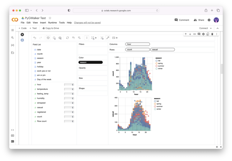
gwalker = pyg.walk(df)Alternatively, you can try it out in Kaggle Notebook/Google Colab:
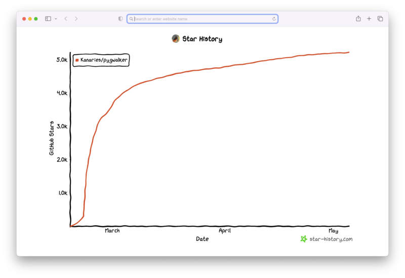
PyGWalker is built on the support of our Open Source community. Don't forget to check out PyGWalker GitHub (opens in a new tab) and give us a star!
Frequently Asked Questions
-
Why are my labels being cut off when I use the
savefigfunction in Matplotlib? This often happens when your labels are "tall", such as when they are rendered using TeX formulas and span multiple lines. Matplotlib does not automatically adjust the plot margins to accommodate these labels, resulting in them being cut off. -
What is the
tight_layoutfunction in Matplotlib? Thetight_layoutfunction is a feature in Matplotlib that automatically adjusts subplot parameters to give specified padding. It ensures that the labels do not overlap and are not cut off. -
What does
bbox_inches='tight'do in thesavefigfunction? Thebbox_inches='tight'option in thesavefigfunction ensures that all elements of the plot, including labels, are fit within the bounding box when the plot is saved. This helps prevent labels from being cut off in the saved figure.