Matplotlib savefig Cuts Off Labels? bbox_inches, DPI Fixes

If matplotlib savefig cuts off your labels, the fastest fixes are fig.savefig(..., bbox_inches='tight') or creating the figure with layout='constrained'. If the problem is a blank export after plt.show(), save the figure before showing it. If the problem is AttributeError: 'Axes' object has no attribute 'savefig', call fig.savefig(...), not ax.savefig(...).
This is a practical savefig checklist for the cases where the official API reference is too broad: clipped labels, bbox_inches='tight', pad_inches, DPI, PNG/SVG/PDF export, transparent backgrounds, and blank images after plt.show().
- Runcell Science: An Open Source Alternative to Claude Science for Research Workflows
- How to Make Mac Not Sleep: Keep Codex, Claude Code, and AI Agents Running
- OpenClaw vs ZeroClaw vs Pi Agent vs Nanobot: Which AI Agent Stack Should You Choose in 2026?
- Can Claude Code Analyze Jupyter Notebooks for Data Science? What It Actually Does
- Claude Code Routines: Why AI Agent Cron Jobs Matter
- Claude Code Desktop Bypass Permissions: How to Enable It
- How to Build Two Python Agents with Google’s A2A Protocol - Step by Step Tutorial
- Top 10 growing data visualization libraries in Python in 2025
savefig Quick Reference
Use fig.savefig() when you already have a Figure object. Use plt.savefig() when you are working with the current pyplot figure. For most static chart exports, this is the safest starting point:
fig.savefig(
    "plot.png",
    dpi=300,
    bbox_inches="tight",
    pad_inches=0.1,
)
That line fixes most cut-off labels, creates a high-resolution PNG, and keeps a small edge buffer. Call it before plt.show() if your backend closes or clears figures after display.
| Need | Use |
|---|---|
| Save the current pyplot figure | plt.savefig("plot.png", dpi=300, bbox_inches="tight") |
| Save an object-oriented figure | fig.savefig("plot.png", dpi=300, bbox_inches="tight") |
| Include labels outside the axes | bbox_inches="tight" |
| Remove extra border | bbox_inches="tight", pad_inches=0 |
| Avoid a blank image | Call savefig() before plt.show() |
| Keep exact figure size | Prefer layout="constrained" instead of bbox_inches="tight" |
Quick Fixes for Common savefig Problems
| Problem | Fastest fix | Best when |
|---|---|---|
| Labels, legend, or title get clipped | fig.savefig('chart.png', bbox_inches='tight') | You need a one-line fix right now |
| You are writing new plotting code | plt.subplots(layout='constrained') | You want the best default for future figures |
| Suptitle, colorbar, or subplot labels get cut off | layout='constrained' | The layout is more complex than a single axes |
| Too much whitespace around the saved figure | bbox_inches='tight', pad_inches=0 | You want a tightly cropped export |
AttributeError: 'Axes' object has no attribute 'savefig' | Use fig.savefig(...) | You accidentally tried to save from an axes object |
| The saved image is blank | Call savefig() before plt.show() | The display backend clears the figure |
If your search was plt.savefig cutting off labels or matplotlib savefig cuts off labels, start with the first two rows.
Blank Image After plt.show(): Save Before You Display
If savefig creates a blank image after plt.show(), the command order is usually the problem. Save the figure first, then display it.
# Wrong order: the figure may be closed before saving
fig, ax = plt.subplots()
ax.plot([1, 2, 3], [1, 4, 9])
plt.show()
fig.savefig("blank.png")

# Correct order: save first, show second
fig, ax = plt.subplots()
ax.plot([1, 2, 3], [1, 4, 9])
fig.savefig("chart.png", dpi=300, bbox_inches="tight")
plt.show()
If you keep a direct Figure reference and call fig.savefig(...), you have more control than with plt.savefig(...), but saving before display is still the least surprising habit in scripts and notebooks.
Basic savefig Syntax
Before diving into fixes, here is the core savefig API. The function writes the current figure to a file, and its behavior depends on the arguments you provide.
import matplotlib.pyplot as plt
import numpy as np

x = np.linspace(0, 10, 100)
y = np.sin(x)

fig, ax = plt.subplots(figsize=(8, 5))
ax.plot(x, y, label='sin(x)')
ax.set_xlabel('X Axis')
ax.set_ylabel('Y Axis')
ax.set_title('Basic Sine Wave')
ax.legend()

fig.savefig('sine_wave.png')
plt.close(fig)
The file format is inferred from the extension. Common options include .png, .svg, .pdf, .eps, and .jpg. You can also pass additional keyword arguments to control resolution, transparency, background color, and bounding behavior.
Key savefig Parameters
| Parameter | Type | Default | Description |
|---|---|---|---|
fname | str or path | (required) | Output file path. Format inferred from extension. |
dpi | float or 'figure' | 'figure' / rcParams['savefig.dpi'] | Resolution in dots per inch for raster output. |
bbox_inches | str or Bbox | None | Set to 'tight' to crop whitespace and include all elements. |
pad_inches | float or 'layout' | 0.1 | Padding when bbox_inches='tight'; 'layout' can reuse constrained-layout padding. |
transparent | bool | False | If True, figure and axes backgrounds become transparent. |
facecolor | color | 'auto' | Figure background color in the saved file. |
format | str | Inferred from fname | Explicitly set the output format (e.g., 'png', 'svg'). |
metadata | dict | None | Key-value metadata embedded in the file (PNG, SVG, PDF). |
Why savefig Cuts Off Labels
Matplotlib calculates the axes position relative to the figure canvas using fractional coordinates. When you set a large font size, use LaTeX-rendered math expressions, rotate tick labels, or add a suptitle, these elements extend beyond the axes bounding box. The figure canvas does not grow to accommodate them.
Common triggers:
- LaTeX-style expressions that render tall symbols (fractions, integrals, summations)
- Large
fontsizevalues on axis labels or titles - Long or rotated tick labels (e.g., date strings at 45 degrees)
- Tight subplot grids where labels from adjacent panels overlap
- Legends placed outside the axes area
fig.suptitle()placed above the subplot grid
Here is a minimal example that demonstrates the problem:
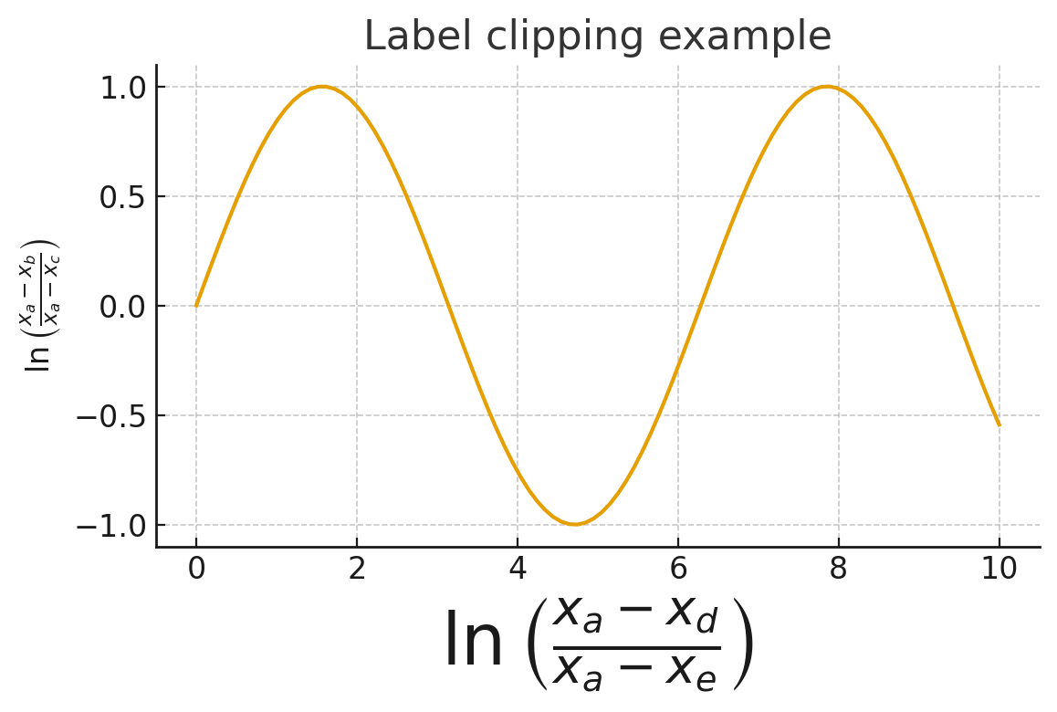
import matplotlib.pyplot as plt

plt.figure()
plt.ylabel(r'$\ln\left(\frac{x_a-x_b}{x_a-x_c}\right)$')
plt.xlabel(r'$\ln\left(\frac{x_a-x_d}{x_a-x_e}\right)$', fontsize=50)
plt.title('Example with LaTeX Labels\nLabel clipping example')
plt.savefig('clipped_labels.png')
plt.show()
The ylabel renders correctly because it fits within the default left margin. The xlabel, however, extends below the figure boundary and gets cut off in the saved file. The five fixes below address this problem from different angles.
Fix 1: layout="constrained" (Recommended)
Current Matplotlib examples commonly enable constrained layout with layout="constrained" when creating the figure. Older code often uses constrained_layout=True; both point to the same layout engine. It adjusts subplot positions after rendering text elements, legends, colorbars, and titles so they are less likely to be clipped.
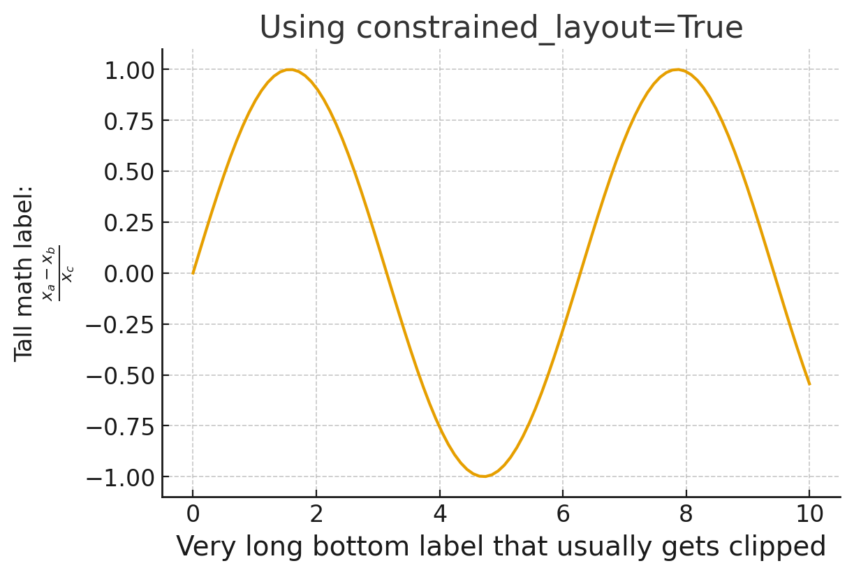
fig, ax = plt.subplots(figsize=(7, 5), layout="constrained")
ax.set_xlabel("Very long bottom label that usually gets clipped", fontsize=16)
ax.set_ylabel("Tall math label:\n$\\frac{x_a - x_b}{x_c}$")
ax.set_title("Constrained Layout Prevents Clipping")
fig.savefig("constrained_layout_fix.png")
Why constrained_layout Works Best
Unlike tight_layout(), which uses a simple padding heuristic, constrained_layout solves a constraint-satisfaction problem. It considers the rendered size of every text element, colorbar, legend, and suptitle, then repositions subplots to make everything fit. This means it handles edge cases that tight_layout cannot, such as:
- Colorbars attached to individual subplots
- Legends placed outside the axes with
bbox_to_anchor fig.suptitle()combined with subplot titles- Nested
GridSpeclayouts
fig, axes = plt.subplots(2, 2, figsize=(10, 8), layout="constrained")

for i, ax in enumerate(axes.flatten()):
    data = np.random.randn(100)
    ax.hist(data, bins=20)
    ax.set_title(f'Panel {i+1}: Distribution')
    ax.set_xlabel('Value')
    ax.set_ylabel('Frequency')

fig.suptitle('Four Histograms with Long Suptitle That Would Otherwise Be Clipped', fontsize=14)
fig.savefig('constrained_subplots.png')
Pros
- Works reliably with colorbars, legends, suptitles, and complex layouts
- Handles nested GridSpec
- The officially recommended approach in Matplotlib's documentation
Cons
- Slightly slower than
tight_layouton large grids (negligible for most uses) - Cannot be combined with
tight_layout()-- use one or the other - Must be set at figure creation time, not after the fact
If you are writing new Matplotlib code, this should be your default choice.
Fix 2: bbox_inches='tight' (Best Quick Fix)
When you cannot modify the figure creation code -- for example, when saving a figure produced by a third-party library -- the bbox_inches='tight' parameter provides an immediate fix.
fig, ax = plt.subplots()
ax.set_xlabel(r'$\ln\left(\frac{x_a-x_d}{x_a-x_e}\right)$', fontsize=24)
ax.set_ylabel('Y Label', fontsize=18)
ax.set_title('Quick Fix with bbox_inches')

fig.savefig('tight_bbox.png', bbox_inches='tight')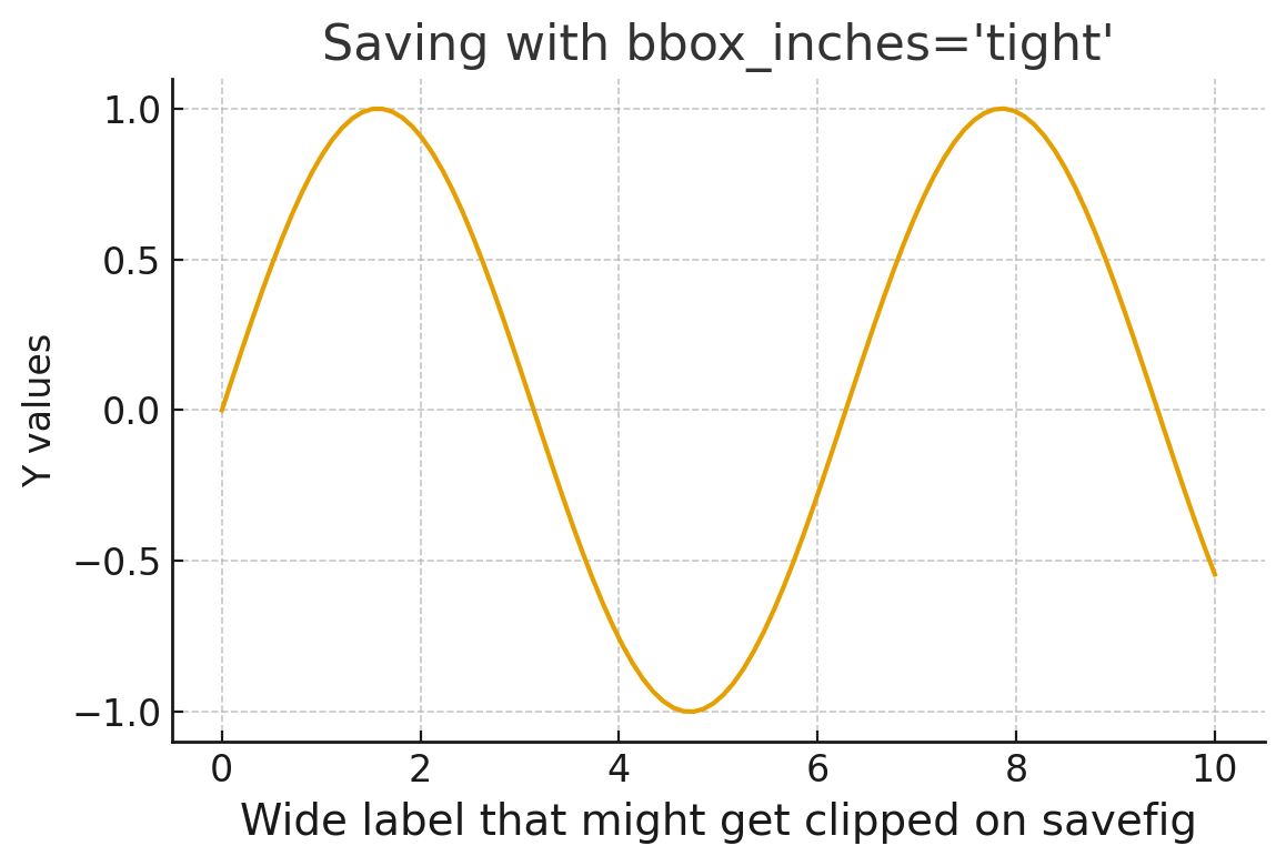
How It Works
When bbox_inches='tight' is passed, Matplotlib recomputes the bounding box of the entire figure after rendering. It expands (or shrinks) the saved region to include all visible artists -- labels, titles, annotations, legends, and colorbars. The pad_inches parameter (default 0.1 inches) adds a small buffer around the edges.
# Custom padding
fig.savefig('padded.png', bbox_inches='tight', pad_inches=0.3)

# Minimal padding
fig.savefig('minimal.png', bbox_inches='tight', pad_inches=0.0)
When to Use
- You need a one-line fix without restructuring your code
- You are saving a figure returned by pandas, seaborn, or another library
- You want the saved file to match what you see on screen
Limitation
bbox_inches='tight' changes the physical size of the saved image. If you need a figure that is exactly 8 by 6 inches (for a journal submission, for example), this parameter may produce a slightly different size. In that case, use constrained_layout instead.
Fix 3: tight_layout()
tight_layout() is the older automatic layout function. It adjusts subplot padding to reduce overlap, and it still works well for simple cases.
fig, axes = plt.subplots(ncols=2, nrows=2, figsize=(8, 6))
for ax in axes.flatten():
    ax.set_xlabel("Example X label")
    ax.set_ylabel("Example Y label")

plt.tight_layout()
fig.savefig('tight_layout_example.png')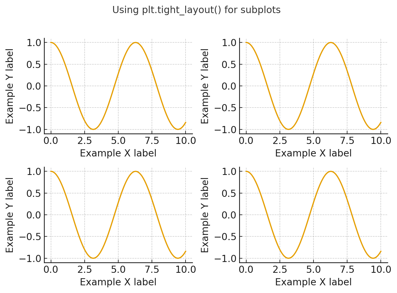
Controlling Padding
You can pass a pad argument to increase or decrease the spacing:
# More padding between subplots
plt.tight_layout(pad=2.0)

# Custom horizontal and vertical spacing
plt.tight_layout(pad=1.0, w_pad=2.0, h_pad=2.0)
When tight_layout Falls Short
tight_layout() struggles with:
- Colorbars (they are not considered during the padding calculation)
- Legends placed outside the axes
fig.suptitle()(it overlaps subplot titles)- Nested GridSpec layouts
For any of those scenarios, switch to layout="constrained".
Fix 4: subplots_adjust() for Manual Control
When you need precise control over margins -- for a publication template, a poster, or a specific aspect ratio -- subplots_adjust() lets you set exact fractional coordinates.
fig, ax = plt.subplots(figsize=(8, 6))
ax.set_xlabel(r'$\ln\left(\frac{x_a-x_d}{x_a-x_e}\right)$', fontsize=20)
ax.set_ylabel('Y Axis', fontsize=16)
ax.set_title('Manual Margin Adjustment')

fig.subplots_adjust(bottom=0.2, left=0.15, right=0.95, top=0.90)
fig.savefig('manual_margins.png')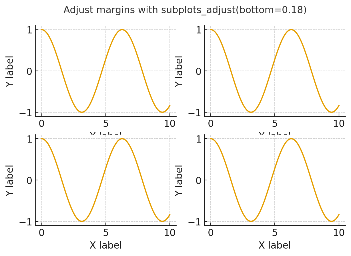
Parameter Reference
| Parameter | Default | Description |
|---|---|---|
left | 0.125 | Left edge of subplots as a fraction of figure width |
right | 0.9 | Right edge of subplots as a fraction of figure width |
bottom | 0.11 | Bottom edge of subplots as a fraction of figure height |
top | 0.88 | Top edge of subplots as a fraction of figure height |
wspace | 0.2 | Width spacing between subplots |
hspace | 0.2 | Height spacing between subplots |
Typical Adjustments
# Bottom label is cut off: increase bottom margin
fig.subplots_adjust(bottom=0.18)

# Suptitle overlaps subplot titles: decrease top
fig.subplots_adjust(top=0.85)

# Legend on the right side is clipped: decrease right
fig.subplots_adjust(right=0.80)

# Subplots overlap vertically: increase hspace
fig.subplots_adjust(hspace=0.4)
This method gives you full control but requires trial and error. It does not adapt to content changes, so if you later increase a font size, you will need to adjust the margins again.
Fix 5: rcParams Global Setting
If you want every figure in your script, notebook, or project to automatically use tight layouts, set the global rcParams:
import matplotlib as mpl

# Option A: Enable autolayout globally
mpl.rcParams['figure.autolayout'] = True

# Option B: Enable constrained_layout globally
mpl.rcParams['figure.constrained_layout.use'] = True
You can also set this in your matplotlibrc configuration file:
# In ~/.config/matplotlib/matplotlibrc (Linux/Mac)
# or C:\Users\<user>\.matplotlib\matplotlibrc (Windows)
figure.autolayout : True
# OR
figure.constrained_layout.use : True
Which rcParam to Use
| Setting | Effect | Best For |
|---|---|---|
figure.autolayout = True | Applies tight_layout() automatically | Simple plots, backward compatibility |
figure.constrained_layout.use = True | Applies constrained_layout automatically | Complex layouts, modern code |
Setting figure.constrained_layout.use = True is the more robust choice for modern codebases, but note that it can conflict with explicit tight_layout() calls in older code. Pick one approach and use it consistently.
Choosing the Right File Format
The format you export to matters as much as the layout. Different formats serve different purposes, and choosing the wrong one can result in blurry images, enormous file sizes, or incompatible files.
fig, ax = plt.subplots(figsize=(8, 5), layout="constrained")
ax.plot(np.linspace(0, 10, 100), np.sin(np.linspace(0, 10, 100)))
ax.set_title('Format Comparison')

# Save in multiple formats
fig.savefig('chart.png', dpi=150)      # Raster, good for web
fig.savefig('chart.svg')               # Vector, good for web + editing
fig.savefig('chart.pdf')               # Vector, good for print/LaTeX
fig.savefig('chart.eps')               # Vector, older LaTeX workflows
fig.savefig('chart.jpg', dpi=150)      # Raster, lossy compression
Format Comparison Table
| Format | Type | Scalable | File Size | Transparency | Best Use Case |
|---|---|---|---|---|---|
| PNG | Raster | No | Medium | Yes | Web, presentations, notebooks |
| SVG | Vector | Yes | Small-Medium | Yes | Web, interactive dashboards, editing in Illustrator |
| Vector | Yes | Small | Yes | LaTeX papers, print publications | |
| EPS | Vector | Yes | Small | No | Legacy LaTeX workflows |
| JPG/JPEG | Raster | No | Small | No | Photographs (avoid for charts) |
| TIFF | Raster | No | Large | Yes | Print publishing with specific requirements |
When to Use Each Format
PNG is the default and works for most purposes. It produces lossless raster images that display well on any screen and support transparency.
SVG is ideal when you need the figure to scale to any size without losing quality. It is perfect for web dashboards and for post-editing in vector graphics tools like Inkscape or Adobe Illustrator.
PDF is the standard for academic papers, especially when using LaTeX. Text in PDF figures remains selectable and searchable.
JPG uses lossy compression that creates visible artifacts around sharp edges and text. Avoid it for charts and plots. It is only appropriate for saving photographic images.
# Force a specific format regardless of file extension
fig.savefig('output_file', format='svg')
DPI and Resolution Control
DPI (dots per inch) determines the resolution of raster formats like PNG and JPG. It has no effect on vector formats like SVG and PDF.
Understanding DPI
fig, ax = plt.subplots(figsize=(8, 6))
ax.plot([1, 2, 3], [1, 4, 9])

# Low resolution: 72 DPI (800 x 600 pixels for 8x6 figure)
fig.savefig('low_res.png', dpi=72)

# Screen resolution: 150 DPI (1200 x 900 pixels)
fig.savefig('screen_res.png', dpi=150)

# Print resolution: 300 DPI (2400 x 1800 pixels)
fig.savefig('print_res.png', dpi=300)

# High-res retina: 600 DPI (4800 x 3600 pixels)
fig.savefig('retina_res.png', dpi=600)
DPI Guidelines
| Use Case | Recommended DPI | Resulting Size (8x6 fig) |
|---|---|---|
| Quick preview | 72 | 576 x 432 px |
| Web or presentation | 150 | 1200 x 900 px |
| Print publication | 300 | 2400 x 1800 px |
| Poster or large-format print | 600 | 4800 x 3600 px |
Setting DPI Globally
import matplotlib as mpl

# Set default DPI for all savefig calls
mpl.rcParams['savefig.dpi'] = 150

# Set display DPI separately (affects notebook rendering)
mpl.rcParams['figure.dpi'] = 100
Note the distinction: figure.dpi controls the on-screen rendering resolution, while savefig.dpi controls the export resolution. Setting savefig.dpi to 150 or 300 and leaving figure.dpi at 100 is a common setup that keeps notebooks responsive while producing high-quality exports.
Calculating Pixel Dimensions
The formula is straightforward:
pixels = figsize_inches * dpiSo a figure created with figsize=(10, 6) and saved at dpi=200 produces a 2000 x 1200 pixel image.
# Precise pixel control
target_width_px = 1920
target_height_px = 1080
dpi = 200
figsize = (target_width_px / dpi, target_height_px / dpi)

fig, ax = plt.subplots(figsize=figsize)
ax.plot([1, 2, 3], [1, 4, 9])
fig.savefig('exact_pixels.png', dpi=dpi)
# Result: exactly 1920 x 1080 pixels
For more on controlling figure dimensions, see our guide on matplotlib figure size.
Saving Figures with Subplots
Multi-panel figures are where label clipping problems multiply. Each subplot has its own labels, and adjacent subplots share limited space. Here are the strategies that work.
Basic Subplot Export
import matplotlib.pyplot as plt
import numpy as np

fig, axes = plt.subplots(2, 3, figsize=(14, 8), layout="constrained")

x = np.linspace(0, 2 * np.pi, 100)
functions = [np.sin, np.cos, np.tan, np.exp, np.log, np.sqrt]
names = ['sin(x)', 'cos(x)', 'tan(x)', 'exp(x)', 'log(x)', 'sqrt(x)']

for ax, func, name in zip(axes.flatten(), functions, names):
    y = func(np.linspace(0.1, 5, 100))
    ax.plot(np.linspace(0.1, 5, 100), y)
    ax.set_title(name, fontsize=12)
    ax.set_xlabel('x')
    ax.set_ylabel(f'f(x) = {name}')

fig.suptitle('Mathematical Functions Overview', fontsize=16)
fig.savefig('subplots_overview.png', dpi=150)
Using layout="constrained" at figure creation handles the spacing automatically. For a deeper look at subplot techniques, see our matplotlib subplots guide.
Shared Axes to Reduce Clutter
When subplots share the same scale, you can eliminate redundant labels:
fig, axes = plt.subplots(2, 2, figsize=(10, 8),
                          sharex=True, sharey=True,
                          layout="constrained")

for ax in axes.flatten():
    data = np.random.randn(200)
    ax.hist(data, bins=25, alpha=0.7)

# Only label the outer edges
fig.supxlabel('Value')
fig.supylabel('Count')
fig.suptitle('Shared Axes Reduce Label Clipping')

fig.savefig('shared_axes.png', dpi=150)
fig.supxlabel() and fig.supylabel() (available since Matplotlib 3.4) add single labels for the entire figure, eliminating per-subplot labels entirely. This produces cleaner exports with less clipping risk.
Saving Individual Subplots
Sometimes you need to export a single panel from a multi-panel figure:
fig, axes = plt.subplots(1, 3, figsize=(15, 5), layout="constrained")

for i, ax in enumerate(axes):
    ax.bar(['A', 'B', 'C'], [3 + i, 7 - i, 5])
    ax.set_title(f'Panel {i+1}')
    ax.set_xlabel('Category')
    ax.set_ylabel('Value')

# Save the full figure
fig.savefig('all_panels.png', dpi=150)

# Save just the second panel
extent = axes[1].get_tightbbox(fig.canvas.get_renderer()).transformed(fig.dpi_scale_trans.inverted())
fig.savefig('panel_2_only.png', bbox_inches=extent.padded(0.2), dpi=150)
For more histogram examples, see our matplotlib histogram guide.
Transparent Backgrounds
Transparent backgrounds are essential when placing figures on colored slides, dark-themed websites, or inside documents with non-white backgrounds.
fig, ax = plt.subplots(figsize=(8, 5), layout="constrained")
ax.plot([1, 2, 3, 4], [10, 20, 25, 30], 'b-o', linewidth=2)
ax.set_xlabel('X Axis', fontsize=14)
ax.set_ylabel('Y Axis', fontsize=14)
ax.set_title('Transparent Background Export')

# Save with transparent background
fig.savefig('transparent.png', transparent=True, dpi=150)
Controlling What Becomes Transparent
The transparent=True flag makes both the figure background and the axes background transparent. If you want only the figure background to be transparent while keeping the axes area white:
fig, ax = plt.subplots(figsize=(8, 5), layout="constrained")
ax.set_facecolor('white')  # Keep axes background white
fig.patch.set_alpha(0.0)   # Make figure background transparent

ax.plot([1, 2, 3], [1, 4, 9])
fig.savefig('partial_transparent.png', facecolor=fig.get_facecolor(), dpi=150)
Transparency by Format
| Format | Supports Transparency |
|---|---|
| PNG | Yes |
| SVG | Yes |
| Yes | |
| EPS | No |
| JPG | No (fills with white) |
If you save a transparent figure as JPG, the transparent regions will be filled with white (or whatever facecolor is set to). Always use PNG or SVG when transparency matters.
Common savefig Errors and Fixes
Problem: FileNotFoundError When Saving
savefig() does not create directories. If the target directory does not exist, you get an error.
import os

# Ensure the directory exists
os.makedirs('output/figures', exist_ok=True)
fig.savefig('output/figures/chart.png')
Problem: Figure Looks Different from Notebook Display
The notebook rendering and savefig use different DPI values and backends. To get consistent results:
fig, ax = plt.subplots(figsize=(8, 5))
ax.plot([1, 2, 3], [1, 4, 9])

# Match display and save DPI
fig.savefig('consistent.png', dpi=fig.dpi, bbox_inches='tight')
Problem: White Border Around Saved Figure
When embedding figures in presentations or web pages, extra whitespace around the plot is unwanted:
# Remove whitespace
fig.savefig('no_border.png', bbox_inches='tight', pad_inches=0)
Problem: savefig Produces Low-Quality Raster Text
Text in raster formats (PNG, JPG) can look pixelated at low DPI. Either increase DPI or switch to a vector format:
# Option A: Higher DPI
fig.savefig('sharp_text.png', dpi=300)

# Option B: Vector format (text stays sharp at any zoom)
fig.savefig('sharp_text.svg')
Problem: Colorbar Gets Cut Off
Colorbars added with fig.colorbar() or plt.colorbar() are external to the axes, making them prone to clipping. Use layout="constrained" or bbox_inches='tight':
fig, ax = plt.subplots(figsize=(8, 6), layout="constrained")
data = np.random.rand(10, 10)
im = ax.imshow(data, cmap='viridis')
fig.colorbar(im, ax=ax, label='Intensity')
ax.set_title('Heatmap with Colorbar')

fig.savefig('colorbar_included.png', dpi=150)
Problem: plt.savefig Not Working (No File Created)
If no file appears after calling savefig, check these common causes:
# 1. Check that you are not using plt.savefig on a closed figure
fig, ax = plt.subplots()
ax.plot([1, 2], [3, 4])
plt.close(fig)
fig.savefig('closed.png')  # This may silently fail

# 2. Check the current working directory
import os
print(os.getcwd())  # Verify where the file is being saved

# 3. Use an absolute path to be safe
fig.savefig('/home/user/figures/chart.png')

# 4. Check for permission errors
try:
    fig.savefig('chart.png')
except PermissionError:
    print("Cannot write to this directory")
Summary: Which Method Should You Use?
| Method | Automatic | Handles Colorbars | Handles suptitle | Exact Size | Best For |
|---|---|---|---|---|---|
layout="constrained" | Yes | Yes | Yes | Yes | Default choice for new code |
bbox_inches='tight' | At save time | Yes | Yes | No (size changes) | Quick fix, third-party figures |
tight_layout() | Yes | No | No | Yes | Simple subplot grids |
subplots_adjust() | No (manual) | Manual | Manual | Yes | Publication templates |
rcParams global | Yes | Depends on setting | Depends | Yes | Project-wide consistency |
Decision Flowchart
- Writing new code? Use
layout="constrained"when creating the figure. - Cannot modify figure creation? Pass
bbox_inches='tight'tosavefig(). - Need exact pixel dimensions for a journal? Use
layout="constrained"(preserves figsize) orsubplots_adjust()for manual precision. - Working with simple subplot grids and no colorbars?
tight_layout()is fine. - Want consistent behavior across an entire project? Set
rcParams['figure.constrained_layout.use'] = True.
Complete Example: Publication-Quality Figure Export
Here is a full workflow that combines the best practices from this guide:
import matplotlib.pyplot as plt
import matplotlib as mpl
import numpy as np

# Global settings for publication quality
mpl.rcParams.update({
    'font.size': 12,
    'font.family': 'serif',
    'axes.labelsize': 14,
    'axes.titlesize': 14,
    'xtick.labelsize': 11,
    'ytick.labelsize': 11,
    'legend.fontsize': 11,
    'figure.constrained_layout.use': True,
    'savefig.dpi': 300,
    'savefig.bbox': 'tight',
})

# Create figure
fig, axes = plt.subplots(1, 2, figsize=(12, 5))

# Panel A: Line plot
x = np.linspace(0, 10, 200)
axes[0].plot(x, np.sin(x), label='sin(x)', linewidth=1.5)
axes[0].plot(x, np.cos(x), label='cos(x)', linewidth=1.5, linestyle='--')
axes[0].set_xlabel('Time (seconds)')
axes[0].set_ylabel('Amplitude')
axes[0].set_title('(a) Trigonometric Functions')
axes[0].legend()

# Panel B: Bar chart with rotated labels
categories = ['Category A', 'Category B', 'Category C', 'Category D', 'Category E']
values = [23, 45, 12, 67, 34]
axes[1].bar(categories, values, color='steelblue')
axes[1].set_xlabel('Category')
axes[1].set_ylabel('Count')
axes[1].set_title('(b) Category Distribution')
axes[1].tick_params(axis='x', rotation=30)

fig.suptitle('Publication-Quality Figure with No Clipped Labels', fontsize=16)

# Save in multiple formats for different uses
fig.savefig('publication_figure.png')   # Web/slides
fig.savefig('publication_figure.svg')   # Editable vector
fig.savefig('publication_figure.pdf')   # LaTeX/print
Build Interactive Visualizations Without Layout Headaches
If you work primarily with pandas DataFrames and spend more time wrestling with Matplotlib layout issues than analyzing data, consider tools designed for interactive exploration.
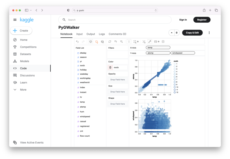
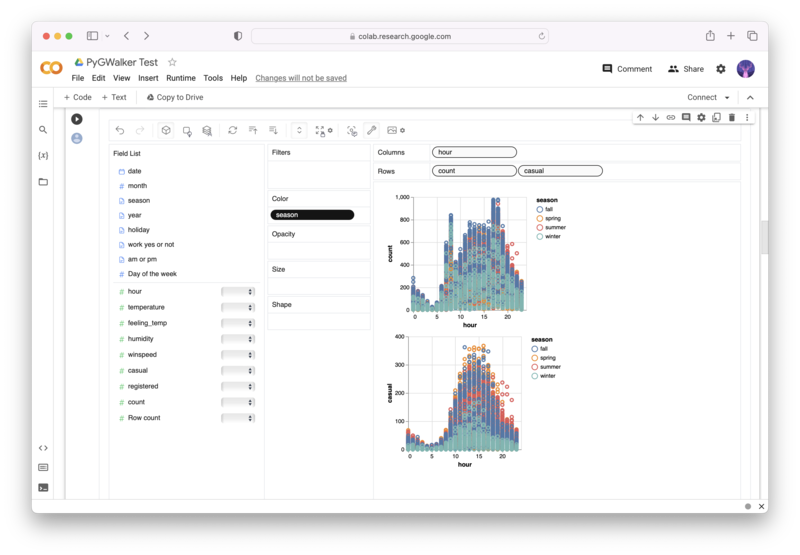
PyGWalker (opens in a new tab) is an open-source Python library that turns any DataFrame into an interactive, Tableau-like visualization interface. You drag and drop fields to build charts, and the layout adjusts automatically -- no savefig tweaking required.

pip install pygwalkerimport pygwalker as pyg
import pandas as pd
df = pd.read_csv('your_data.csv')
walker = pyg.walk(df)PyGWalker generates interactive charts directly in Jupyter notebooks. When you need to export a chart, the resulting image includes all labels and legends automatically, with no clipping issues.
For an AI-native Jupyter experience, RunCell (opens in a new tab) adds an AI agent directly into your notebook environment. It can generate visualizations, handle data transformations, and manage exports -- all with natural language instructions. This is particularly useful when you want publication-quality figures without memorizing every savefig parameter.
| Kaggle | Google Colab | GitHub |
|---|---|---|
 |  |  |
Frequently Asked Questions
1. Why are my labels being cut off when saving a Matplotlib figure?
Matplotlib does not automatically resize the figure canvas when text elements like axis labels, titles, or legends extend beyond the axes bounding box. The saved file only captures the original figure dimensions, so anything outside that region gets clipped. Use layout="constrained" when creating the figure, or pass bbox_inches='tight' to savefig().
2. Should I use bbox_inches='tight' or layout="constrained"?
Use bbox_inches='tight' when you need a one-line export fix or cannot change how the figure was created. Use layout="constrained" when you are writing new plotting code and want Matplotlib to reserve space for labels, legends, colorbars, and suptitles before export.
3. What is the difference between tight_layout and constrained_layout?
tight_layout() uses a simple padding heuristic that adjusts subplot positions based on tick labels and axis labels. It does not account for colorbars, legends outside the axes, or fig.suptitle(). Constrained layout considers more figure elements, making it more reliable for complex layouts.
4. What does bbox_inches='tight' actually do?
It recalculates the bounding box of the figure at save time, expanding or shrinking it to include all visible elements (labels, titles, annotations, legends, colorbars). The pad_inches parameter adds a small buffer around the edges. This changes the physical size of the saved image, so it may not match the original figsize exactly.
5. Why is my Matplotlib savefig output blank after plt.show()?
In many scripts, a blocking plt.show() closes or unregisters the pyplot figure. If you call plt.savefig() afterward, Matplotlib may save a new empty figure. Call fig.savefig(...) or plt.savefig(...) before plt.show().
6. Why did bbox_inches='tight' change my output size?
bbox_inches='tight' crops the saved area to the visible artists, then applies pad_inches. That crop can change the final inch or pixel dimensions. If exact size matters, use layout="constrained" or manual margins instead.
7. What DPI should I use for savefig?
For screen display and presentations, 150 DPI is sufficient. For print publications, use 300 DPI. For posters or large-format prints, use 600 DPI. Vector formats (SVG, PDF) do not use DPI for rendering, so resolution is only relevant for raster formats (PNG, JPG, TIFF).
8. Should I use PNG or SVG for my figures?
Use PNG for general-purpose exports, especially when sharing on the web, in presentations, or in contexts where raster images are expected. Use SVG when you need the figure to scale without quality loss (web dashboards, responsive layouts) or when you plan to edit the figure later in a vector graphics editor. For academic papers, PDF is typically the best choice because it integrates seamlessly with LaTeX.
9. Why does my saved figure look different from the notebook display?
The Jupyter notebook backend and savefig use different DPI settings and rendering pipelines. The notebook display uses figure.dpi (typically 72 or 100), while savefig uses savefig.dpi (which may default to a different value). To get consistent results, explicitly set both to the same value, or pass dpi=fig.dpi to savefig().
10. How do I save a Matplotlib figure with a transparent background?
Pass transparent=True to savefig(). This makes both the figure and axes backgrounds transparent. Only PNG, SVG, and PDF support transparency. JPG and EPS do not -- transparent regions will be filled with white.
Related Guides
- Matplotlib Subplots -- master multi-panel layouts before exporting them with savefig.
- Matplotlib Figure Size -- control figure dimensions for precise pixel or inch-based exports.
- Matplotlib Colormap -- choose the right color scheme for figures destined for print or screen.
- Seaborn Heatmap -- seaborn heatmaps often need savefig tweaks to preserve annotations and colorbars.
- Seaborn Pairplot -- large multi-panel pairplots require careful export settings to avoid label clipping.
- Polars vs Pandas -- considering Polars for faster data processing before visualization? Compare both libraries.