How to Create a Time Series Plot with Matplotlib in Python
- Name
- Rajiv Chandra
Updated on
In this tutorial, you'll learn how to create a time series plot with Matplotlib in Python. Whether you're visualizing stock prices, web traffic, or any other time-dependent data, Matplotlib is a powerful tool for data visualization and analysis. We'll show you how to customize tick markers and labels, work with dates on the horizontal axis, and add minor tick marks for a more detailed view of your data.
Want to quickly create Data Visualizations in Python?
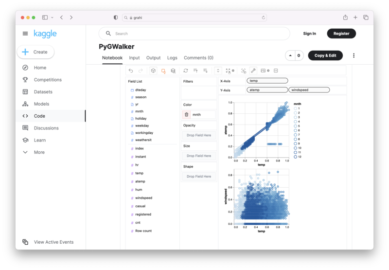
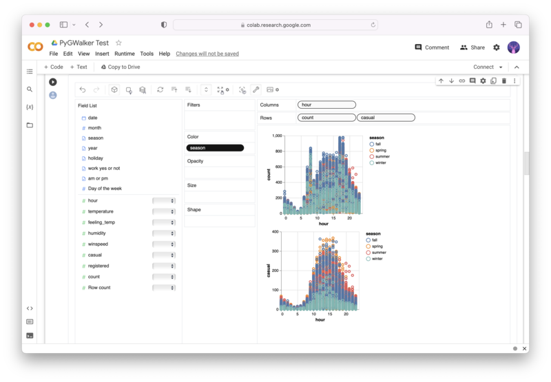
PyGWalker is an Open Source Python Project that can help speed up the data analysis and visualization workflow directly within a Jupyter Notebook-based environments.
PyGWalker (opens in a new tab) turns your Pandas Dataframe (or Polars Dataframe) into a visual UI where you can drag and drop variables to create graphs with ease. Simply use the following code:
pip install pygwalker
import pygwalker as pyg
gwalker = pyg.walk(df)
You can run PyGWalker right now with these online notebooks:
And, don't forget to give us a ⭐️ on GitHub!
What is Matplotlib and what is it used for?
Matplotlib is a data visualization library for Python. It provides a wide range of tools for creating static, animated, and interactive visualizations in Python. Matplotlib is widely used in academia, industry, and government for creating charts, plots, and graphs.
How can I customize the tick markers and labels on a time series plot with Matplotlib?
You can customize the tick markers and labels on a time series plot with Matplotlib by using the set_xticks() and set_xticklabels() methods. These methods allow you to specify the location and format of the tick markers and labels on the horizontal axis.
import matplotlib.pyplot as plt
import pandas as pd

# Load data
data = pd.read_csv("data.csv")

# Convert date column to datetime
data["date"] = pd.to_datetime(data["date"])

# Create plot
fig, ax = plt.subplots()

# Set tick locations and labels
ax.set_xticks(data["date"])
ax.set_xticklabels(data["date"].dt.strftime("%Y-%m"))

# Plot data
ax.plot(data["date"], data["value"])

# Show plot
plt.show()
In this example, we first load the data using the Pandas library and convert the date column to a datetime format. Then, we create the plot object using Matplotlib and set the tick locations and labels using the set_xticks() and set_xticklabels() methods. Finally, we plot the data and display the plot using the show() method.
How can I work with dates on the horizontal axis in Matplotlib?
You can work with dates on the horizontal axis in Matplotlib by using the date2num() function from the matplotlib.dates module. This function converts a date object into a floating-point number, which can be used to plot dates on the horizontal axis.
import matplotlib.pyplot as plt
import matplotlib.dates as mdates
import pandas as pd

# Load data
data = pd.read_csv("data.csv")

# Convert date column to datetime and date2num format
data["date"] = pd.to_datetime(data["date"]).apply(mdates.date2num)

# Create plot
fig, ax = plt.subplots()

# Plot data
ax.plot_date(data["date"], data["value"], linestyle="solid")

# Show plot
plt.show()
In this example, we first load the data using the Pandas library and convert the date column to a datetime format. Then, we use the date2num() function to convert the date column into a format that can be plotted by Matplotlib. Finally, we plot the data using the plot_date() method and display the plot using the show() method.
What is a MonthLocator and how is it used in Matplotlib?
A MonthLocator is a Matplotlib class that is used to specify the locations of the tick marks on the horizontal axis for a time series plot. The MonthLocator class can be used to generate tick locations at regular intervals of months.
import matplotlib.pyplot as plt
import matplotlib.dates as mdates
import pandas as pd

# Load data
data = pd.read_csv("data.csv")

# Convert date column to datetime and date2num format
data["date"] = pd.to_datetime(data["date"]).apply(mdates.date2num)

# Create plot
fig, ax = plt.subplots()

# Set tick locator
ax.xaxis.set_major_locator(mdates.MonthLocator())

# Set tick formatter
ax.xaxis.set_major_formatter(mdates.DateFormatter("%Y-%m"))

# Plot data
ax.plot_date(data["date"], data["value"], linestyle="solid")

# Show plot
plt.show()
In this example, we first load the data using the Pandas library, convert the date column to a datetime format, and convert it to the format that can be plotted by Matplotlib. Then, we create the plot object and set the tick locator using the set_major_locator() method to generate tick locations at regular intervals of months. Finally, we plot the data and display the plot using the show() method.
How can I add minor tick marks to a time series plot with Matplotlib?
You can add minor tick marks to a time series plot with Matplotlib by using the set_minor_locator() method of the xaxis object. This method allows you to specify the location of the minor tick marks on the horizontal axis.
import matplotlib.pyplot as plt
import matplotlib.dates as mdates
import pandas as pd

# Load data
data = pd.read_csv("data.csv")

# Convert date column to datetime and date2num format
data["date"] = pd.to_datetime(data["date"]).apply(mdates.date2num)

# Create plot
fig, ax = plt.subplots()

# Set tick locator
ax.xaxis.set_major_locator(mdates.MonthLocator())

# Set tick formatter
ax.xaxis.set_major_formatter(mdates.DateFormatter("%Y-%m"))

# Set minor tick locator
ax.xaxis.set_minor_locator(mdates.MonthLocator(bymonthday=15))

# Plot data
ax.plot_date(data["date"], data["value"], linestyle="solid")

# Show plot
plt.show()
In this example, we first load the data using the Pandas library and convert the date column to a datetime format. Then, we create the plot object and set the tick locator and formatter as we did before. Finally, we set the minor tick locator using the set_minor_locator() method to generate tick locations every 15th day of each month. We plot the data and display the plot using the show() method.
Conclusion
Matplotlib is a powerful tool for creating time series plots in Python. With its wide range of customization options, you can create beautiful and informative visualizations of your time-dependent data. Whether you're just getting started with data visualization or you're an experienced data analyst, Matplotlib is a valuable addition to your toolkit.
Other Python Tutorials: