What Is Seaborn in Python | Data Visualization Using Seaborn
- Name
- Rajiv Chandra
Updated on
Data visualization is an integral part of data science projects, and Python has several libraries for the same. One such Python data visualization library that is building quite a fanbase is Seaborn. Seaborn is a high-level graphics library built on top of the popular visualisation library Matplotlib. Seaborn has a more modern feel than Matplotlib with beautiful design choices and a more intuitive API. In this beginner's guide, we'll introduce Seaborn library and explore its features for data visualization.
Want to quickly create Data Visualizations in Python?
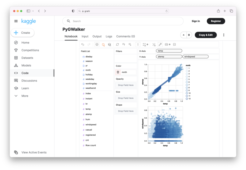
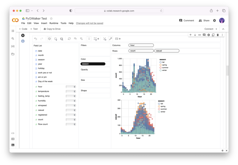
PyGWalker is an Open Source Python Project that can help speed up the data analysis and visualization workflow directly within a Jupyter Notebook-based environments.
PyGWalker (opens in a new tab) turns your Pandas Dataframe (or Polars Dataframe) into a visual UI where you can drag and drop variables to create graphs with ease. Simply use the following code:
pip install pygwalker
import pygwalker as pyg
gwalker = pyg.walk(df)
You can run PyGWalker right now with these online notebooks:
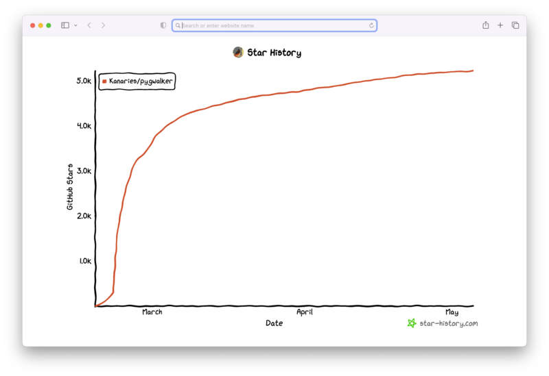
And, don't forget to give us a ⭐️ on GitHub!
What is Seaborn in Python, and How Does it Differ from Matplotlib?
Seaborn is a Python data visualization library that is built on top of Matplotlib. It provides a high-level interface for creating beautiful and informative statistical graphics. Seaborn makes it easy to explore and understand the structure of your dataset by offering a range of familiar plots, including heatmaps, scatterplots, and distributions.
While Matplotlib is an excellent tool for creating basic visualizations, its default styles are not particularly aesthetically pleasing. Seaborn is designed to address this issue by providing a wide range of styles and color palettes that make it easy to create custom, publication-quality visualizations.
Seaborn also includes several advanced features that Matplotlib does not, such as the ability to plot complex statistical relationships and work with categorical variables.
What are the Benefits of Using Seaborn for Data Visualization?
Seaborn has several benefits that make it a popular choice for data visualization:
1. Beautiful and Customizable Visualizations
Seaborn provides several beautiful and customizable visualization styles that make it easy to create publication-quality plots. Seaborn also has built-in color palettes that can be customized to match any specific need.
2. Support for Complex Statistical Relationships
Seaborn provides several plotting functions that can visualize complex statistical relationships, making it easier to explore and understand your data.
3. Support for Categorical Variables
Seaborn provides several plotting functions tailored to working with categorical variables. These functions make it easy to explore and understand relationships between different categories of data.
4. Easy Integration with Pandas
Seaborn is designed to work seamlessly with Pandas, a powerful data manipulation library in Python. This integration makes it easy to work with and visualize data in a Pandas DataFrame.
5. Compatibility with Machine Learning Libraries
Seaborn is also easy to integrate with other machine learning libraries such as Scikit-learn, making it a popular choice for building machine learning pipelines.
What are the Different Types of Plots that can be Generated Using Seaborn?
Seaborn provides several plotting functions that can be used to create different types of plots. Some of the most commonly used plots in Seaborn include:
1. Heatmaps
Heatmaps are a graphical representation of data where the values in a matrix are represented as colors. Seaborn provides several heatmap functions that can be used to create different types of heatmaps.
2. Barplots
Barplots are used to visualize categorical data. Seaborn provides several barplot functions that can be used to create different types of barplots.
3. Pairplots
Pairplots are used to visualize pairwise relationships between different variables in a dataset. Seaborn provides a pairplot function that can be used to create different types of pairplots.
4. Scatterplots
Scatterplots are used to visualize how two variables in a dataset are related. Seaborn provides several scatterplot functions that can be used to create different types of scatterplots.
5. Boxplots and Violinplots
Boxplots and violinplots are used to visualize the distribution of data in a dataset. Seaborn provides several functions that can be used to create different types of boxplots and violinplots.
What are the Mandatory Dependencies for Using Seaborn?
Seaborn has several dependencies that must be installed before it can be used. The mandatory dependencies for Seaborn are:
- Python version 3.6 or above.
- NumPy library.
- pandas library.
- Matplotlib library.
How Can Seaborn Be Installed on a System?
Seaborn can be installed on a system using pip, which is a package manager for Python. To install Seaborn using pip, run the following command in your terminal window:
pip install seabornAlternatively, Seaborn can also be installed using conda, which is a popular package manager for data science libraries. To install Seaborn using conda, run the following command in your terminal window:
conda install seabornConclusion
Seaborn is a powerful data visualization library in Python that provides beautiful and customizable plots for exploring and understanding your data. Seaborn is easy to use and provides several advanced features that make it a popular choice for data scientists. By leveraging Seaborn, data scientists can quickly visualize their data and gain insights that may not have been apparent otherwise.