A Comprehensive Guide on ggplot2 in R
- Name
- Rajiv Chandra
Updated on
Welcome to our comprehensive guide on a popular data visualization library in R, which can help you take your data analysis skills to the next level. In this guide, you'll learn about the various components and customization options available, along with advanced techniques for creating interactive and engaging visuals.
Want to quickly create Data Visualizations in Python?
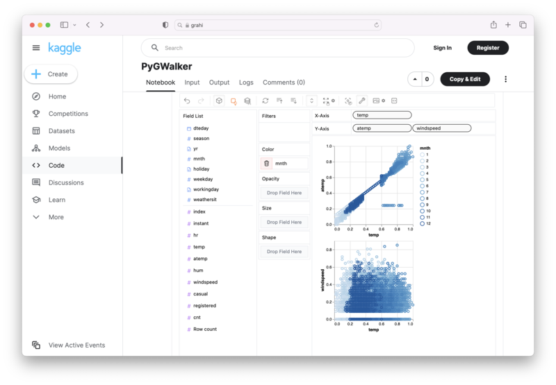
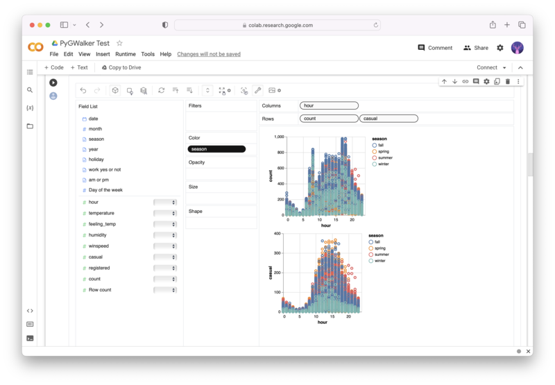
PyGWalker is an Open Source Python Project that can help speed up the data analysis and visualization workflow directly within a Jupyter Notebook-based environments.
PyGWalker (opens in a new tab) turns your Pandas Dataframe (or Polars Dataframe) into a visual UI where you can drag and drop variables to create graphs with ease. Simply use the following code:
pip install pygwalker
import pygwalker as pyg
gwalker = pyg.walk(df)
You can run PyGWalker right now with these online notebooks:
And, don't forget to give us a ⭐️ on GitHub!
What is ggplot2 in R?
ggplot2 is a data visualization library in R that allows you to create visually appealing plots and graphs. It is built on the Grammar of Graphics, a theory that describes how different aspects of a plot can be combined and customized to create a wide range of visuals. It is a popular alternative to the base R graphics, and one of the most widely used data visualization libraries in R.
How do I install ggplot2 in R?
To install ggplot2, you can use the following command in the R console:
install.packages("ggplot2")What are the advantages of ggplot2 in R over base R graphics?
ggplot2 offers several advantages over base R graphics:
- ggplot2 uses a consistent syntax for creating plots, making it easier to learn and use.
- ggplot2 provides a wide range of customization options, allowing you to create highly customized visuals.
- ggplot2 offers a modular system of layers, making it easy to build complex plots.
- ggplot2 supports a wide range of chart types, including scatter plots, line plots, histograms, and more.
What are the basic components of a ggplot?
A ggplot consists of three basic components:
- Data: The data to be visualized
- Aesthetic Mapping: The visual variables like x, y values, colours, etc.
- Geometric Objects: The geometric shapes like points, lines, etc. that represent the data
How can I personalize the charts in ggplot2 in R?
You can personalize the charts in ggplot2 using various customization options like:
- Changing the line thickness and color
- Setting axis limits and labels
- Adding a title, subtitles, captions, and text annotations
- Changing the font size and family
- Adding themes to set the background colors, grids, fonts, and more.
What datasets are pre-installed in ggplot2 in R?
ggplot2 comes with several pre-installed datasets for practicing like diamonds, mtcars, mpg.
How do I import and explore the Iris dataset in ggplot2 in R?
You can import and explore the Iris dataset in R as follows:
data(iris)
head(iris)
This code will load the iris dataset, and the head() function will show you the first few rows of the dataset.
What are the essential elements of any plot in ggplot2?
Every ggplot consists of essential elements, as follows:
- Data
- Geometric Object
- Aesthetic mappings
- Scales (for axis and legends)
- Coordinate System
- Facets
What is the Grammar of Graphics and how is it used in ggplot2 in R?
The Grammar of Graphics is a theory that describes how to create a wide range of visualizations by combining different components of a chart. In ggplot2, the Grammar of Graphics is used to create data visualizations by mapping data variables to aesthetic properties like color, size, and shape.
What are the visualization capabilities of ggplot2 in R?
ggplot2 has a wide range of visualization capabilities, including:
- Scatter Plots
- Line Plots
- Density Plots
- Histograms
- Box Plots
- Bar Plots
- Area Plots
- Heat Maps
- Violin Plots
What are some popular plots that can be created using ggplot2 in R?
ggplot2 can be used to create a wide range of plots, including:
- Scatter Plots
- Line Plots
- Bar Plots
- Box Plots
- Heat Maps
- Density Plots
- Violin Plots
How can I customize and add more layers to graphics in ggplot2 in R?
You can customize and add more layers to graphics in ggplot2 using various options like:
- Changing the colors and shapes of points
- Adding a trend line or regression line
- Adding multiple geometric objects to the same plot
- Creating facets or subplots to visualize different aspects of the data
- Adding legends, text annotations, and labels to the plot
What are the themes available in ggplot2 in R for personalizing charts?
ggplot2 offers several built-in themes to personalize charts, including:
- theme_grey
- theme_light
- theme_dark
- theme_minimal
- theme_classic
- theme_bw
You can choose the theme that best suits your data and customize it further based on your preferences.
Conclusion
In conclusion, ggplot2 is one of the most widely used data visualization libraries in R, and with good reason. Its powerful capabilities and customizable options make it suitable for almost any data visualization task. With this comprehensive guide, you'll have all the tools you need to create stunning visuals and become a full stack data scientist.