5 Common Ways to Use Matplotlib Colormaps (cmaps)

Matplotlib’s colormap (cmap) system is much richer than “just pick a color scheme.” Once you understand the API, you can:
- Visualize continuous values (heatmaps, images)
- Encode extra dimensions in scatter plots
- Create discrete colormaps for categories
- Use nonlinear scaling (log, boundaries) for tricky data
- Sample colors from a colormap to style your own plots
In this post we’ll walk through 5 common patterns with code + real chart outputs. You can copy–paste each snippet into your own notebook or script.
All examples assume:
import numpy as np
import matplotlib.pyplot as plt
1. Continuous colormap with imshow
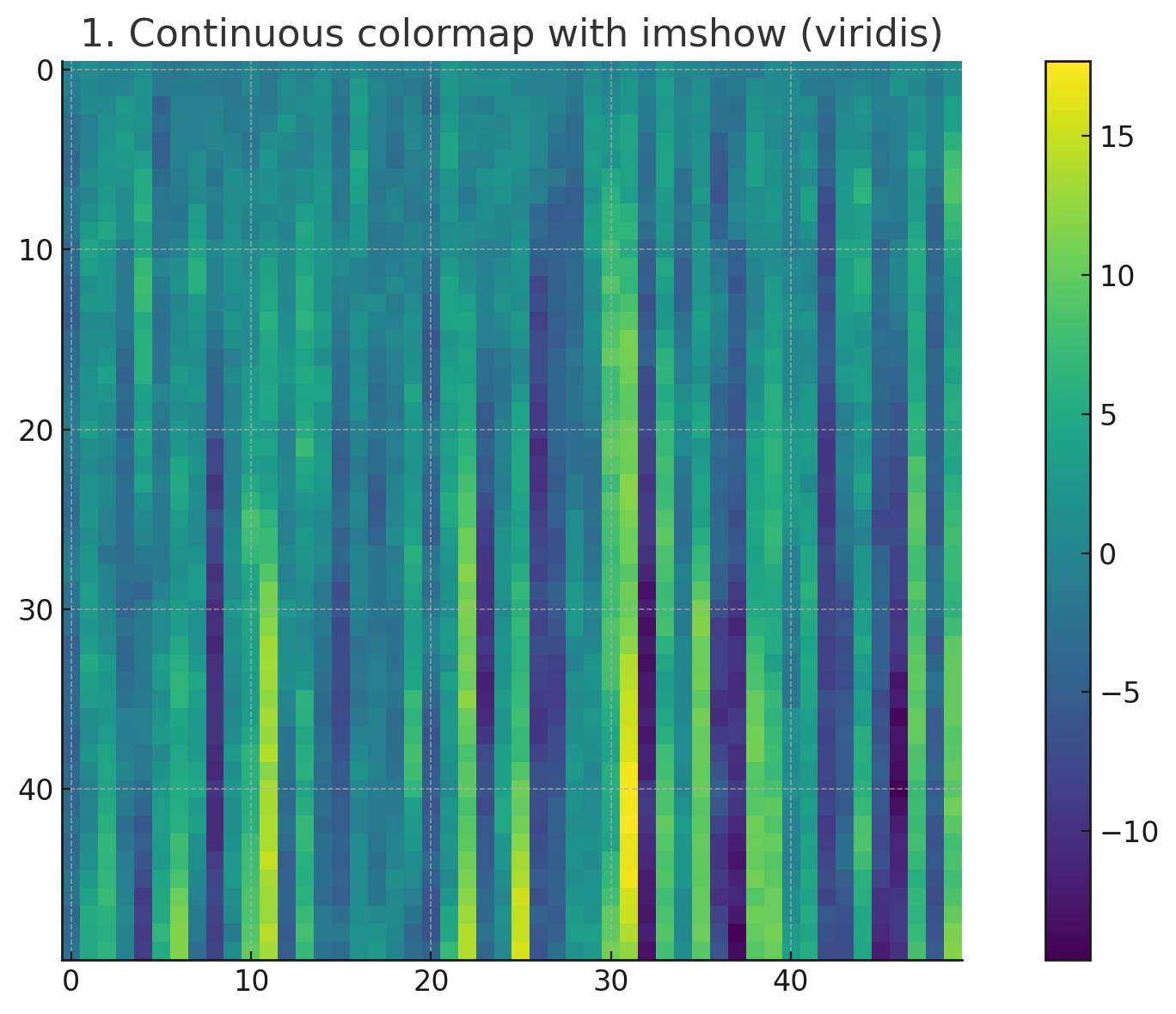
The most basic use of colormaps is to visualize 2D arrays with imshow—e.g. heatmaps, images, or any regular grid.
Code
import numpy as np
import matplotlib.pyplot as plt

# Generate some random-ish 2D data
data = np.random.randn(50, 50).cumsum(axis=0)

plt.figure()
plt.imshow(data, cmap="viridis")
plt.colorbar()
plt.title("Continuous colormap with imshow (viridis)")
plt.tight_layout()
plt.show()
Chart
You get a smooth heatmap using the perceptually-uniform viridis colormap:
(This corresponds to the first image above: a purple–green heatmap with a colorbar.)
Key points:
cmap="viridis"selects the colormap.plt.colorbar()draws a color scale so the viewer can interpret values.- Any 2D NumPy array can be passed to
imshow.
2. Scatter plot with colormap and colorbar
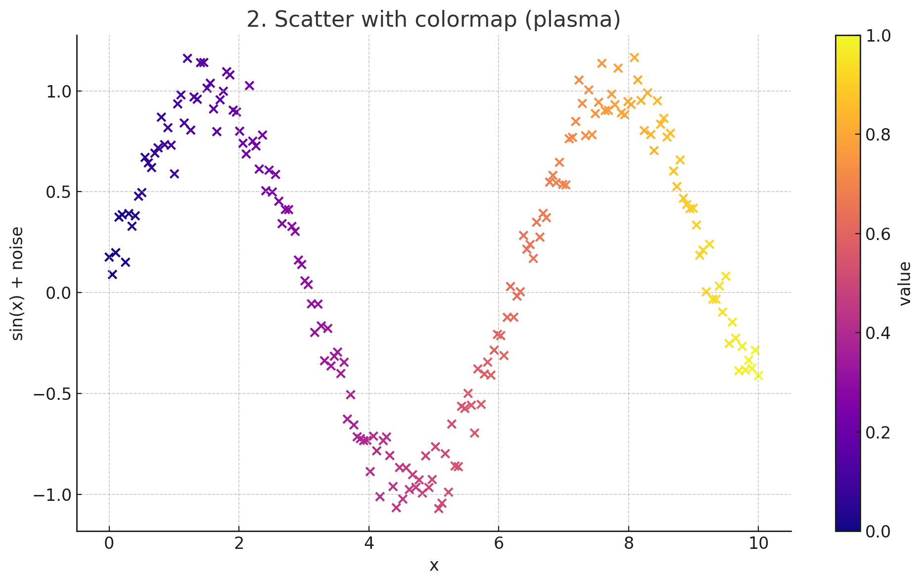
You can use colormaps to encode an extra numeric dimension in a scatter plot (e.g. time, intensity, probability).
Code
import numpy as np
import matplotlib.pyplot as plt

np.random.seed(0)
x = np.linspace(0, 10, 200)
y = np.sin(x) + 0.1 * np.random.randn(200)

# A separate value for each point, mapped to a colormap
values = np.linspace(0, 1, 200)

plt.figure()
scatter = plt.scatter(x, y, c=values, cmap="plasma")
plt.colorbar(scatter, label="value")
plt.title("Scatter with colormap (plasma)")
plt.xlabel("x")
plt.ylabel("sin(x) + noise")
plt.tight_layout()
plt.show()
Chart
You get a scatter plot where point colors transition smoothly along the plasma colormap, plus a colorbar explaining what the colors mean.
Key points:
c=valuessupplies the numeric data to map to colors.cmap="plasma"chooses the colormap.- Pass the
scatterobject toplt.colorbar()to get a matching colorbar.
3. Discrete colormap for categories
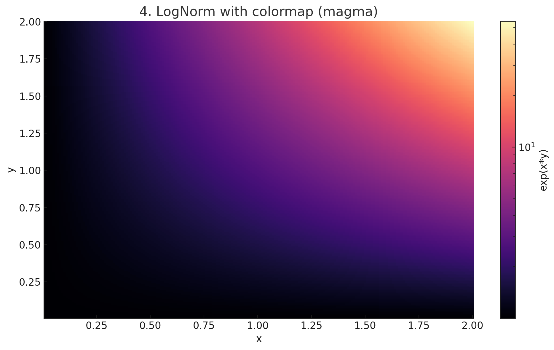
Colormaps are continuous by default, but you can also use them to create a small set of discrete colors for categories (classification results, labels, etc.).
Code
import numpy as np
import matplotlib.pyplot as plt
from matplotlib.colors import ListedColormap

# Fake 4-category classification
categories = np.random.randint(0, 4, 100)
x = np.random.randn(100)
y = np.random.randn(100)

# Build a discrete colormap from the first 4 colors of tab10
base_cmap = plt.cm.tab10
cmap_disc = ListedColormap(base_cmap(np.linspace(0, 1, 4)))

plt.figure()
for i in range(4):
    mask = categories == i
    # Use a single color for each class
    plt.scatter(x[mask], y[mask], c=[cmap_disc(i)], label=f"class {i}")

plt.legend()
plt.title("Discrete colormap for categories (tab10 subset)")
plt.xlabel("x")
plt.ylabel("y")
plt.tight_layout()
plt.show()
Chart
You’ll see a scatter plot where each category (0–3) has its own distinct color (taken from tab10).
Key points:
ListedColormaplets you construct a colormap from a list of colors.- This is great when you need a small number of stable category colors.
- We used
tab10(a good default qualitative colormap) and took 4 colors from it.
4. Using normalization (LogNorm) with a colormap
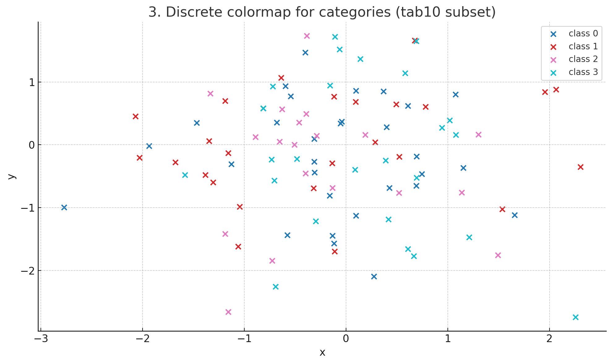
Sometimes data spans several orders of magnitude. Mapping it linearly to colors can hide structure. Instead, combine a colormap with a normalization function such as LogNorm.
Code
import numpy as np
import matplotlib.pyplot as plt
from matplotlib.colors import LogNorm

x = np.linspace(0.01, 2, 200)
y = np.linspace(0.01, 2, 200)
X, Y = np.meshgrid(x, y)
Z = np.exp(X * Y)  # Grows very quickly

plt.figure()
pcm = plt.pcolormesh(X, Y, Z, norm=LogNorm(), cmap="magma")
plt.colorbar(pcm, label="exp(x * y)")
plt.title("LogNorm with colormap (magma)")
plt.xlabel("x")
plt.ylabel("y")
plt.tight_layout()
plt.show()
Chart
You’ll see a 2D colored field where areas with small and large values are both visible, thanks to the logarithmic scaling, using magma.
Key points:
norm=LogNorm()controls how values map to the [0, 1] range before applyingcmap.- Works with
pcolormesh,imshow,scatter, etc. - Other norms:
Normalize,BoundaryNorm,PowerNorm, etc.
5. Sampling colors from a colormap for line plots
Colormaps aren’t only for "filled" plots. You can sample individual colors from a colormap and use them wherever you want – for lines, bars, annotations, etc.

Code
import numpy as np
import matplotlib.pyplot as plt

cmap = plt.cm.cividis   # choose any colormap you like
xs = np.linspace(0, 10, 200)

plt.figure()
for i, freq in enumerate(np.linspace(0.5, 2.5, 6)):
    ys = np.sin(freq * xs)
    color = cmap(i / 5.0)   # sample evenly across the colormap
    plt.plot(xs, ys, label=f"freq={freq:.1f}", color=color)

plt.legend(title="frequency")
plt.title("Sampling colors from colormap (cividis)")
plt.xlabel("x")
plt.ylabel("sin(freq * x)")
plt.tight_layout()
plt.show()
Chart
You’ll get multiple sine waves, each with a different color taken from cividis, smoothly varying along the colormap.
Key points:
plt.cm.<name>gives you a colormap object you can call like a function.cmap(t)returns an RGBA color fortin[0, 1].- This is a neat way to get consistent, aesthetically pleasing color palettes.
Wrap-up
These 5 patterns cover a lot of everyday usage of Matplotlib colormaps:
- Continuous heatmaps with
imshow+cmap. - Scatter plots where color encodes an extra value dimension.
- Discrete categorical colors using
ListedColormap. - Nonlinear scaling with
LogNorm(and friends) + colormaps. - Sampling colors from a colormap for custom styling (lines, bars, etc.).
Once you’re comfortable with these, you can explore:
- Custom colormaps (from your own color lists or external tools)
BoundaryNormfor discrete value ranges (e.g. bins)- Perceptually uniform colormaps (
viridis,plasma,cividis, etc.) for better readability and accessibility