Use Matplotlib Stylesheets for Enhanced Data Visualization
Updated on
Matplotlib is an incredibly powerful library in Python for data visualization. The library's real charm lies in its customizable nature, providing a wide range of options to adjust the look of your plots. One such feature that adds to the customization power of Matplotlib is the use of stylesheets.
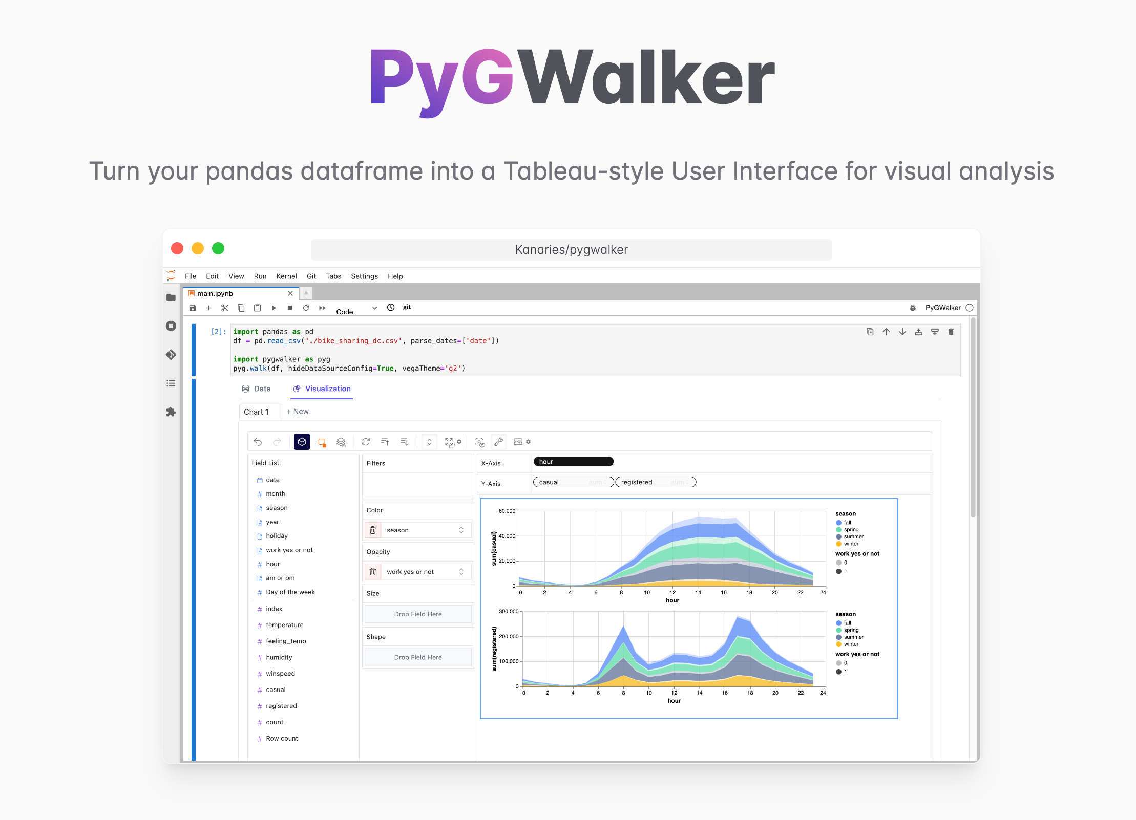
Want to quickly create Data Visualization from Python Pandas Dataframe with No code?
PyGWalker is a Python library for Exploratory Data Analysis with Visualization. PyGWalker (opens in a new tab) can simplify your Jupyter Notebook data analysis and data visualization workflow, by turning your pandas dataframe (and polars dataframe) into a tableau-alternative User Interface for visual exploration.
What is a Matplotlib Stylesheet?
Matplotlib Stylesheets are a feature that allows users to customize the look and feel of their graphs. They function much like CSS for web design, setting a consistent theme or style for all your visualizations. Stylesheets define properties like color schemes, grid lines, background color, and more, providing a quick and easy way to ensure all your plots have a unified appearance.
How Can Matplotlib Stylesheets Improve Data Visualization?
Data visualization is all about presenting data in a way that is both informative and engaging. Stylesheets can significantly enhance the aesthetic appeal of your plots, making them more enjoyable to look at and easier to understand.
The right stylesheet can bring your data to life, highlighting important details and making patterns more noticeable. Whether you're presenting your findings to a client or publishing a research paper, a well-chosen stylesheet can make your work stand out.
Benefits of Using Stylesheets in Matplotlib
Using stylesheets in Matplotlib offers several advantages:
-
Consistency: Stylesheets ensure that all your plots follow a unified theme, enhancing readability and professionalism.
-
Efficiency: Instead of manually setting properties for each plot, stylesheets allow you to set them all at once, saving time and effort.
-
Customization: Matplotlib offers a variety of stylesheets, but you're not limited to these. You can create your own stylesheet to match your specific preferences.
How to Use Matplotlib Stylesheets in Python?
Applying a Matplotlib Stylesheet is simple. After importing Matplotlib into your Python environment, you can use plt.style.use('style') to set the style for your plots, where 'style' is the name of the stylesheet you want to use.
For instance, to use the "FiveThirtyEight" stylesheet, you would run:
pythonCopy code
import matplotlib.pyplot as plt plt.style.use('fivethirtyeight')
Different Types of Matplotlib Stylesheets
Matplotlib comes with a range of built-in stylesheets, each with its unique aesthetic:
-
The "FiveThirtyEight" stylesheet emulates the distinctive style of the FiveThirtyEight website's plots (opens in a new tab).
-
The "Dark Background" stylesheet is perfect for presentations, where a darker background can make your plots stand out.
-
The "Grayscale" stylesheet is excellent for printing, as it conserves ink and remains readable even without color.
-
The "Cyberpunk" stylesheet offers a unique, neon-like aesthetic that can make your plots more engaging.
-
The "Seaborn-Whitegrid" stylesheet, derived from the Seaborn library, provides a clean and clear aesthetic for your plots.
You can view all available stylesheets using plt.style.available.
Choosing the right stylesheet for your plots is an essential part of effective data visualization. Here are a few things to consider:
-
Your Audience: If you're presenting to a business audience, you might want a clean, professional look like the "Seaborn-Whitegrid" stylesheet. For a more casual or creative audience, something like the "Cyberpunk" stylesheet might be more fitting.
-
The Data: Different data may call for different styles. For example, the "Dark Background" stylesheet might be great for highlighting colorful data, while the "Grayscale" stylesheet might be better for simpler data sets.
-
The Medium: Are you presenting your data in a dark presentation room? The "Dark Background" stylesheet might be perfect. Printing in black and white? "Grayscale" is the way to go.
Customizing Matplotlib Stylesheets to Fit Your Preferences
Matplotlib allows you to create your own stylesheets to match your specific needs. This process involves creating a .mplstyle file, where you can define the properties you want to change. This file can then be loaded into Matplotlib using plt.style.use('path/to/stylesheet').
For more information on creating your own stylesheets, you can check the official Matplotlib documentation (opens in a new tab).
Matplotlib Stylesheets vs Seaborn: Which one is Better?
Matplotlib and Seaborn are both powerful data visualization libraries, and choosing between them depends on your specific needs. Seaborn offers a high-level interface and more attractive default styles, while Matplotlib provides more flexibility and control over your plots.
However, it's important to note that Seaborn is actually built on top of Matplotlib. This means that you can use Matplotlib's stylesheets and customization options even when you're using Seaborn, giving you the best of both worlds.
Creating Theme-Based and Attractive Plots with Matplotlib Stylesheets
You can apply the principles of design to your data visualizations with Matplotlib stylesheets. Themes help tell a story, guide interpretation, and create an emotional response.
For example, if you're visualizing data about climate change, you might choose a "Seaborn-Whitegrid" stylesheet for its clean, professional look. If you're presenting data on night-time electricity usage, the "Dark Background" stylesheet could be a perfect thematic match.
The key is to choose a stylesheet that complements the data you're presenting and the story you're trying to tell.
Conclusion
Matplotlib stylesheets offer a powerful way to enhance your data visualizations in Python. By ensuring consistency, saving time, and allowing for customization, stylesheets can significantly improve your work's readability and impact. Whether you're using one of Matplotlib's built-in stylesheets or creating your own, the right stylesheet can take your data visualization to the next level.
Remember, data is only as good as your ability to understand and interpret it, and a well-chosen stylesheet can go a long way in achieving that goal.
To further enhance your data visualization skills, consider exploring our tutorials on topics like converting a dictionary to a DataFrame, adding a row to a DataFrame, and plotting a DataFrame.
