Matplotlib fill_between: Conditional Fills, Bands, and isin() Fixes


fill_between shades the area between two y-curves (or between a curve and a baseline). It is the standard tool for confidence bands, “above/below” highlights, and region callouts on line charts.
Quick syntax
import matplotlib.pyplot as plt
import numpy as np

x = np.linspace(0, 10, 200)
y1 = np.sin(x)
y2 = np.cos(x)

fig, ax = plt.subplots()
ax.plot(x, y1, label="sin")
ax.plot(x, y2, label="cos")
ax.fill_between(x, y1, y2, color="0.7", alpha=0.4)
ax.legend()
plt.show()| Goal | Pattern |
|---|---|
| Fill between two series | ax.fill_between(x, y1, y2, alpha=0.3) |
| Fill under one line | ax.fill_between(x, 0, y, alpha=0.3) |
| Only where a condition holds | where=(y1 > y2) (same length as x) |
| Index / category filter | where=df.index.isin([...]) — not Python in |
| Smoother edges on conditions | interpolate=True |
- How to Use Pi Coding Agent 1.0: Install, Connect a Model, and Run Your First Task
- How to Use Laya: Classify Text in a pandas DataFrame with the Open-Source Jev Alternative
- Claude Code Reads AGENTS.md Now: Setup, Loading Modes, and Sharing One File with Codex, OpenCode, and Cursor
- How to View Deleted Reddit Posts (2026 Guide): 5 Ways That Still Work
- GPT Image 2.5: How to Use It, Flare vs Sunburst, and API Pricing
- How to Use DeepSeek Harness: Install, Set Up, and Run Your First Agent
- Runcell Science: An Open Source Alternative to Claude Science for Research Workflows
- How to Make Mac Not Sleep: Keep Codex, Claude Code, and AI Agents Running
- OpenClaw vs ZeroClaw vs Pi Agent vs Nanobot: Which AI Agent Stack Should You Choose in 2026?
- Can Claude Code Analyze Jupyter Notebooks for Data Science? What It Actually Does
- Claude Code Routines: Why AI Agent Cron Jobs Matter
- Claude Code Desktop Bypass Permissions: How to Enable It
- How to Build Two Python Agents with Google’s A2A Protocol - Step by Step Tutorial
- Top 10 growing data visualization libraries in Python in 2025
What fill_between does
Matplotlib draws a polygon from (x, y1) to (x, y2) and fills it. x, y1, and y2 must be the same length (or y1/y2 can be scalars).
That single idea covers most “highlight this region” tasks without inventing custom patches.
Basic fill between two curves
This example fills everything between sine and cosine:
import matplotlib.pyplot as plt
import numpy as np

x = np.linspace(0, 10, 300)
y1 = np.sin(x)
y2 = np.cos(x)

fig, ax = plt.subplots(figsize=(7.2, 4.2))
ax.plot(x, y1, label="sin(x)", color="#2563eb", lw=2)
ax.plot(x, y2, label="cos(x)", color="#dc2626", lw=2)
ax.fill_between(x, y1, y2, color="#94a3b8", alpha=0.45)
ax.set_xlabel("x")
ax.set_ylabel("y")
ax.legend(loc="upper right")
plt.show()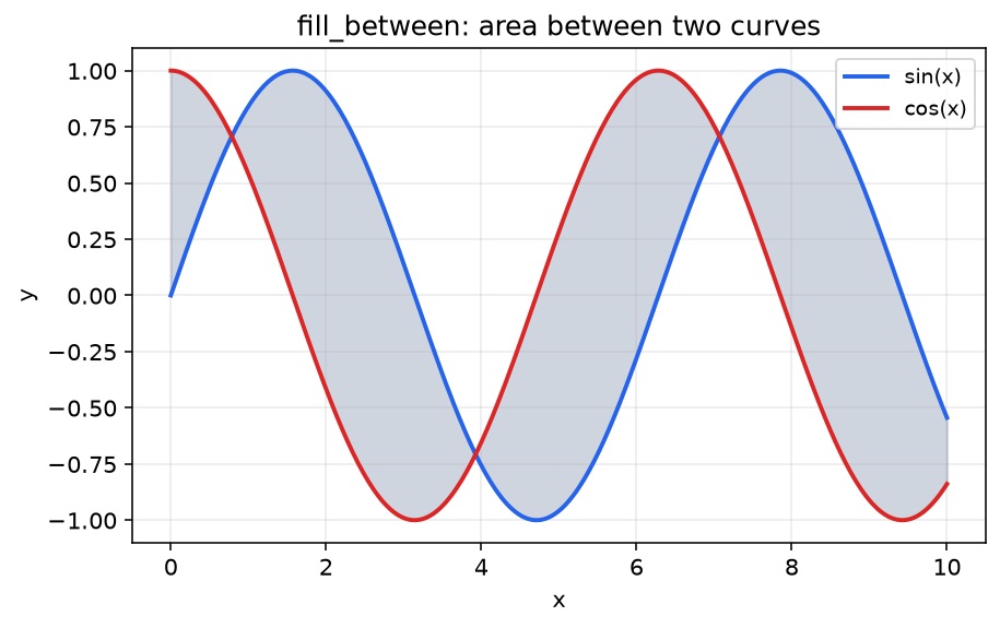
Useful knobs:
alpha— keep fills translucent so lines stay readablecolor/facecolor— fill colorlinewidth=0— hide the polygon edge if it fights the line styleslabel=— include the fill in the legend when it represents a real category
Conditional fills with where=
Pass a boolean array (same length as x) to paint only part of the band. Use two calls if you want two colors:
fig, ax = plt.subplots(figsize=(7.2, 4.2))
ax.plot(x, y1, label="sin(x)", color="#2563eb", lw=2)
ax.plot(x, y2, label="cos(x)", color="#dc2626", lw=2)

ax.fill_between(
    x, y1, y2,
    where=(y1 > y2),
    interpolate=True,
    color="#22c55e",
    alpha=0.35,
    label="sin > cos",
)
ax.fill_between(
    x, y1, y2,
    where=(y1 <= y2),
    interpolate=True,
    color="#f97316",
    alpha=0.30,
    label="sin ≤ cos",
)

ax.legend(loc="upper right", ncol=2)
plt.show()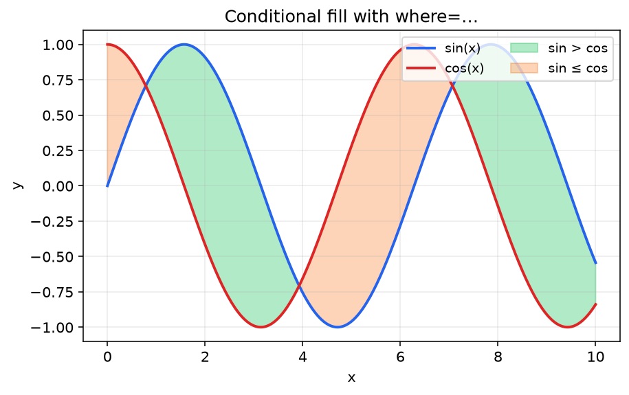
Why interpolate=True matters
Without interpolation, the fill can cut with blocky vertical edges where the condition flips between sample points. interpolate=True estimates the crossing so the highlight follows the curves more cleanly. Prefer it for dense continuous series; it is less important for sparse categorical x-axes.
Confidence / error band pattern
A very common real-world use is “mean ± uncertainty”:
t = np.linspace(0, 12, 200)
mean = np.sin(t / 1.5) + 0.15 * t
std = 0.35 + 0.08 * np.abs(np.cos(t))

fig, ax = plt.subplots(figsize=(7.2, 4.2))
ax.plot(t, mean, color="#0f766e", lw=2.2, label="estimate")
ax.fill_between(t, mean - std, mean + std, color="#14b8a6", alpha=0.28, label="±1σ band")
ax.set_xlabel("time")
ax.set_ylabel("value")
ax.legend(loc="upper left")
plt.show()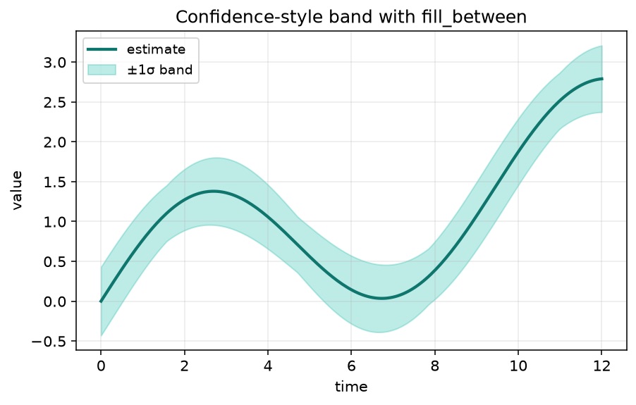
Same idea works for quantiles (p10/p90), forecast ranges, or min/max envelopes. Plot the center line after or with a higher z-order if the fill feels too loud.
Troubleshooting: fill only for some categories / months
Search traffic often hits this page after a failed attempt like:
# Broken ideas
where = plotMonths.index in ["January", "February", "March"]   # ValueError / nonsense
where = [m in ["January", "February", "March"] for m in plotMonths.index]  # may work, but isin is cleaner
What goes wrong
array in listis not element-wise. NumPy/pandas objects raiseValueErroror return a single ambiguous boolean.- You need a boolean vector aligned with
x, not one True/False for the whole array.
Fix: isin() (or np.isin)
Complete, runnable example with categorical month labels:
import matplotlib.pyplot as plt
import numpy as np
import pandas as pd

months = ["Jan", "Feb", "Mar", "Apr", "May", "Jun", "Jul", "Aug"]
df = pd.DataFrame(
    {
        "A": [12, 14, 13, 15, 18, 17, 16, 19],
        "B": [10, 11, 12, 14, 13, 15, 14, 16],
    },
    index=months,
)

fig, ax = plt.subplots(figsize=(7.2, 4.2))
ax.plot(df.index, df["A"], marker="o", label="series A")
ax.plot(df.index, df["B"], marker="o", label="series B")

ax.fill_between(
    np.arange(len(df)),
    df["A"],
    df["B"],
    where=df.index.isin(["Jan", "Feb", "Mar"]),
    color="#38bdf8",
    alpha=0.35,
    label="Q1 highlight",
)

ax.set_xticks(range(len(df)), df.index)
ax.legend(loc="upper left")
plt.show()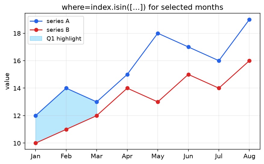
Notes:
- For a DatetimeIndex, prefer boolean masks like
(df.index.month <= 3)or.isinon normalized labels. - When x is categorical labels on the axis, passing integer positions to
fill_between(as above) is often more reliable than string categories. - Keep
wherelength equal to the x array you pass.
Common traps
| Trap | Symptom | Fix |
|---|---|---|
| Length mismatch | ValueError: ... not the same size | Align x, y1, y2, where |
Using Python in on Index/array | ValueError or empty fill | index.isin([...]) / np.isin |
Forgetting alpha | Fill hides lines | alpha=0.2–0.4 |
| Outside legend clipped in PNG | Legend cut off | See legend outside plot + bbox_inches="tight" |
| Ugly condition edges | Blocky regions | interpolate=True |
For multi-series charts, pair fills with clear line styles from multiple line plots. If the figure feels cramped after annotations and bands, adjust figure size before you fight legend placement.
fill_between vs fill_betweenx
fill_between(x, y1, y2)— vertical fill between two y values across x (most common).fill_betweenx(y, x1, x2)— horizontal fill between two x values across y (useful for vertical profiles, density strips, tornado-style ranges).
Same where= idea applies to both.
FAQ
Conclusion
ax.fill_between(x, y1, y2) is the small API with outsized visual payoff: compare series, show uncertainty, and spotlight regions. Reach for where= when the story is conditional, use isin/boolean masks instead of Python in for labels, and keep alpha low so the data still leads.
Related Guides
- Matplotlib legend outside plot — keep series labels readable next to filled regions
- Matplotlib multiple line plots — multi-series charts that pair well with fills
- Matplotlib figure size — room for bands, labels, and legends
- Matplotlib savefig cuts off labels — export without clipping
- Matplotlib subplots — panel layouts for multiple filled series
- Matplotlib annotations and text — label the regions you just filled